-
Posts
11 -
Joined
-
Last visited
Everything posted by Ment2008
-
Many good ideas, let's hope devs will approve and make these real
-
-
-
Hello, As a new player im having hard time locate these locations, for exmple, if im looking for Scyther, i can see #Map, but in what region these #Map i can't really know. So i have to google it, ask in discord and why can't we just have another #Region Title ? just like this:
-
Well this box is already there, its empty, i don't see no reason why not to add some useful information inside..
-
I'm new here and has no clue about this two locations, while at work I'm alt tabbing alot and this is causing disconnects due to idle (even 5 min DC) and sometimes im in middle of some master battle and this is just casing auto lose... Different scenario but same result, lose of progress. +1 definitely
-
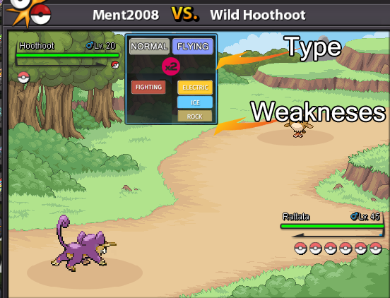
Hello, I'm new to Pokemon and still using THIS CHART to determine which attack element should i use vs opponents Its not that complicated but before using the chart i have to determ which element my opponent are and to do so i have to use database site https://pokemondb.net/ right now, in combat when you mouse-over on your or opponents name you get this pop up box: Can these boxes have better use and have Type + weaknesses, for example: Or another visual improvment to my suggestion by @SainteBaguette and the pop box can show the weaknesses Also idea by @KyloRen :
-
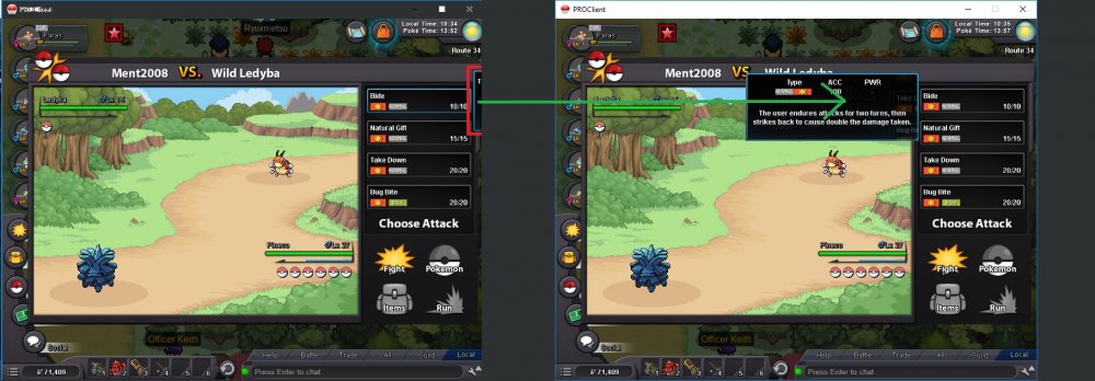
Hello, Can skill description have adjustment like side to pop or so, i'm playing on super low res (800x600) and having issues to read skills descriptions since its swallowed outside game window:
-
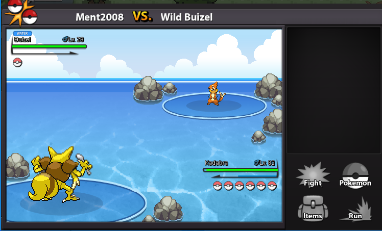
Hello everyone! Since battle animation & text is client side thing why don't we have the options to speed it up? This is example of a single turn: 1. Selecting Fight 2. Selecting skill 3. See dialog about what skill opponent used 4. See opponent skill animation 5. See dialog about what skill I've used 6. See my skill animation If you wonder, this takes 7-8 seconds This is example of a pokemon swap: 1. Selecting Pokemon ball 2. Choosing pokemon 3. See dialog about what pokemon just entered battle 4. See ball throwing aniomation 5. See dialog about what skill opponent used 6. See opponent skill animation If you wonder, this takes 8 seconds, if it was my turn, it would take 12+ seconds. This old level up experience animation, Yeah there's no animation at all, Rattata level from 58 to 61 intently without us seeing experience bar getting unnecessary experience animation. While with new system each level takes 2-3 seconds, means, if your Rattata should jump from level 5 to level 40 it will take nearly a minute to do so. Its cool and all to see these interaction for first time, but you get tired of it pretty fast.. Can we get some real-life time and have these unnecessary things adjusted? If someone like to see slow motion Battle animations, Texts & Experience bar, let them have it x1. But for the rest, allow us to change it via , just like this:
-
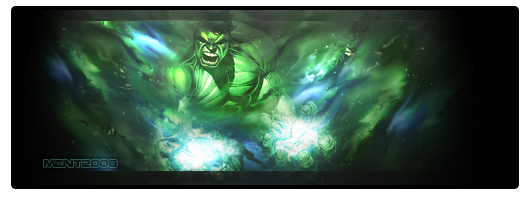
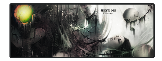
Hello everyone! I've decided to make my own shop, i will create forum avatars and signatures according to your requirements. This is not yet completed thread and things will be updated. Forum Avatar: Select Border/less Choose Style/Background Image Choose Font, Warp location, Or not Eventually submission form should be as follows: [TABLE] [TR] [TD] Hi, I would like to purchase : Border Nº - 4 Image Nº- A004 Or Link Font - https://fonts.google.com/specimen/Bungee+Inline The result will look like this: [/TD] [/TR] [/TABLE] To be Continued


