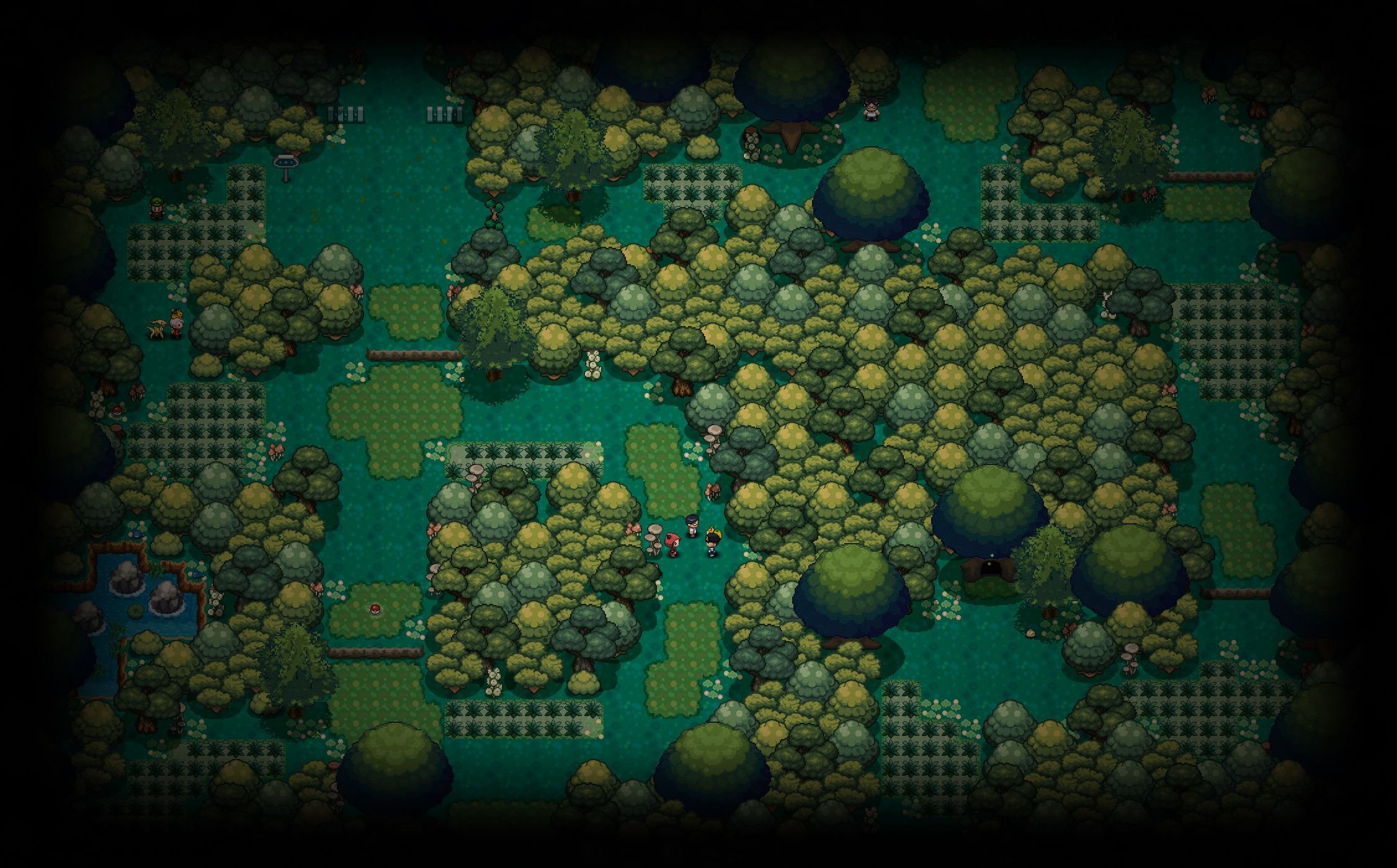


New Trade Zone
Trade Zone is now live
Use the new Trade Zone for auctions and instant-price trades so Pokemon and item offers are easy to find.
Yuifelwood
Suspended
-
Joined
-
Last visited
Everything posted by Yuifelwood
-
No problem! It looks good 😄
-
Looking at this sprite. I think dithering would not be that neccessary for the mask. Considering the inspiration of the mask the texture gotta look slick and smooth, which dithering would usually end up making look rough. Other than that I'd suggest leaving the side of the right eye darker and instead put the dark blue highlight where the brow is. As the light source comes from top left.
-
Helllo there etto900, A shame you don't like the new follower designs that much. Could you elaborate on why you dislike them?
-
10/10 Well organized and aesthetically pleasing.
-
Greetings Outrage! Hope you will enjoy your time in the community.
-
Greetings Xarmadon ~ Hope you'll have a great time in our community.
-
Pixel Art is just something you can do in many kinds of art programs. It doesn't require much. The three I suggested in my tutorial are ones I personally used. I have no experience with other art programs regarding Pixel Art.
-
Added +40 Pixelart Tutorials by Pedro Medeiros The artist for Celeste, Towerfall, and Skytorn.
-
Fire
-
-
A nice addition. Thanks for your contribution c: Love the work you're showing here there is a lot of attention to detail and the shading is properly placed for the light sources you have intended. At most I can say for the first sprite, the arms seem to be lacking elbows giving them a bit of rubber hose vibe. Other than that it's all good.
-
Thank you ~
-
Thank you ~ This means a lot.
-
Not bad at all c: Need some shading work for the back sprite, but otherwise it looks pretty good ~
-
We are aware some shinies aren't their actual visual representation and this is being worked upon. ~
-
It's true that having multiple accounts is not allowed, however there is a maximum limit so having two accounts isn't that much of an issue.
-
Happy new year! c:
-
Well, what I can say about it is that the darker a shade becomes the darker the outline should be. As you can see in this image the darkest spot in this sprite is the area I just highlighted. However, the outline is the lightest out of all outlines in that particular part of the body. That particular spot should have the darkest outline and therefore be black, while in spots with lighter colors you can shade the outlines into the lighter color that you used in the darker area. If you do that it will look like this:
-
Love the costume it looks fairly good already ~ Just need a bit more attention to the shading for the right ear. There's a shade on the top part which would imply the light source is coming from below while the rest of the sprite indicates the light source coming from above. As for the walk animations of the sprites the leg moving backwards should have a darker outline, as it moves out of the light source's reach. Other than that this costume is good. :3 Keep up the good work ~
-
Welcome to the Pixelart Tutorial Master Thread So you want to learn and create Pixel art, maybe you want to share your tips and tricks? Well, it's time to grab your art programs and get to work! Those who want to share their own piece of tutorials be sure to also apply which Art Program you use to work with. Feedback and Questions involving pixelart will be accepted. Tutorial Links Riukkii's Pixel Tutorial (Paint Tool Sai) +40 Pixelart Tutorials by Pedro Medeiros Yui's Pixelart Tutorial Greetings prospective Pixel-artists. This is a tutorial to the wonderful world of Pixelart in which I will explain pointers which someone should pay attention to when making sprites. I will mainly be focusing on techniques that are used for the Pixelart of the official Pokémon games that have been used up to the 5th generation. And the fun part? You won't necessarily need a pen tablet to do it. As long as you have a mouse that can move you can Pixelart! Through my career I've made use of of three different programs (All Free) and each of them had their own personal perk in my opinion. Ms Paint + Has all the tools that are wanted and needed to make pixel-art. + Very simple in use + Has an Eraser that could quickly and cleanly replace colors as desired + Will not blur selected images when scaling them up and down but rather expand the size of the pixels. - No layers - Does not support Transparent backgrounds - Can't make animations Program that has been available for many Windows OSes for a long time. It's a fairly simple program but has most of the tools necessary for drawing Pixel-art. This program comes with an eraser that can quickly replace specific colors of choice with any color you like once you learn how to use it. It's con is that it has no layer function so it's recommended to duplicate sprites often to ensure you can go back to a previous stage the sprite was in as the undo function doesn't roll entirely back. On top of that the program does not support transparency and has no option to turn the background transparent. Gimp + Has Layers + Supports Transparent backgrounds + Supports creation of GIF Animations frame by frame + Selection tool that selects any pixels of a similar color - Will blur images when attempting to expand them in size - Most of the brushes use anti-aliasing and should be avoided. - Eraser has anti-aliasing function which isn't desired for Pixel-art. - Transparent background isn't the default setting when creating a new canvas Has layers and transparency. It also has a selection tool that will make the user able to select a color and it will automatically seek out any pixel that is of a similar color and select them all that way. It's eraser tool is very tedious though as it makes existing pixels semi-opaque not deleting it entirely leaving the sprite unclean. Fire Alpaca + Has Layers + Supports Transparent backgrounds + Transparent background is the default setting when creating a new canvas + Can easily set all brushes to non-anti aliasing mode + Can preview animations frame by frame in Onion Skin mode. + Exporting as Onion Skin mode will save each frame as a separate PNG image. - Will blur images when attempting to expand them in size - Cannot save as GIF animation (uses separate website to generate and upload these) Important note on this program: Tick Anti-Aliasing off for all your tools that you are going to use, else there will be a cluster of many different colors and opaque pixels that you do not want. Okay, so as you may have noticed... I emphasize on the fact that you should NEVER use anti-aliasing when making Pixelart. As to why? Well, Pixelart is a medium that has come to be based upon the fact that there wasn't a lot of data space available on digital storage material back in the old days. By this I don't only mean the physical size of the sprite shouldn't be too large, but also that a sprite shouldn't have too many colors onto it, because every unique color in an image takes up more data. If you look at the old first and second generation Official sprites of Pokémon you will notice each sprite having no more than 4 colors used on them. (Note: White and Black count as colors those were the two standard colors that always took 2 out of 4 spots) Due to the upgraded cardridge that came with the GBA generation, the third generation of pokémon games had their color palette expanded to a whopping 16 unique colors and expanded the physical size limit of each sprite, giving pixel-artists more freedom. as well as allowing them to use more colors than they originally could. In gen 4 this would expand even further, even though at that point the official pixel-artists for Pokémon stopped bothering with trying to reach the color cap. Anyways, the important part is for Pixelart that you set the color palette aside that you want to use in your project. This includes all intended colors and their shades. In the instance that you will use anti-aliasing... Your computer ends up generating more colors than you intended to use, and while it will give shading a much smoother look, most colors will not even be perceived on the tiny sprite yet take up the unnecessary data that I talked about earlier. As to make a point out of it I will draw a line in fire alpaca with anti-aliasing on and anti aliasing off. You'll immediately see the difference when zoomed out. The line with anti-aliasing is above while the one without is below it. Anti-aliasing is a computer generated tool that makes for smoother edges when drawing, which is great for digital painting, while the other line looks really choppy. Zooming in you'll notice that the line-art above consists of many different opacities of black, while the line below is 100% the same black color for each pixel. The line below takes less data from the storage and gives you full control of the color of each pixel. Which you are going to need when making pixel-art. Creating Pixelart Drawing the base When making a pixelart there are a bunch of steps that need to be taken. First of all you need a clear image of what exactly you want to make. Draw a sketch, or a skeleton build of what you intend to design. In MS paint I recommend sketching with any color that isn't black so in the future you can delete the sketch-lines at any point in time. For Pokemon Generation 5 battle sprites the maximum boundaries of your image are 96 x 96 pixels. It doesn't really matter which medium you use at this point yet. So go ahead with anything you may be comfortable with. For this exercise example I'll be drawing a Luxray. Lineart Once you got the base down it's time to draw the line-art. Create a new layer in your art program. If you used MS paint. Select a color that differs from the color you used for the sketch line. From this point on the real pixel-arting will start. Just trace over the image you just made. However you do it is up to you, you can pick to carefully do it pixel-by pixel. Or you immediately just start drawing lines like a madman... I won't judge. It's the end result that counts. As you can see I drew lines like a madman myself. And while I got the initial line-art down it's time to give those pixels a little more attention. Zooming in on the sprite is a given, it grants you more accuracy to work on that lineart. First of all, we want to have as little pixels meant for outline touching. Which means reducing the chunks of black I have highlighted with red circles here. After deleting those we're not done though there are still a bunch of excessive pixels in the pixelart. I have highlighted the pixels in the next image. All line-art pixels have to be connected to one another. However, diagonally also counts as being connected. So the pixels at the spots I have highlighted are unnecessary. The reason why it is important to remove these excess pixels is so that the lineart doesn't look thicker on these particular spots in the sprite. Mind that I haven't highlighted all the spots on the Luxray which needed to be removed. Once you've cleaned up all the excessive pixels your lineart should be of consistent thickness. --> Now there can be instances where you're not entirely satisfied with the shape of the sprite. That can be easily fixed from this point on. There are a few rules to keep in mind from here: Don't make your straight lines too long, or it may look unnaturally straight on the Pokémon... If they are organic... which is most of the time. The only exception in the rule are Pokémon made from minerals or plating like Avalugg. It's part of it's design that it's back is flat like a table after all. ~ Then your followup question would be: How do I make a line-art less wobbly and more organic? Well I got some spots on my Luxray's Lineart I am not entirely satisfied with so let's take those as an example! We are going to make these lines flow better and bend properly. In this case it's just a matter of counting how many pixels are in each row. And to make a curve you're going to take each row of pixels and gradually make the lines shorter as you draw the curve. A lot of this work just requires whatever curve you're satisfied with. So you're going to zoom out and zoom in a lot just to see if it curves properly. The faster the amount of pixels reduces the sharper your curve will end up looking. Now Luxray's mane has a slightly too straight diagonal line so I gonna curve that out a little more to make it seem rounder. --> --> As you can see I didn't really seem to have done much, however the effect is immediately much better. So you learn, a single pixel could affect the entire look of a sprite. ~ Now one last example of an error I found on the line-art as I go. The front paw. There is a tiny bulge sticking out that doesn't really look that great. This is because the pixels per line are irregular which... when you want to make little stick-out things doesn't matter that much, but in this case you want a smooth leg. So we're going to move one pixel aside. --> Once you're 100% satisfied with your lineart it's time to move to the next step ~ Do not be afraid to make alterations on the lineart as you go. You may find some more errors as you're working in future steps. Now that the line-art is complete we can start picking a color palette. And since I took an existing Pokémon Luxray already has a color palette which can be taken. However, here is a piece of advice for when you work on a project that does not have their colors laid out already: Pick colors that don't contrast too much, however, make sure the difference in shade is enough to be distinctive to notice. With that in mind, let's first use the base colors to have a good look as which color belongs where. As you can see I laid out all the colors that I want to use next to the sprite. These are all the colors I will use for the entire sprite. But before I start shading I first want to have a clear idea from where the light source will come. In case of battle sprites for Pokémon the light source is always in the top left corner. From there you have to imagine how the shapes would look when the light falls from there on the sprite. (Note: PRO's Overworld human sprites has the light source from the center above.) The colors I currently set on Luxray are it's base colors. Anything lighter than that is a highlight, which is supposed to give the sprite a glossier look. Everything darker than the base color is a shadow and is a spot where light is less likely to reach. As you may notice it may seem on some spots like I used more colors than are given in the colorpalette, however I made use of a shading technique that can be used in various ways to make it seem like more colors are involved. This technique is called "Dithering" by making a checker pattern one can make it seem like colors are blending together into one. It can also be used to make two completely different colors seemingly blend together. Plus it can also be used as a way to get some texture in your shading. So the sprite looks more furry. Now we're almost there. There is one last thing that needs to be shaded, and that is the outline. Treat it like you did with the rest of the sprite. Just make sure the outline is always darker than the color near it. Use black outlines for the darkest shading. And then you've done it! You created your own Pixelart. ~ Be sure to save your image as a PNG file. Otherwise the color quality of your image may fracture.
-
Hey hello ~ Enjoy your stay ^^
-
Hey welcome ~ I admire your dedication to monotyping in pvp c:
-
Happy cake day--- oh... Well STILL EAT THE CAKE!
-
You mean the Shiny Color doesn't show up for a Shiny Slurpuff during battle?
-
Happy cake day Naero c:
