Leaderboard
Popular Content
Showing content with the highest reputation on 01/17/19 in all areas
-
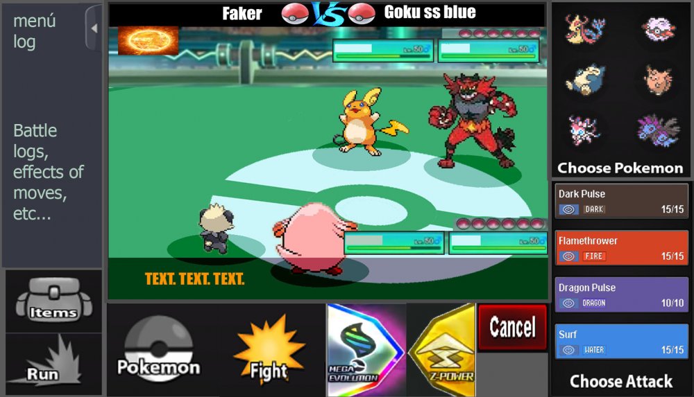
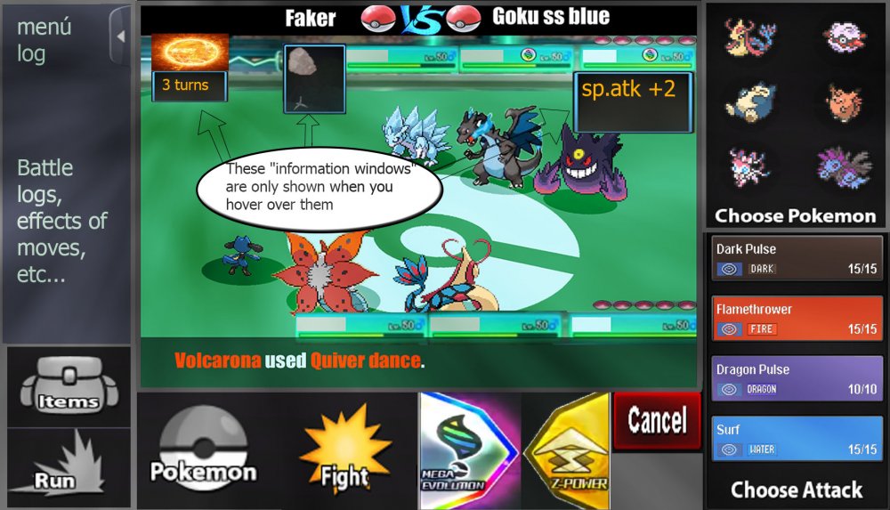
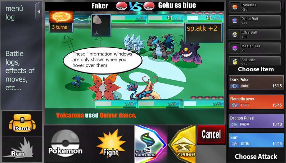
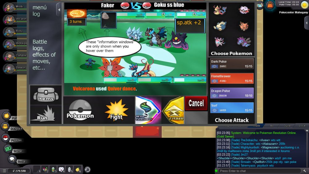
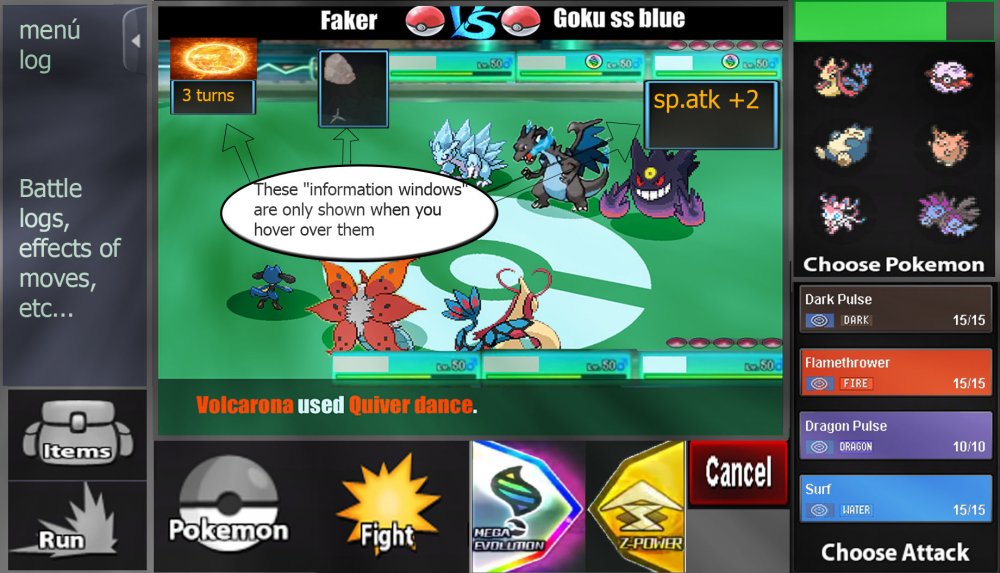
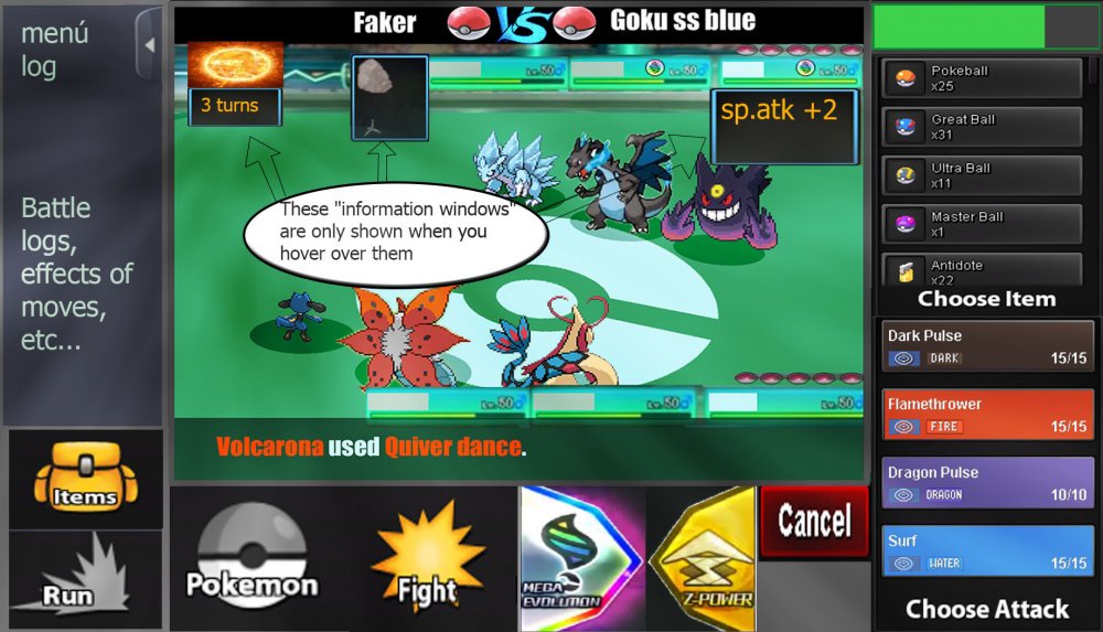
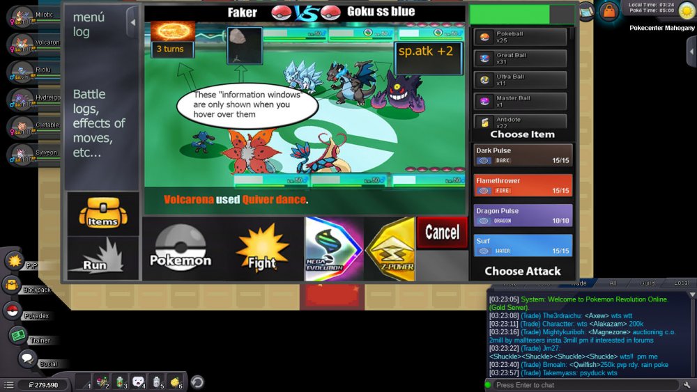
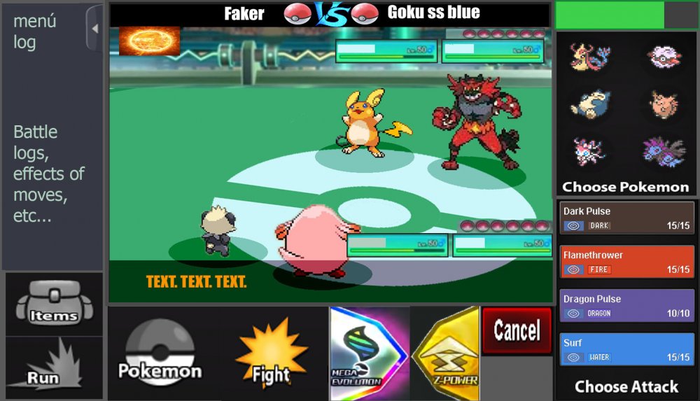
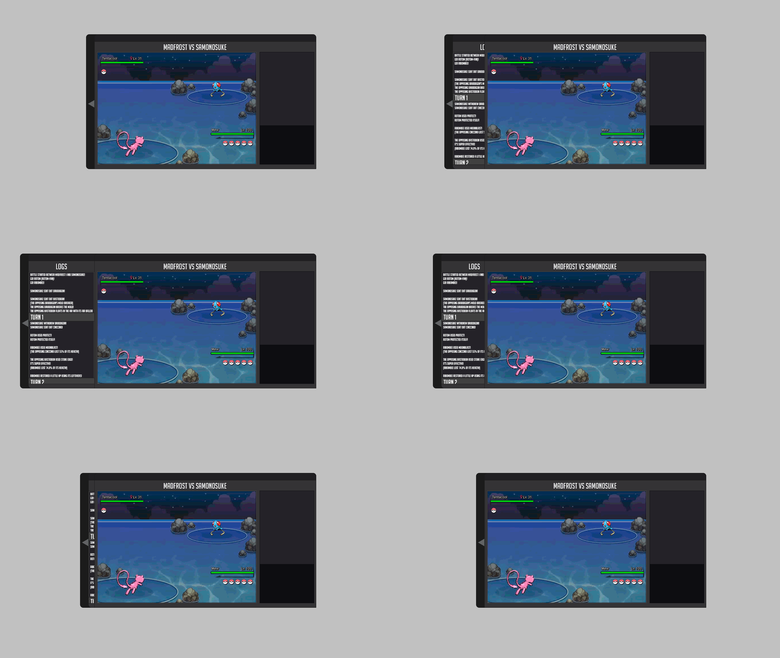
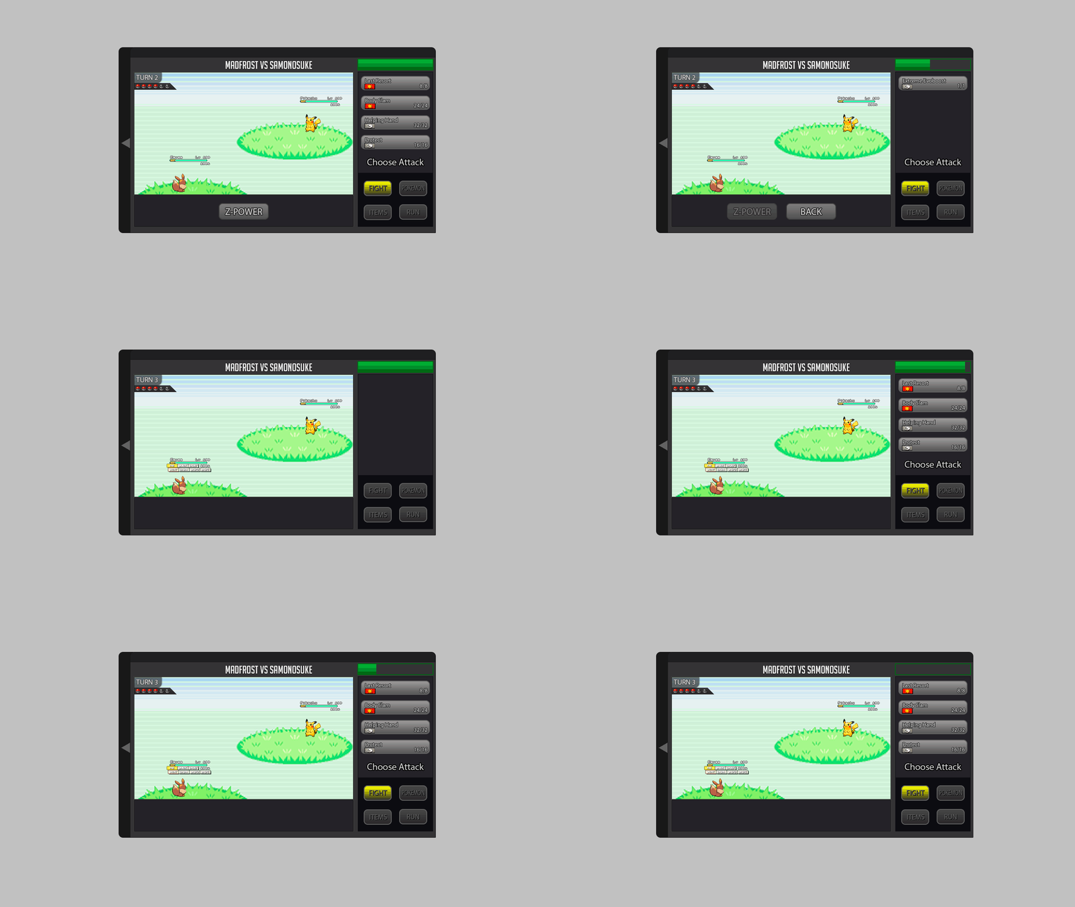
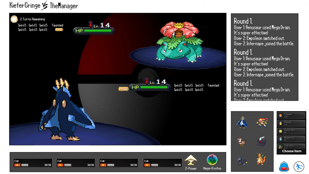
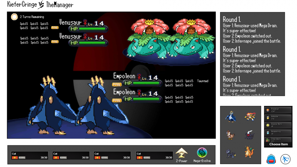
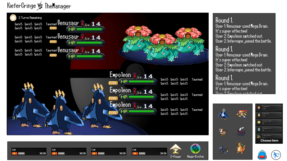
Hi, this is my battle iu, I hope you like it. Basically it has all the buttons that have been required, bigger buttons also thinking about the Android version and PC users. The battles, I prefer them to be full screen optionally (The battlefield is made by me ... it's for the pvp battles) Let us begin 3 vs 3 Battles: -I have reinvented some parts like the "vs", and also the attacks with colors of their types. -The buff states must be as shown in the image, - they only have to be displayed when the mouse passes over- -The Menu Logs must be able to open and close, as the user wants, by means of a button placed as shown in the image -items and pokemon in same place, are changed, by pressing "pokemon button" or "items button"- -items and pokemon in same place, are changed, by pressing "pokemon button" or "items button"- -As I see it in the game "window mode"- -2 vs 2 Battles- -same controls as in version 3 vs 3, there are no major changes. That's it, I hope I have not forgotten anything, thanks for watching, regards2 points
-
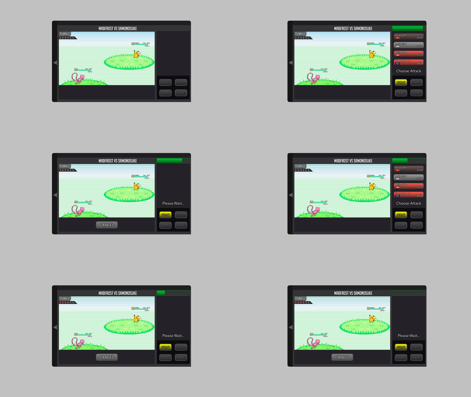
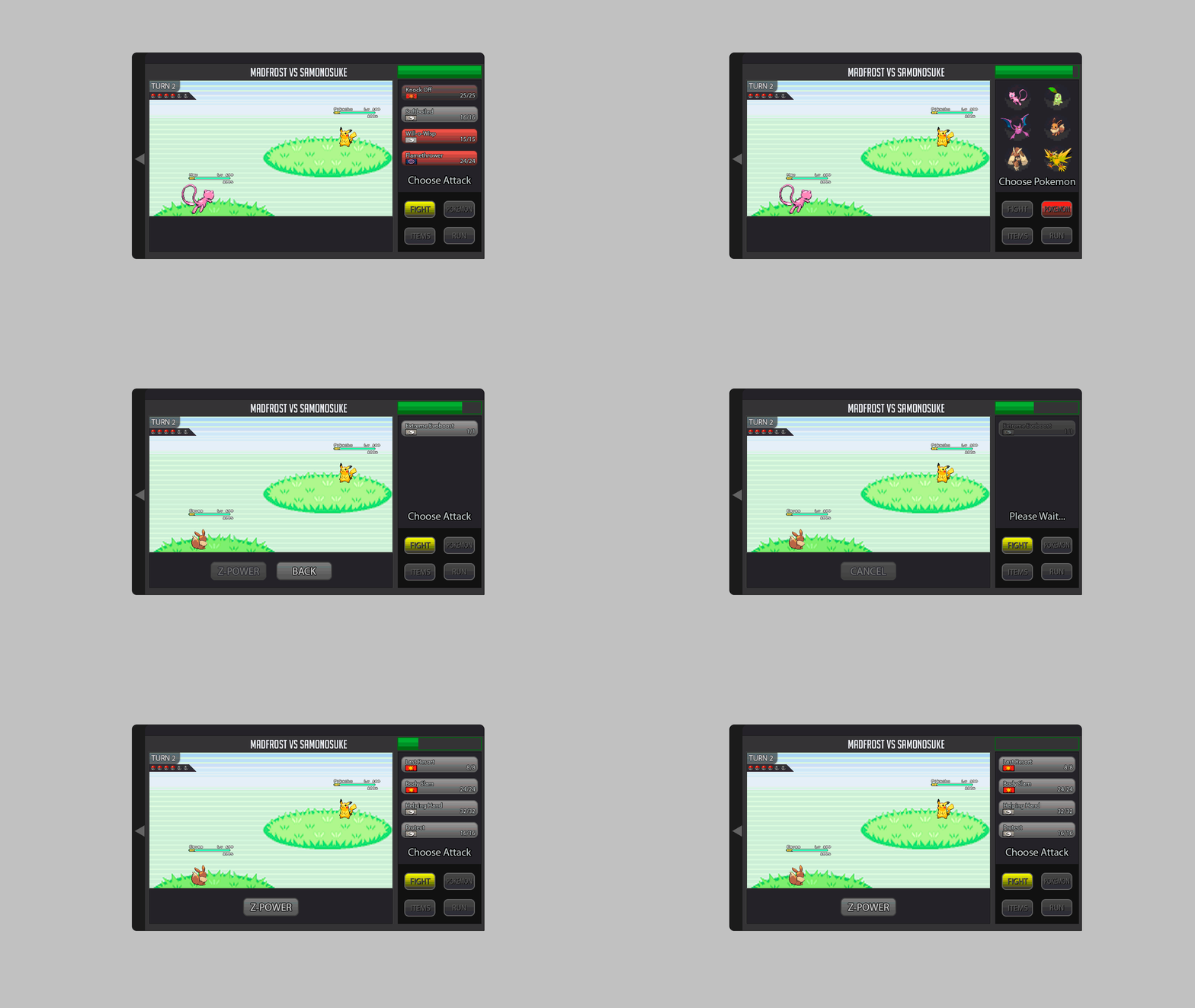
ok.. HII :3, this is my own version of the battle iu ,i decide to keep the visual concept of the game, the principal reason is that is more easy for the :incoming,new ,casual and those that live on the game :v to assimilate the redesign and the way that the iu works , redesigning the space and the visual order of some elements that all the player already know and integrate the new ones by a easy and familiar look . (i apologise for the font of the text ,i don't know how to find it,i try to find a similar) This is the way that the iu look on full screen (example) [MEDIA=imgur2]YdjG9Kx[/MEDIA] (the design of 3vs3/ 2vs2/ 1vs1 use the same space) This is the way that looks the different iu (the post will show the way that looks with mega evolution an z move) this preview is for understand some elements and its function that appear on the iu [MEDIA=imgur2]5hxnusI[/MEDIA] 1. the time time that each player have for do a action on each turn , attack etc( this time can be cut by the action of the opponent in the case of the attacks) 2. the boost /effects/others -those effects that create a negative stat on the pokemon will be show on red describing which stat is been affected negative(-hp,-spd etc.) -this include the effects of poison,sleep,stun.etc) 2.1-those effects that create a positive stat on the pokemon will be show on green describing which stat is been affected positive(+spd,+atk etc) 3. the identification number the purpose of this numbers is make easy the identification of the pokemon that is making a action /making a easy way to decide which pokemon you want to attack by looking the number that this one have and making a easy way to decide a action 4.weather this title is for tell the players if there's any weather condition on the battle ,if there no weather conditions this will be without any indication ,in the contrary case 4.1- there going to appear a image that show which weather is on battle and the time that left to over 5. turn/battle chat this title is going to change each time that both players do and actions ,this helps to indicate the left turnos for the weather too 5.1 -the battle chat will be a history of the current battle action and turn ,describing which player do a action against the other payer.(this will be sow too the time that left for the weather condition)(this will show too the boost stats and negative stats by the exact % of each state)((this chat only show the events on battle u cant talk to the other payer)) 6. the action chat/description this text will be generated automatically after the player do and action ,so in this way the player can be sure that the action that says the battle chat is the right one,if is not the player can cancel the action by clicking on the cancel button (this action depends too on the action of the other player,if the other player already do their action the option will be executed automatically within any option to cancel) 1v1 MEGA evolution [MEDIA=imgur2]yXtUhr6[/MEDIA] Z move [MEDIA=imgur2]BhEIjoP[/MEDIA] 2v2 MEGA evolution [MEDIA=imgur2]D6kEUP3[/MEDIA] Z move [MEDIA=imgur2]p6cykEE[/MEDIA] 3vs3 MEGA evolution [MEDIA=imgur2]bM51OUL[/MEDIA] Z move [MEDIA=imgur2]JJtVdBz[/MEDIA] Ok and now you can see how the panel changes when you already use the MEGA evolution or the Z move MEGA EVOLUTION [MEDIA=imgur2]WnpLJoa[/MEDIA] Z MOVE [MEDIA=imgur2]VvkTUDZ[/MEDIA] ( after use the MEGA evolution or the Z move the option blocks with the text you already use it ) Ok that is the way that is the way that the battle iu looks now this its the way that the select of pokemon and items looks. Chose pokemon [MEDIA=imgur2]M5qkzDZ[/MEDIA] Choose item [MEDIA=imgur2]zlw2vi4[/MEDIA] (the small icons that are in front of the panel are for select :items ,pokeballs and potions etc) Ty for read the post ,i hope all the staff member like my design,so that's it :3 . sorry for my bad english ;v2 points
-
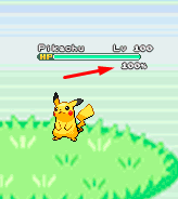
About the new battle UI I explain what I think and I'm putting some gifs and images as an example, I hope you understand. About the new Battle UI I thought a lot and I came to a conclusion about doing a Battle UI based on the old one, because I think the old one is very good, and I think it would be better to recreate it because if I create a new Battle UI, I think it would bother a lot of people who hunt all day and for those people who play the game on the cell phone. So I decided to recreate the old one trying not to disturb the people who play the game on the cell phone and for those who are hunting pokemons all day. Battle 2v2 and 3v3 fights: For 2v2 battles could work with the first two pokémons of your list. For 3v3 battles could work with the first three pokémons of your list Example: In the example I put the video of the Ash playing the pokeballs because I had not found an animation on the internet just playing the pokeball. Button for Megas: For the megas I think it should stay down as it is there in the example. Example: Button for Z-Moves: For the Z-MOVES I think it should stay down as it is there in the example. Example: Button for Cancel: For the Cancel I think it should stay down as it is there in the example. Example: Battle Logs: I think it would be nice to create a button next to the logs, as soon as it clicks the button will appear the logs next. Because there are people who get pokemons all day long, and with the logs appearing this right away I think I could mess up these people who are hunting many pokemons. More information looks at the example below. Example: Buffs, Paralyzed, Taunted etc: Paralyze, taunts, buffs and etc. I think I should stay in below life because I think it would look cool because it was going to look like the other pokemon games! Paralyze, taunts and etc. should appear before, and the buffs soon after. More information looks at the example below. Example: Then in the example you will see that he took Paralyze, it is because the pikachu used an attack and gave paralyze in Eevee, and the Paralyze appeared before the buffs. Weather and room effects as well as their turn count: The weather and counting should be right there in the upper right corner, showing that she is in such a Climate and showing the count of turns that she ends up. More information looks at the example below. Example: Extra: I think it would be nice to put a percentage of the Pokémon's life at the time of battle. Example: I made some changes in the post to put the bigger gifs because they were too small and hard to see. Thank you for your attention. :D2 points
-
Yaaaaay it's done! Notes: - All the berries found in the Viridian Maze are EV-reducing berries. - The free Pokemon found at the end is either Growlithe, Bellsprout(?) or Horsea(?). - Headbutt costs 2k to learn. - Erika Boss - Refer to link here.1 point
-
Welcome to Purplemauth & Dreadrules guide on how to beat every boss in PRO! We designed this total guide in an effort to battle each boss as simply and with as few items as possible. This guide will be separated into 3 parts: 1) Disclaimer and preventative measures 2) Required/Highly Recommended/Specialty Pokemon 3) Strategies for each boss *Please note this guide will NOT contain strategies for one time bosses (Red, Hannah, Youngster Joey, Archie, Maxie, Lance, MehCanMet)* Disclaimer and Preventative measures List of Pokemon Boss Strategies1 point
-
1 point
-
I just created my account and when i got in the server my character is there, bald and I can't change it, there's no customization options. I heard that I can ask for a reset, so here I am.1 point
-
Hello potential Guildsmates. My names John and I currently live in Germany. I'm looking for a guild that uses English as its main language and is active in European Timezones. I'm currently grinding my way through Kanto hunting for Pkmn with good natures and EV Training them. I'm playing on the silver Server.1 point
-
1 point
-
Hello Vunac11. I am sorry for the inconvenience. The Pokemon you received was via lending trade. That means that you wouldn't be the rightful owner and the Pokemon would return back. Any changes on a lending Pokémon, will be deleted when it returns back to the rightful owner. I hope you understand how lending trade works now. Let me know if you have more questions. Kind regards, Logan1 point
-
I'm really happy to see that your issue has been solved. If you have any further questions, please don't hesitate to ask. With that said, i will now close the thread. Have a wonderful day !1 point
-
I'm really happy to see that your issue has been solved. If you have any further questions, please don't hesitate to ask. With that said, i will now close the thread. Please stay tuned on our OFFICIAL PRO DISCORD for further announements. Have a wonderful day !1 point
-
Actually we compensate the time you lose due to server maintenance and we even usually give a few extra days. If you have any type of issue with your time based consumable feel free to make a post in the Donation Issues Sub-forum and an Administrator will happily help you. Also, your post kind of makes no sense, because you can not currently donate anyways at the moment.1 point
-
i heard there is some psychic guy i can talk to to check it,where is he ?plz help1 point
-
1 point
-
There is a guy called 'Psychic Yukki' in pokecenters. He looks like this. You can find him in the following cities. Hearthome City Hoenn Safari Zone Lobby Johto Safari Zone Lobby Mirage Island Summit Mt. Silver Pokecenter Moon Mossdeep City Olivine Pokecenter Pokecenter Cerulean Pokecenter Cinnabar Pokecenter Dewford Town Pokecenter Goldenrod Pokecenter Leev Town Pokecenter Lilycove City Pokecenter Love Island Pokecenter One Island Pokecenter Pinkan City Pokecenter Rusboro City Pokecenter Sandgem Town Pokecenter Vermilion Safari Stop (Kanto Safari) Sinnoh Safari Stop Veilstone City1 point
-
1 point
-
1 point
-
I'm really happy to see that your issue has been solved. If you have any further questions, please don't hesitate to ask. With that said, i will now close the thread. Have a wonderful day !1 point
-
Hi @koke2009 I'm sorry for the inconvenience I would like to inform and assure you that you didn't lose your progress and that everything is still there, you just need to merge your account and i will now help you explaining how to do that. As first, take note that the Red and Blue server has merged to form the Silver Server, and the Yellow Server is now renamed as the Gold Server. You will need to merge your accounts by log in the DASHBOARD and merge your accounts. I checked your account and it seems like you have 25 hours on the Blue Server, so if you want to have back your progress you have to select Blue Server as your main server. To merge your account you can use the following guide under the spoilers: [spoiler= Step 1] Log into your dashboard and click the [Merge is required] button: [spoiler=Step 2] Select the desired merge option; once you get the successful merge dialogue, you're done! I also suggest to read the EVERYTHING ABOUT THE MERGE for questions you may have and if you should experience any issue while merging. In case that, after the merge, you should still get the Invalid Password/Username error, please go ahead and change your password from the DASHBOARD, ensuring that it is alphanumerical (characters from a to z and from 0 to 9) Remember that you are able to play, with your old progress, only on the Silver Server since the server transfers are closed in this moment. Let me know if you have been successful in solving your issue and if you have any further questions. Have a wonderful day !1 point
-
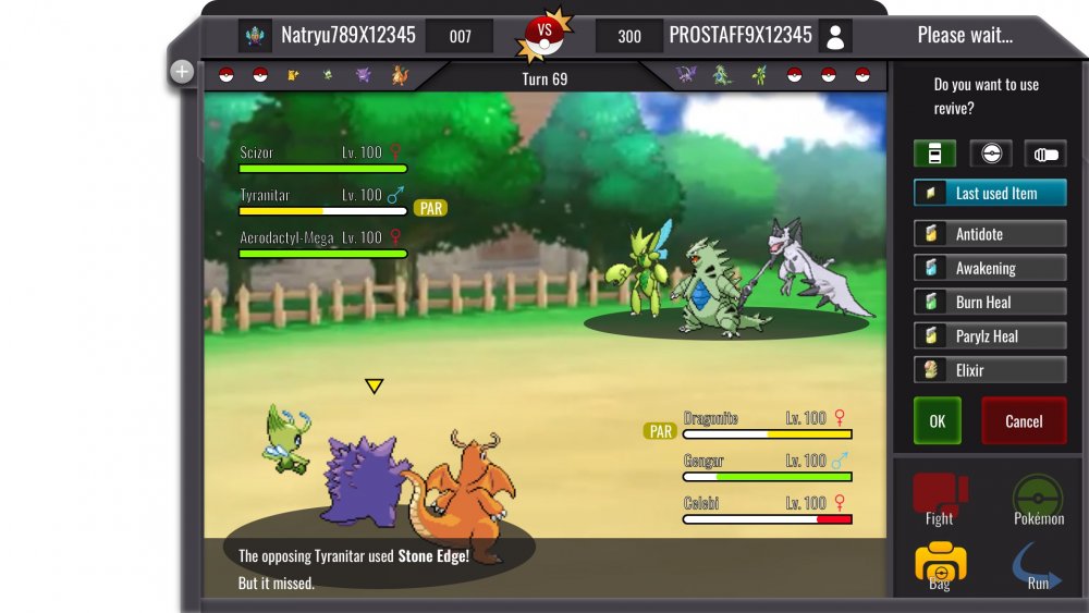
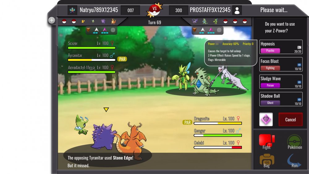
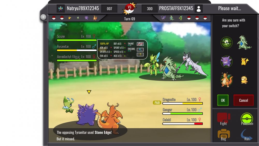
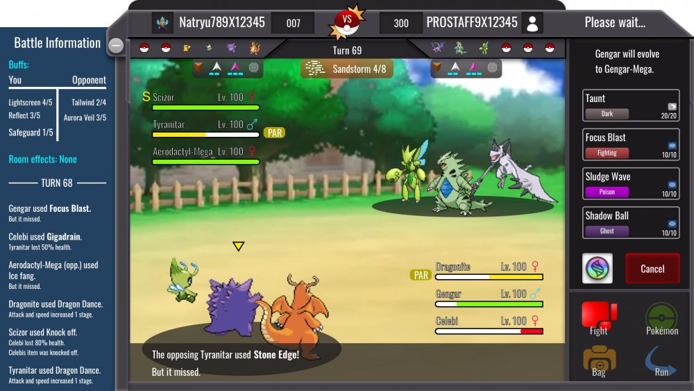
3v3_battle information Description: On the left you can see the battle information screen which can be opened by clicking on the plus icon ( minus icon if active). The screen includes information about room effects and buffs. The effects show the remaining turns. So basically it counts downwards( 3,2,1,0). Below you can see the battle log. Next to the players name you can see your Avatar and the PVP rating. Below the team preview you can see the field hazards and the weather condition. Mega Evolution should be triggered by clicking on the icon. You will then be asked if you are sure. You can cancel then or even afterwards if the opponent is still deciding for his move. Clicking on the Mega stone = yes. [spoiler=Team Switch and stat info] Description: The switch works with DRAG and DROP. The active pokemons are those with the green icon behind them. You will ask if you chose the correct Pokemon for the incoming switch and you can press OK or Cancel. Stat information can be shown if you hover over a pokemon Name. It will show HP in % and ONLY buffs which made changes. So if you have no boost in ATK, the ATK change will not appear. I have placed ALL possible changes into this "bubble". Obviously most of them will not be triggered at the same time. Just to showcase what is possible. [spoiler=Item usage] Description: I hope the Item menu is self explained. Only new thing are the categories: HP/Status heal items; Pokéballs and Battle items such as X-attack. And the feature last used item should be added for convenience . [spoiler=Z-move usage] Description: Here is the Z-Stone placed where the Mega Stone would be. Depending on your choice, since you can't have both in one team. Same dialog function. Important is. A NORMAL move, will not trigger a question where you have to press OK... You will just use it. If you have not a Z or Mega Stone the box will be replaced with OK. If you hover over a move it will show description of it as well information about Z-move. On mobile hover=press longer. __________ Hello guys. Here is my second submission. Quick info: Blue background should have around 90% opacity... Nevertheless. I hope you like it. Vote it up and dm me feedback if you want. Criticism is welcomed.1 point
-
1 point
-
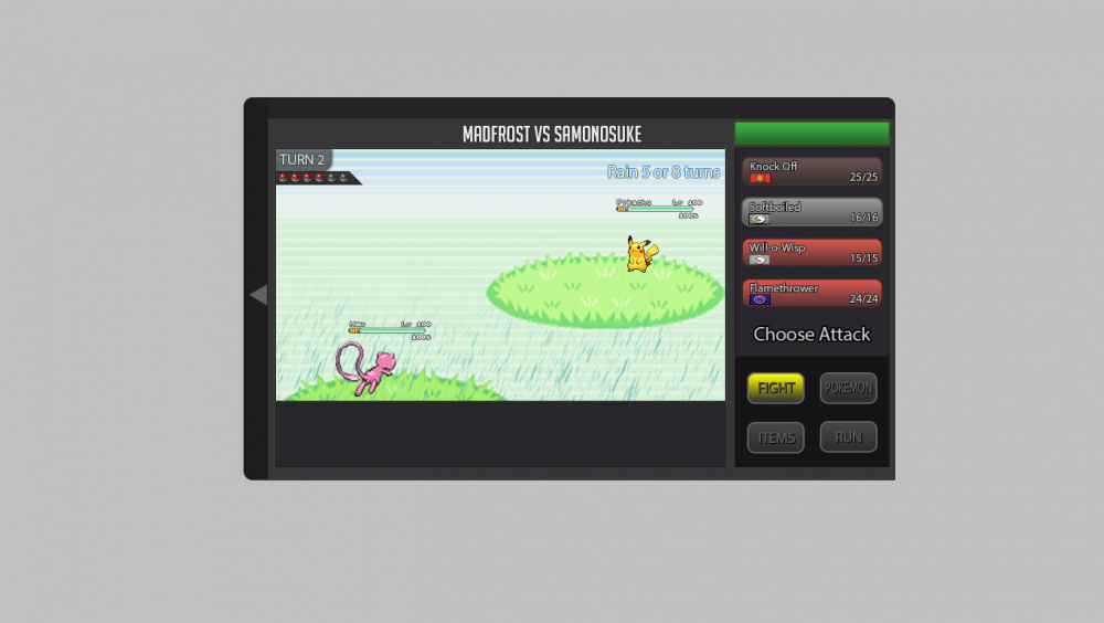
Hi everybody My rework should stick to the current design with all new required buttons and stuff included. I designed new buttons for the menu. And so I added in the "FIGHT" window the buttons for Z-Moves, Mega-Evolution and a button for cancel the moves. It would be nice if the attack moves has the color of it type. For example: water attacks are with a blue touch. Maybe we can add a "super effective", "not effective", etc... sign to the different attacks, depending on the enemys pokémon. The information for boosts and effects could be with a hover on the blue information button near by the health bar by each pokémon. The weather stats could be simply added as shown. Maybe as an extra animation for rain for example would be great. You can see at the top left corner a little triangle. With this you can show or hide the battle log as seen below. Important for the textbox is, that every time it arrives the health bars should be hidden imo. Thats all I guess. Do not hesitate to ask if you need more detail informations about my rework battle ui.1 point
-
Hello this is my UI. Everything that was asked for is in the UI. If there is anything I missed be sure to tell me and I will add it on. If anyone also has any tips to maybe improve it more than be sure to let me know. The white that you see is for the background/Overworld. Also, when you've selected a move, there is room in the box when all moves dissapear to press cancel. I Hope you enjoy.1 point
-
I know that the Battle Interfaces do not really look good, nor clean, that's simply because I am no artist and if I were to make the icons myself they would be really ugly. That's why I copied existing sprites and stuff, so you'd just need someone to replace them with proper artwork and tiles. The amount of parts where Pokemon can be will be determined on the mode that is going to be played, e.g. one bottom platform for the standard one versus one Mode. Normal Battle Interface - after selecting Fight on the bottom right - The existing Z-Button can be either used for the Mega Evolution or a Z-Move Bag Interface (Pokeball Window) - after clicking on Bag on the bottom right and the Pokeball Icon on the bottom left1 point
-
Hello everyone, this guide will provide you all the information you will need for the Bug Catching Contest. . . . . . . [anchor=rewards].[/anchor] I hope this guide helped and I wish you good luck in the Contest :Crazy: Kind regards.1 point
-
Where is the best place to find Ralts?? - Love Island - Fifth Island - Route 34 - Trainers Valley ,Please reply Thanks..1 point

