Leaderboard
Popular Content
Showing content with the highest reputation on 01/23/19 in all areas
-
2 points
-
2 points
-
Changelog 10.1.2019 The following bosses have been reworked: - Lorelei - Erika - Chuck - Koichi - Oak - Elm This rework encompasses several things: 1. The bosses are now scripted in Python, meaning new variables. This means that any prior win streaks and cooldowns have been reset. 2. Because of this, the cooldown checkers in each region also do not work for these bosses, for the time being. 3. The bosses are now restricted to level 100 Pokemon. 4. To mitigate this drop in difficulty, three different selectable difficulty levels are available: Easy, Medium, and Hard. - On Easy, bosses have no EVs and no hold items., as well as a weakened moveset. Consecutive win rewards are also not available. - On Medium, bosses have 252 EVs in each stat and hold items. This should be about as difficult as bosses are currently. - On Hard, bosses have 400 EVs in each stat and hold items. Furthermore, the player is not allowed to use in-battle items such as Revives. 5. The bosses' teams have also been reworked. Reborn bot is no longer accurate for these bosses. 6. Crashing during these specific bosses' battles only should no longer start the cooldown! Python knows the difference between a disconnect and a crash. Don't try to abuse this, you'll get put on cooldown and be a sad puppy. 7. Boss rewards have also been reworked, but the impact of this should primarily be more useful consumables and less TMs. 8. As always, if any bugs managed to sneak their way onto live server, please report them promptly so I don't get fired. Thanks! 9. Hour requirements are gone. 10. The requirement that you only have level 100s on your team is also gone. All bosses require now is to be champion of its respective region. - Nikola updated to also not start cooldown on crash.2 points
-
Welcome to the Legendary Megathread ! This thread gathers all the guides and quests related to the Legendary Pokemon available in PRO. You may use Ctrl+F or Cmd+F if you're searching for a specific Legendary or use the index below. ★ Available Legendary Pokemon ★ ♦ Page 1 ♦ Mew Celebi Raikou Entei Suicune Jirachi Latios and Latias Phione Heatran Azelf Uxie and Mesprit Genesect ♦ Page 2 ♦ Registeel, Regice and Regirock Articuno, Moltres and Zapdos Kyurem Tornadus, Landorus and Thundurus Volcanion Manaphy ★ Available seen data only ★ ♦ Page 1 ♦ Mewtwo (Part of Mew Quest) Lugia and Ho-Oh (Part of Legendary Dog Quest) Dialga, Palkia and Arceus (Part of Lake Guardian Quest) Credits: 6head, CarlHo, ErickLysander, Fabion, Fadoka, Praxis, PreHax, Seibuza, Somes, Uaua21 point
-
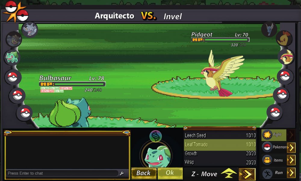
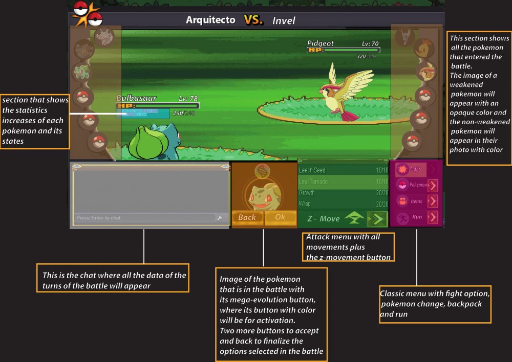
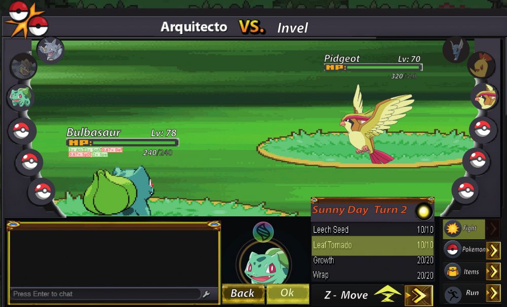
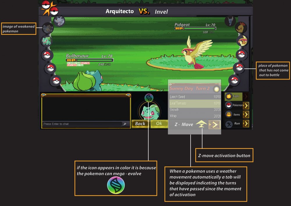
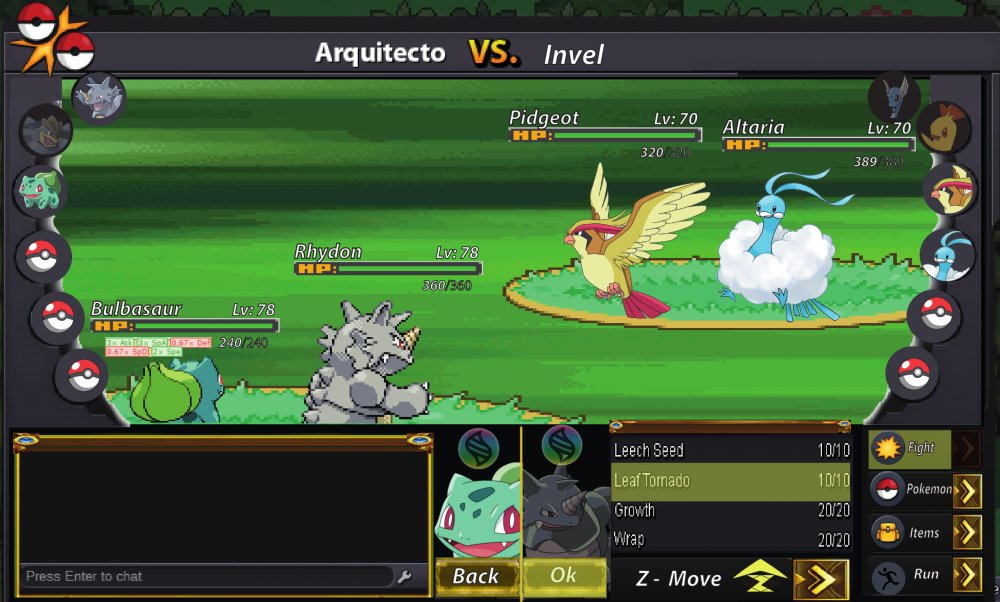
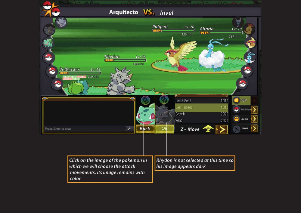
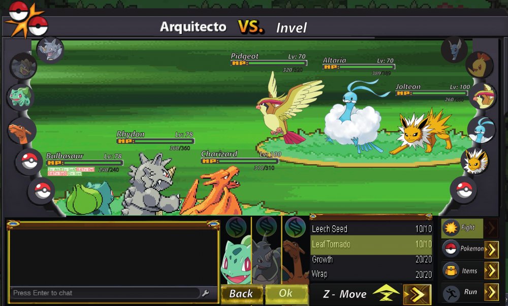
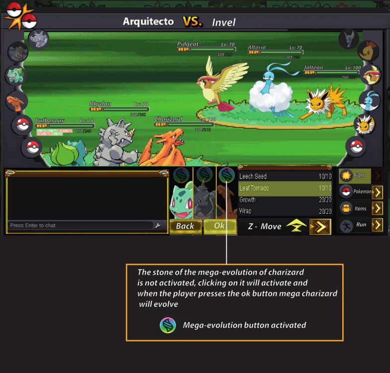
In near future there will be a significant PVP update. My full concentration is set on this right now, which is why there will probably less updates in the next time. For this PRO needs a new Battle UI, because the current one is missing a few features. There are already staff members who work on it, but as their specialty lies in other areas, I want to give everyone the possibility to participate. That's why I make a small event out of it. Everyone is allowed to create a new Battle UI and the Battle UI that will be taken over will be royally rewarded. The one gets a non-tradable shiny of your choice. The nature can be chosen, the IVs and ability will be generated randomly. The Pokemon must be catchable by everyone. The following things have to be added in the new Battle UI: - Enough space for 2v2 and 3v3 fights. - Buttons for Megas, Z-Moves and Cancel a move. - Some kind of battle log should be included as well. - Every current element (items, run away, moves, switch Pokemon) should be included obviously. - An option to show boost and effects (SPD x 1,5, Paralyzed, Taunted etc.) would be great. - Weather and room effects as well as their turn count. You do not have to stick to the current design. You can change it completely, even make it full screen mode. That is completely up to you. Please note, that if we take non of the submitted designs, there will be no winner at all. You have 30 days (Janurary 15th, 11:59 PM GMT+0) to submit a battle UI. The time might be extended if there's no usable design till then. This post will be unlocked in 2 weeks on December 30th, please post your battle UIs in here. Do not make any unrelated posts here. Please only post the final UI in here. The winner has to submit the final design, all UI elements and has to give PRO the permission to use it. Good luck to every participant.1 point
-
1 point
-
Changelog 23.1.2019 Small boss changes: - Hard mode now has the boss randomize the order of their team. This should make cheesy strategies slightly more difficult to pull off. - Fixed a visual bug where the cooldown would show "0 days" if it was under 23 hours 59 minute 59 seconds. - This is for already reworked bosses only. Changelog 24.1.2019 - Shary and Shaui reworked. - Legendary dog Guardians reworked.1 point
-
I think you are correct in suggesting that a better grind spot pre Kanto E4 could exist, I don't like the idea of it being CC. That map already has way too many people on it and I think it should remain more endgame. I think an easier solution that would require basically no coding or quest changing would be to raise Seafoam B4F or whatever floor it is to be 57-60. Then its not quite as good as cc, but its better than the 40 something that it is now.1 point
-
I personally have no say in the matter. That falls to Eaty. He is the one who makes those decisions.1 point
-
1 point
-
1 point
-
Hi @Blissfully0207 I'm sorry for the inconvenience. Could you please try to restart your client and if that fix your error? Also, please make sure to have the correct version of the client for your pc. If restarting should not fix you error, could you please try the following procedure and let me know if it works: Delete all the PRO Files that you have (.zip and remaining files too). Then download CCLEANER and run it to make sure to delete anything else. Restart your computer/device Download again the game from HERE Let me know if you have been able to solve your issue and if you have any further questions. Have a wonderful day !1 point
-
1 point
-
Hey @Blissfully0207, This problem is familiar to me from some of my guild members. Either you have to restart the client (which you have already done) or download PRO again. Here again the link to the download page: https://pokemonrevolution.net/download.php I hope it works again then. greetings SchattenDialga1 point
-
Ill write all the Names down and pick the winners with random org so u cant pick it o:1 point
-
1 point
-
1 point
-
1 point
-
1 point
-
1 point
-
1 point
-
1 point
-
1 point
-
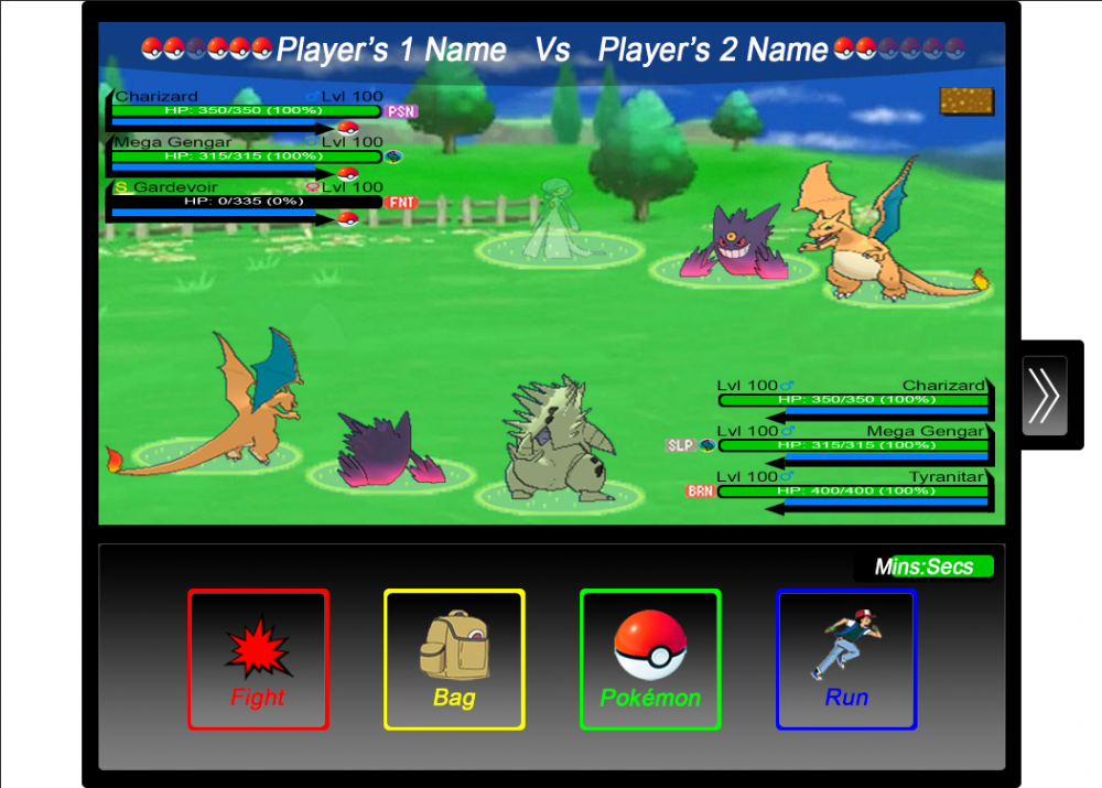
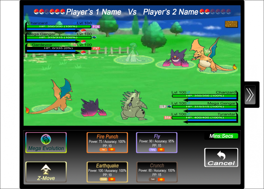
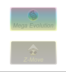
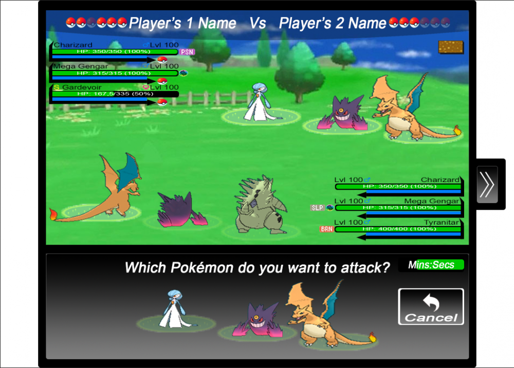
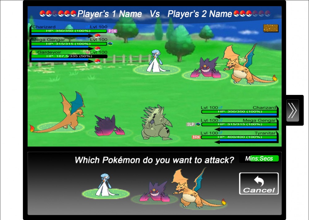
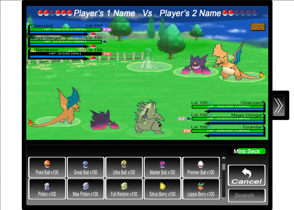
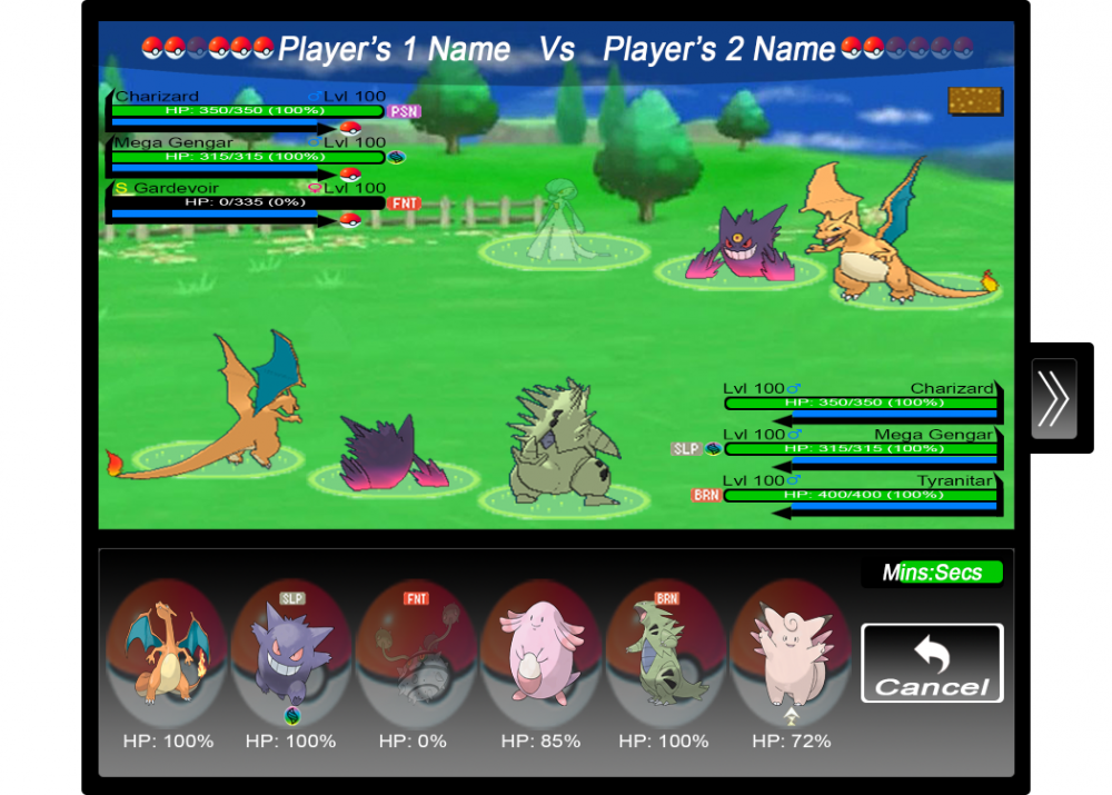
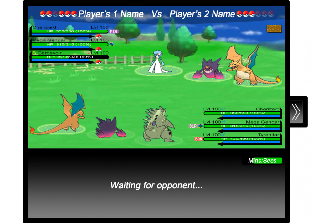
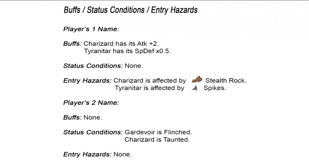
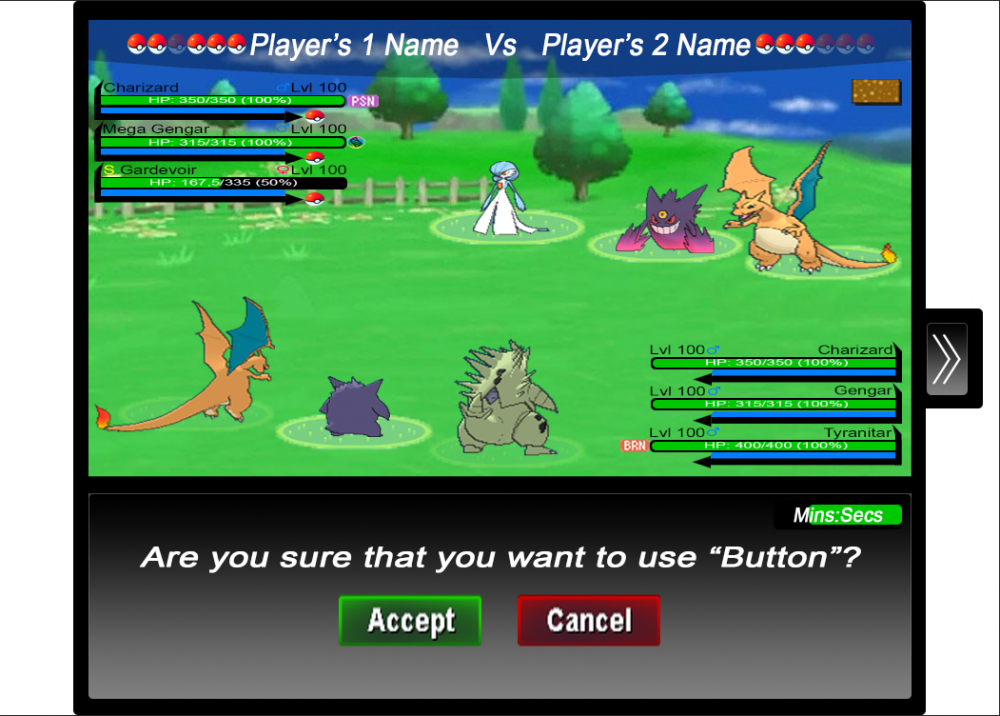
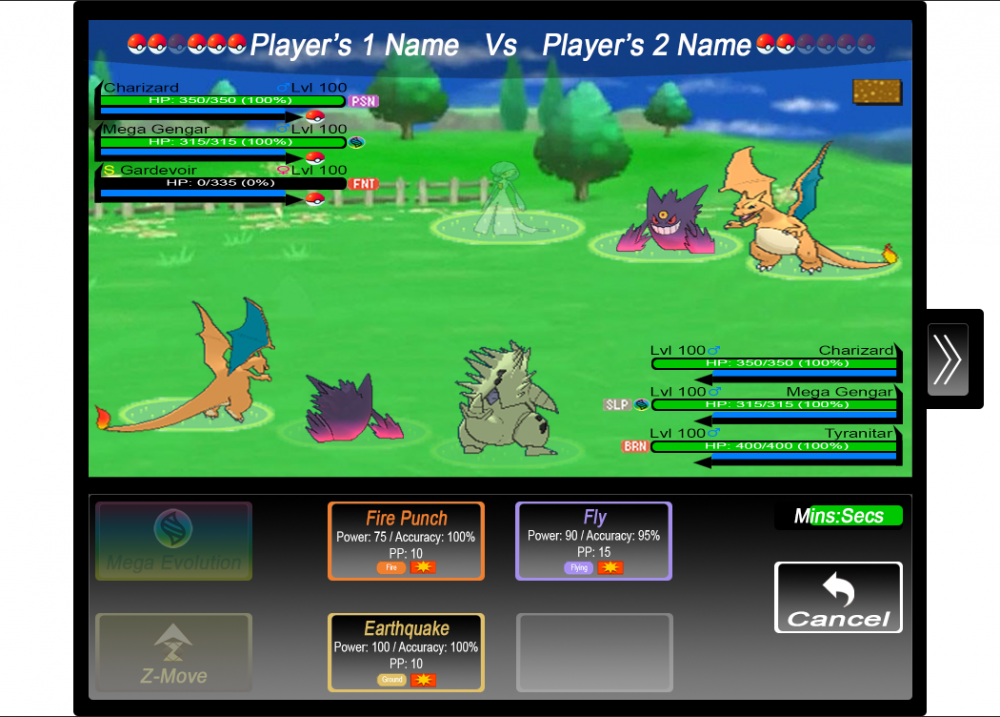
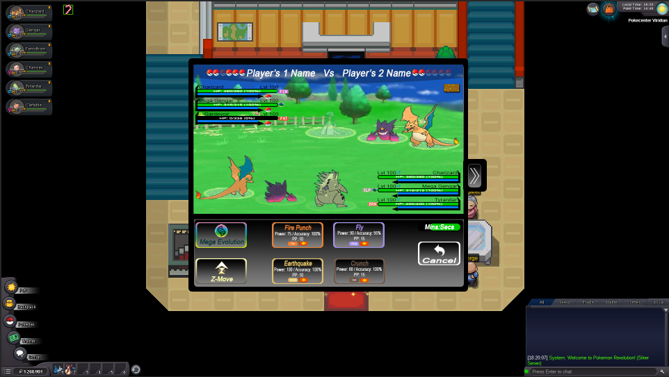
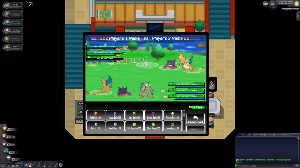
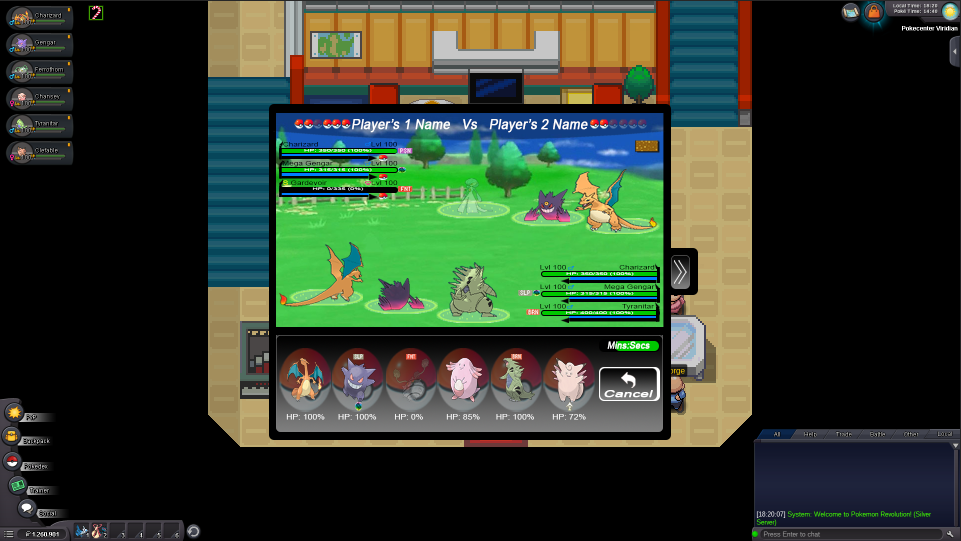
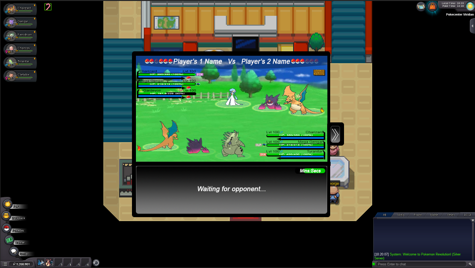
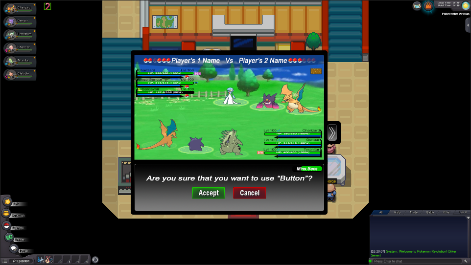
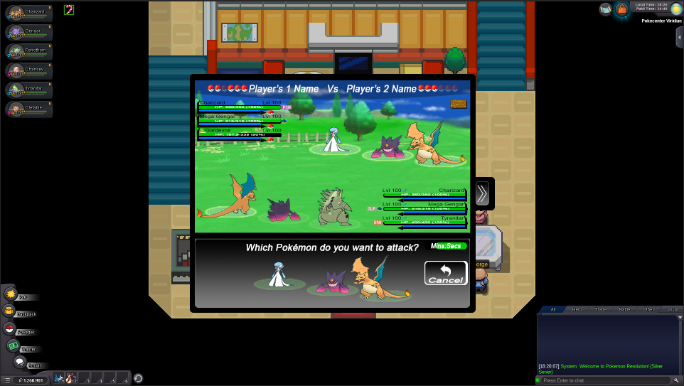
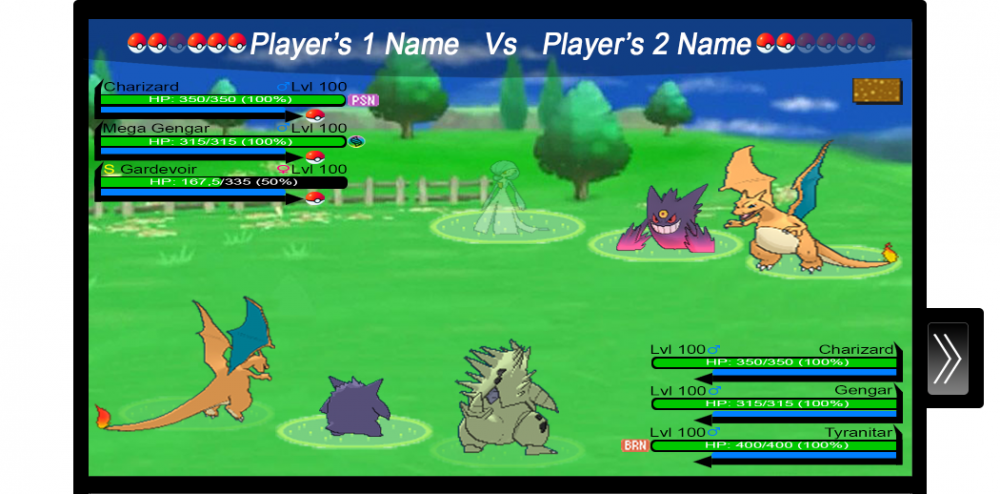
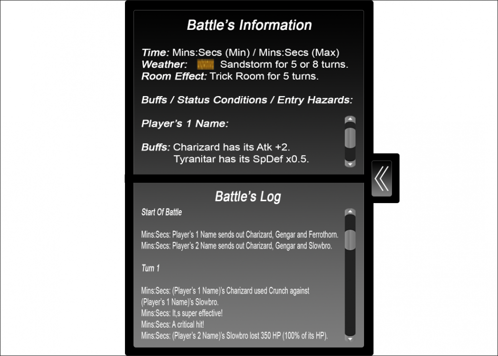
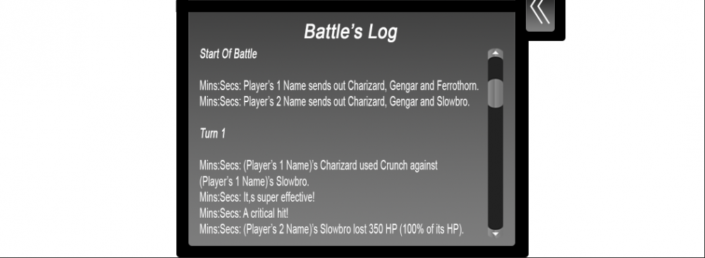
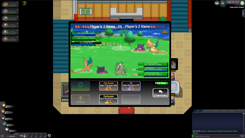
Hello everyone! This is my work for the Battle UI Rework and I hope that you will like it. First of all I want to apologize for the big upcoming post. I have made a completely new Battle UI as you will see below and I have made a lot of changes compared with the current Battle UI and I think that these changes could help a lot everyone. Also, I'm thinking that this Battle UI shouldn't be used only for PvP and it could work as well at normal battles with wild Pokémon, NPCs, Bosses, etc. I will explain every thought that I had above each image, while I was working on this Battle UI, even the obvious things, in order to avoid leaving any possible questions unanswered. So let's begin! Generall Idea: My idea was to create a Battle UI a bit similar to Pokémon's 3rd-5th Generation video games. Then I thought that it would be completely different with the current Battle UI and people either wouldn't like it at all or they couldn't get used to it and to enjoy it. So I tried to combined them a bit, if anyone can say so. Also, I made bigger buttons, in order to help mobile users, as I know that a lot of people use the Android version of the game and they keep complaining that the buttons are too small and they missclick a lot. I play the game in my PC, but I have played a bit in my mobile phone, too and the buttons where a bit small and in my opinion they weren't practical. The buttons where a bit small to me, not only in the fight, but generally in the game and imagine that my mobile phone has a screen of 5,5 inches. Ok, it's a game in the phone and no one expects to have big buttons, but they should be a bit bigger than they are now. I wanted my Battle UI to have big buttons enough, to be clear and distinct, to be understandable, and to have as much space as it can be between everything, that appears in it. Here is a first look at my work... Main Menu: This is how the Battle UI's main menu would look like, when we are in the start of the fight. You can see that there is a countdown in the right bottom corner near the "Run" button. This is like the countdown that the current PvP Battle UI has, but this one that I used, shows the minutes and the seconds that have left for our move. In my opinion this is better than just showing a bar that ends as the time passes. I placed it down in the menu section, because in my opinion our eyes will mostly check in this section, as we have to choose an action that we want to do, to use the move, the item and the Pokémon that we want and I think that it's the best place there in order to check it easier and not to check the one moment in the menu section and the other at the top, where it is right now in the current Battle UI. This countdown is the same for us and for our opponent. Also, I have made two references in the anime, in the main buttons with Red's bag appearing in the "Bag" button and Ash appearing in the "Run" button, where he runs to escape from the fight. I hope that there is no problem with copyrights as I found these pictures in Google. So the fight starts... Fight Menu: When someone presses the "Fight" button, this menu appears, where it contains the moveset of the first Pokémon of his/her squad, the "Mega Evolution" and "Z-Move" buttons, again the countdown in the same position as it was in the main menu and a "Cancel" button, which if it is pressed, we go back to the main manu. About the moves, the first move is Flamethrower, the second is Fly, the third is Earthquake and the fourth is Crunch. The moves have all the information that someone needs. They have the type's name in order to be recognizable easily, in case that someone doesn't remember the move's type and also the have an outline of type's color just for looking cool. They have the power's, accuracy's, PP's and category's information, too. If we hover over the moves, it should appear a window with the move's description. The buttons for Mega Evolution and Z-Move can't be pressed if a Pokémon doesn't hold a Mega Stone or a Z-Crystal, respectively, or if it is Mega Evolved and these buttons should be like this: Also, if a Pokémon doesn't know four moves and for example it knows only three, the last of its moves should be like this: Here, is a better example: In 2v2 or 3v3 battles, we have to choose in which Pokémon we want to use our moves. So, I thought something like this... This appears in the menu section when we have chosen a move to use against our opponent's Pokémon, but we haven't chosen which Pokémon we want to attack. As you see the terrain of each Pokémon is transparent. When we hover our cursor over the Pokémon, that we want to attack, that Pokémon's terrain will not be transparent anymore and it will be as it is in the battle screen. This indicates which Pokémon we are about to attack. Now if we press that Pokémon, the selected move will be used against it. As you see the rest Pokémon's terrains are transparent, because our cursor isn't above them. So now we are ready to use a move against opponent's Gardevoir and if we press Gardevoir, our selected move will be used against it. Now, let's press the "Cancel" button and then the "Bag" button to check our bag... Bag Menu: Here as you can see the bag menu contains all of our Poké Ball and our medicines. I would like that all of these items, to be in alphabetical order. In this picture the first item in our bag is Poké Ball, the second is Great Ball, the third is Ultra Ball and so on, and in the below line the Potion is the sixth item, the Max Potion is the seventh item and so on. If we hover over the items, it should appear a window with the item's description. Near the items, there is a scroll down bar with arrows on its edges, in case that someone wants to use them to scroll down. Again there is the "Cancel" button and the countdown and there is a "Search" section, where we can type as many letters we want in order to find the item that we want, in case we have a lot of items in our bag. For example, if someone types "Premi", the Premier Ball should appear if he/she has any. Also, I would like to share an idea about finding an item. An item should appear even though when someone types its letters with not the correct order. For example, if someone types "abll" in the "Search" section, all the items that have the letters "a", "b", "l" and "l" in their names should appear, regardless of their order in the item's name. This should be implemented in the Pokémon storage too, while some people doesn't know how to type correctly a Pokémon's name and they have to find it among all of the Pokémon that he/she has. Also, in the Pokémon storage should be implemented that you can type "." (dot) or " " (space), because for example you can't find Mime Jr., unless you search it among all of your Pokémon. Also, we have to know which Pokémon we are using, while we search our items in our bag. This can be shown by the terrain of that Pokémon. If it isn't transparent, then it is the Pokémon that we are using right now and for example we can give it a Max Potion, if it needs it. Let's press the "Cancel" button again and now let's press the "Pokémon" button to check our Pokémon... Pokémon Menu: As you can see here we have again the countdown and the "Cancel" button. Except these we have our Pokémon squad with the very left Pokémon to be the first of our squad and the very right Pokémon to be the sixth of our squad. Furthermore, a fainted Pokémon should be transparent as this Ferrothorn with the "fainted" status above its head, too. Here, there are some status conditions above each affected Pokémon's head and below of the Pokémon that is Mega Evolved or it has used a Z-Move, there is the Mega Evolution's symbol and it shows which Pokémon we have Mega Evolved in this fight and the Z-Move's symbol and it shows which Pokémon used a Z-Move in this fight, respectively. Also, here we can check each of our Pokémon's HP. Now that the explanation of each menu has ended, let's explain what we see in the batle screen... Battle Screen: I am thinking that when the fight is about to start, the battle screen that shows the Pokémon, the HP/Level bars and the backgrounds fade in, then the first Pokémon with its HP/Level bar appears (first two for 2v2 or first three for 3v3) and after that we can make any action that we want. The Pokémon that appear in the fight at first, are our first three Pokémon. As you can see in the image we have Charizard, Mega Gengar and Tyranitar. Charizard is the first Pokémon in our squad, Mega Gengar is the second and Tyranitar is the third one, that was sent out in the place of a fainted Ferrothorn. Our opponent's first Pokémon is Charizard, the second Pokémon is Mega Gengar and the third one is Gardevoir. In addition, you can see that our third Poké Ball at the top, to the left of our name is transparent and that is because our third Pokémon fainted (Ferrothorn) and in its place we sent out Tyranitar. So, the very left Poké Ball is our first Poké Ball and the very right is our sixth Poké Ball. For our opponent, the very left Poké Ball is his/her first Poké Ball and the very right is his/her sixth Poké Ball. I did it this way, cause I think it helps a lot, as it's like reading a text. Also, if a trainer doesn't have a Pokémon to send out in the place of a fainted Pokémon, the fainted Pokémon should be transparent like Gardevoir in the image above. In case, that we battle for example, a swarm of Ariados (2v2 or 3v3 battle), then the fainted Pokémon would be transparent like the Gardevoir in the image above, or it would be removed from the field. I didn't design a 2v2 battle, because it's the same with a 3v3 battle. Moreover, the status conditions, Mega Evolution's symbol and Z-Move's symbol should be near each Pokémon's name in order to know which Pokémon has a status condition, or it is Mega Evolved or it has used a Z-Move. By the way, the order of the status condition and the Mega Evolution's or the Z-Move's symbol should be like this: First Gengar has been Mega Evolved and after that Gengar fall asleep. So, the symbol that is nearest to each Pokémon's name is the one that happened first. Also, the name of each Mega Evolved Pokémon should be changed to the mega one, such as "Gengar" to be changed to "Mega Gengar". I think that it would be perfect, if there would be an indication of how much HP does a Pokémon have, like "HP: 284/350". This helps us knowing how much damage deals, a move from our opponent's Pokémon to a specific Pokémon of our squad. With this change if we take damage from a certain opponent's Pokémon move, then we may know how much the same move will deal the next time the same two Pokémon fight again, unless there were stats or something that changed the move's power. Now you can see that appears the weather's symbol in the battle screen, which in this case is Sandstorm's symbol. Something else about battle screen, is that we have to know which Pokémon we use each time. We can understand it from the terrain below of each Pokémon. The unselected Pokémon's terrain is transparent and it shows us that we don't use that Pokémon and we use the one that its terrain isn't transparent. We really don't care which Pokémon our opponent is using each time and that's why there isn't any transparent terrain below of his/her Pokémon. We check at the Battle's Log, which Pokémon he/she uses. Also, if we own a Pokémon that our opponent owns, too, a Poké Ball should be appear near the Level Bar and if we don't own it, then that place should be blank. If a trainer doesn't have complete squad (six Pokémon), then his/her squad near his/her name, should be like this: As you see there are five Poké Balls in the Player's 2 squad, instead of six, as he/she doesn't have complete squad. Now what is going on when our opponent's turn arrives? Waiting For Opponent: This message appears, when the opponent's turn arrives. And when our opponent makes his/her move this message disappeares and we are redirected to the main menu, where we are ready to make our next move. Something else that you may have noticed, is that I don't have the battle's information about the weather's/trick room's turns, the buffs, some status conditions such as "flinched", the entry hazards and some kind of battle log. This is why it is hidden and it is revealed with this button: It is hidden, because it may covers enough space and this can be annoying. If someone presses it, it opens and it is like this: Now let's discuss a bit about this window... Battle's Information/Buffs, Status Conditions and Entry Hazards/Battle's Log: Here as you can see there are all the information about the battle such as the time that counts down (I wanted to place it in this section, too, because someone might be busy, while he/she tries to find something in this window and he/she didn't look at the countdown that there is in the main menu, in the fight menu, in the bag menu and in the Pokémon menu), the weather and the room effects and how many turns have passed. If there isn't any weather or any room effect in the field, then in the place of weather and room effect, should appear this: "Weather: None." and "Room Effect: None.". Also, here there is a buffs/status conditions/entry hazards section with a scroll down bar, where it shows for each player his/her Pokémon's buffs/status conditions (if there is any) and if any of his/her Pokémon is affected by any entry hazard. Furthermore, there is a battle's log, in which we can see everything that took place in this fight. Check the examples of battle's information, of buffs/status conditions/entry hazards and of battle's log: Time shows how much time has left for our move and also there are how many turns have passed from the weather and room effects. Here we see the buffs, the status conditions and the entry hazards that affect each Pokémon. In status conditions's section there should be only the status conditions that don't have a specific symbol, in order to be recognizable such as "Sleep" that has this symbol: So in this section there should be only the status conditions like "Taunted", "Flinched", etc. and not the major status conditions such as "Burned", "Frozen", etc. The major status conditions are shown in the battle screen and we can recognize them easily. Namely, there should be only status conditions that affect mobility like "Wrapped", that affect move execution or move effects like "Confused", the move-based status conditions like "Dig", the shield status conditions like "Reflect", the sword status conditions like "Focus Energy", those status conditions that affect the use of items like "Embargo", the HP-related status condtions like "Leech Seed", the visibility-related status conditions like "Miracle Eye" and finally the miscellaneous status conditions like "Gastro Acid". Also, among these status conditions there should be only one sleep-related status condition like "Sleepless". In the entry hazard's section we see that there is an entry hazard with its symbol, that affects each Pokémon. Let's check a better example of how this section is: And now we check the last section of this window... Now we have a Battle's Log with a scroll down bar, where there is what exactly and when happened in this fight from start to finish. The "Mins:Secs" indicates the real-life time. For example, if we started a fight at 16:57, in the start of the fight there should be this time (16:57). I didn't know if you wanted to check some new sentences and that's why I sticked to some classic sentences and I added some new things that the current battle log doesn't have. I think that you may wanted to see a place for battle log and not some kind of battle log with some sentences of mine, but if you want something like this I can work on it. Now what happens if someone missclicks an action and wants to correct this mistake? I think that this can be very helpful... This question should be appeared after every action that we take, because a lot of people have missclicked a button or they have regreted about their choice of a move/item/switch Pokémon. I think that this will be very helpful to all of us. But this can also make the game very slow, so I recommend to use it only in "Mega Evolution" and "Z-Move" buttons that can be used only once per battle. So if we wanted to mega evolve Gengar to Mega Gengar, then that message should appear. Now I will show you how the Battle UI would look in game... So this is my Battle UI! I hope that you like it. I did my best in order to give you a Battle UI that everyone will enjoy!. I think that I haven't forgot anything and that I have covered everything about the Battle UI rework. If there is something that you don't understand, feel free to ask me. Also, in case that my Battle UI is chosen, if the developers want to know anything about my work such as my sources, the dimensions of the objects or more, of course you can ask me. Of course I can design some backgrounds for the battle screen, add some items that the game doesn't have right now, such as the rest Poké Balls and more! If you want anything, like I said before, don't hesitate to contact with me. I hope that the stuff will love it and the developers will not have problem to materialize it! Credits go to Bulbapedia, because I used a lot of stuff from there and of course to Google!1 point
-
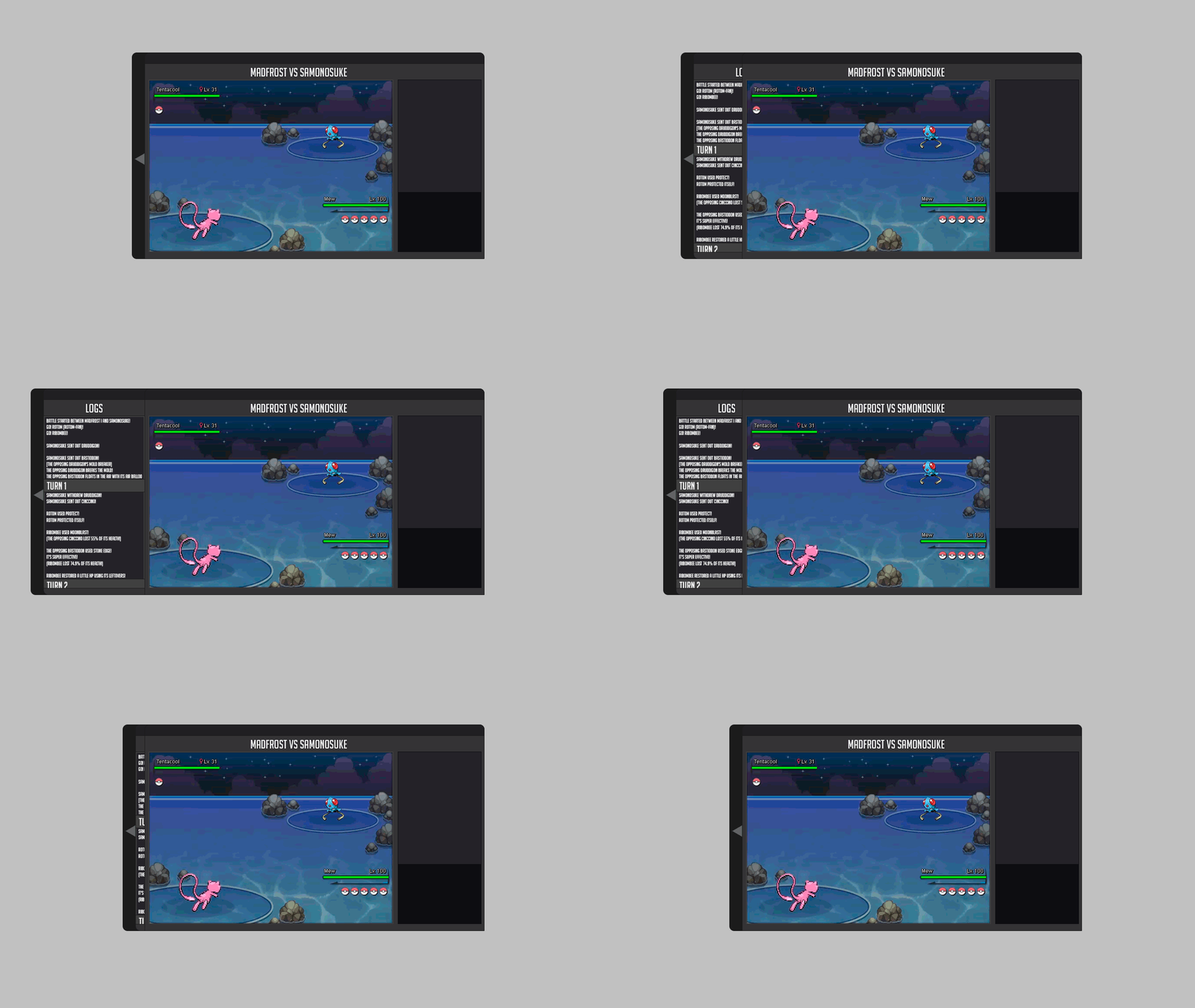
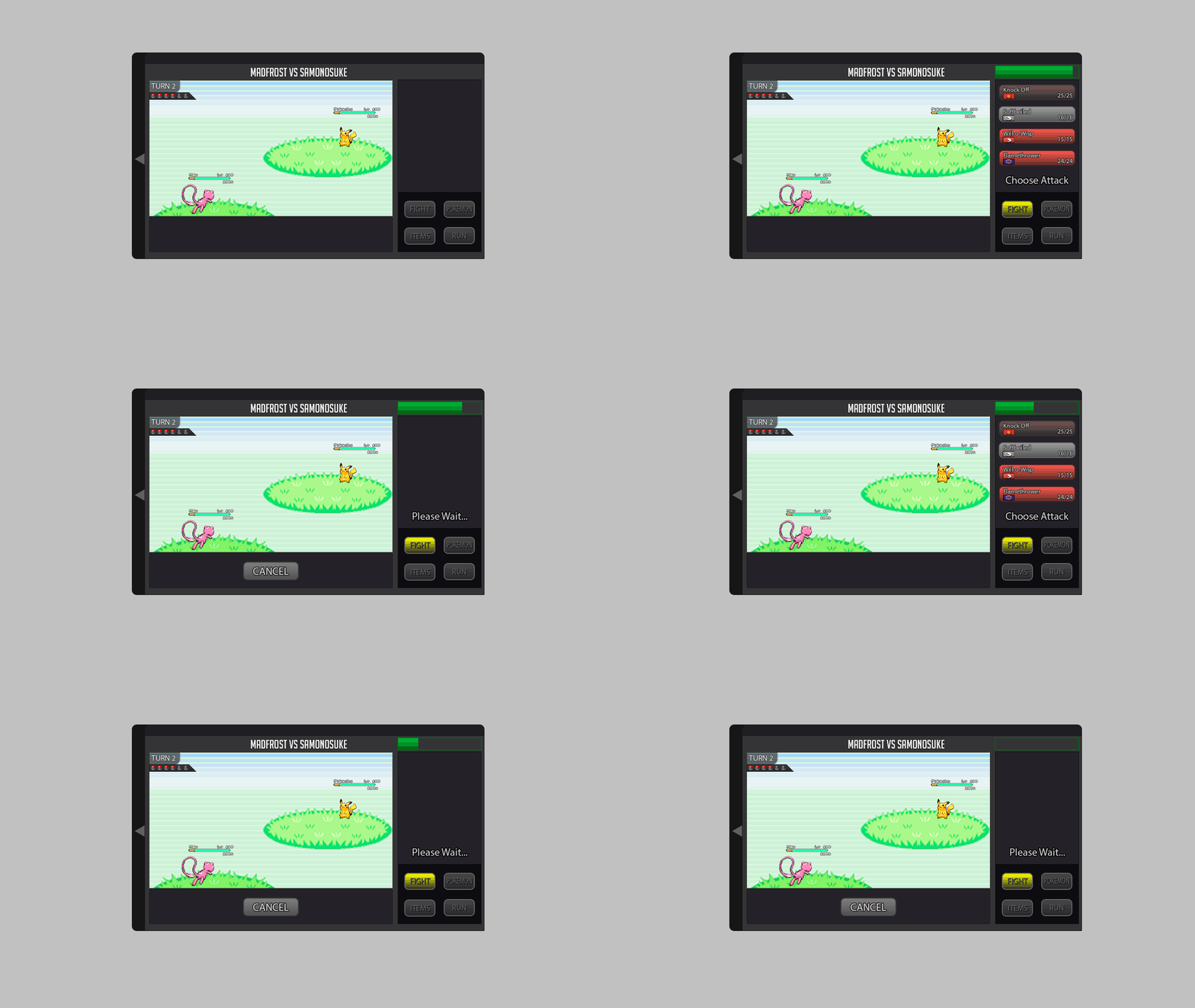
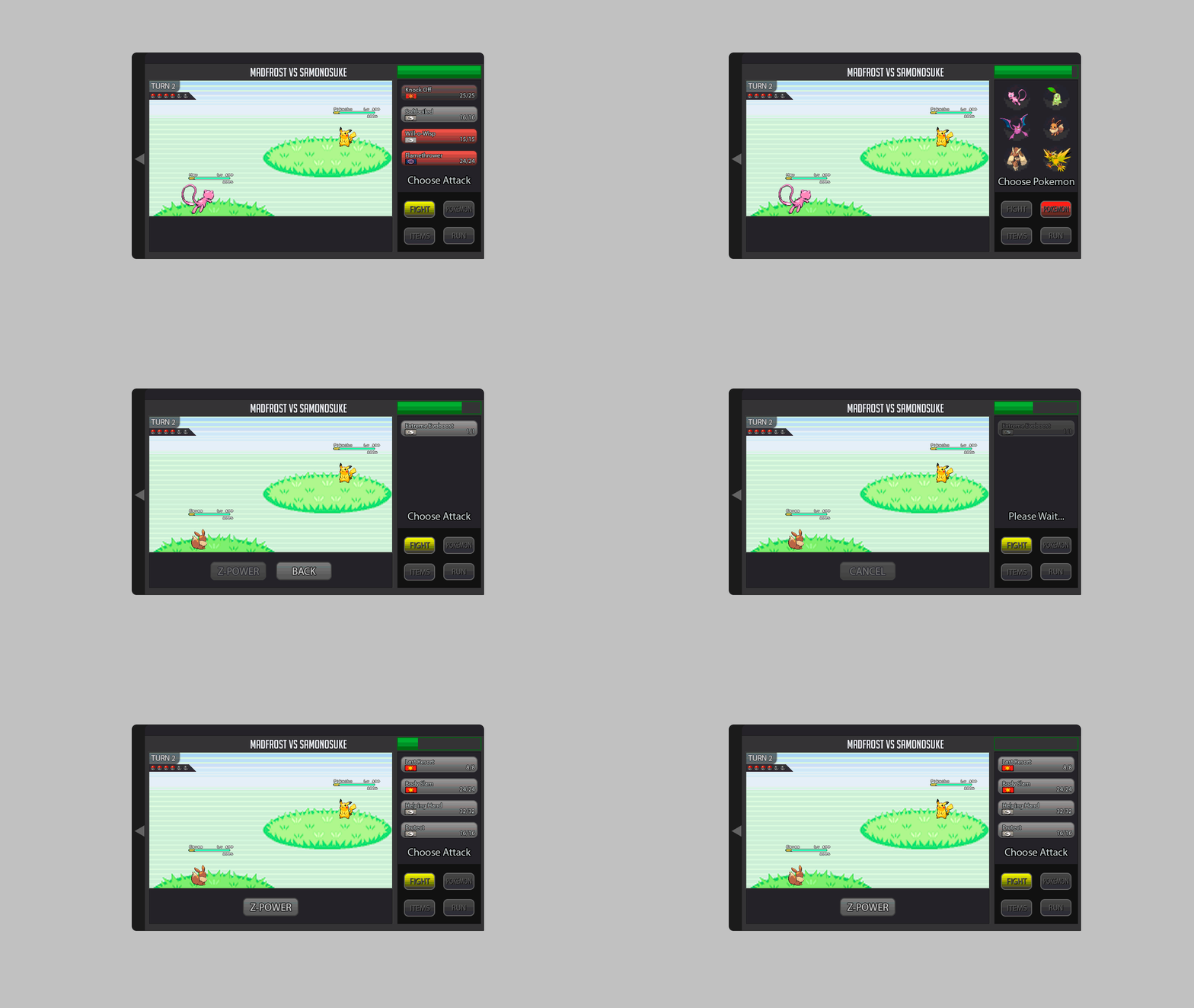
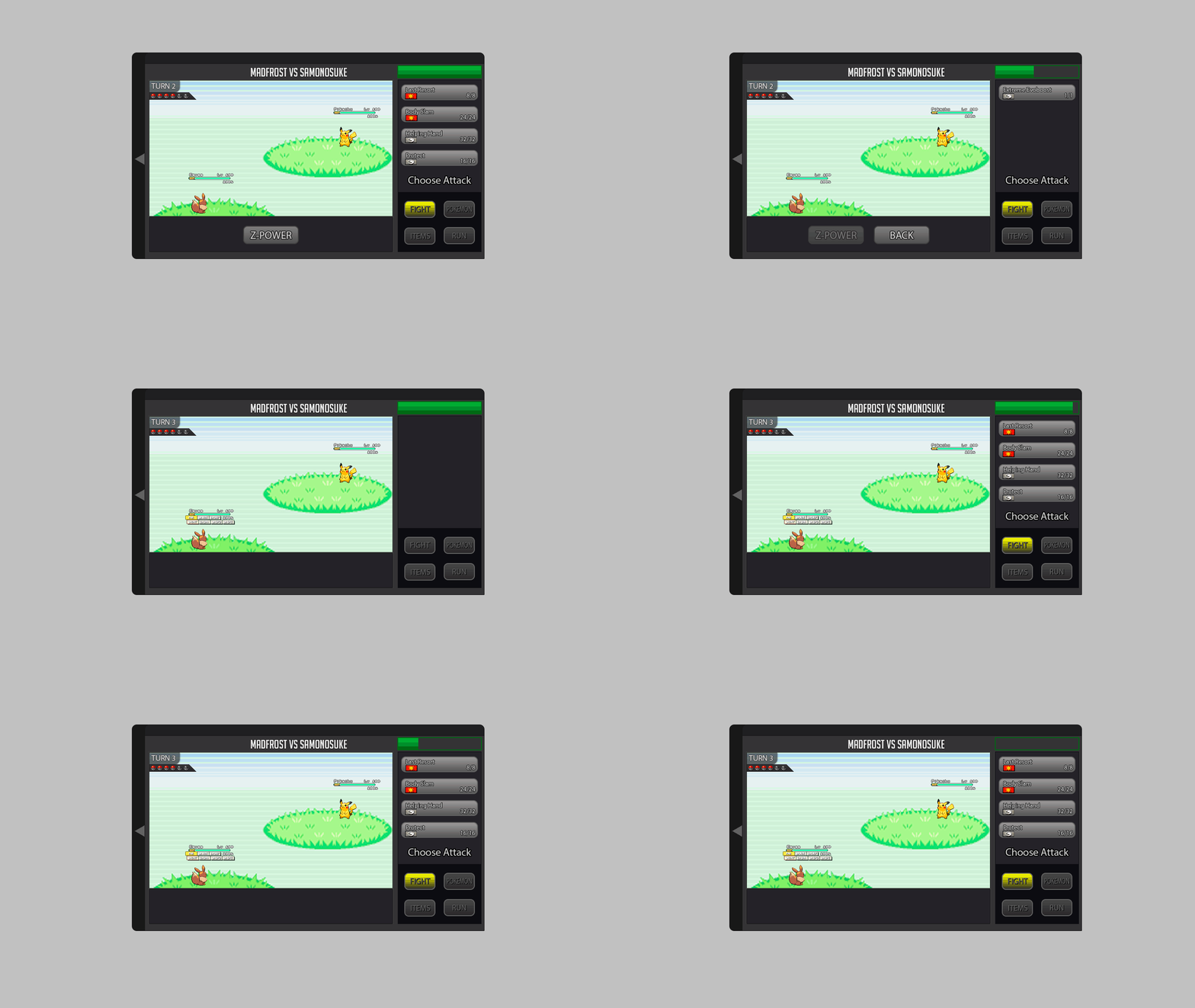
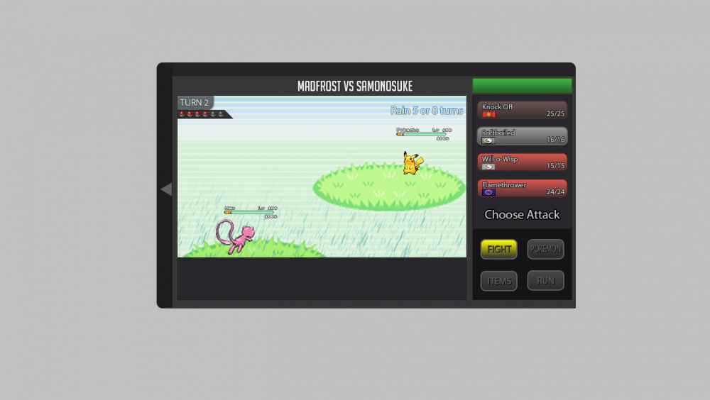
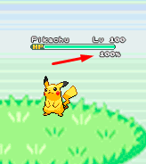
About the new battle UI I explain what I think and I'm putting some gifs and images as an example, I hope you understand. About the new Battle UI I thought a lot and I came to a conclusion about doing a Battle UI based on the old one, because I think the old one is very good, and I think it would be better to recreate it because if I create a new Battle UI, I think it would bother a lot of people who hunt all day and for those people who play the game on the cell phone. So I decided to recreate the old one trying not to disturb the people who play the game on the cell phone and for those who are hunting pokemons all day. Battle 2v2 and 3v3 fights: For 2v2 battles could work with the first two pokémons of your list. For 3v3 battles could work with the first three pokémons of your list Example: In the example I put the video of the Ash playing the pokeballs because I had not found an animation on the internet just playing the pokeball. Button for Megas: For the megas I think it should stay down as it is there in the example. Example: Button for Z-Moves: For the Z-MOVES I think it should stay down as it is there in the example. Example: Button for Cancel: For the Cancel I think it should stay down as it is there in the example. Example: Battle Logs: I think it would be nice to create a button next to the logs, as soon as it clicks the button will appear the logs next. Because there are people who get pokemons all day long, and with the logs appearing this right away I think I could mess up these people who are hunting many pokemons. More information looks at the example below. Example: Buffs, Paralyzed, Taunted etc: Paralyze, taunts, buffs and etc. I think I should stay in below life because I think it would look cool because it was going to look like the other pokemon games! Paralyze, taunts and etc. should appear before, and the buffs soon after. More information looks at the example below. Example: Then in the example you will see that he took Paralyze, it is because the pikachu used an attack and gave paralyze in Eevee, and the Paralyze appeared before the buffs. Weather and room effects as well as their turn count: The weather and counting should be right there in the upper right corner, showing that she is in such a Climate and showing the count of turns that she ends up. More information looks at the example below. Example: Extra: I think it would be nice to put a percentage of the Pokémon's life at the time of battle. Example: I made some changes in the post to put the bigger gifs because they were too small and hard to see. Thank you for your attention. :D1 point
-
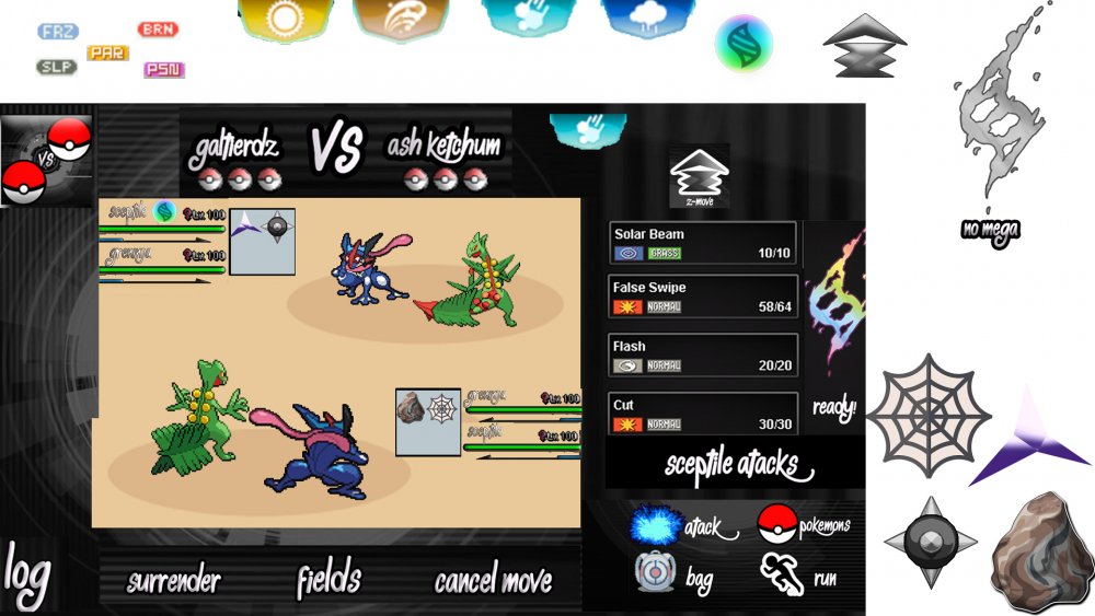
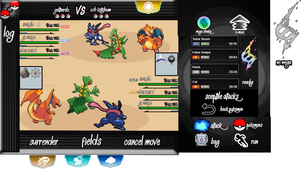
Greetings. This and the Battle Ui that I created, my Photoshop expired half way through the work so I could not improve enough. I used the requirements that were imposed and with some changes, for example below we have Options such as "Surrender", "Field", "Cancel Move", also added something to be the "Log" or "Field" button and to show Field Camps as Sticked Web, etc. The default menu has been added too. The Faithful Icon has also been changed. I made 2 Places where there could be the button for Megas, although I liked it more than this one next to the Moveset, The Button of Z-Move was also Added. I would like to have more work in this Battle Ui job, but unfortunately I can not afford the PhotoShop package for personal reasons. I hope Battle Ui can inspire you, Thank you for your attention. PS: I could not send in PSD File.1 point
-
Glad to hear your issue is solved! Enjoy, and have a great week :Grin: - [glow=lightgreen]Locked as solved[/glow] -1 point

