Leaderboard
Popular Content
Showing content with the highest reputation on 01/09/19 in all areas
-
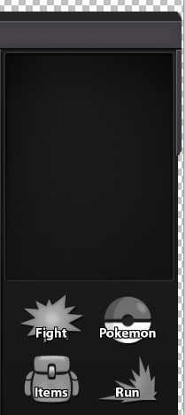
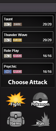
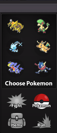
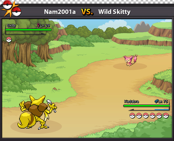
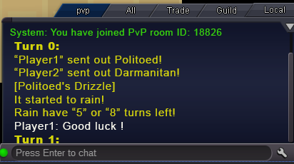
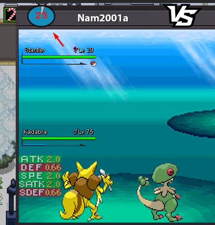
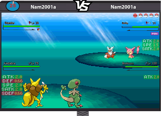
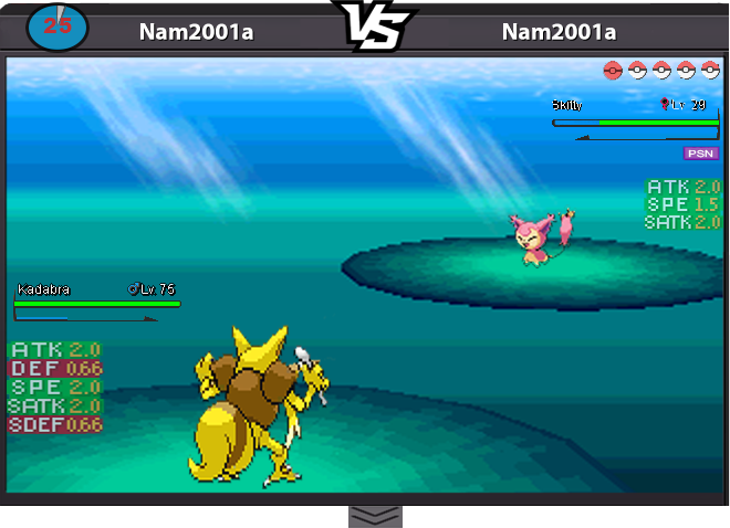
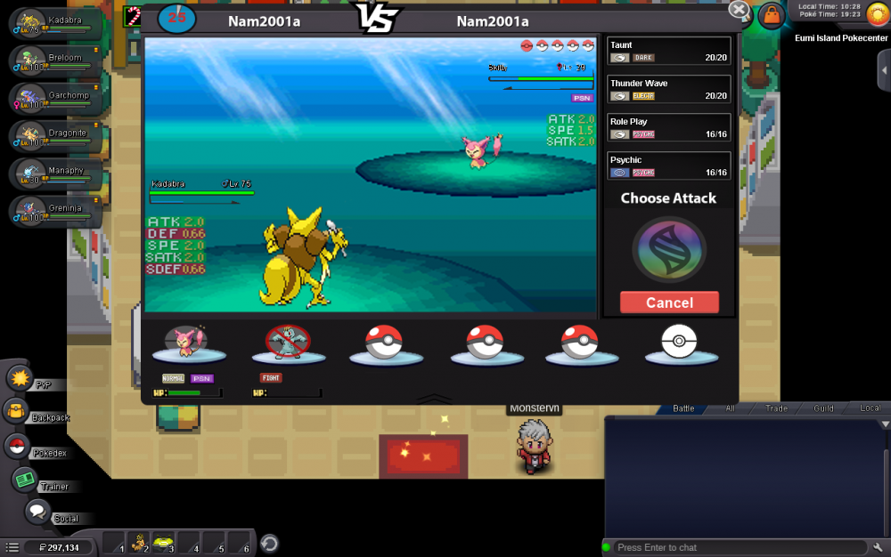
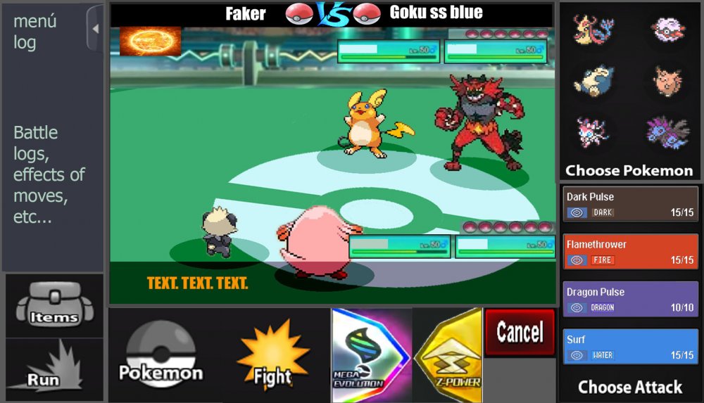
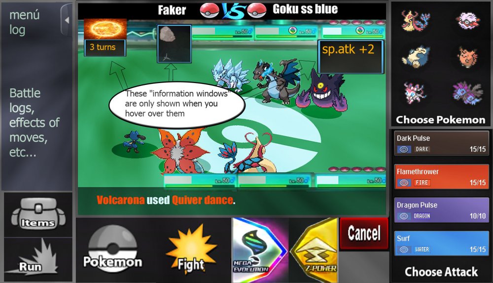
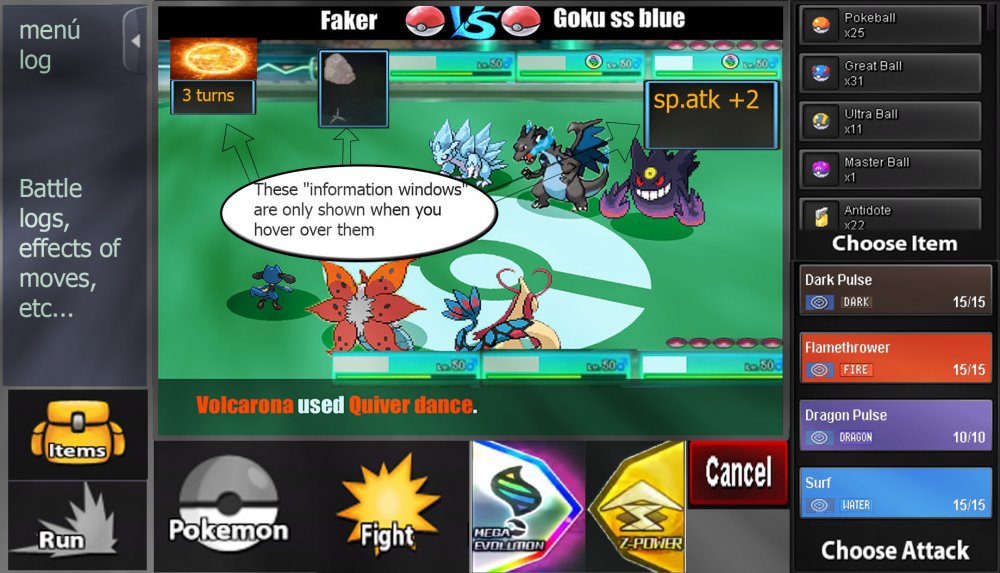
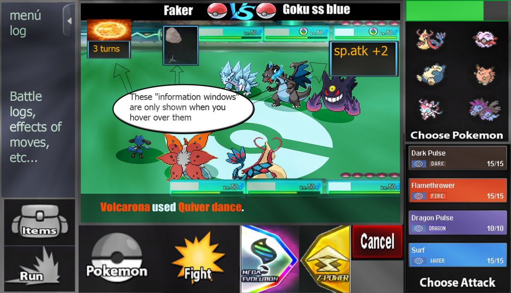
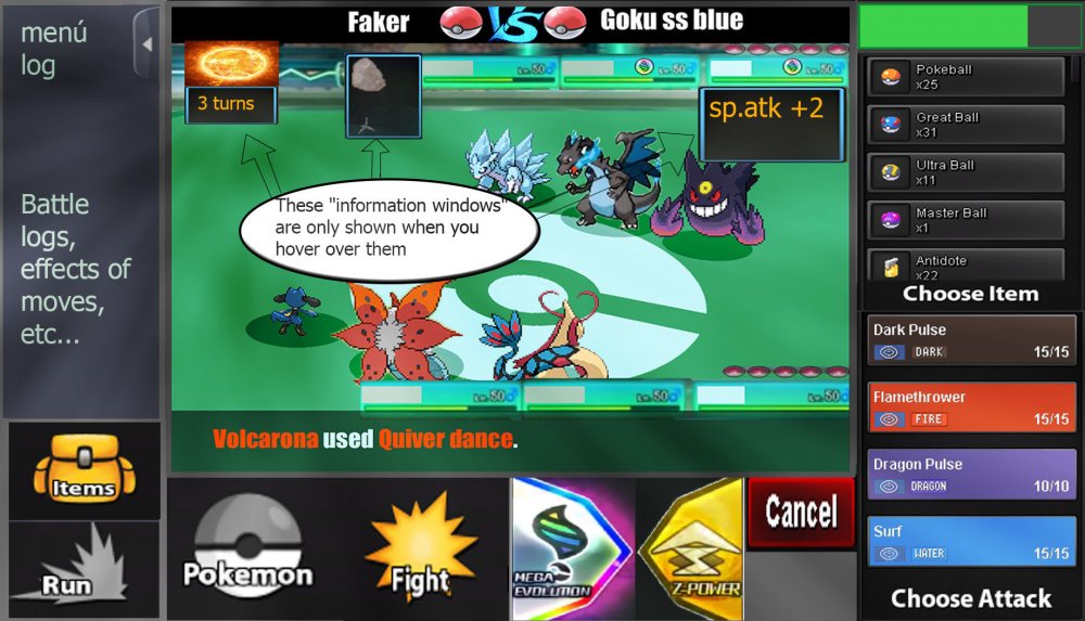
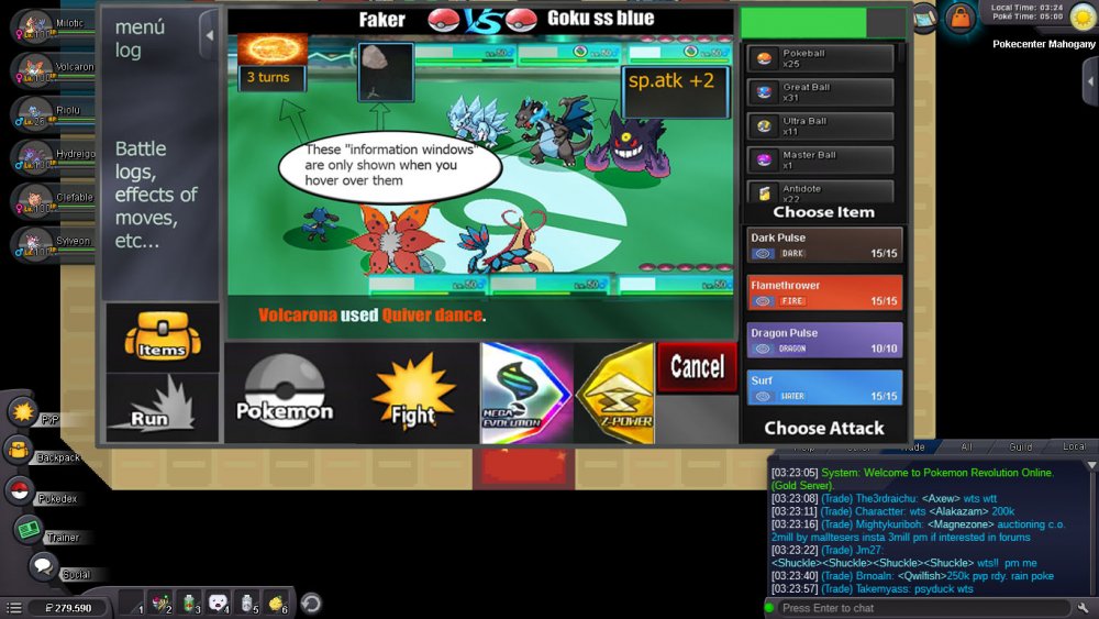
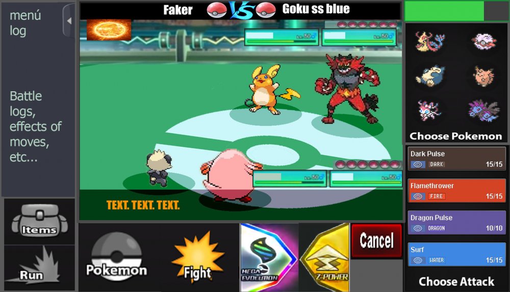
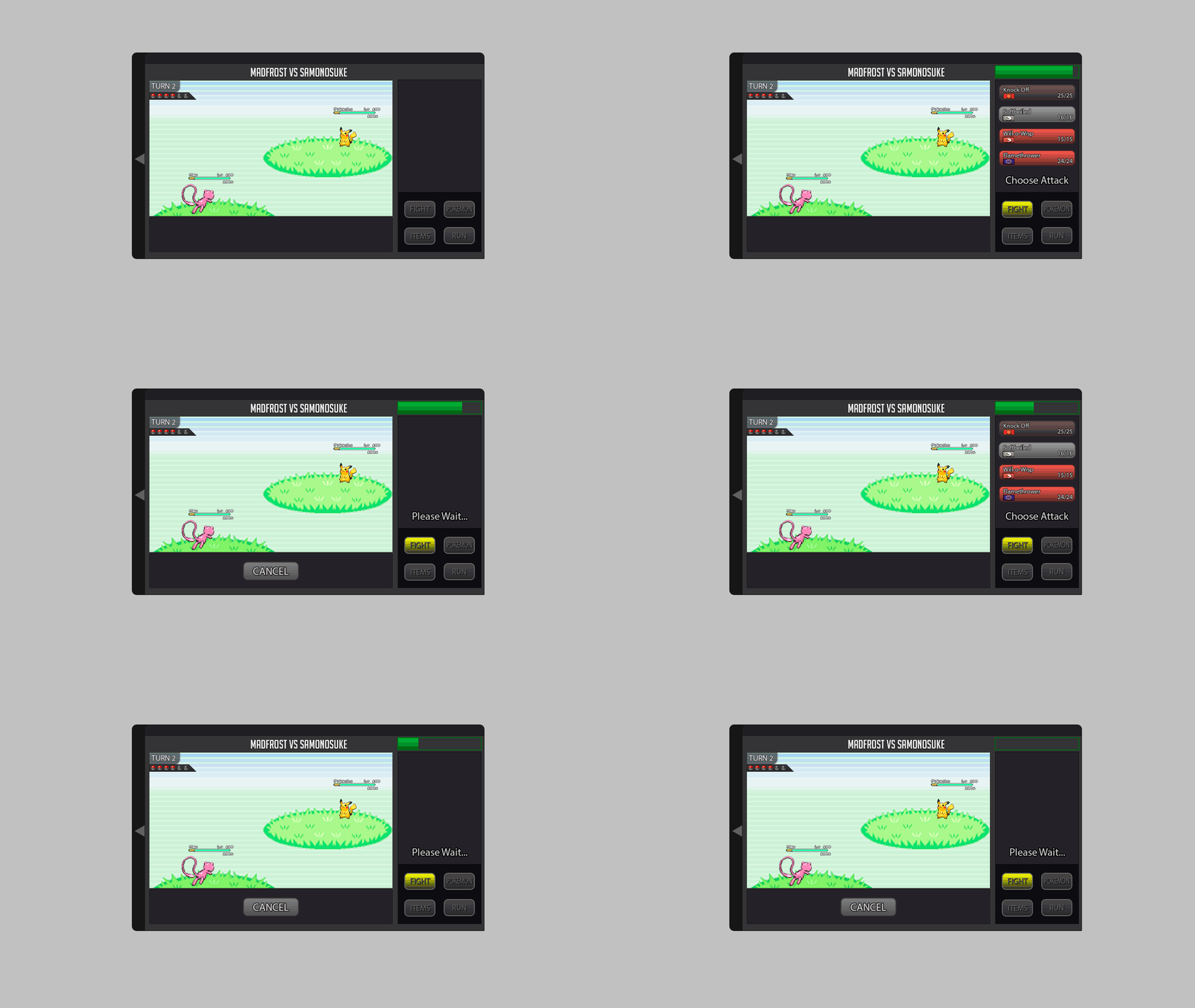
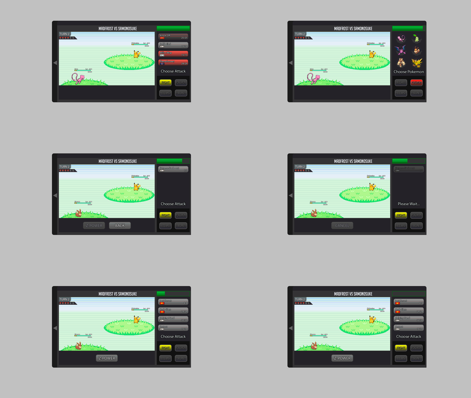
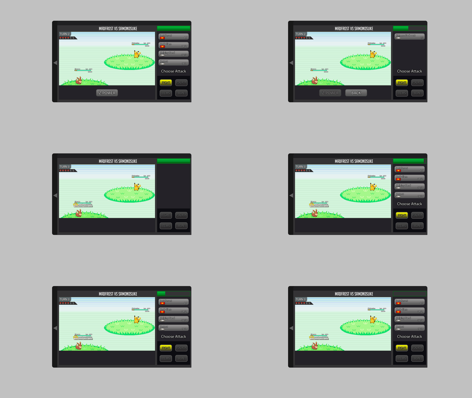
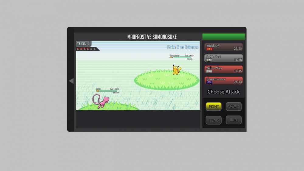
Hey everyone ^^, I created a Battle UI and im very proud x) since im kinda new to Photoshop and i spend a lot of time creating this :D. I created a completely new Design but tried to stay as true to the classic design as possible . Sooo i hope U will like it ^^ First Picture shows the Countdown/Timer for the Round (necessary for pvp) 1. Battle LOG I placed the Battle LOG on the left because i think this is the best way and looks nice. in think the battle log should be able to fade in and out so i created a button for it. (Random Text xD as Example) 10/11. Scroll Buttons for Battle Log 2. The Weather should be on the top (seems logic for me xD) A little Icon that shows how many turns left. 3. Field Status My Idea is it to show field status only if u want to. So I created a Button for each Side where u can fade in all Informations. (2nd Picture) 4. Title, Names etc. Here is written what is happening in the moment. For Example: If u Select the Pokemon Button it says"choose" or if u choose Fight in 3v3 Battle it tell u the name of the chosen Pokemon. 5. Buttons Here we have the classic Buttons wich are colored if u choose/hover them. (redesigned :D ) 6.Cancel Button I placed it like this because i think it should be near to the other buttons. 7. Mega & Z- Buttons These Buttons should be gray until they are usable, then they should be highlighted. 8. Boosts and Effects should stay classic at the HP bar of the Pokemon. Big thx to Kad1r and Chroxler (I want to mention Obviously on the Top right Box u have the option to select Pokemon, Attack, Items etc...) =)4 points
-
Well, I think this game needs a PVP council asap. I consider the actual metagame unhealthy and less competitive than the previous ones. I know this is a MMORPG and the market is very relevant and, infact, i think that the PVP leaders shouldn't have only the power to ban and not ban some specific pokèmons but also they should be able to decide the tiering of the pokèmons to hunt. For example: if the metagame needs more sand i'd lower the tier of Larvitar and Hippopotas by 1 stage or more in case of need. And ofc increasing the tiering of the broken and centralizing pokèmons (for example Timburr) by also deleting some spawn locations. This would make this (fantastic) game more competitive and more similiar to games like Clash Royale which is balancing things every month. And this would make this game more fun in the PVP side because we will see different metagames from season to season. I personally think this work is needed because the metagame is costantly in evolution and without a supervisor it can be more uncompetitive and boring than ever. Of course, when I talk about fixing the spawn rates i'm not talking to make Drillbur, Dratini T1 but simply lowering and increasing their tier by 1-2 stages.2 points
-
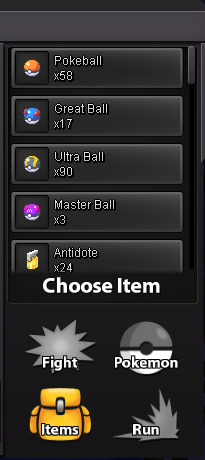
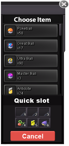
ok.. HII :3, this is my own version of the battle iu ,i decide to keep the visual concept of the game, the principal reason is that is more easy for the :incoming,new ,casual and those that live on the game :v to assimilate the redesign and the way that the iu works , redesigning the space and the visual order of some elements that all the player already know and integrate the new ones by a easy and familiar look . (i apologise for the font of the text ,i don't know how to find it,i try to find a similar) This is the way that the iu look on full screen (example) [MEDIA=imgur2]YdjG9Kx[/MEDIA] (the design of 3vs3/ 2vs2/ 1vs1 use the same space) This is the way that looks the different iu (the post will show the way that looks with mega evolution an z move) this preview is for understand some elements and its function that appear on the iu [MEDIA=imgur2]5hxnusI[/MEDIA] 1. the time time that each player have for do a action on each turn , attack etc( this time can be cut by the action of the opponent in the case of the attacks) 2. the boost /effects/others -those effects that create a negative stat on the pokemon will be show on red describing which stat is been affected negative(-hp,-spd etc.) -this include the effects of poison,sleep,stun.etc) 2.1-those effects that create a positive stat on the pokemon will be show on green describing which stat is been affected positive(+spd,+atk etc) 3. the identification number the purpose of this numbers is make easy the identification of the pokemon that is making a action /making a easy way to decide which pokemon you want to attack by looking the number that this one have and making a easy way to decide a action 4.weather this title is for tell the players if there's any weather condition on the battle ,if there no weather conditions this will be without any indication ,in the contrary case 4.1- there going to appear a image that show which weather is on battle and the time that left to over 5. turn/battle chat this title is going to change each time that both players do and actions ,this helps to indicate the left turnos for the weather too 5.1 -the battle chat will be a history of the current battle action and turn ,describing which player do a action against the other payer.(this will be sow too the time that left for the weather condition)(this will show too the boost stats and negative stats by the exact % of each state)((this chat only show the events on battle u cant talk to the other payer)) 6. the action chat/description this text will be generated automatically after the player do and action ,so in this way the player can be sure that the action that says the battle chat is the right one,if is not the player can cancel the action by clicking on the cancel button (this action depends too on the action of the other player,if the other player already do their action the option will be executed automatically within any option to cancel) 1v1 MEGA evolution [MEDIA=imgur2]yXtUhr6[/MEDIA] Z move [MEDIA=imgur2]BhEIjoP[/MEDIA] 2v2 MEGA evolution [MEDIA=imgur2]D6kEUP3[/MEDIA] Z move [MEDIA=imgur2]p6cykEE[/MEDIA] 3vs3 MEGA evolution [MEDIA=imgur2]bM51OUL[/MEDIA] Z move [MEDIA=imgur2]JJtVdBz[/MEDIA] Ok and now you can see how the panel changes when you already use the MEGA evolution or the Z move MEGA EVOLUTION [MEDIA=imgur2]WnpLJoa[/MEDIA] Z MOVE [MEDIA=imgur2]VvkTUDZ[/MEDIA] ( after use the MEGA evolution or the Z move the option blocks with the text you already use it ) Ok that is the way that is the way that the battle iu looks now this its the way that the select of pokemon and items looks. Chose pokemon [MEDIA=imgur2]M5qkzDZ[/MEDIA] Choose item [MEDIA=imgur2]zlw2vi4[/MEDIA] (the small icons that are in front of the panel are for select :items ,pokeballs and potions etc) Ty for read the post ,i hope all the staff member like my design,so that's it :3 . sorry for my bad english ;v2 points
-
PVP Council Hi, I’m NJNP. I’m mostly known for my team building and high level tournament play on smogon. I’ve dipped into the competitive scene here in the past and I’ve fully immersed myself into pro after some push to come back. That is the goal of this post: to improve the pvp scene of pro. On smogon, most decisions especially competitive ones are made by a group of people. That group is called a council. That group generally is of some of the best players in their competitive format and has good knowledge on the meta-game. They proceed to make sure the metagame is in proper order and deal with problematic elements of the metagame as they appear. The council is generally known for holding suspects. The council is to see if these Pokémon are guilty of being killers of the meta or are they innocent and perfectly fine for the meta. The decision to what should be suspected is single handily up to the council but heavily influenced by the community. The council doesn’t suspect something that does not have community interest or concern. Generally before something is decided to be suspected, the council asks the community their opinions before they move forward with a decision. I feel a council would be great for pro pvp as megas are coming and legendaries are becoming more accessible. The council will aid the community in making decisions for the betterment of pvp. I’d want the council also to aid in creating an official viability rankings for pvp. I’m not sure exactly why one hasn’t been commissioned in the past but I think it would make sense for players regarded as the best at pvp to be able to help others understand what is good in the meta-game. I have 2 council concepts that can be decided or at least give an idea on the set up. Concept #1: 2 CO Leaders 1 From Silver 1 From Gold 3 Council Members 5 Members In Total Concept #2: 1 Leader Representing Both Servers 4 Council Members 5 Members In Total I’d like to hear people’s opinions on bringing a council to pro pvp and if anyone has any questions feel free to post them below and I’ll answer them.1 point
-
Eumi Island Theme Park 1 [spoiler=Nugget] [spoiler=Rainbow Candycane] [spoiler=Red Candycane] [spoiler=2 Green Candycanes] Eumi Island Theme Park 2 [spoiler=Nugget] [spoiler=Red Candycane] [spoiler=2 Green Candycanes] Eumi Island Theme Park 3 [spoiler=Dusk Stone] [spoiler=Red Candycane] [spoiler=Green Candycane] [spoiler=4 Red Candycanes] Eumi Island Temple Entrance [spoiler=Nugget] [spoiler=2 Green Candycanes] [spoiler=Stick] [spoiler=2 Red Candycanes] [spoiler=Rainbow Candycane] Eumi Island House 3 [spoiler=Red Candycane] [spoiler=Green Candycane] Eumi Island Park Shop [spoiler=Rainbow Candycane] [spoiler=3 Red Candycanes] [spoiler=4 Green Candycanes] Eumi Island Theme Park Casino [spoiler=3 Red Candycanes] [spoiler=2 Green Candycanes]1 point
-
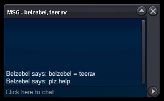
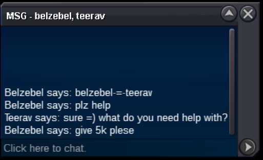
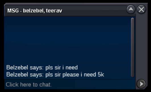
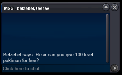
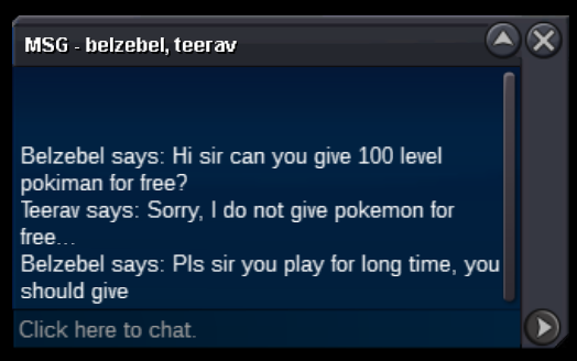
I would like there to be a new rule under "Chat Rules" that makes the action of asking for free things via PM report-able. Otherwise known as "begging." THE STORY Ah, a kind soul in need of some help. We are having a good day, let's ask what they need help with. [spoiler=Message From Stranger] We don't really like giving out money for free, but we don't want to be rude. Let's tell them sorry that we cannot help them and move on. Our friends are waiting for us to hunt! And we still need to select those pokemon we want to sell in trade chat. Another message pops up! [spoiler=Message From Stranger] The same person... we ponder as what is that is they desperately need the money for. Regardless, we do not give money for free to people we do not know. We kindly reject them and move on. We have our syncs and pokemon ready to sell in our party and meet up with some friends to hunt that elusive Christmas Mareep! After some time, we finally sell a pokemon we have been posting in trade chat. We are so happy we rush to the PC to meet our buyer. They are waiting for us and we happily make the trade. As we are browsing for more pokemon to sell, a new message pops up. [spoiler=Message From Stranger] It is the same strange that was asking for money... We thought we told this person that we do not give things for free. Regardless, we tell them no and hope they understand. However, they do not seem to understand... [spoiler=Message From Stranger] Now it is getting annoying. Twice we have told this individual that we do not give things for free and they continue to harass us. Feeling frustrated, we think about what we can do. We can ignore this player by typing "/ignore playername" into the chat. Yeah, we can do that. This way we can continue to farm and sell pokemon without fear of being harassed by this player. After some time, another sell! Amazing, let's return to the PC and sell our pokemon. However, as soon as we enter the pokemon center, we are met with a new message. [spoiler=Message From Stranger] "No!" We scream to our self. "Not this again." We kindly reject their request and try to move on with our game play. However, after leaving the MSG, the new stranger messages us again insisting me give them money! We think about what we can do. We can ignore this player as well, yeah. But what if another person tries to do it? We hate getting harassed by people for free things. Can we report these people so they will stop? Our logic is simple for reporting them. They are harassing us. We will compile lots of messages from people like this and report them all in once. Some time goes by and we finally get a response. [spoiler=Message From Staff] It seems we are out of luck. We have no choice but to turn off our PMs while we play PRO because of this form of harassment. We cannot post in trade chat because it requires us to keep our PMs on. And we cannot socialize with everyone else because we fear being harassed by beggers. Our experience playing PRO has diminished and maybe tomorrow we will not even play. RESPONSES TO ARGUMENTS AGAINST IMPLEMENTING THIS RULE Just /ignore this person. Logging out resets this feature. It is not possible to remember all the people to /ignore each time you relog and it is not fun. This creates an inconvenience for a player in a negative away. [*]What if they really need the help? There is a "Help" channel in game. There are rules to prevent staff from getting individual PMs for help based on similar reasons. The same should apply here. If someone needs help, its best they ask in a public area in case others have the same question or concern. Asking for money or free pokemon is not the same as asking for help or a favor. [*]This is not a form of harassment. It is. No one should be pressured into giving free things to other players. This creates a negative stigma and general unwillingness to continue playing after being asked for free things.1 point
-
Please, help, I was trying to capture manaphy from the Christmas event and suddenly the connection went for no apparent reason, it does not let me try again, help1 point
-
a 3 day bms is sometimes a pressure for me,maybe the game can be more convenient by adding a non-stress 1 day bms.THANK U FOR HEARING1 point
-
I'm having a problem with the latest update on my phone.I can dowbload it woth no problem at all but when I try and install it I get a message saying app not installed. I've googled the problem but nothing seems to be working. Can anybody help me please. Thanks in advance1 point
-
Hey there, Juliph Thank you for the reply, I did everything you said and I have it working now :-) Thank you much appreciated1 point
-
Hi [uSER=864141]@WHatdesu[/uSER] ! I would like to apologize for the inconvenience and thank you for your report. I have forwarded this issue to the relevant parties that will check it. Unfortunately, i am unable to give you an estimated time for when this will be fixed, however you can stay tuned on our OFFICIAL PRO DISCORD for further announcements about bug-fixes and updates. You can also check the UPDATE LOGS in order to be always updated on the changes we do on the game. Let me know if you have any further questions, have a wonderful day !1 point
-
I am glad to hear your issue has be resolved. I will now close this thread. If you have any other questions in the future do not hesitate to create a another post and I will be happy to assist you :) Have a great day! With Regards, Juliph1 point
-
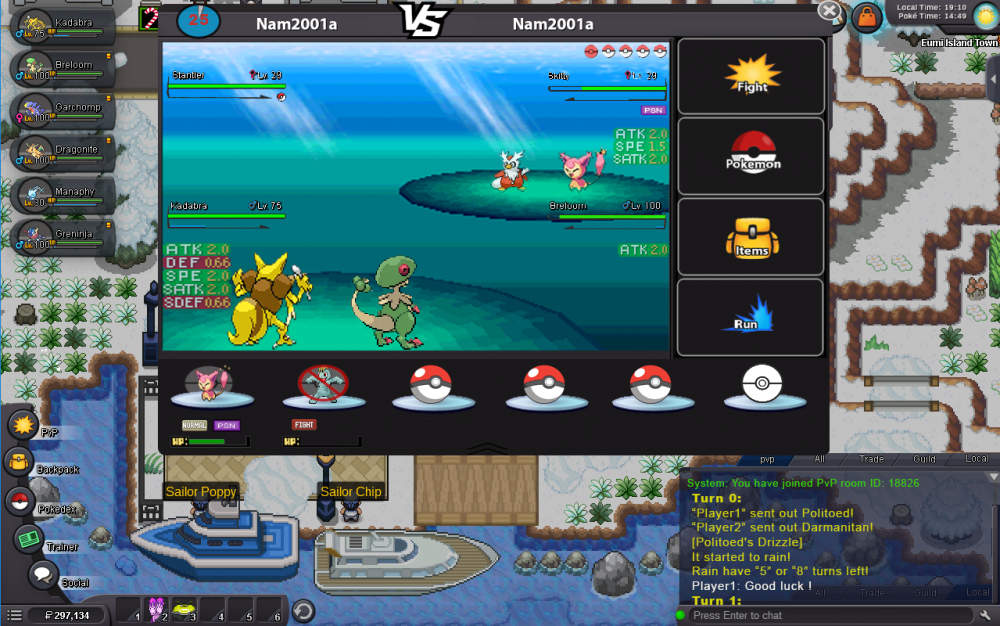
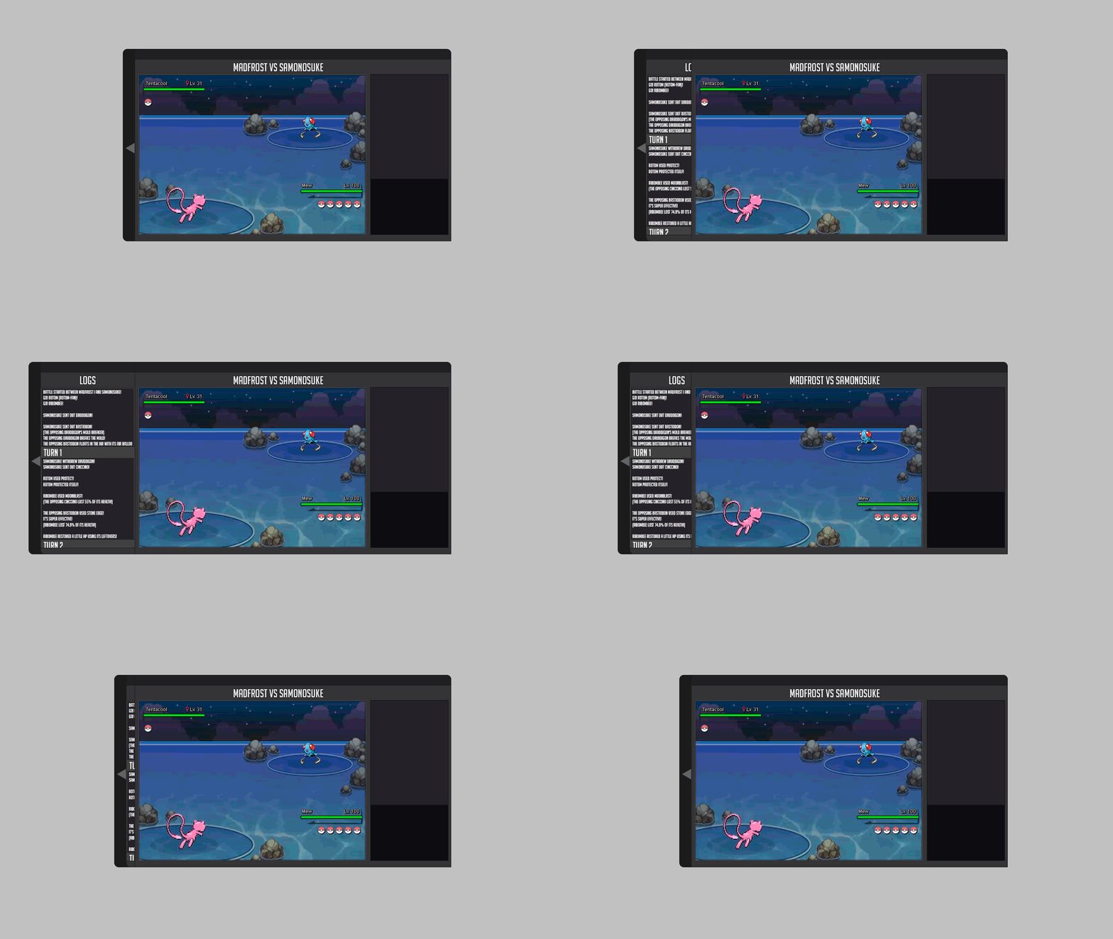
Well this is my entry for the Battle ui, I like the original battle ui so I based mine off of it and did improvements on it that was needed with mega, z-power, where 2s and 3s would look like, stat changes, and a battle log that is naturally closed but can be open with a tab on the side. I also attached an example of how big the ui will be with the log opened in game. I hope you enjoy my changes ;D .1 point
-
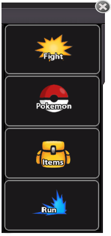
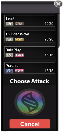
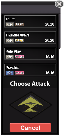
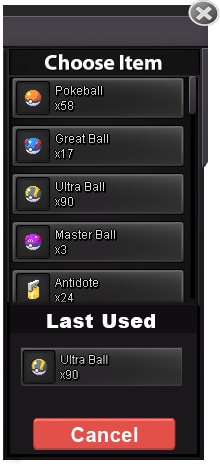
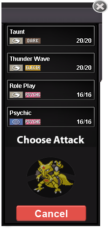
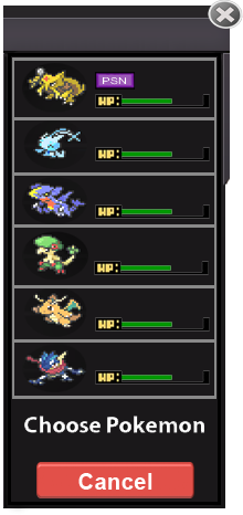
My UI devided into 4 big part: PART 1: Actions tab [spoiler=Part 1] -let's start with "main tab". It's the beginning tab where the battle start: New: . Old: I keep and rework the old sprites to make people get used to with it much easier than using the new ones. I removed the useless empty space to make those buttons bigger. The new "X" button at the top help you to disconect from battles, that mean it will work as same as logout but you don't realy have to do that. - Next will be the fight tab when you click the "Fight" button: New: Holding Mega stone: Holding Z-Move: Old: I replaced by the "cancel" button which will save a lot of spaces for every actions tab. When you click the cancel button you will be send to the main tab and cancel everything you haven't finished yet. That also mean this button will work as a "cancel move" button too. After select a move, mega evol or z-move, that button should be flashy like this . I don't know how to make it or what is that calling so I will leave it to you. This allow you to know which pokemon you are picking move at ( kinda useful for 2vs2 or 3vs3 ) and it also replace the empty space on it if pokemon are not holding mega or z. - Items tab: Option 1: Option 2: . Old: - Switch pokemon tab: New: . Old: As we have a bigger tab, choosing pokemon should give more info on the selecting pokemon. - PART 2: Main window [spoiler=Part 2] [spoiler=Part 2] My main window have 2 parts, 1vs1 and 2vs2. And I won't make 3vs3 due to a very simple reason "It's such an stupid mode". 3vs3 cause a lots of work (for the staff, not for me), lots of bug and no one want to play. I can still add the 3v3 battle UI realy quick if you actually want it. - 1vs1: 2vs2: Old: - Hazards keep the same as before because ppl already get used to with it and it take no places. So there are no reason for me to making new one for that. - I don't really know what make weather bugged in PRO so I will put the turns counting for it in the battle log instead of showing on screen and keep it as before. - One more thing I want you to add is when clicking on the opponent's name, it will sending command to inspect that person, so we can easily get more info on OP like rating, guild... ( Making Inspect only work on same location make no sense since U can use reborn bot to do that ) PART 3: Team preview [spoiler=Part 3] [spoiler=Part 3] - The first pokemon showed as "Revealed pokemon" - Second is "Fainted Pokemon" - 3,4,5 showed as "Unrevealed Pokemon" (Incase u want to keep NPC pokemon Unrevealed) - 6 is an " Empty slot" - This tab can be minimize by clicking that bottom button to save screen places if u don't really need it - If you pointing the mouse over the health bar, it will show a screen with that pokemon info like names, moves used, health in % ... ( just suggestion, I don't have UI for that) - If you cliking on the revealed pokemons, it will open pokedex with that pokemon's name on searching. ( just suggestion) PART 4: Battle log [spoiler=Part 4] Why I want to have battle log on game chat instead of making it on battle screen? 1. It will save alots of hard work because game chat is a thing that you already have. 2. It save spaces on screen. 3. It's allow you to chat with opponent throught the log like Showdown. - So, let's explain more on how this thing will work: Basically, when u start a PvP battle, the system will creat and send you and also your opponent to a private channel. All the logs for that battle will be send to that channel. That mean you can also invite your friends to that channel as spectator throught the given room ID. Ofc they can only see the log and be able to chat there only. But it's just the first part of spectating, It's up to you for developing more on this amazing feature. + This PvP channel can't be closed like "Local" channel + You are force to leave the current pvp's room if you logout or enter any battle. + You can Ignore OP by clicking ignore them if you don't like they chatting in logs. + PvE logs can be work the same as this except you can't leave the given room ID. + It will need some rework on this chat but still better than making new one. I'm still new to photoshop and this is my first time making a project on this. My PSD file Download: DROPBOX I have so much things and ideas to say but I can't tell it in just 1 post cuz this is a really long post so I might keep edited this post with change logs if I found any news or make any changes. Changelog: [spoiler=logs] [spoiler=logs] [spoiler=logs] [spoiler=1/1/2019]- 1/1/2019: + remake the "Cancel" button to make it look better: Old:. New: + Lower the mega button opacity:, it's have a better look now: + Added PvP timer to the main window: + And some small changes. [spoiler=2/1/2019] + Remake the "Choose pokemon tab" + Some small edits on Option 1: Option 2: . + Added on the fight tab, which let you know which pokemon you are playing at 2vs2 or 3vs3 and it also replace mega and z-move button when pokemon is not holding that. + Remake the z-move button1 point
-
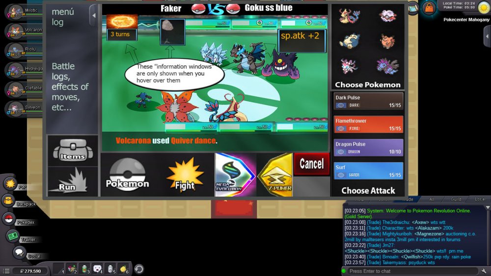
Hi, this is my battle iu, I hope you like it. Basically it has all the buttons that have been required, bigger buttons also thinking about the Android version and PC users. The battles, I prefer them to be full screen optionally (The battlefield is made by me ... it's for the pvp battles) Let us begin 3 vs 3 Battles: -I have reinvented some parts like the "vs", and also the attacks with colors of their types. -The buff states must be as shown in the image, - they only have to be displayed when the mouse passes over- -The Menu Logs must be able to open and close, as the user wants, by means of a button placed as shown in the image -items and pokemon in same place, are changed, by pressing "pokemon button" or "items button"- -items and pokemon in same place, are changed, by pressing "pokemon button" or "items button"- -As I see it in the game "window mode"- -2 vs 2 Battles- -same controls as in version 3 vs 3, there are no major changes. That's it, I hope I have not forgotten anything, thanks for watching, regards1 point
-
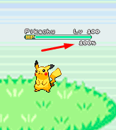
About the new battle UI I explain what I think and I'm putting some gifs and images as an example, I hope you understand. About the new Battle UI I thought a lot and I came to a conclusion about doing a Battle UI based on the old one, because I think the old one is very good, and I think it would be better to recreate it because if I create a new Battle UI, I think it would bother a lot of people who hunt all day and for those people who play the game on the cell phone. So I decided to recreate the old one trying not to disturb the people who play the game on the cell phone and for those who are hunting pokemons all day. Battle 2v2 and 3v3 fights: For 2v2 battles could work with the first two pokémons of your list. For 3v3 battles could work with the first three pokémons of your list Example: In the example I put the video of the Ash playing the pokeballs because I had not found an animation on the internet just playing the pokeball. Button for Megas: For the megas I think it should stay down as it is there in the example. Example: Button for Z-Moves: For the Z-MOVES I think it should stay down as it is there in the example. Example: Button for Cancel: For the Cancel I think it should stay down as it is there in the example. Example: Battle Logs: I think it would be nice to create a button next to the logs, as soon as it clicks the button will appear the logs next. Because there are people who get pokemons all day long, and with the logs appearing this right away I think I could mess up these people who are hunting many pokemons. More information looks at the example below. Example: Buffs, Paralyzed, Taunted etc: Paralyze, taunts, buffs and etc. I think I should stay in below life because I think it would look cool because it was going to look like the other pokemon games! Paralyze, taunts and etc. should appear before, and the buffs soon after. More information looks at the example below. Example: Then in the example you will see that he took Paralyze, it is because the pikachu used an attack and gave paralyze in Eevee, and the Paralyze appeared before the buffs. Weather and room effects as well as their turn count: The weather and counting should be right there in the upper right corner, showing that she is in such a Climate and showing the count of turns that she ends up. More information looks at the example below. Example: Extra: I think it would be nice to put a percentage of the Pokémon's life at the time of battle. Example: I made some changes in the post to put the bigger gifs because they were too small and hard to see. Thank you for your attention. :D1 point
-
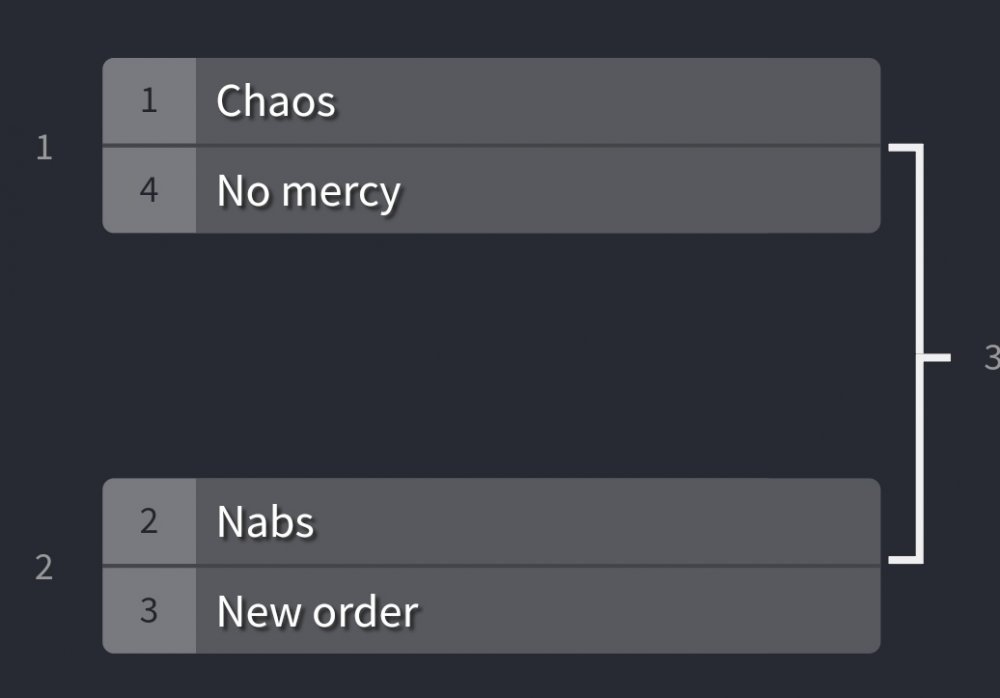
Introduction Hello and welcome to my new tournament. Im glad to present you the first Guild Tournament in PRO. The idea is based on the guild wars but, why not make a Monthly Tournament with the Top 10 guilds? How to participate Easy, just finish the season with your guild on the Top 10 (Guild ladder). Then, we will contact with all the Leaders to prepare the tournament. Format Each guild will make a 5 players team (1 Captain and 4 players). Each team will play vs another guild in a 5 vs 5. Your team must win 3 out of 5 battles to advance to the next round. [spoiler=Random Example] [spoiler=Random Example] 5 No Mercy Players Vs. 5 Chaos Players will fight in a BO5. Each captain decide the order of his players: 1st. "Belzebel" 2nd. "Squad" etc... Then the battles will be 1st No Mercy Player Vs. 1st Chaos Player. Prizes 4.000.000 Pokedollars for the winner Team. (Of course I won't force any guild to contribute, but feel free to add money for the prize). Details and Objectives All the tournament will be played on PRO. The prize is Hosted by New Order. (For the moment). The objective is to have fun and give more importance to the guilds. We will host this event MONTHLY. Be professional and respectful with any other player. If you can, please record your battles, I want to share the best battles with the community (Probably Via Youtube). We will create a Discord for the tournament. Team that can participate 1. FenixReborn Baltoo 13204 2. NewOrder Destro16 11339 3. Legacy Theminho 10987 4. Chaos Buyshinynair 9762 5. NoMercy Teerav 9041 6. OriginReborn Lasthope4 5512 7. DemonZ Ultron 5153 8. BloodNight Luminetor 4768 9. TheNabs Shac 4615 10. Apocalypse Dask5 43211 point

