Leaderboard
Popular Content
Showing content with the highest reputation on 02/12/19 in all areas
-
Ola, meu nome é Daniela. Somos jogadores que vieram de outro jogo (World of Warcraft), e resolvemos criar uma guild aqui , primeiramente porque gostamos de guild organizada e pequenas. Convido vocês a entrarem na nossa guilda, não somos os mais experientes, mas estamos dispostos a te ajudar no que precisar. Temos um DISCORD próprio onde estamos quase o dia todo online onde vocês podem conversar com a gente por voz . A ideia é ter uma guild de amigos e não uma guild grande e forte. Então resumindo.... Não pedimos requerimentos.1 point
-
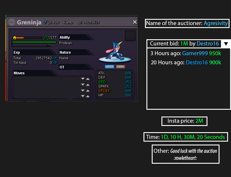
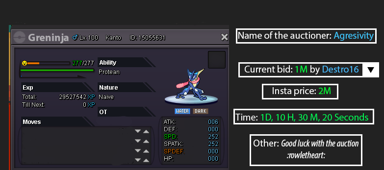
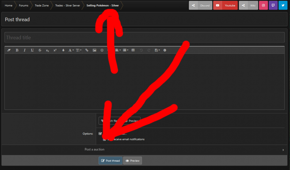
I think would be nice add in forum only in the subforum selling pokemon and selling shiny pokemons add the option to add a timer and a register for the auctions. The fuction of make this mode: 1º Avoid to the seller retract of his sell. 2º Avoid the usual problem of the time ( many sellers or buyers have the problem of wait to the last minutes to bid and the seller say that bid is not accepted because is out of the time so this would fix that) 3º Would be a cooler way to auc pokemons. I'll let a screenshot of how would be in my head: Dont forget let your oppinions down please <3 , regards. Agresivity1 point
-
Hello. As we know, Membership gives us an EXP bonus of 50%. Whereas, the EXP boost gives a bonus of 25%. Which is half of what's given by MS. The item EXP boost is made particularly to grant EXP boost but it's not really the case in MS; it has other benefits as well. So if EXP boost is particularly made for that, then its boost should be increased to at least 50%. 25% seems a bit less. I haven't really explained much you know my point. Thank you.1 point
-
1 point
-
HELLO TRAINERS WELCOME IN MY NEW GUIDE MY NEW GUIDE IS ABOUT HOW TO FARM MONEY EASILY ON PRO HERE IS SOME STEPS WHICH CAN HELP YOU TO EARN MONEY FAST AND EASILY STEP - 1 (DO BOSSES AND DIG SPOTS) 1ST OF ALL IF YOU WANT TO EARN MONEY THEN YOU SHOULD START DOING SOME BOSSES BOSSES GIVES A GOOD AMOUNT OF MONEY SOME BOSSES GIVES 10-20K AND SOME GIVES OVER 60K + SOME ITEMS TOO LIKE LIFE ORB AND OTHER GOOD ITEMS YOU CAN CHECK BOSSES COOLDOWN ON PRO OFFICIAL DISCORD SERVER DIG SPOTS - DIG SPOTS IS THE 2ND WAY TO EARN BUT IT ONLY GIVES RARE ITEMS SOMETIMES RARE ITEMS LIKE RARE CANDY, FOSSILS ETC. YOU CAN COLLECT A BUNCH OF RARE CANDY AND CAN SELL IN A BIG AMOUNT. STEP - 2 (HUNT GOOD AND META POKES) THIS IS THE BEST WAY TO EARN MONEY FAST AND EASILY YOU CAN HUNT META POKES LIKE GIBLE, TYRANITAR, DRAGONITE, DEINO'S ETC IF YOU WANT TO CHECK THE RARITY OF POKE THEN YOU CAN CHECK ON PRO'S OFFICIAL DISCORD YOU CAN GET THE ALL INFORMATION OF THAT POKE WHICH YOU WANT TO HUNT I HAVE 1 MORE TIP FOR YOU YOU CAN HUNT POKE AND AFTER HUNTING 3-4 POKES YOU CAN TRAIN THEM AND CAN SELL ON FORUMS EASILY STEP - 4 DO EV TRANING AND LEVEL UP SERVICES (DAYCARE) YOU CAN EARN A GOOD AMOUNT OF MONEY BY DAYCARE TOO YOU JUST HAVE TO SPEND SOME MORE TIME IN COMPARISION OF HUNTING BUT THIS IS EASY TO IF YOU NEED ANYTYPE OF HELP THEN FEEL FREE TO ASK ME YOU CAN ASK HERE OR YOU CAN DM ME ON DISCORD TOO [spoiler=My Discord]Mega Lucario#02021 point
-
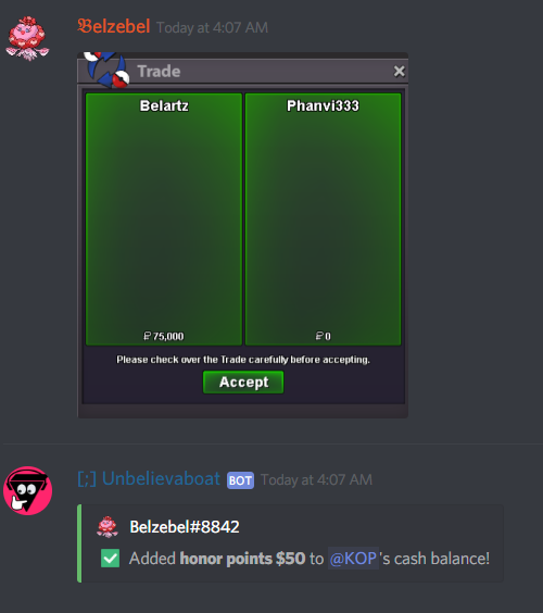
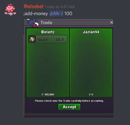
Hello warriors! Long time no see, right? I've been really busy in real life now that I'm working but I have my days off on Mondays and Wednesday now. Let's celebrate that I finally made some time during valentines season to host an event! Valentines Hunt event Gold & Silver server No Entry-fee Event starts: February 11th Event ends: March 1st In this event, your goal is to catch the best Valentines pokemon based on the nature, ability and IVs recommended by Smogon. Valentines pokemon available to hunt Nidoran F & M + evos Illumise & Volbeat Frillish F & M + evo Pikachu & Raichu Budew + evos Luvdisc Alomomola Sawk & Throh Spearow & Fearow Minun & Plusle [spoiler=PRIZEPOOL] [spoiler=PRIZEPOOL] 1st place x1 Coin Capsule OR 300k pokedollars 100 honor points x1 underlevel pokemon from Warrior Shop 2nd place 50 coins OR 150k pokedollars 75 honor points x1 underlevel pokemon from Warrior Shop 3rd place 25 coins OR 75k pokedollars 50 honor points x1 underlevel pokemon from Warrior Shop The rewards will be overall, counting both servers. There is NO individual rewards for each server. [spoiler=HOW TO PARTICIPATE] Join Emfire discord: here In Emfire discord, find the #sign-up channel in Valentines Event category and write your in game name and server. Post a screenshot of your valentine pokemon in #screen-shots channel. Only ONE screenshot is available per player. Delete all the screenshots you don't want one day before the event ends and keep only the best one. If you have any question about the event, use the #event-chat channel in Valentines Event category. EXTRA WTB epic bold Valentines Frillish/Jellicent (any gender) [spoiler=WINNERS] 1st Place Winner: Jazlan94 Reward 2nd Place Winner: Mattsw Reward 3rd Place Winner: Phanvi333 Reward (He didn't want any pokemon from the Warrior Shop)1 point
-
Hi @Mertysoner I'm sorry for the inconvenience. I would like to inform you that, unfortunately, you cannot have again another change to get the shiny Magikarp through that NPC as that is a one-time only thing. However, i am able to check if you have released any Magikarp recently and check if one of the was Shiny. Unfortunately, we are experiencing issues with our tools and therefore the recovery might take a while to bed one. Nevertheless, i will update you through this post as soon as i will have checked your account to search for the Magikarp released. Please, be patient in the while. Have a wonderful day !1 point
-
Hello! How about make Pinkan spawns the same as Valentine’s spawns. The same as the end of Christmas.1 point
-
Hi @Riffen I'm sorry to hear about the inconvenience you have experienced. I would like to inform you that, as you well stated, the maximum amount of the same item that you can have in your inventory is 999. Take note that this limit has been added in order to avoid memory issues that would then lead to the servers being unstable and crash. This issue is mainly experienced during merging, and that's why it is stated in our FAQ: Unfortunately, i'm sorry to inform you that we cannot refund you of your money as it would be unfair to the others that experienced the same issue and accepted the loss of their money as we cannot issue refund. Nevertheless i can assure you that, in order to prevent anyone else to experience the same issue, our content scripter worked on a script that block user to buy pokeballs from that NPC once the player have already 949 pokeballs. However, if you would like to increase the % of catch rate of the wild Pokémon, it is suggested to bring them to 1 HP and use a status effect such as paralysis and sleep. I'm sorry about the inconvenience but i hope you can understand why we cannot fulfill your request. Let me know if something is unclear and if you have any further questions. Have a wonderful day !1 point
-
Hi there, [uSER=2355811]Lucaspalo[/uSER] I would first like to say thank you for taking the time to create your post and voice your side of things, as community feedback is something we always look to when gauging the overall satisfaction of players base. With that said, I would like to reassure you that our Developers here at Pokemon Revolution Online work nonstop to improve the stability of the servers. However this is not an easy nor quick process. Here at PRO, we value our community deeply and try our best to take and improve on anything and everything the community feels need to be improved or reworked and this is the same for the servers. Please note that your suggestion will not got unheard :) I hope this can give you some reassurance! Please let me know if you have anymore question or concerns. Looking forward to your reply :) With kind regards, Juliph1 point
-
1 point
-
1 point
-
1 point
-
Hi @LastMatheus I'm sorry for the inconvenience. I would like to inform you that if you are interested in customize again your chacter, then you are able to do so by using a Magic Mirror. You can obtain the Magic Mirror through the coins shop, at a cost of 50 coins, or buying it from other players using the in-game trade chat or the correct FORUM - TRADE ZONE of the server where you play on. Unfortunately, this is the only way you can customize the basic look of your character. Nevertheless, you can obtain a lot of awesome clothes in the game, buying them from other players or obtaining them through quests. I hope the information given was helpful, let me know if you have any further questions. Have a wonderful day!1 point
-
1 point
-
1 point
-
1 point
-
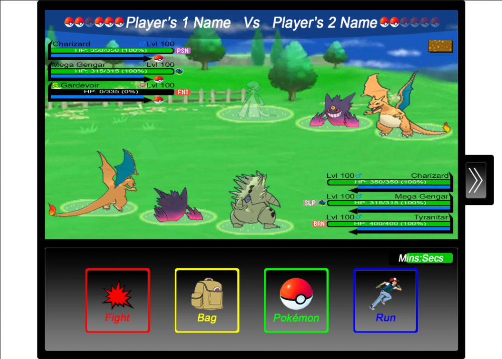
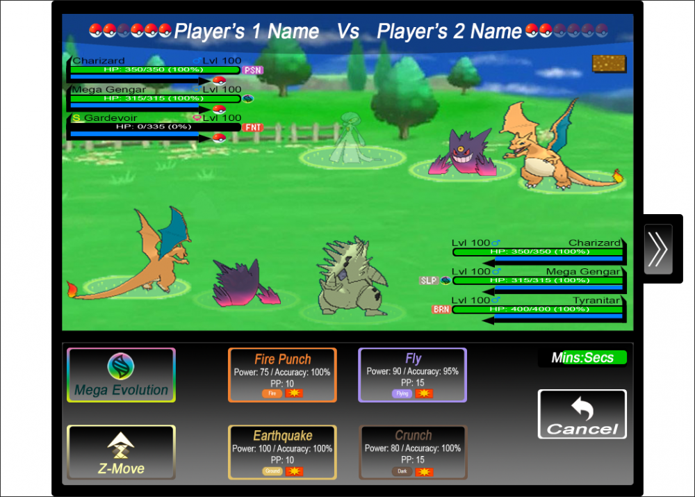
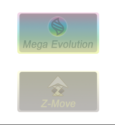
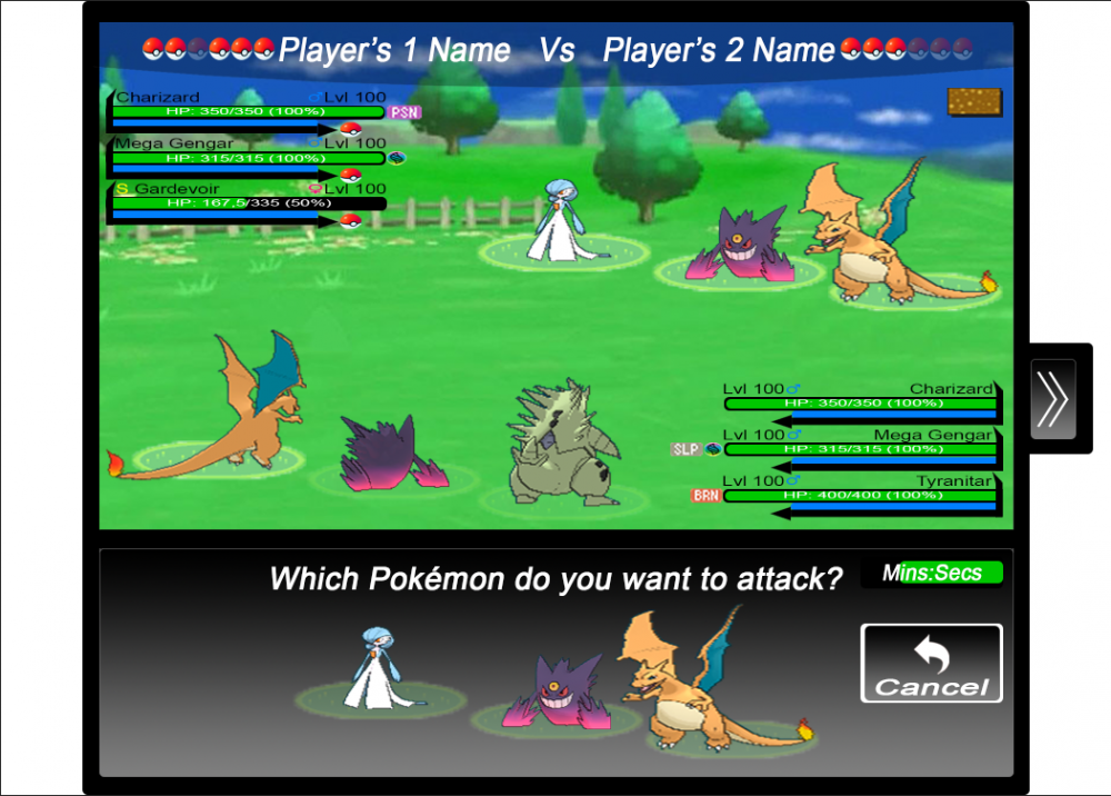
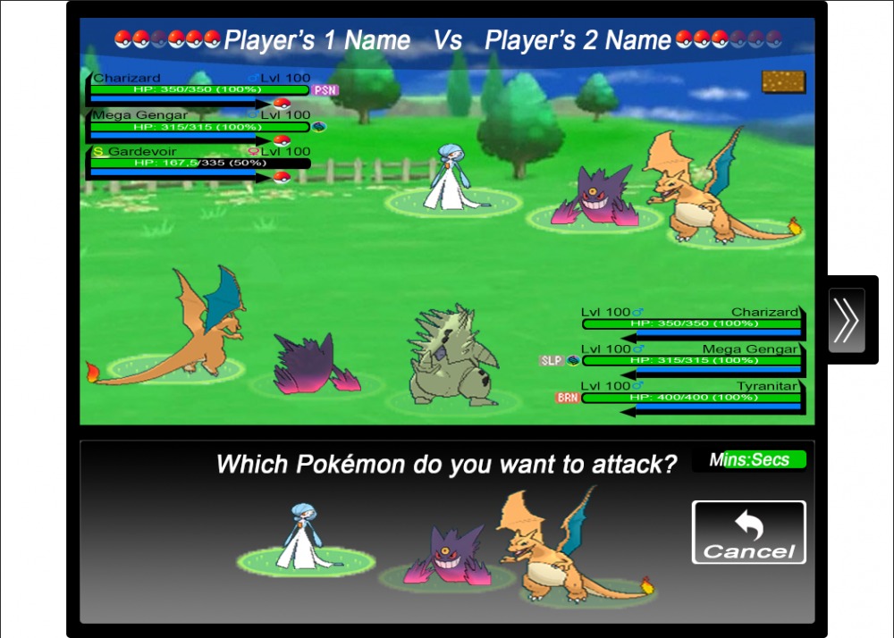
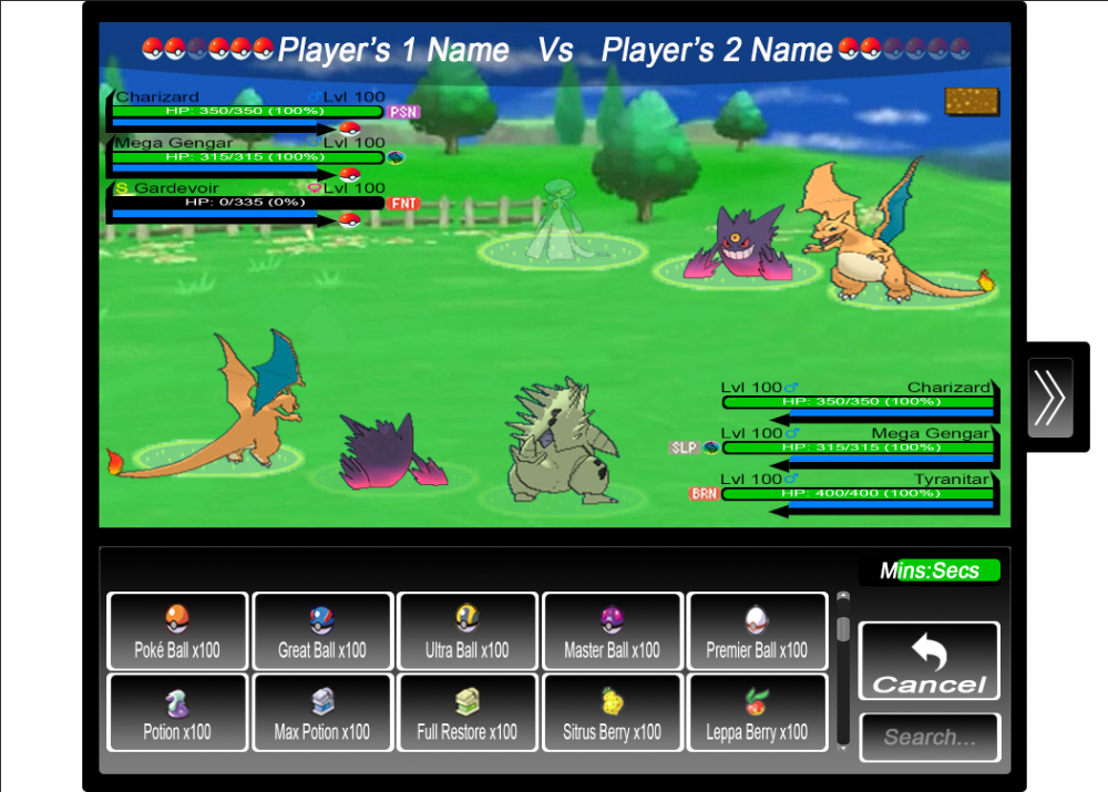
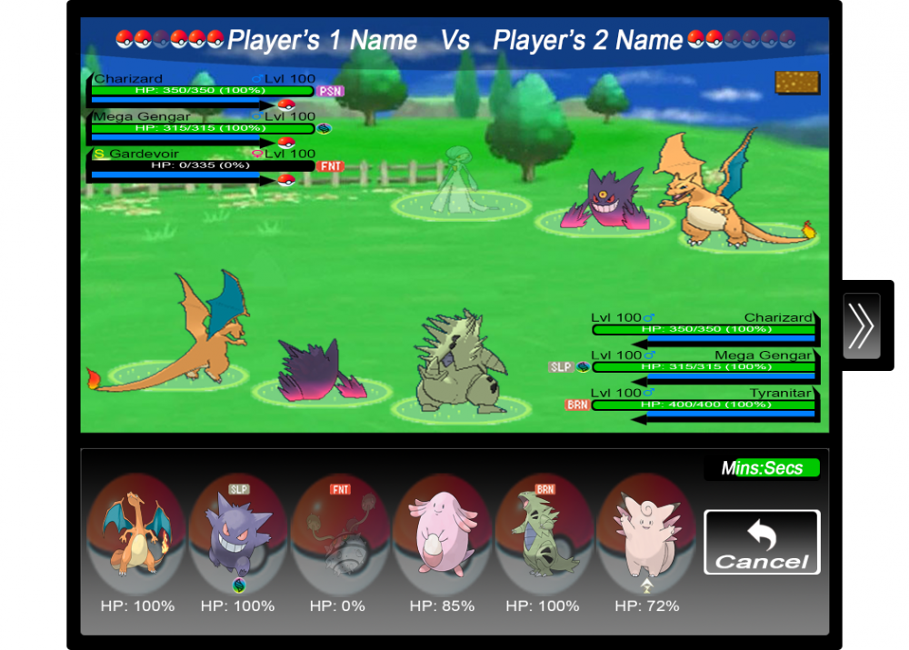
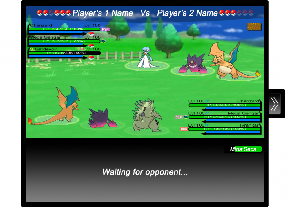
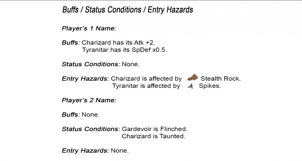
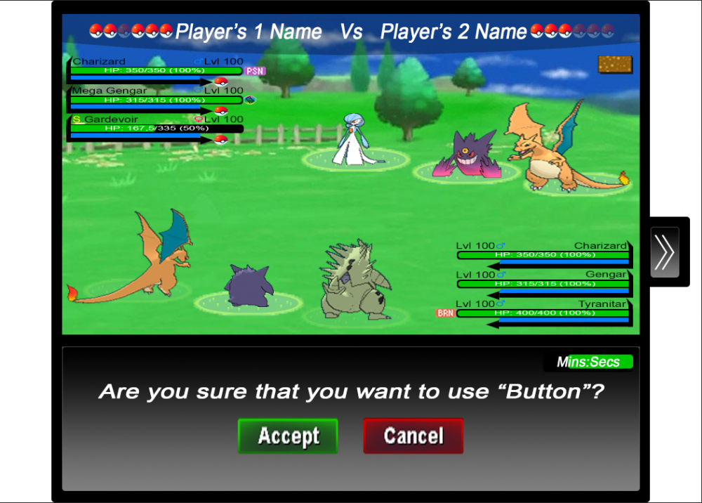
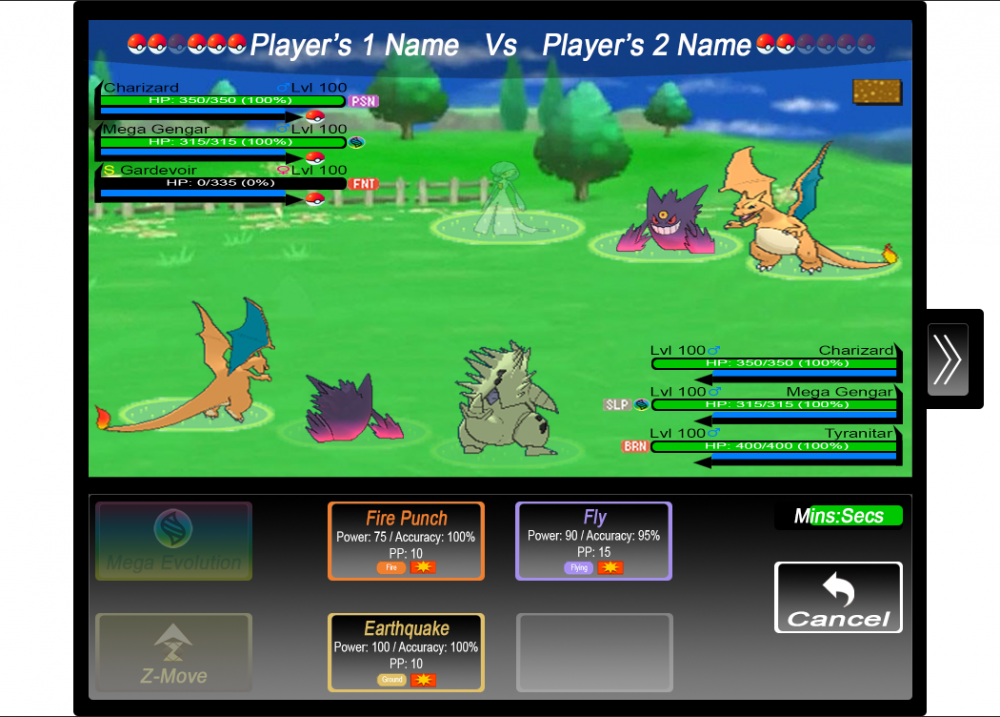
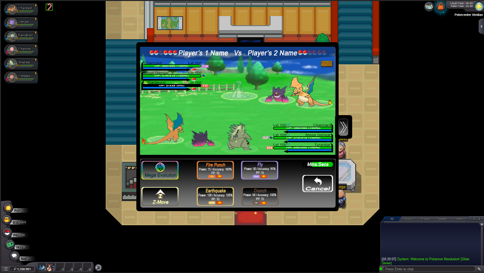
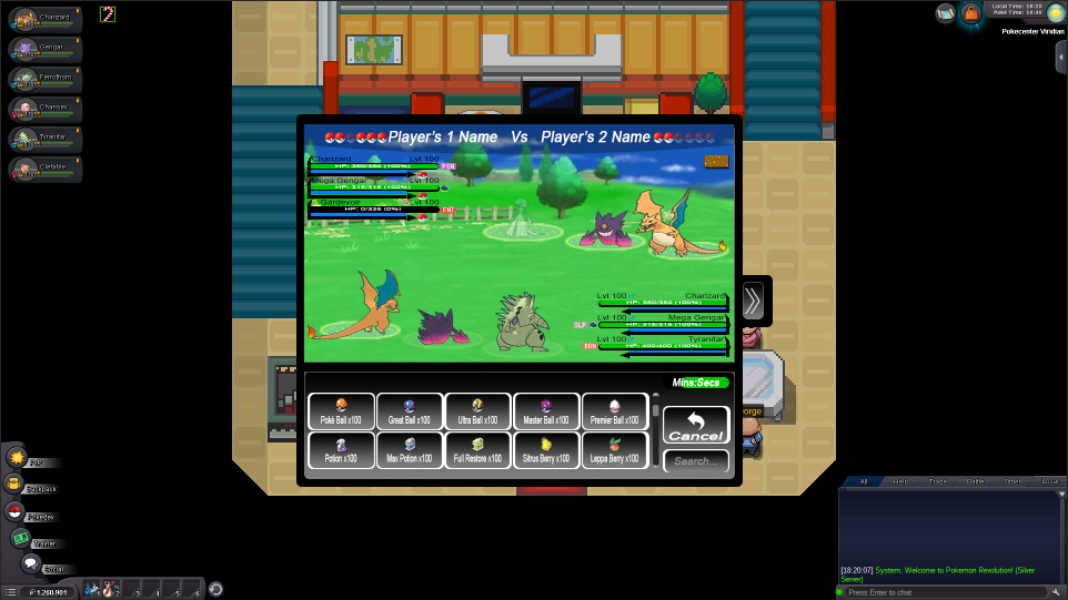
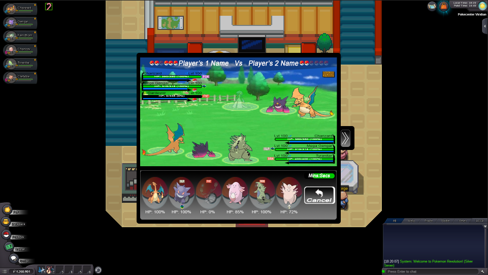
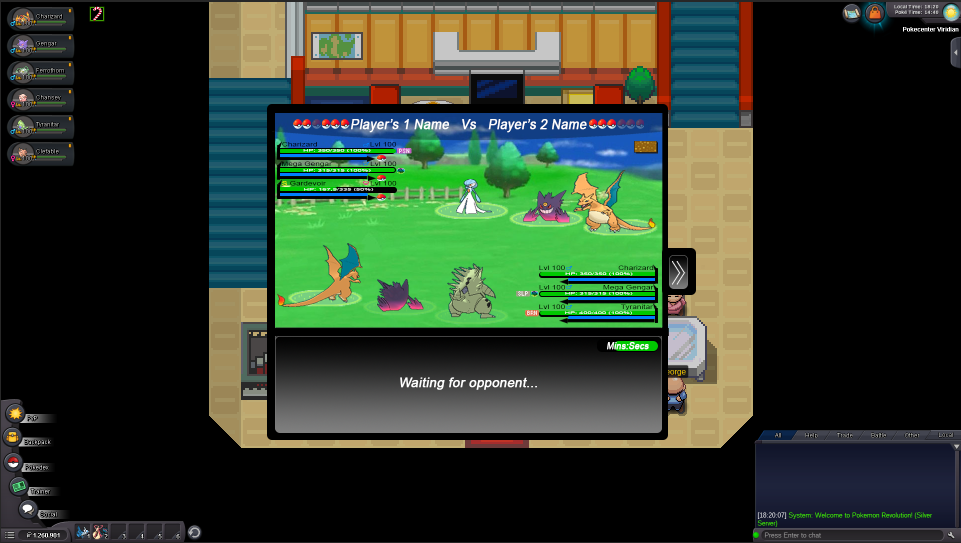
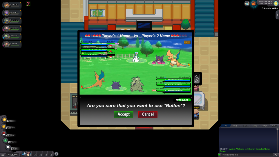
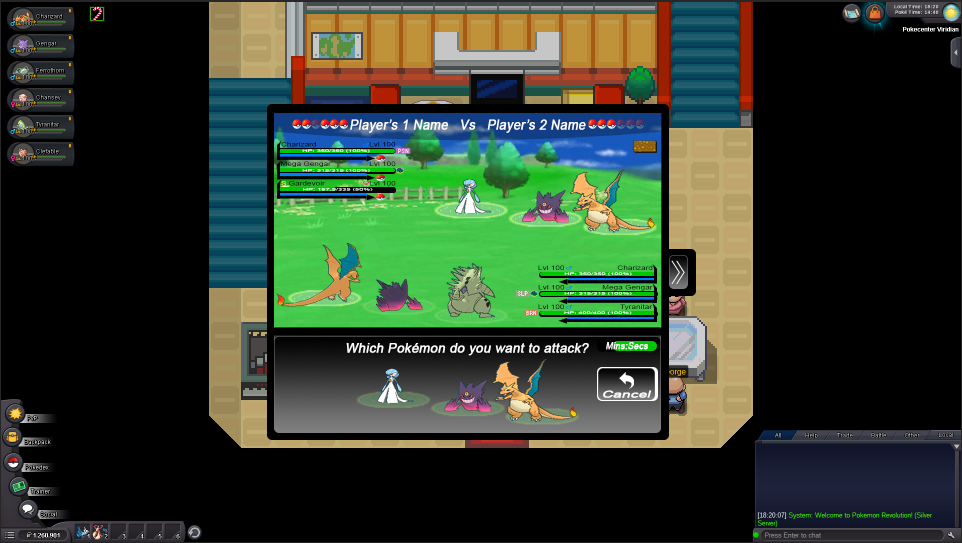
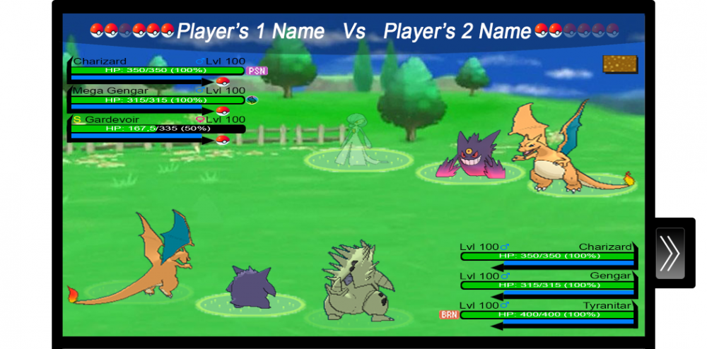
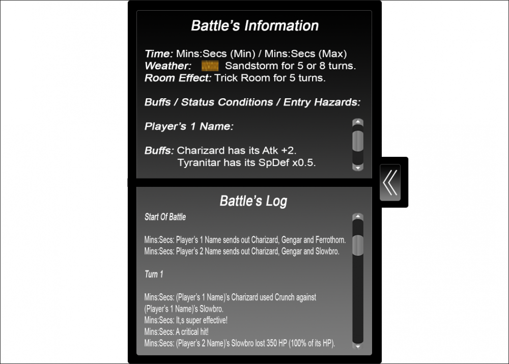
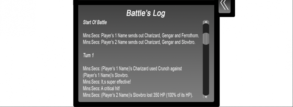
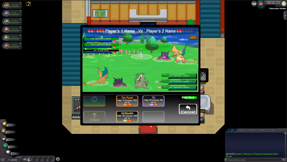
Hello everyone! This is my work for the Battle UI Rework and I hope that you will like it. First of all I want to apologize for the big upcoming post. I have made a completely new Battle UI as you will see below and I have made a lot of changes compared with the current Battle UI and I think that these changes could help a lot everyone. Also, I'm thinking that this Battle UI shouldn't be used only for PvP and it could work as well at normal battles with wild Pokémon, NPCs, Bosses, etc. I will explain every thought that I had above each image, while I was working on this Battle UI, even the obvious things, in order to avoid leaving any possible questions unanswered. So let's begin! Generall Idea: My idea was to create a Battle UI a bit similar to Pokémon's 3rd-5th Generation video games. Then I thought that it would be completely different with the current Battle UI and people either wouldn't like it at all or they couldn't get used to it and to enjoy it. So I tried to combined them a bit, if anyone can say so. Also, I made bigger buttons, in order to help mobile users, as I know that a lot of people use the Android version of the game and they keep complaining that the buttons are too small and they missclick a lot. I play the game in my PC, but I have played a bit in my mobile phone, too and the buttons where a bit small and in my opinion they weren't practical. The buttons where a bit small to me, not only in the fight, but generally in the game and imagine that my mobile phone has a screen of 5,5 inches. Ok, it's a game in the phone and no one expects to have big buttons, but they should be a bit bigger than they are now. I wanted my Battle UI to have big buttons enough, to be clear and distinct, to be understandable, and to have as much space as it can be between everything, that appears in it. Here is a first look at my work... Main Menu: This is how the Battle UI's main menu would look like, when we are in the start of the fight. You can see that there is a countdown in the right bottom corner near the "Run" button. This is like the countdown that the current PvP Battle UI has, but this one that I used, shows the minutes and the seconds that have left for our move. In my opinion this is better than just showing a bar that ends as the time passes. I placed it down in the menu section, because in my opinion our eyes will mostly check in this section, as we have to choose an action that we want to do, to use the move, the item and the Pokémon that we want and I think that it's the best place there in order to check it easier and not to check the one moment in the menu section and the other at the top, where it is right now in the current Battle UI. This countdown is the same for us and for our opponent. Also, I have made two references in the anime, in the main buttons with Red's bag appearing in the "Bag" button and Ash appearing in the "Run" button, where he runs to escape from the fight. I hope that there is no problem with copyrights as I found these pictures in Google. So the fight starts... Fight Menu: When someone presses the "Fight" button, this menu appears, where it contains the moveset of the first Pokémon of his/her squad, the "Mega Evolution" and "Z-Move" buttons, again the countdown in the same position as it was in the main menu and a "Cancel" button, which if it is pressed, we go back to the main manu. About the moves, the first move is Flamethrower, the second is Fly, the third is Earthquake and the fourth is Crunch. The moves have all the information that someone needs. They have the type's name in order to be recognizable easily, in case that someone doesn't remember the move's type and also the have an outline of type's color just for looking cool. They have the power's, accuracy's, PP's and category's information, too. If we hover over the moves, it should appear a window with the move's description. The buttons for Mega Evolution and Z-Move can't be pressed if a Pokémon doesn't hold a Mega Stone or a Z-Crystal, respectively, or if it is Mega Evolved and these buttons should be like this: Also, if a Pokémon doesn't know four moves and for example it knows only three, the last of its moves should be like this: Here, is a better example: In 2v2 or 3v3 battles, we have to choose in which Pokémon we want to use our moves. So, I thought something like this... This appears in the menu section when we have chosen a move to use against our opponent's Pokémon, but we haven't chosen which Pokémon we want to attack. As you see the terrain of each Pokémon is transparent. When we hover our cursor over the Pokémon, that we want to attack, that Pokémon's terrain will not be transparent anymore and it will be as it is in the battle screen. This indicates which Pokémon we are about to attack. Now if we press that Pokémon, the selected move will be used against it. As you see the rest Pokémon's terrains are transparent, because our cursor isn't above them. So now we are ready to use a move against opponent's Gardevoir and if we press Gardevoir, our selected move will be used against it. Now, let's press the "Cancel" button and then the "Bag" button to check our bag... Bag Menu: Here as you can see the bag menu contains all of our Poké Ball and our medicines. I would like that all of these items, to be in alphabetical order. In this picture the first item in our bag is Poké Ball, the second is Great Ball, the third is Ultra Ball and so on, and in the below line the Potion is the sixth item, the Max Potion is the seventh item and so on. If we hover over the items, it should appear a window with the item's description. Near the items, there is a scroll down bar with arrows on its edges, in case that someone wants to use them to scroll down. Again there is the "Cancel" button and the countdown and there is a "Search" section, where we can type as many letters we want in order to find the item that we want, in case we have a lot of items in our bag. For example, if someone types "Premi", the Premier Ball should appear if he/she has any. Also, I would like to share an idea about finding an item. An item should appear even though when someone types its letters with not the correct order. For example, if someone types "abll" in the "Search" section, all the items that have the letters "a", "b", "l" and "l" in their names should appear, regardless of their order in the item's name. This should be implemented in the Pokémon storage too, while some people doesn't know how to type correctly a Pokémon's name and they have to find it among all of the Pokémon that he/she has. Also, in the Pokémon storage should be implemented that you can type "." (dot) or " " (space), because for example you can't find Mime Jr., unless you search it among all of your Pokémon. Also, we have to know which Pokémon we are using, while we search our items in our bag. This can be shown by the terrain of that Pokémon. If it isn't transparent, then it is the Pokémon that we are using right now and for example we can give it a Max Potion, if it needs it. Let's press the "Cancel" button again and now let's press the "Pokémon" button to check our Pokémon... Pokémon Menu: As you can see here we have again the countdown and the "Cancel" button. Except these we have our Pokémon squad with the very left Pokémon to be the first of our squad and the very right Pokémon to be the sixth of our squad. Furthermore, a fainted Pokémon should be transparent as this Ferrothorn with the "fainted" status above its head, too. Here, there are some status conditions above each affected Pokémon's head and below of the Pokémon that is Mega Evolved or it has used a Z-Move, there is the Mega Evolution's symbol and it shows which Pokémon we have Mega Evolved in this fight and the Z-Move's symbol and it shows which Pokémon used a Z-Move in this fight, respectively. Also, here we can check each of our Pokémon's HP. Now that the explanation of each menu has ended, let's explain what we see in the batle screen... Battle Screen: I am thinking that when the fight is about to start, the battle screen that shows the Pokémon, the HP/Level bars and the backgrounds fade in, then the first Pokémon with its HP/Level bar appears (first two for 2v2 or first three for 3v3) and after that we can make any action that we want. The Pokémon that appear in the fight at first, are our first three Pokémon. As you can see in the image we have Charizard, Mega Gengar and Tyranitar. Charizard is the first Pokémon in our squad, Mega Gengar is the second and Tyranitar is the third one, that was sent out in the place of a fainted Ferrothorn. Our opponent's first Pokémon is Charizard, the second Pokémon is Mega Gengar and the third one is Gardevoir. In addition, you can see that our third Poké Ball at the top, to the left of our name is transparent and that is because our third Pokémon fainted (Ferrothorn) and in its place we sent out Tyranitar. So, the very left Poké Ball is our first Poké Ball and the very right is our sixth Poké Ball. For our opponent, the very left Poké Ball is his/her first Poké Ball and the very right is his/her sixth Poké Ball. I did it this way, cause I think it helps a lot, as it's like reading a text. Also, if a trainer doesn't have a Pokémon to send out in the place of a fainted Pokémon, the fainted Pokémon should be transparent like Gardevoir in the image above. In case, that we battle for example, a swarm of Ariados (2v2 or 3v3 battle), then the fainted Pokémon would be transparent like the Gardevoir in the image above, or it would be removed from the field. I didn't design a 2v2 battle, because it's the same with a 3v3 battle. Moreover, the status conditions, Mega Evolution's symbol and Z-Move's symbol should be near each Pokémon's name in order to know which Pokémon has a status condition, or it is Mega Evolved or it has used a Z-Move. By the way, the order of the status condition and the Mega Evolution's or the Z-Move's symbol should be like this: First Gengar has been Mega Evolved and after that Gengar fall asleep. So, the symbol that is nearest to each Pokémon's name is the one that happened first. Also, the name of each Mega Evolved Pokémon should be changed to the mega one, such as "Gengar" to be changed to "Mega Gengar". I think that it would be perfect, if there would be an indication of how much HP does a Pokémon have, like "HP: 284/350". This helps us knowing how much damage deals, a move from our opponent's Pokémon to a specific Pokémon of our squad. With this change if we take damage from a certain opponent's Pokémon move, then we may know how much the same move will deal the next time the same two Pokémon fight again, unless there were stats or something that changed the move's power. Now you can see that appears the weather's symbol in the battle screen, which in this case is Sandstorm's symbol. Something else about battle screen, is that we have to know which Pokémon we use each time. We can understand it from the terrain below of each Pokémon. The unselected Pokémon's terrain is transparent and it shows us that we don't use that Pokémon and we use the one that its terrain isn't transparent. We really don't care which Pokémon our opponent is using each time and that's why there isn't any transparent terrain below of his/her Pokémon. We check at the Battle's Log, which Pokémon he/she uses. Also, if we own a Pokémon that our opponent owns, too, a Poké Ball should be appear near the Level Bar and if we don't own it, then that place should be blank. If a trainer doesn't have complete squad (six Pokémon), then his/her squad near his/her name, should be like this: As you see there are five Poké Balls in the Player's 2 squad, instead of six, as he/she doesn't have complete squad. Now what is going on when our opponent's turn arrives? Waiting For Opponent: This message appears, when the opponent's turn arrives. And when our opponent makes his/her move this message disappeares and we are redirected to the main menu, where we are ready to make our next move. Something else that you may have noticed, is that I don't have the battle's information about the weather's/trick room's turns, the buffs, some status conditions such as "flinched", the entry hazards and some kind of battle log. This is why it is hidden and it is revealed with this button: It is hidden, because it may covers enough space and this can be annoying. If someone presses it, it opens and it is like this: Now let's discuss a bit about this window... Battle's Information/Buffs, Status Conditions and Entry Hazards/Battle's Log: Here as you can see there are all the information about the battle such as the time that counts down (I wanted to place it in this section, too, because someone might be busy, while he/she tries to find something in this window and he/she didn't look at the countdown that there is in the main menu, in the fight menu, in the bag menu and in the Pokémon menu), the weather and the room effects and how many turns have passed. If there isn't any weather or any room effect in the field, then in the place of weather and room effect, should appear this: "Weather: None." and "Room Effect: None.". Also, here there is a buffs/status conditions/entry hazards section with a scroll down bar, where it shows for each player his/her Pokémon's buffs/status conditions (if there is any) and if any of his/her Pokémon is affected by any entry hazard. Furthermore, there is a battle's log, in which we can see everything that took place in this fight. Check the examples of battle's information, of buffs/status conditions/entry hazards and of battle's log: Time shows how much time has left for our move and also there are how many turns have passed from the weather and room effects. Here we see the buffs, the status conditions and the entry hazards that affect each Pokémon. In status conditions's section there should be only the status conditions that don't have a specific symbol, in order to be recognizable such as "Sleep" that has this symbol: So in this section there should be only the status conditions like "Taunted", "Flinched", etc. and not the major status conditions such as "Burned", "Frozen", etc. The major status conditions are shown in the battle screen and we can recognize them easily. Namely, there should be only status conditions that affect mobility like "Wrapped", that affect move execution or move effects like "Confused", the move-based status conditions like "Dig", the shield status conditions like "Reflect", the sword status conditions like "Focus Energy", those status conditions that affect the use of items like "Embargo", the HP-related status condtions like "Leech Seed", the visibility-related status conditions like "Miracle Eye" and finally the miscellaneous status conditions like "Gastro Acid". Also, among these status conditions there should be only one sleep-related status condition like "Sleepless". In the entry hazard's section we see that there is an entry hazard with its symbol, that affects each Pokémon. Let's check a better example of how this section is: And now we check the last section of this window... Now we have a Battle's Log with a scroll down bar, where there is what exactly and when happened in this fight from start to finish. The "Mins:Secs" indicates the real-life time. For example, if we started a fight at 16:57, in the start of the fight there should be this time (16:57). I didn't know if you wanted to check some new sentences and that's why I sticked to some classic sentences and I added some new things that the current battle log doesn't have. I think that you may wanted to see a place for battle log and not some kind of battle log with some sentences of mine, but if you want something like this I can work on it. Now what happens if someone missclicks an action and wants to correct this mistake? I think that this can be very helpful... This question should be appeared after every action that we take, because a lot of people have missclicked a button or they have regreted about their choice of a move/item/switch Pokémon. I think that this will be very helpful to all of us. But this can also make the game very slow, so I recommend to use it only in "Mega Evolution" and "Z-Move" buttons that can be used only once per battle. So if we wanted to mega evolve Gengar to Mega Gengar, then that message should appear. Now I will show you how the Battle UI would look in game... So this is my Battle UI! I hope that you like it. I did my best in order to give you a Battle UI that everyone will enjoy!. I think that I haven't forgot anything and that I have covered everything about the Battle UI rework. If there is something that you don't understand, feel free to ask me. Also, in case that my Battle UI is chosen, if the developers want to know anything about my work such as my sources, the dimensions of the objects or more, of course you can ask me. Of course I can design some backgrounds for the battle screen, add some items that the game doesn't have right now, such as the rest Poké Balls and more! If you want anything, like I said before, don't hesitate to contact with me. I hope that the stuff will love it and the developers will not have problem to materialize it! Credits go to Bulbapedia, because I used a lot of stuff from there and of course to Google!1 point







(1).thumb.png.cc601e8b7ac8ea3a34e8aac1770e0b24.png)
