Leaderboard
Popular Content
Showing content with the highest reputation on 01/10/19 in all areas
-
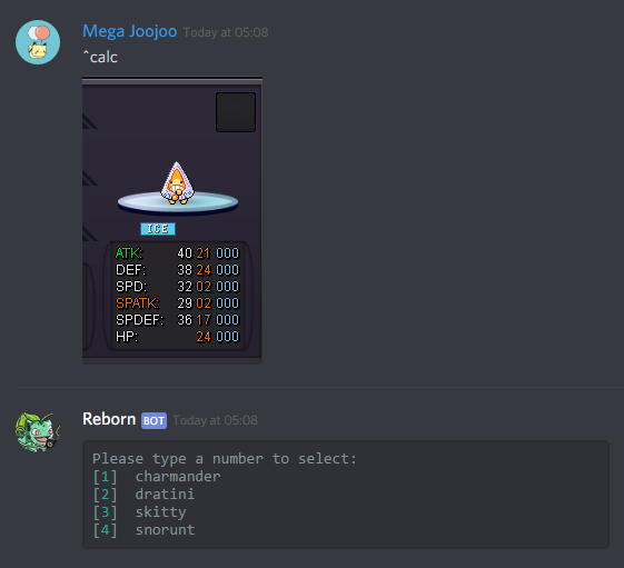
It's Christmas time everyone! One of the most beautiful time of the year. As some of you guys know I've returned back to PRO recently and wanted to thank all of our Chaos members for waiting me for a long time. In return, I've decided to host a hunt event. Since, there will be a big change over the weekend (from Friday 00:00 to Sunday 23:59 GMT) on the spawn rate of Xmas themed pokemon, we will be hunting Xmas pokemon. This event will be valid for Chaos members only and the prizes for the event was donated by @imhanjoo. Special thanks to all the artists who made the Xmas themed pokemon and the ones @Cames @buyshinynair @Kaminokage @Justyuno @CyBeR54 who have helped me open this event. Let's see who is the luckiest hunter in Chaos !! Have fun guys :3 1. Using any kind of automation software, haking or editing the PRO game/client is prohibited. 2. Only pokemon that was caught after the event started will be accepted (ID will be checked). 3. The submitted pokemon needs to have your OT. 4. The event will be held in Chaos discord (No register needed). [ Tier 1 ] [ Tier 2 ] [ Tier 3 ] [ Tier 4 ] [ Tier 5 ] [ Tier 6 ] [ Tier 7] [ Tier 8 ] [ Tier 9 ] [ First Place ] 3x Coin Capsule + 1x 30-Days Membership [ Second Place ] 2x Coin Capsule + 1x 15-Days Membership [ Third Place ] 1x Coin Capsule + 1x Black Membership [ Fourth Place ] 1x 15-Days Membership + 1x Black Membership [ Additional Prize ] The most talkative and helpful member will receive 1x Coin Capsule as a reward (The more you talk in discord, the more chance of winning this reward). For this event, only Xmas themed pokemon will be accepted. Calculating the points of each pokemon will be easy. Both nature and ability will not be valued as points. Only the ivs and encounter rarity will be valued. The total points of each pokemon will be calculated as <Total ivs + Encounter Rarity Gain>. The encounter rarity gain is given minimum of 0 and up to maximum of 120, based on the encounter rate of the pokemon. [ Encounter Rarity Gain Table ] Our discord bot can calculate your points, if you write ^calc and post a picture of the pokemon! The event starts on January 11th 00:00 AM GMT+0 and ends on January 13th 23:59 PM GMT+0 !! Chaos Xmas Hunt Event Cooldown3 points
-
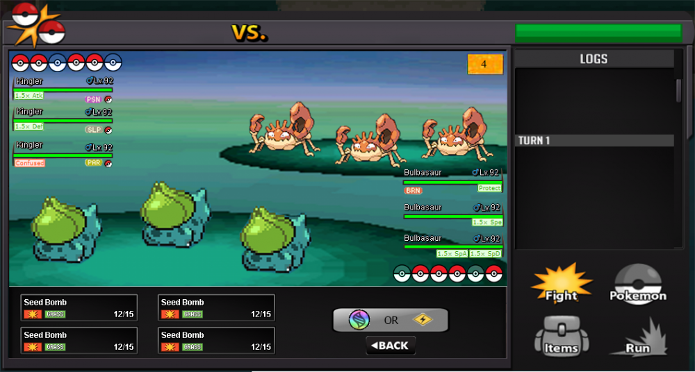
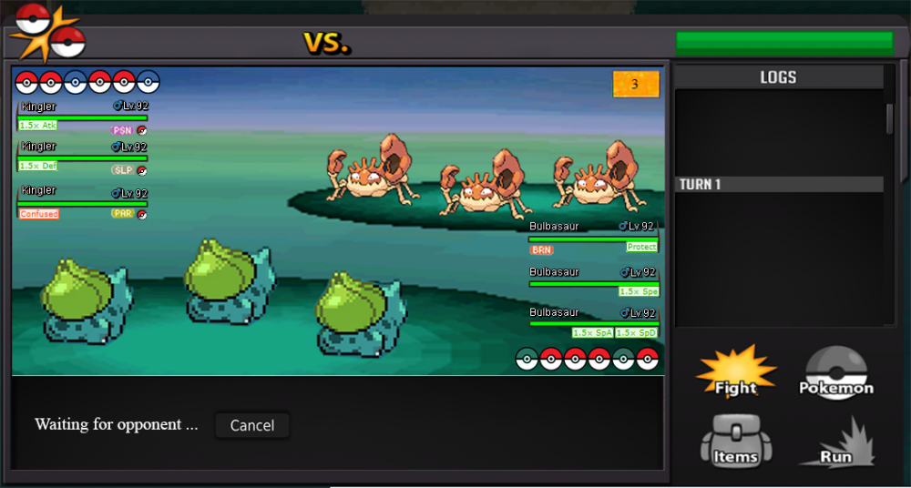
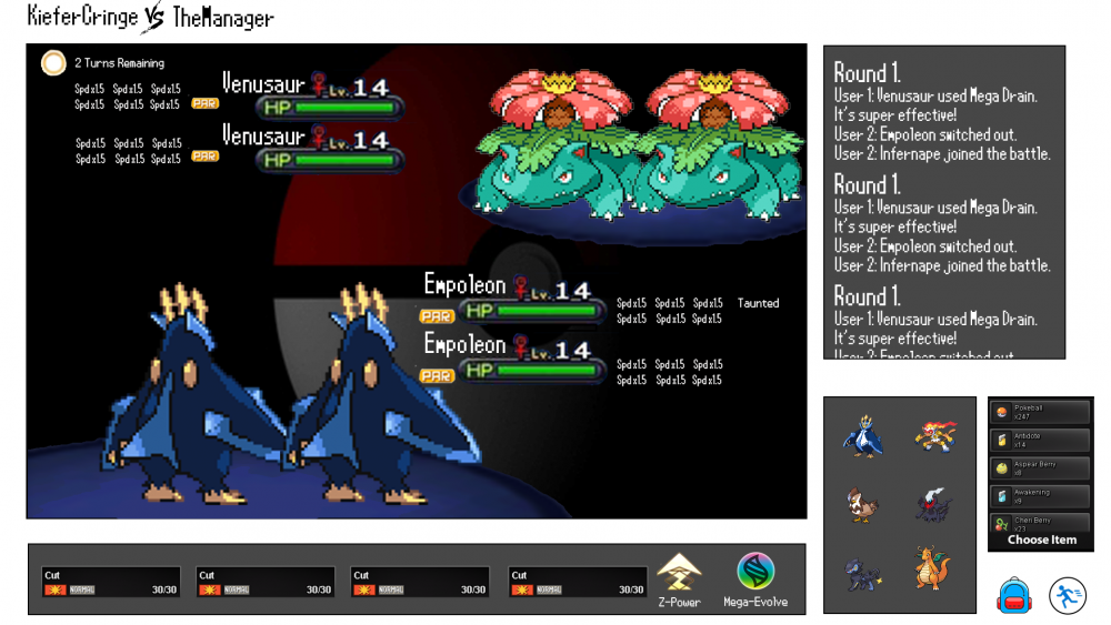
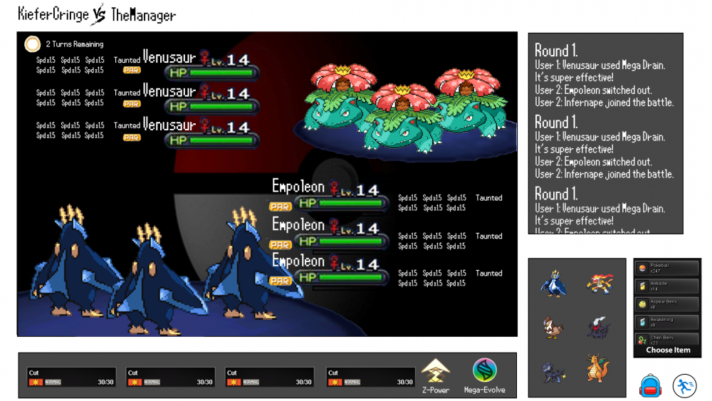
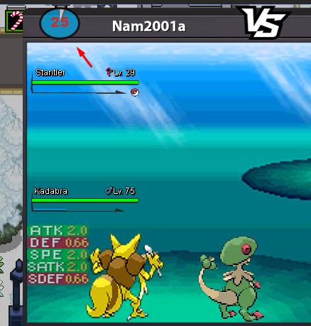
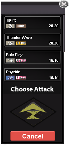
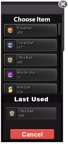
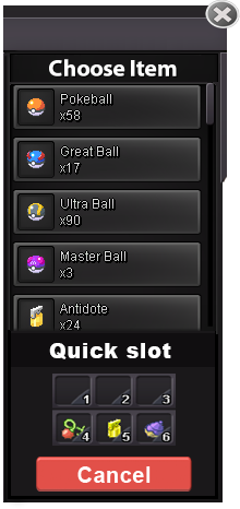
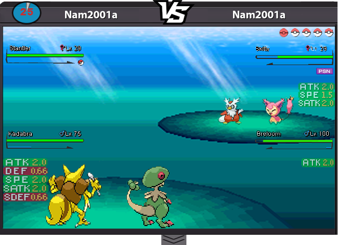
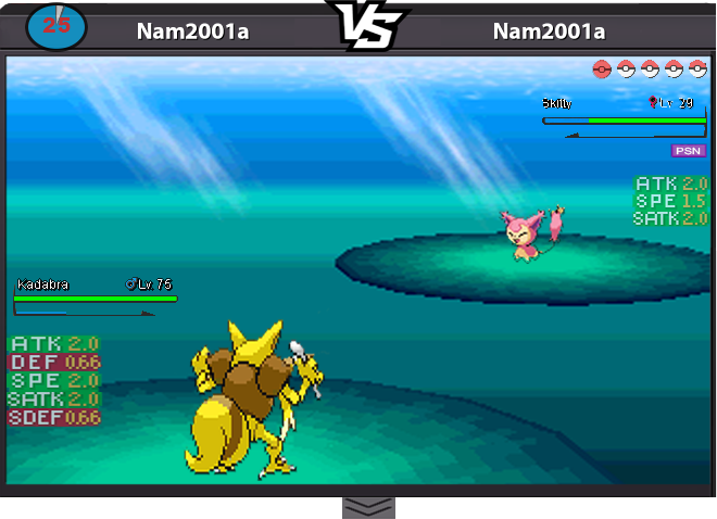
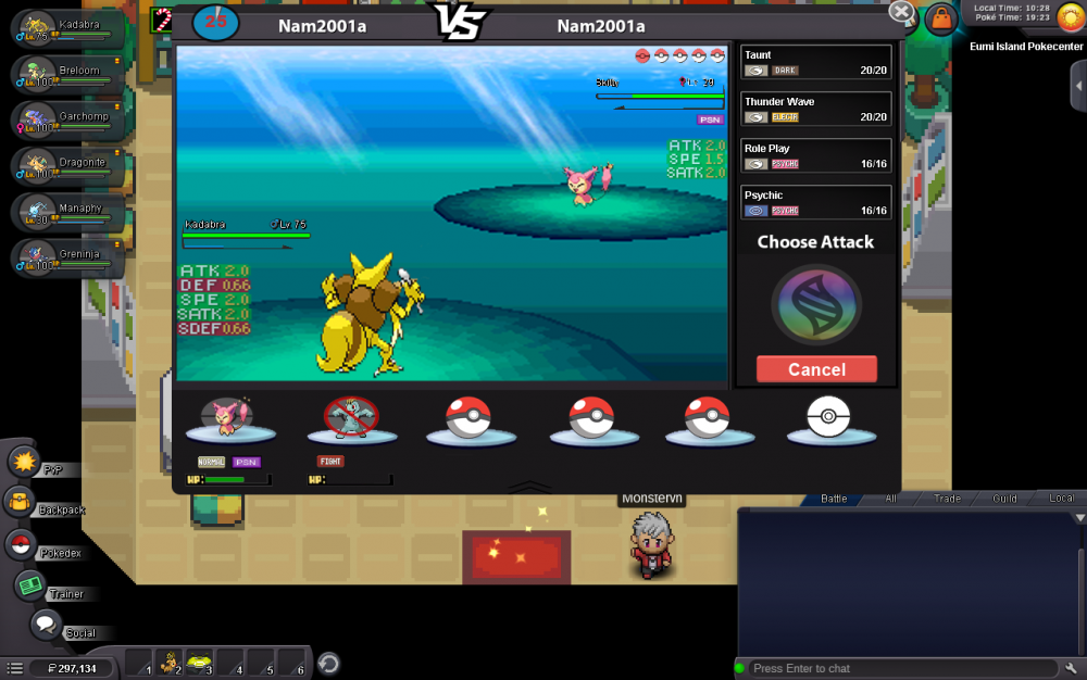
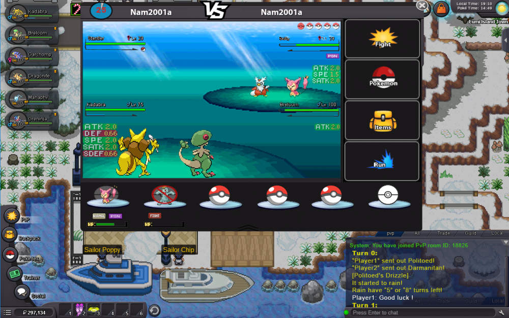
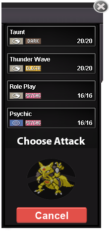
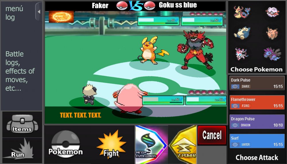
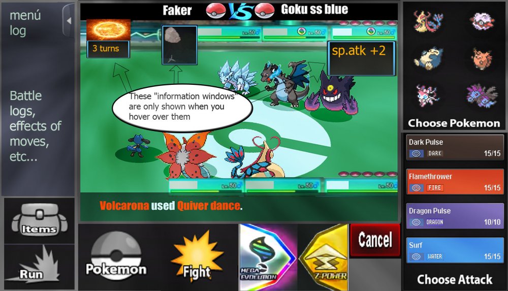
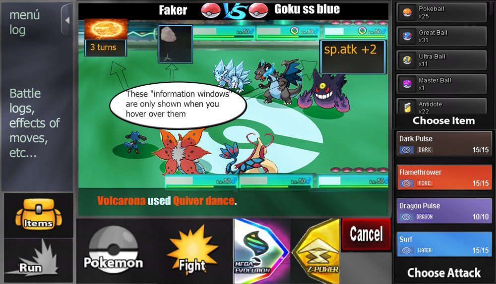
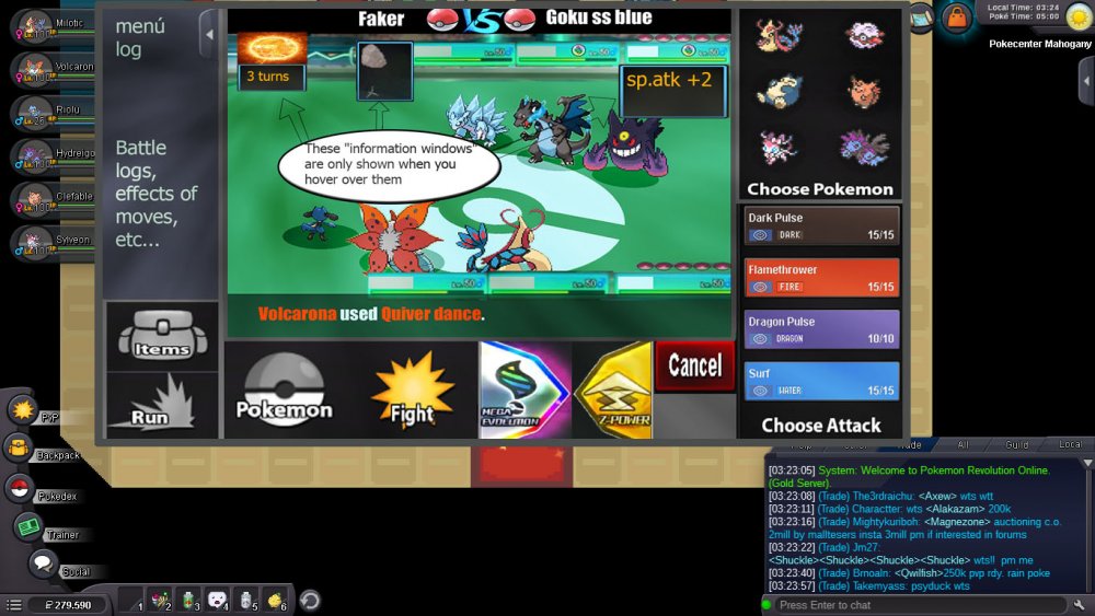
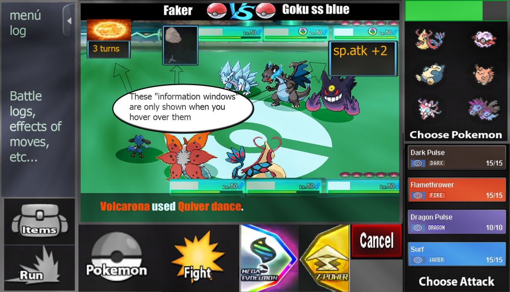
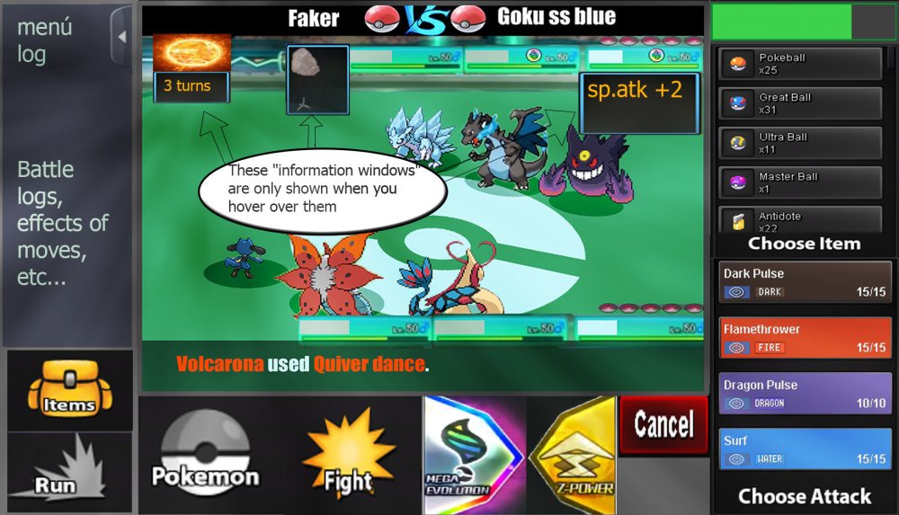
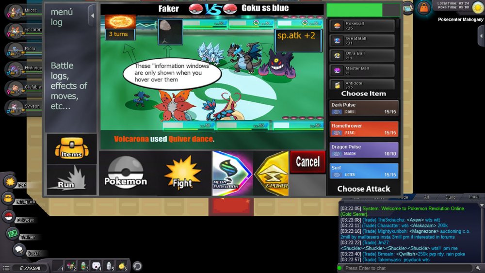
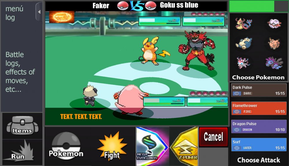
Hey everyone ^^, I created a Battle UI and im very proud x) since im kinda new to Photoshop and i spend a lot of time creating this :D. I created a completely new Design but tried to stay as true to the classic design as possible . Sooo i hope U will like it ^^ First Picture shows the Countdown/Timer for the Round (necessary for pvp) 1. Battle LOG I placed the Battle LOG on the left because i think this is the best way and looks nice. in think the battle log should be able to fade in and out so i created a button for it. (Random Text xD as Example) 10/11. Scroll Buttons for Battle Log 2. The Weather should be on the top (seems logic for me xD) A little Icon that shows how many turns left. 3. Field Status My Idea is it to show field status only if u want to. So I created a Button for each Side where u can fade in all Informations. (2nd Picture) 4. Title, Names etc. Here is written what is happening in the moment. For Example: If u Select the Pokemon Button it says"choose" or if u choose Fight in 3v3 Battle it tell u the name of the chosen Pokemon. 5. Buttons Here we have the classic Buttons wich are colored if u choose/hover them. (redesigned :D ) 6.Cancel Button I placed it like this because i think it should be near to the other buttons. 7. Mega & Z- Buttons These Buttons should be gray until they are usable, then they should be highlighted. 8. Boosts and Effects should stay classic at the HP bar of the Pokemon. Big thx to Kad1r and Chroxler (I want to mention Obviously on the Top right Box u have the option to select Pokemon, Attack, Items etc...) =)3 points
-
Hiya, your local gay here!! I already have about 70 hours in-game, so I wouldn't call myself ''new'', but I'm new to the forum and probably none of you will know me, so... hi. I'm just a 16 year old teen, not quite a gamer anymore, just here to relive my old pokemon adventures from his Nintendo DS on here with all of you! :) HUGE American Horror Story fan (Just saying) Add me on discord if you... idk wanna play together or whatever: Shidoni#3898 Thank you, next.2 points
-
You can have up to 900 Pokemon total, in your party and in your box. If you try to catch more pokemon it won't allow you to throw pokeballs. It is possible to fill 60 boxes in the PC, bearing in mind that you have to add the Pokemon in your party. You can check the number of Pokemon in the Trainer card, below the pokedex icon.2 points
-
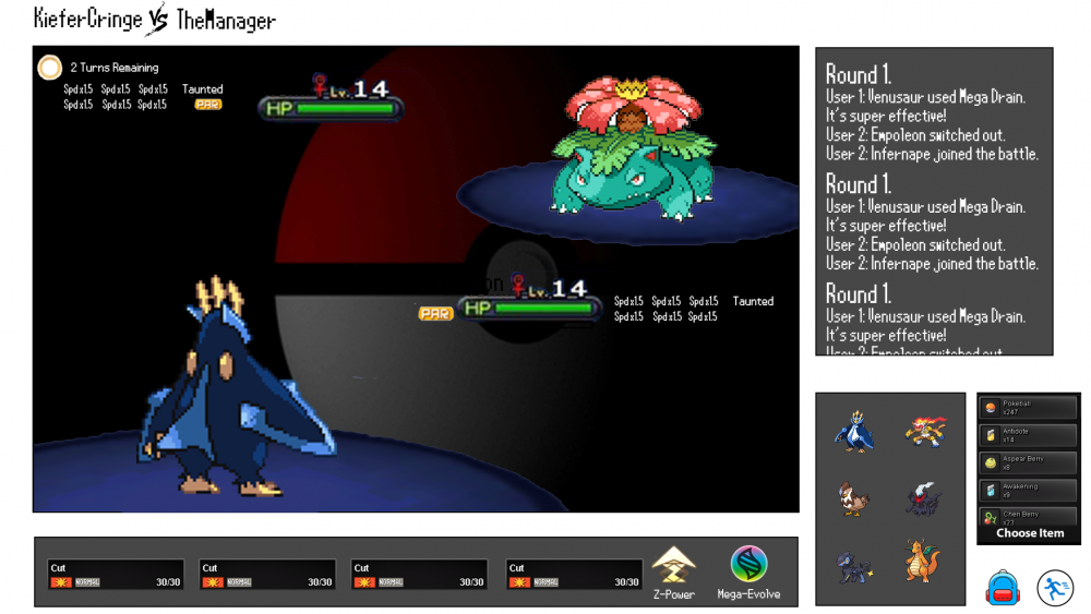
In near future there will be a significant PVP update. My full concentration is set on this right now, which is why there will probably less updates in the next time. For this PRO needs a new Battle UI, because the current one is missing a few features. There are already staff members who work on it, but as their specialty lies in other areas, I want to give everyone the possibility to participate. That's why I make a small event out of it. Everyone is allowed to create a new Battle UI and the Battle UI that will be taken over will be royally rewarded. The one gets a non-tradable shiny of your choice. The nature can be chosen, the IVs and ability will be generated randomly. The Pokemon must be catchable by everyone. The following things have to be added in the new Battle UI: - Enough space for 2v2 and 3v3 fights. - Buttons for Megas, Z-Moves and Cancel a move. - Some kind of battle log should be included as well. - Every current element (items, run away, moves, switch Pokemon) should be included obviously. - An option to show boost and effects (SPD x 1,5, Paralyzed, Taunted etc.) would be great. - Weather and room effects as well as their turn count. You do not have to stick to the current design. You can change it completely, even make it full screen mode. That is completely up to you. Please note, that if we take non of the submitted designs, there will be no winner at all. You have 30 days (Janurary 15th, 11:59 PM GMT+0) to submit a battle UI. The time might be extended if there's no usable design till then. This post will be unlocked in 2 weeks on December 30th, please post your battle UIs in here. Do not make any unrelated posts here. Please only post the final UI in here. The winner has to submit the final design, all UI elements and has to give PRO the permission to use it. Good luck to every participant.1 point
-
When you open up your pokedex and click any pokemon, the "base stats" visual is bugged it's very very light grey and no longer green.1 point
-
I just buy SLudge bomb from Nikker11 with 30k and when i try to learn it. Sever just disconect me :( help me pls1 point
-
Hello due to the boss revamp I'm posting here the info i can collect: KOICHI: Hard Mode LUCARIO - Life Orb Moveset: Focus Blast Dark Pulse - - HITMONCHAN - Focus Sash Ice Punch - - - Hitmontop - Stone Edge - - - Hitmonlee - Knock Off - - - Gallade - Zen Headbutt - - - Pangoro - - - - Rewards: 36840 pokedollars, 4 PVE coins, Riolu1 point
-
1 point
-
Changelog 10.1.2019 The following bosses have been reworked: - Lorelei - Erika - Chuck - Koichi - Oak - Elm This rework encompasses several things: 1. The bosses are now scripted in Python, meaning new variables. This means that any prior win streaks and cooldowns have been reset. 2. Because of this, the cooldown checkers in each region also do not work for these bosses, for the time being. 3. The bosses are now restricted to level 100 Pokemon. 4. To mitigate this drop in difficulty, three different selectable difficulty levels are available: Easy, Medium, and Hard. - On Easy, bosses have no EVs and no hold items., as well as a weakened moveset. Consecutive win rewards are also not available. - On Medium, bosses have 252 EVs in each stat and hold items. This should be about as difficult as bosses are currently. - On Hard, bosses have 400 EVs in each stat and hold items. Furthermore, the player is not allowed to use in-battle items such as Revives. 5. The bosses' teams have also been reworked. Reborn bot is no longer accurate for these bosses. 6. Crashing during these specific bosses' battles only should no longer start the cooldown! Python knows the difference between a disconnect and a crash. Don't try to abuse this, you'll get put on cooldown and be a sad puppy. 7. Boss rewards have also been reworked, but the impact of this should primarily be more useful consumables and less TMs. 8. As always, if any bugs managed to sneak their way onto live server, please report them promptly so I don't get fired. Thanks! 9. Hour requirements are gone. 10. The requirement that you only have level 100s on your team is also gone. All bosses require now is to be champion of its respective region. - Nikola updated to also not start cooldown on crash.1 point
-
1 point
-
Hey @LukeUnique, I can recommend one of these guilds to form an alliance. Good luck https://pokemonrevolution.net/forum...-international-guild-raiders-alliance.116747/ kings regards SchattenDialga1 point
-
As i cannot provide further support, i will now close the thread. If you have any further questions, please don't hesitate to ask. Please stay tuned on our OFFICIAL PRO DISCORD for further announcements. Have a wonderful day !1 point
-
I'm really happy to see that your issue has been solved. If you have any further questions, please don't hesitate to ask. With that said, i will now lock the thread. Have a wonderful day !1 point
-
I'm really happy to see that your issue has been solved. If you have any further questions, please don't hesitate to ask. With that said, i will now lock the thread. Have a wonderful day !1 point
-
Check out our guild Chaos. The link of our guild thread is below my signiture.1 point
-
1 point
-
You have a lot of good mons to offer here, but I would highly recommend looking over your prices. I saw the conkeldurr and immediately spit water in laughter for instance.1 point
-
) hi drralts38 on the game Pro caught a togetic in sendoff spring and the player has logged in to find they haven't got it the player caught it yesturday1 point
-
Hello there, @Chitz In order to get your Geodude recovered, you need to make post in our RESTORE POKEMON MEGATHREAD , following the instructions given at the first post of the Megathread. I will now lock this thread, as you should post in the link I provided you with above, to get your Pokemon restored. Hope you have a good day!1 point
-
1 point
-
Hi @NeetishVerma05 ! I'm sorry for the inconvenience. I would like to inform you that your Togepi doesn't require a de-leveling to be able to evolve into Togekiss. Togepi evolves into Togetic when leveled up with 255 of friendship, therefore you can level it up from 99 to 100 making sure that it has 255 of friendsip by using the command /happy 1-6 After that, Togetic evolves into Togekiss when exposed to a Shiny Stone that you can obtain in the following ways: -Quoting our ITEM GUIDE- Also, it may held by some wild Pokémon with 8% chances: #Pokemon Map Area Daytime Rarity MS Level Togepi Love Island Land N Tier 8 No 18-21 Togepi Route 34 Land M/D/N Tier 8 Yes 11-15 Also, in the future, please use the EVOLUTION & DELEVELING REQUEST MEGATHREAD if you would like to request our help for a delevel or trade-evolution. Let me know if something is unclear or if you have not been able to evolve your Togepi. Have a wonderful day !1 point
-
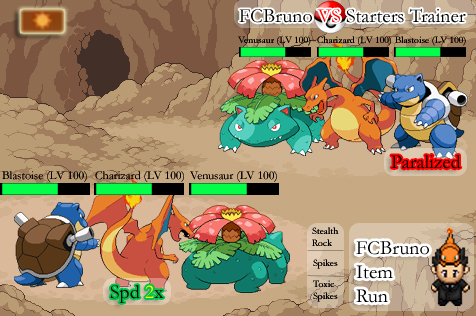
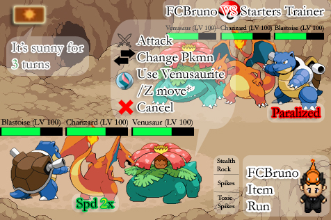
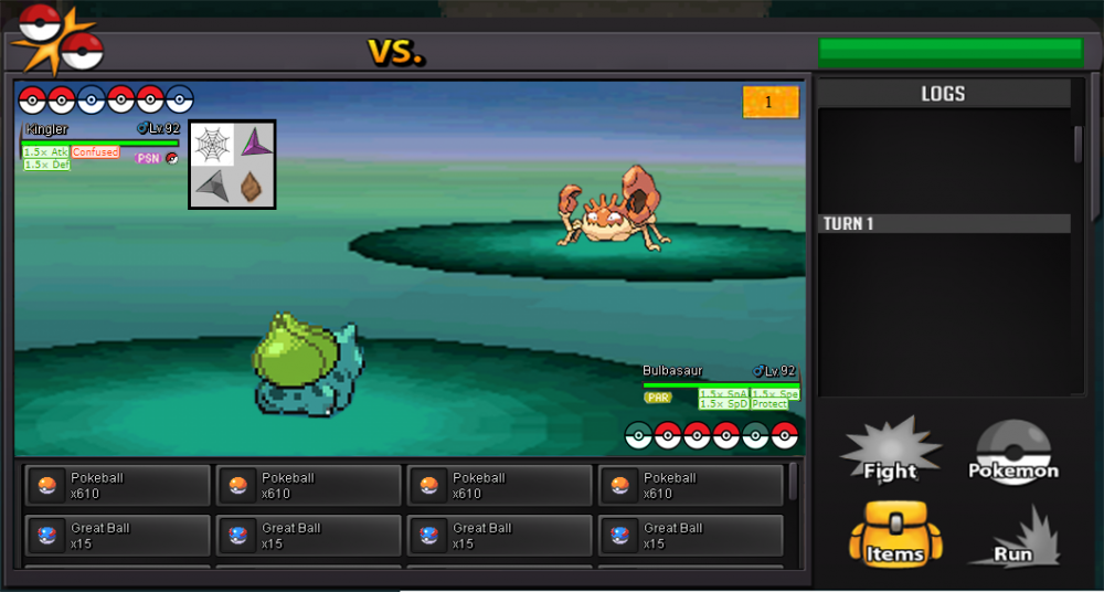
When the battle begins: * Boost and damage status are shown near respective pokémon. When you click on respective pokémon, appears a window with options (attack, change pokémon, use mega stone/ z move - only available if trainer got item and cancel). If you pass mouse on left top screen, you can see how many turns will happening climatic modifiers. Traps (stealth rock, spikes and toxic spikes) will have your respective icons colored when used. For items, would be great a new bag window opened when you click for this option. When a move is used, appears instantly information on middle screen. I'm not a good image editor, but's +- my idea! =)1 point
-
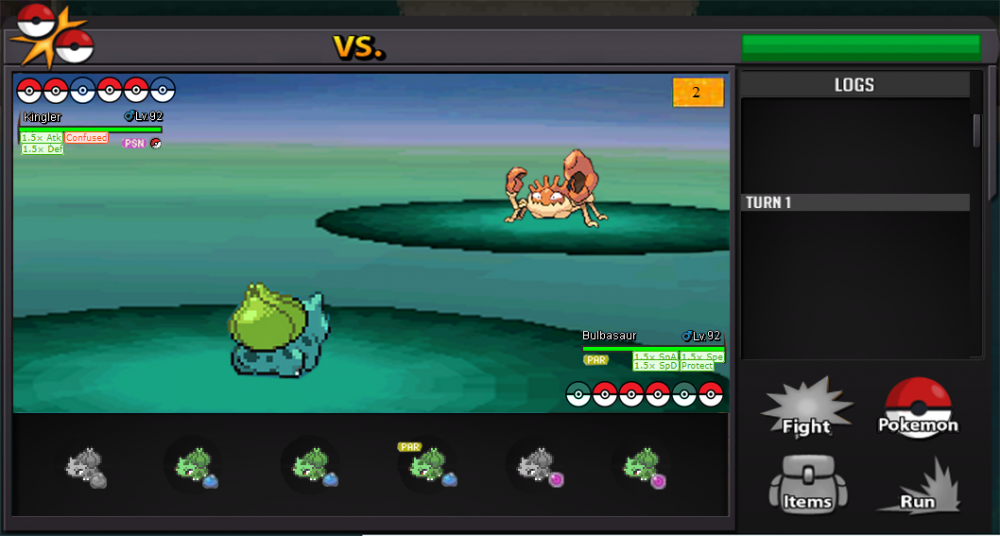
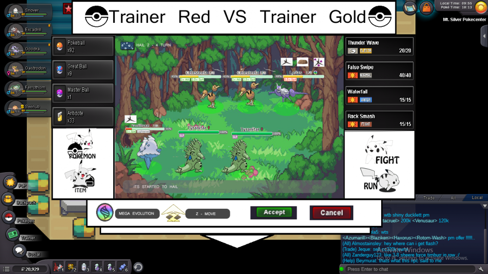
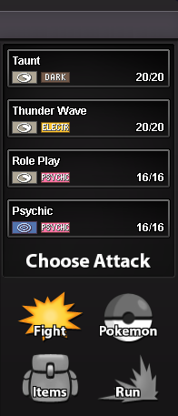
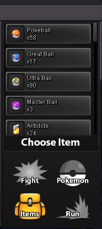
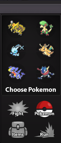
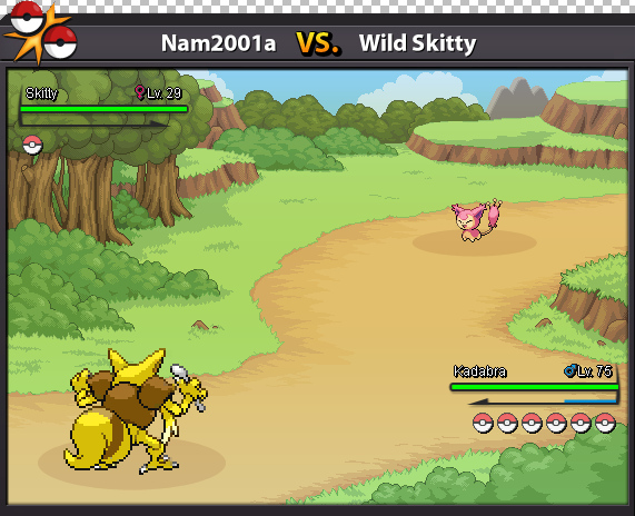
UI when we select battle option, after selecting move, in a 2v2 or 3v3 battle, we can click opponent's pokemon to select. if attack can damage all opponent pokemons, there will be no selections [ i have not put attacks in this img ]. Move cancel option, in middle of 4 move blocks. Will be RED when opponent has not yet selected move, and b/w when opponent has selected move. This UI also have MEGA and Z-MOVE buttons, when ready, Button will be colorful and when not ready, will be b/w. In the box showing pokemon's hp and name, in that i had not yet added exp and lvl, i not had much time :| but that can be placed just down to hp. Status condition is being show in opponents pokemons. Weather is already been showed. We can see weather effecs, ofc And Attacks like stealth rock, their effects will be shown when we put mouse over pokemon or just hold on ( in android ). "S" sign shows that a pokemon is shiny :P This UI is shown when you click on bag button, and have blank portion on right side; which will be used to place item blocks, and a scroller. This is shown when we click Pokeball button, to switch pokemon, in this three pokemons are left, so after choosing one of them, we can click one of our three present pokemon to switch with. Run button, always works , as to run ofc. this will also be b/w in a trainer/gym/pvp battle [ just except wild ]. Battle log, can be in a specific channel, or a message from system, only visible to user. OR, left side can be extended and a battle log can be made there. Though, i have one more idea, what about a battle chat? [ not that one which already exists ] , in between two users [ if pvp ] ? if want to add, the extended part for battle log, 3/5th part can be for battle log. 2/5th part of that could be used for battle chat [ when user vs user ], this could be useful though, when two persons battling can talk! I hope you like, or at least get an idea!1 point
-
Xin chào quản trị viên Tôi là Anh Đỗ, đầu tiên tôi cảm thấy thiết kế của bạn quá đầy đủ và chi tiết, vì vậy tôi đã thiết kế lại nhưng dựa trên ý tưởng của bạn và tôi coi đây là phiên bản cải tiến hơn và thêm Move Z và Evolution Mega. Và tôi hy vọng bạn thấy thiết kế này. Và thiết kế này cũng rất dễ sử dụng cho người chơi trên điện thoại và trên PC :) 1) Chiến đấu Tôi thấy rằng 2v2 không khác gì 3v3, ngoại trừ việc xóa 1 pokemon, vì vậy tôi quyết định chỉ thiết kế 3v3. Tôi cũng đã thêm nút Quay lại và chờ đợi đối thủ và tăng điểm chỉ số cho Pokemon trong trận chiến diễn ra. Hình ảnh đầu tiên tương đương với pokemon đầu tiên, vì vậy sẽ không có nút quay lại và bắt đầu từ pokemon thứ 2 và thứ 3 sẽ có nút quay lại. Lý do tại sao tôi đặt Move Z và Evolution Mega trong 1 là vì tôi thấy rằng mọi pokemon trong trận chiến đều giữ một vật phẩm cố định trong trận chiến, vì vậy khi có một con Pokemon khổng lồ, nó sẽ hiển thị các nút tiến hóa cực lớn và đảo ngược khi di chuyển Z + loại. Và tôi cũng đã thêm một danh sách các lượt và thêm đếm ngược thời tiết 2) Chọn Pokemon Tôi nghĩ rằng tôi nên xem vật phẩm của mình hiện tại khi chuyển Pokemon vì người dùng trong trận đấu có thể quên vật phẩm mà pokemon của họ đang sạc và mỗi lần họ nhập Pokemon On và xem lại, làm như vậy rất thuận tiện và thời gian tiêu thụ, vì vậy tôi đã thêm vật phẩm mà Pokémon ác sẽ xuất hiện bên dưới pokemon của chúng. 3) Mục Tôi nghĩ sẽ tốt hơn cho người dùng khi thấy số lượng vật phẩm họ đang tham gia trong trận chiến sẽ tiết kiệm thời gian tìm kiếm của người chơi và các lớp trong các trận đấu cũng không cần phải thay đổi vì quá tốt.1 point
-
I'm kotzf , I'm mobile user , I think some button is too small ,so i design bigger button for battle ui. Any color.button.position u can change, I just provide more comfortable ui. I know PRO minimum window size is 800*600 ,so i design this size for battle ui (battle log is open). see my video [spoiler=battle screen] [spoiler=open battle log] [spoiler=move] back button can go back battle screen [spoiler=mega stone / z-moe use & cancel] [spoiler=pokemon] [spoiler=item] Some ui explain: [spoiler=1v1] 1.Boost ,ex:+atk*1, -Spd*2... , up at the area. 2.This sign is remind both of player who was used mega stone or z-move (suggest from my friend ,if u don't want can be cancel ) 3.HP & EXP bar & effects. [spoiler=2v2]1 point
-
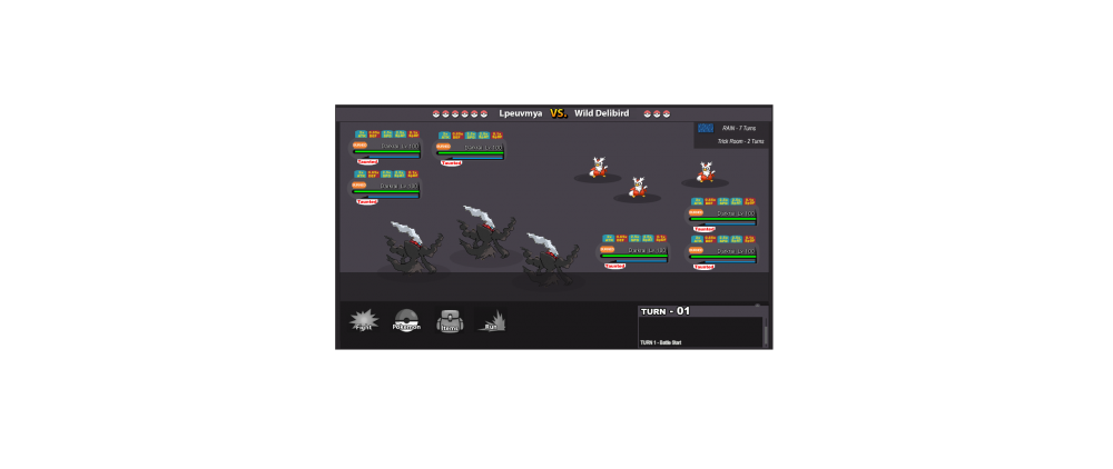
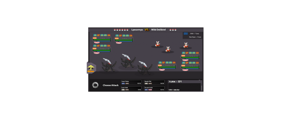
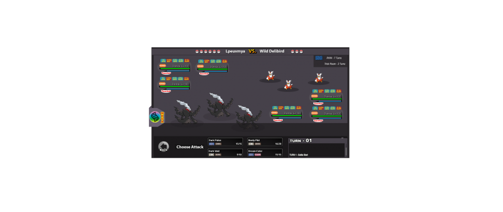
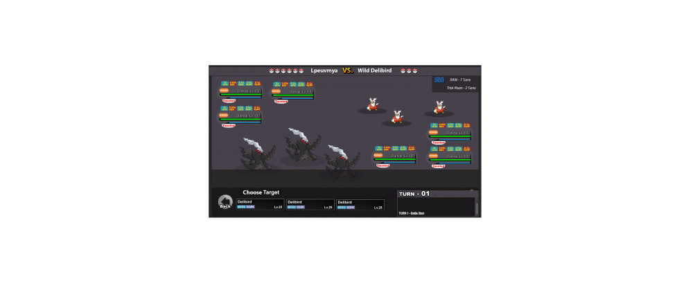
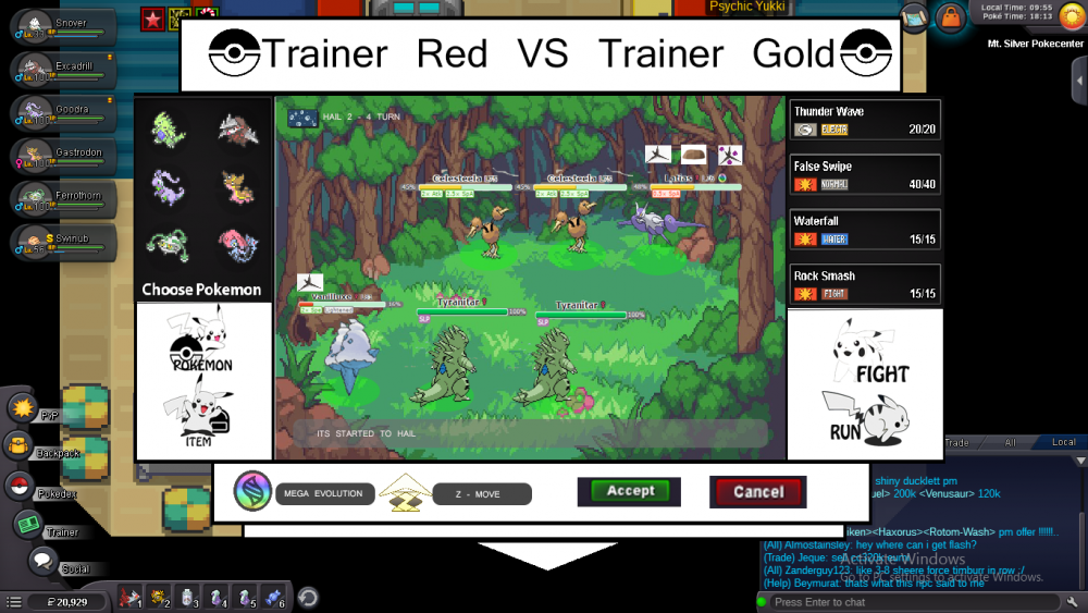
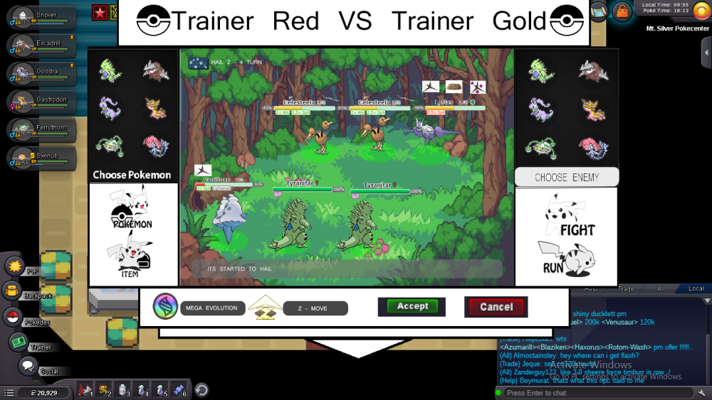
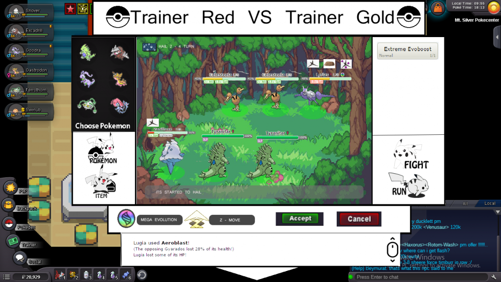
Hello, this is the interface I made. I thought about keeping the visual personality that PRO already has and not changing the interface we already know so that it would be easy for developers to implement, so we would have this update as soon as possible. So based on that I did that, I hope you like it. IMAGE 1 - Components of a battle The first part is the basic idea you already have in PRO: - Keep the PRO buttons "Fight", "Pokemon", "Items" and "Run". - Keep the dialog field - Keep the VS. and the players name The second part is of additional effects and status: - Each pokemon that is about a buff condition or debuff in the statuses, will have this information informed leaving the Pokémon Life Bar, I created as Internet Browser Guides, with colors to represent if it is a buff or a debuff. (Example: Darkrai used Nastly plot and his special attack increased by 2 times, a blue colored tab will pop up with the status increased). However, the "status guides" should always keep the order that is already in the PRO. Attack, Defense, Speed, Sp. Attack and Sp. Defense. - The effects like disable and taunted will appear in "white" tabs The third part is about the climate, the field and the log: - The climate is simple will have in the upper right corner a dialog box informing the turns of the weather and some field effects like trick room - For spikes and toxic spikes of the visual form that is already present in the PRO, being visualized only in the field below the pokemons - The log would appear and indicate the turns, it will be responsible for the time the player has for pvps matches and is recorded in percentages how much each pokemon suffered damage and etc (I thought about the pokemon showdown log and I based it here ) IMAGE 2 - Choosing the Attack ( Z-Move e Mega Evolution The first part is about Z-move and Mega evolution, I thought of elaborating them as a tape that appears from behind the UI as if it were a folded paper. A pokemon can not have a Z-move and Mega then evolve the "ribbon" both for mega evolution and for the Z-move would be in the same location. In the options to choose the attack would be elaborated in two stages that I will speak in the next image, however the attacks would be maintained in the same way that is in the PRO but distributed lying down. And last but not least the button to go back to return to the previous menu. IMAGE 3 - Choosing the Target The last part would be the second stage to choose the desired target. And that's it. Some more points - I worked with the gray background so that the development team can choose the fields at will - The items would work the same way we have today in the PRO, but organized in a lying way, in the same way that the attacks1 point
-
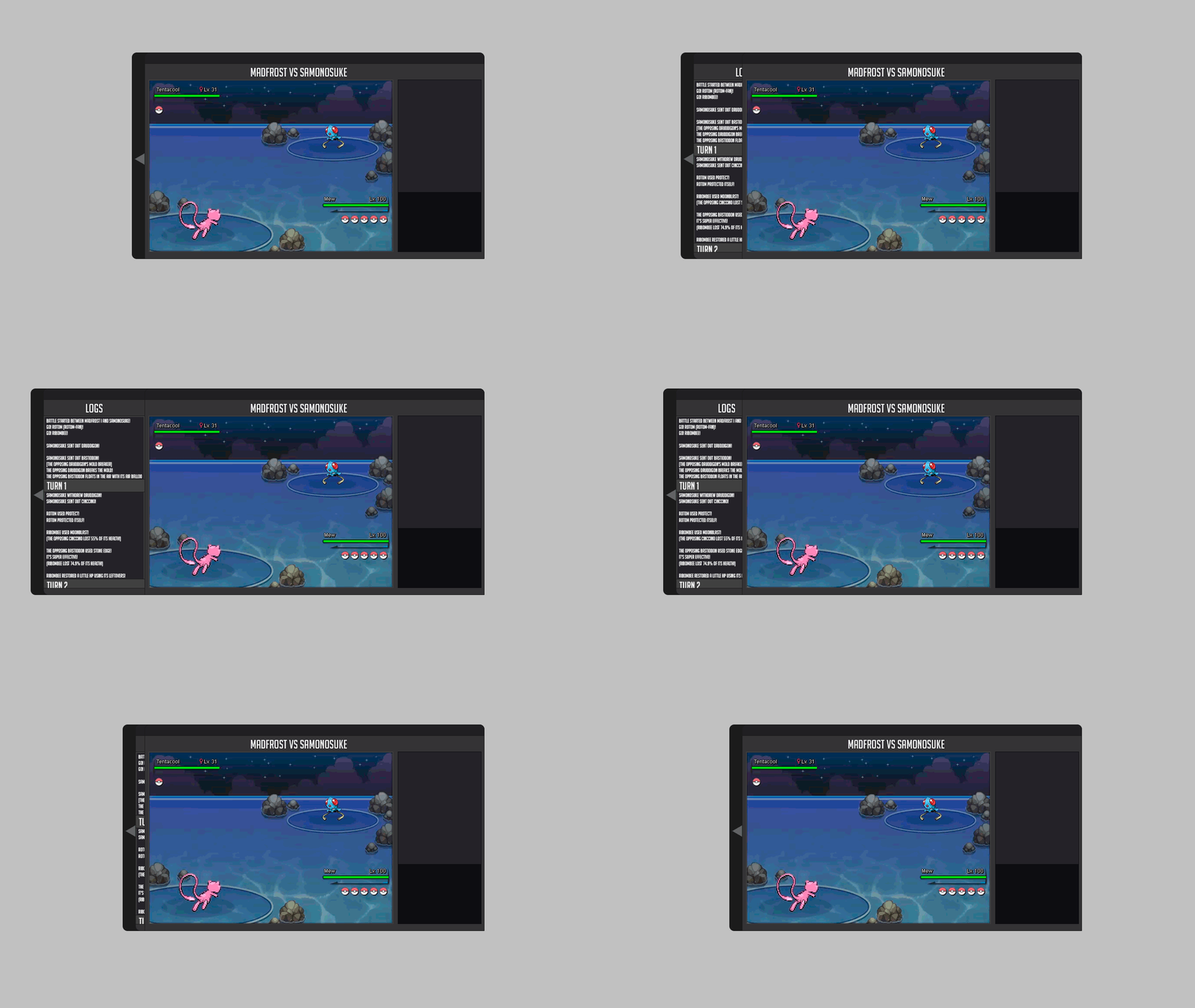
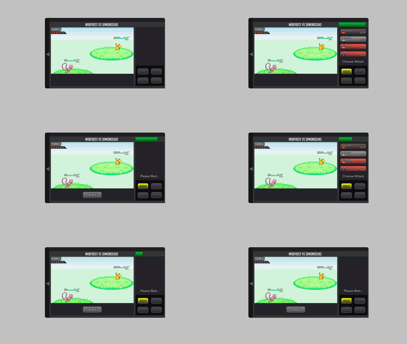
Well this is my entry for the Battle ui, I like the original battle ui so I based mine off of it and did improvements on it that was needed with mega, z-power, where 2s and 3s would look like, stat changes, and a battle log that is naturally closed but can be open with a tab on the side. I also attached an example of how big the ui will be with the log opened in game. I hope you enjoy my changes ;D .1 point
-
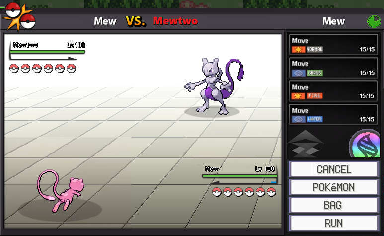
Hi everybody My rework should stick to the current design with all new required buttons and stuff included. I designed new buttons for the menu. And so I added in the "FIGHT" window the buttons for Z-Moves, Mega-Evolution and a button for cancel the moves. It would be nice if the attack moves has the color of it type. For example: water attacks are with a blue touch. Maybe we can add a "super effective", "not effective", etc... sign to the different attacks, depending on the enemys pokémon. The information for boosts and effects could be with a hover on the blue information button near by the health bar by each pokémon. The weather stats could be simply added as shown. Maybe as an extra animation for rain for example would be great. You can see at the top left corner a little triangle. With this you can show or hide the battle log as seen below. Important for the textbox is, that every time it arrives the health bars should be hidden imo. Thats all I guess. Do not hesitate to ask if you need more detail informations about my rework battle ui.1 point
-
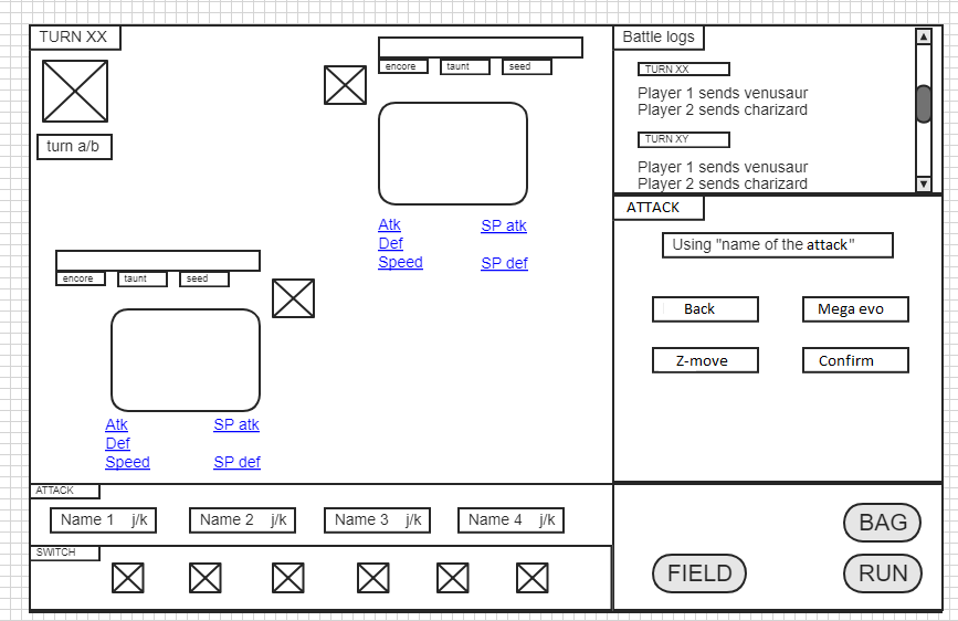
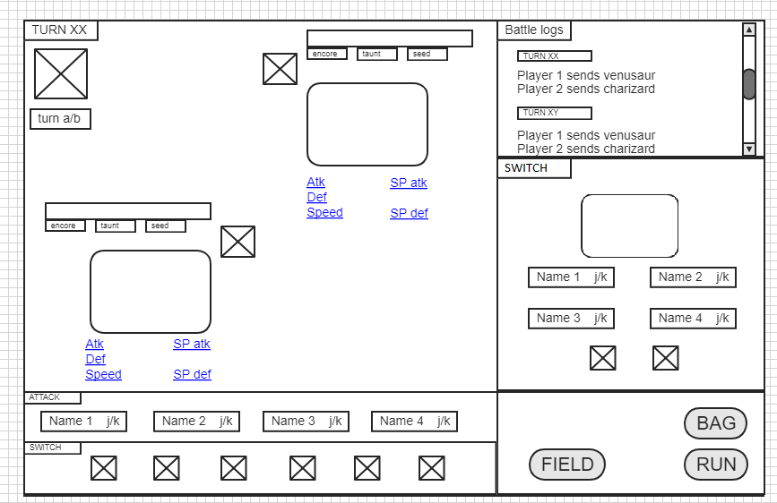
Hello, I'm not an artist but I hope the UI I propose here will help to design the final UI. First, I imagined a window like the one above when the fight begins. It offers a team preview with the username of the players fighting each other. The 2 icones on the bottom right corner are designed to host pictures of the command "Run" and "Fight". This is the basic screen for 1 vs 1 fight. On the top left corner it shows how many turns have been played and a picture of the current weather on the field (with the turns). Lots of information about the pokemons fighting are displayed : percentage of life, if the pokemon is taunted, seeded etc. , a zone symbolised by a square with a cross inside is planned to host a gif for paralysis, poison, burn and sleep status. Information about increased or descreased stat are also available. The switch part shows the pokemon in the team you can put into the fight. When you click on BAG you see this. Then you can choose to use he object on a pokemon of your team. A click on bag then a pokemon and finally the attatck of the pokemon for which you want to recover PP for example. When you click on FIELD, it gives you information about entry hasards and the terrain (is there electric terrain, grassy terrain etc.) When you click on one of the 4 attacks, in the "general window" you will be asked to confirm your attack with mega evo and z-move button. When you click on a pokemon you want to switch with an other on the field, information about the pokemon are displayed in the "general window". The squares with a cross inside represent the pictures for the "back" and "confirm" option. This is a view of the 2 vs 2 battle window. The 3 vs 3 battle window is easily obtainable with this screen. Do not hesitate to ask if you need more details about my Battle UI.1 point
-
Hello this is my UI. Everything that was asked for is in the UI. If there is anything I missed be sure to tell me and I will add it on. If anyone also has any tips to maybe improve it more than be sure to let me know. The white that you see is for the background/Overworld. Also, when you've selected a move, there is room in the box when all moves dissapear to press cancel. I Hope you enjoy.1 point
-
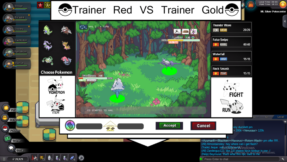
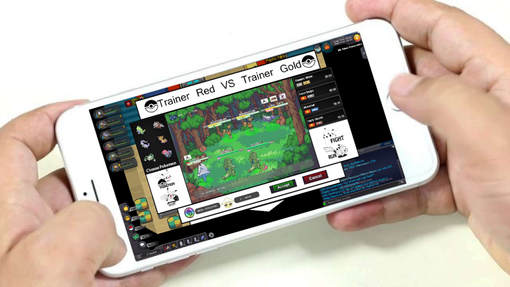
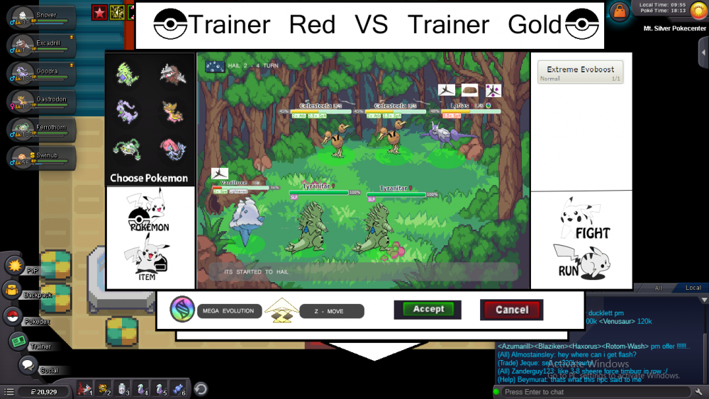
Hello Fellow Pokemon Trainer. Im Really bad with introduction and English is not my First Language *tehee So Let Get to Explanation of my Battle UI XD This is the 1 v 1 battle. there is 4 icon Fight,Run,Pokemon and Item. Pokemon and item in the left, fight and run in the right. just like the original battle ui after u click one of icon i will open menu like pokemon, item or move. on the bottom there is a new 4 button. mega button, z move button, and validate button. mega button for mega evolution, z move for making move be z move, and validate to validate action what u gonna take. 1. Example validate button : if u want to use false swipe and u click false swipe then validate button (accept and cancel) will usable (the color will be black if not click move after click it will be green and red) after that there is a message "are u sure use false swipe?" use green accept button for yes, and red for no. "Make sure make option feature to disable validate button for hunting in wild pokes so we dont have a time for validate every action we do" :v 2. Example for mega button : if u want to mega evo just click the mega button and choose move what u gonna use. then pokemon will mega evolution and use move (ofc after validate action) 3. Example for Z move : just click Z move button and ur move is gonna change to z move if there is a Z move in ur movepool and validate :) - For health bar and status. im taking example from pokemon showdown that really nice and informative. all status will appear below health bar. - For toxic spikes,spikes and stealth rock its above pokemon health bar - For weather and room. i really likes icon in original battle UI. just add more icon for trick room and wonder room and a little bit explanation. i decided to split 4 icon to make it more enjoyable in android *imo so we can use our 2 mother finger to select hehe :) and now 3 vs 3 battle ui * sorry i dont make 2vs2 but it will almost same like 3vs3 HERE almost same like 1v1 but i decided to make it after we choose we move we gonna choose our enemy like After choose move then validate u can choose enemy *sorry i copied the picture. the icon like we switch pokemon but in the right side. then validate ur action :) last is log. Did u see triangle on the bottom?. its log, touch the triangle and it will open like this There will be scroll icon too. I think that the end of my explanation. hehe *now everyone will now im poor XD HOPE U LIKE IT (u must like it*evil grin) IM EBONCANDLE SEE YA (If u ask show the item or show the z move) GOOD LUCK EVERYONE o/ And Happy New Year1 point
-
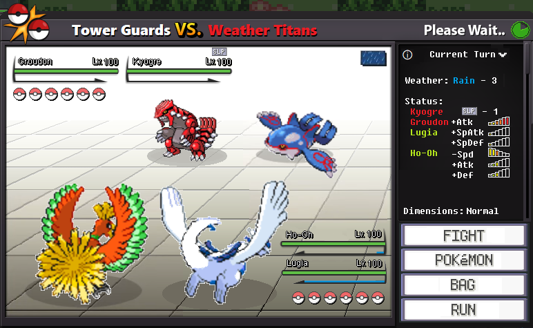
Hi all fellow trainers! First of all I have to say that this is not exactly a NEW battle UI: its just a "rework" of our actual (beloved) battle UI with just the add ons u asked for the main reason is that it matches the theme of others UIs of the game, but also because im a nostalgic and i like to copy-paste a lot on paint xD I chose old school buttons bc -as said above- im a nostalgic [vertical layout allows android users to reach all buttons with the thumb while holding the device] the only differences in the fight menu (First Image) are: -buttons for Mega and Z moves (that should "turn on" when available) - "Fight" button that turns to "Cancel" when the menu is opened -The name of the attacker displayed above its moves (needed for 2vs2 and 3vs3) in order to make enough space for it i did the battle timer round 2nd image shows a 2vs2 fight in the image we can see the "Current Turn" infos > - displayed where the moves are in the fight menu - clicking on "Current Turn" will change it to "Battle Log" [spoiler=Navigate Fight/BattleLog/CurrentTurn] In Current Turn we can see current wheater with its turn count: Rain - 3 The "Status" infos tells the actives stats boosts, handicaps and conditions in the exaple we have a sleeping (since 1 turn) Kyogre, a full swords dance Groudon, Lugia used calm mind once and Ho-oh cursed 3 times at the bottom we have a "dimensions" info that works like "weathers" and tells if any room is triggered / > Normal Trick Room > Twisted - x Magic Room > Magic - x Wonder Room > Wonder - x where Xs are the turn counts Finally we have a 3vs3 battle and here is displayed the "Battle Log" > It records and shows all the battle events - we can tell that Raikou thunderbolted Moltres at the start of the battle Both Battle Log and Current Turn menus requires a side scroll to navigate the infos *I've wrote Dogs but someone calls them Cats* I did the status icons that should be used mainly in Current Turn: [spoiler=Status Icons] Red frame = Damage Background = type of the move White background = not specific move Here's an example of stacking multiple statuses in battle (imo volatile statuses can be displayed only in Current Turn: there is no need to show them like normal statuses -as I did-) [spoiler=battle example] the only thing missing is the window that shows entry hazards bc imo it already works fine - Very well done works here - i just enjoy to partecipate hoping the appearance will not change TOO MUCH because i like it as simple and clean as it is :) Lucky New Year to everyone!1 point
-
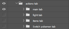
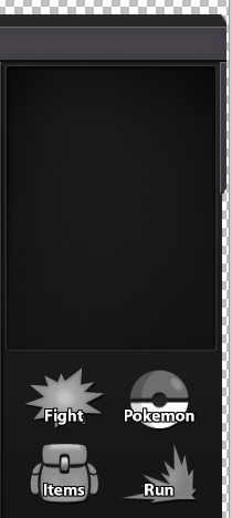
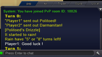
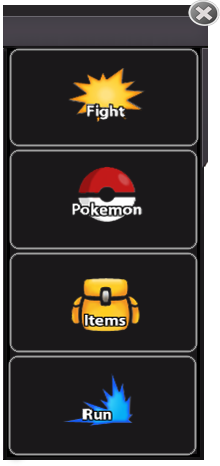
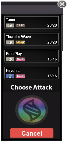
My UI devided into 4 big part: PART 1: Actions tab [spoiler=Part 1] -let's start with "main tab". It's the beginning tab where the battle start: New: . Old: I keep and rework the old sprites to make people get used to with it much easier than using the new ones. I removed the useless empty space to make those buttons bigger. The new "X" button at the top help you to disconect from battles, that mean it will work as same as logout but you don't realy have to do that. - Next will be the fight tab when you click the "Fight" button: New: Holding Mega stone: Holding Z-Move: Old: I replaced by the "cancel" button which will save a lot of spaces for every actions tab. When you click the cancel button you will be send to the main tab and cancel everything you haven't finished yet. That also mean this button will work as a "cancel move" button too. After select a move, mega evol or z-move, that button should be flashy like this . I don't know how to make it or what is that calling so I will leave it to you. This allow you to know which pokemon you are picking move at ( kinda useful for 2vs2 or 3vs3 ) and it also replace the empty space on it if pokemon are not holding mega or z. - Items tab: Option 1: Option 2: . Old: - Switch pokemon tab: New: . Old: As we have a bigger tab, choosing pokemon should give more info on the selecting pokemon. - PART 2: Main window [spoiler=Part 2] [spoiler=Part 2] My main window have 2 parts, 1vs1 and 2vs2. And I won't make 3vs3 due to a very simple reason "It's such an stupid mode". 3vs3 cause a lots of work (for the staff, not for me), lots of bug and no one want to play. I can still add the 3v3 battle UI realy quick if you actually want it. - 1vs1: 2vs2: Old: - Hazards keep the same as before because ppl already get used to with it and it take no places. So there are no reason for me to making new one for that. - I don't really know what make weather bugged in PRO so I will put the turns counting for it in the battle log instead of showing on screen and keep it as before. - One more thing I want you to add is when clicking on the opponent's name, it will sending command to inspect that person, so we can easily get more info on OP like rating, guild... ( Making Inspect only work on same location make no sense since U can use reborn bot to do that ) PART 3: Team preview [spoiler=Part 3] [spoiler=Part 3] - The first pokemon showed as "Revealed pokemon" - Second is "Fainted Pokemon" - 3,4,5 showed as "Unrevealed Pokemon" (Incase u want to keep NPC pokemon Unrevealed) - 6 is an " Empty slot" - This tab can be minimize by clicking that bottom button to save screen places if u don't really need it - If you pointing the mouse over the health bar, it will show a screen with that pokemon info like names, moves used, health in % ... ( just suggestion, I don't have UI for that) - If you cliking on the revealed pokemons, it will open pokedex with that pokemon's name on searching. ( just suggestion) PART 4: Battle log [spoiler=Part 4] Why I want to have battle log on game chat instead of making it on battle screen? 1. It will save alots of hard work because game chat is a thing that you already have. 2. It save spaces on screen. 3. It's allow you to chat with opponent throught the log like Showdown. - So, let's explain more on how this thing will work: Basically, when u start a PvP battle, the system will creat and send you and also your opponent to a private channel. All the logs for that battle will be send to that channel. That mean you can also invite your friends to that channel as spectator throught the given room ID. Ofc they can only see the log and be able to chat there only. But it's just the first part of spectating, It's up to you for developing more on this amazing feature. + This PvP channel can't be closed like "Local" channel + You are force to leave the current pvp's room if you logout or enter any battle. + You can Ignore OP by clicking ignore them if you don't like they chatting in logs. + PvE logs can be work the same as this except you can't leave the given room ID. + It will need some rework on this chat but still better than making new one. I'm still new to photoshop and this is my first time making a project on this. My PSD file Download: DROPBOX I have so much things and ideas to say but I can't tell it in just 1 post cuz this is a really long post so I might keep edited this post with change logs if I found any news or make any changes. Changelog: [spoiler=logs] [spoiler=logs] [spoiler=logs] [spoiler=1/1/2019]- 1/1/2019: + remake the "Cancel" button to make it look better: Old:. New: + Lower the mega button opacity:, it's have a better look now: + Added PvP timer to the main window: + And some small changes. [spoiler=2/1/2019] + Remake the "Choose pokemon tab" + Some small edits on Option 1: Option 2: . + Added on the fight tab, which let you know which pokemon you are playing at 2vs2 or 3vs3 and it also replace mega and z-move button when pokemon is not holding that. + Remake the z-move button1 point
-
Well first of all i'm not an artist, I made this in MS Paint so yeah. I figured the idea behind this post is to provide you with ideas and not the actual UI because staff can make better UI than me. With that being said Lets begin This is how my UI looks [spoiler=Battle UI] 1. Everything is pretty self explanatory, 3v3 battle, HP bar has two marks at 75% and 25% respectively to gauge damage easily hp color changes at 50%. 2. Top right is the digital timer (bar sucks) changes color to yellow at 20s and red at 10s. 3. Below that is opponents pokemon team, background changes to red when fainted. 4. I've added Field status tab with a drop down button which shows entry hazards, screens, and other field status either side. 5. Battle status at bottom left corner that shows current weather, no of turns, and other status like trick room, magic and wonder room which can be opened and closed. [spoiler=Battle Status] 6. Bottom left is the battle logs again with expand and drop down button (yes the yellow/black thing is scroller xD). [spoiler=Battle log] 7. I've kept Fight UI bottom right. Following tab opens when u click on Fight [spoiler=Fight UI] 8. Here u can select poke > then choose a attack ( also a button for z-move/Mega evolution ) > then choose a target > option to cancel move. 9. After you click bag item following tab opens [spoiler=Bag Tab] 10. Click on any of the options following tab opens, each different for battle items, pokeballs, medicine (I've only shown one) Sorry for my bad English. Thank you for reading, hope you like it.1 point
-
I have three pictures that show how the UI changes based on having a Mega, Z-move, or if an action is already selected. I forgot to add one for a Mon that has neither Z or Mega but I think that would be pretty obvious. I did not know if a transparent or dark blend looked better so some UI's have one or the other for comparison. I was not sure if PRO wants megas and z-moves to have a button style like how volt switch works currently or the checkbox like showdown so I just went with the showdown version but both work like that. Lastly, keeping the UI the same size regardless of 1v1, 2v2, or 3v3 is good because texts for the rain, screens, etc can go further down without impedence because even with a better font size the UI much like in showdown will have text behind that milotic shown on the far left if you have enough turn based effects in play but since most battles are 1v1 this allows more space for those texts in that format despite leaving a lot of open background. Hope these look appealing in one way or another. Just spent yesterday learning as much about Unity as I could and here is a draft of what I was going for, probably would also be smart of me to add dropdown bars for the items and chat for mobile space enhancements. Run button is on current draft but forgot to take a fresh snippit.1 point
-
Hello, Attached is a storyboard pdf of my version of the battle UI. The overall file size was too large for upload so I had to separate it into 3 files (part 1, part 2 and part 3) so I wouldn't end up with an unnecessarily long post of images. There is a text box on the bottom right of each slide within the pdf's with a brief explanation. V/R, Chaos PRO_battleUI_ storyboard_part1.pdf.zip PRO_battleUI_ storyboard_part2.pdf PRO_battleUI_ storyboard_part3.pdf1 point
-
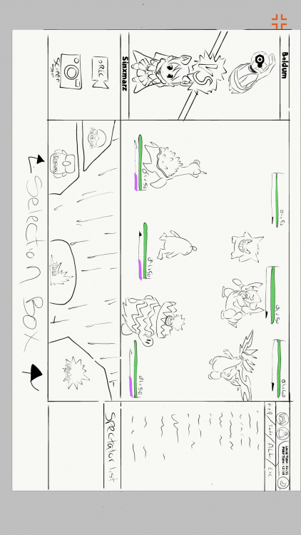
It's simple yet has everything one needs the chat on the right side and would be nice to have an option to spectate your guild mates. I put a small box under the chat box to show who is spectating you also a simple record or screen shot button and a (vs) on top with awesome animation one us to show what or who your battling on the left. it's a full screen view! It would work well with computer and mobile devices also for the bottom box where we have the options for the bag/ pokes /run away/ battle icon everything should be shown in that box aka the selection box if You click/tap on the battle icon it should take you to your moves/ z-moves and mega icons there should be enough room to add the weather conditions status condition of each pokes etc. In the center of the selection box as well. Pokemon they should also be displayed in the selection box when you click/tap on the Pokemon icon so on and so forth with the other icons nice an simple not to complex :) and as for the 3 v 3 display it should have just enough space to veiw all the pokes yur over all Pokemon and health bars are great just the way they are no need to change it. well your over all original design is nice and easy to understand and it is why I think you should consider just improving the original but keeping the same simplicity of that is all I don't own a computer but I Drew this on my phone I got sick and could not finish coloring it.1 point
-
Hi, this is my battle iu, I hope you like it. Basically it has all the buttons that have been required, bigger buttons also thinking about the Android version and PC users. The battles, I prefer them to be full screen optionally (The battlefield is made by me ... it's for the pvp battles) Let us begin 3 vs 3 Battles: -I have reinvented some parts like the "vs", and also the attacks with colors of their types. -The buff states must be as shown in the image, - they only have to be displayed when the mouse passes over- -The Menu Logs must be able to open and close, as the user wants, by means of a button placed as shown in the image -items and pokemon in same place, are changed, by pressing "pokemon button" or "items button"- -items and pokemon in same place, are changed, by pressing "pokemon button" or "items button"- -As I see it in the game "window mode"- -2 vs 2 Battles- -same controls as in version 3 vs 3, there are no major changes. That's it, I hope I have not forgotten anything, thanks for watching, regards1 point
-
ok.. HII :3, this is my own version of the battle iu ,i decide to keep the visual concept of the game, the principal reason is that is more easy for the :incoming,new ,casual and those that live on the game :v to assimilate the redesign and the way that the iu works , redesigning the space and the visual order of some elements that all the player already know and integrate the new ones by a easy and familiar look . (i apologise for the font of the text ,i don't know how to find it,i try to find a similar) This is the way that the iu look on full screen (example) [MEDIA=imgur2]YdjG9Kx[/MEDIA] (the design of 3vs3/ 2vs2/ 1vs1 use the same space) This is the way that looks the different iu (the post will show the way that looks with mega evolution an z move) this preview is for understand some elements and its function that appear on the iu [MEDIA=imgur2]5hxnusI[/MEDIA] 1. the time time that each player have for do a action on each turn , attack etc( this time can be cut by the action of the opponent in the case of the attacks) 2. the boost /effects/others -those effects that create a negative stat on the pokemon will be show on red describing which stat is been affected negative(-hp,-spd etc.) -this include the effects of poison,sleep,stun.etc) 2.1-those effects that create a positive stat on the pokemon will be show on green describing which stat is been affected positive(+spd,+atk etc) 3. the identification number the purpose of this numbers is make easy the identification of the pokemon that is making a action /making a easy way to decide which pokemon you want to attack by looking the number that this one have and making a easy way to decide a action 4.weather this title is for tell the players if there's any weather condition on the battle ,if there no weather conditions this will be without any indication ,in the contrary case 4.1- there going to appear a image that show which weather is on battle and the time that left to over 5. turn/battle chat this title is going to change each time that both players do and actions ,this helps to indicate the left turnos for the weather too 5.1 -the battle chat will be a history of the current battle action and turn ,describing which player do a action against the other payer.(this will be sow too the time that left for the weather condition)(this will show too the boost stats and negative stats by the exact % of each state)((this chat only show the events on battle u cant talk to the other payer)) 6. the action chat/description this text will be generated automatically after the player do and action ,so in this way the player can be sure that the action that says the battle chat is the right one,if is not the player can cancel the action by clicking on the cancel button (this action depends too on the action of the other player,if the other player already do their action the option will be executed automatically within any option to cancel) 1v1 MEGA evolution [MEDIA=imgur2]yXtUhr6[/MEDIA] Z move [MEDIA=imgur2]BhEIjoP[/MEDIA] 2v2 MEGA evolution [MEDIA=imgur2]D6kEUP3[/MEDIA] Z move [MEDIA=imgur2]p6cykEE[/MEDIA] 3vs3 MEGA evolution [MEDIA=imgur2]bM51OUL[/MEDIA] Z move [MEDIA=imgur2]JJtVdBz[/MEDIA] Ok and now you can see how the panel changes when you already use the MEGA evolution or the Z move MEGA EVOLUTION [MEDIA=imgur2]WnpLJoa[/MEDIA] Z MOVE [MEDIA=imgur2]VvkTUDZ[/MEDIA] ( after use the MEGA evolution or the Z move the option blocks with the text you already use it ) Ok that is the way that is the way that the battle iu looks now this its the way that the select of pokemon and items looks. Chose pokemon [MEDIA=imgur2]M5qkzDZ[/MEDIA] Choose item [MEDIA=imgur2]zlw2vi4[/MEDIA] (the small icons that are in front of the panel are for select :items ,pokeballs and potions etc) Ty for read the post ,i hope all the staff member like my design,so that's it :3 . sorry for my bad english ;v1 point
-
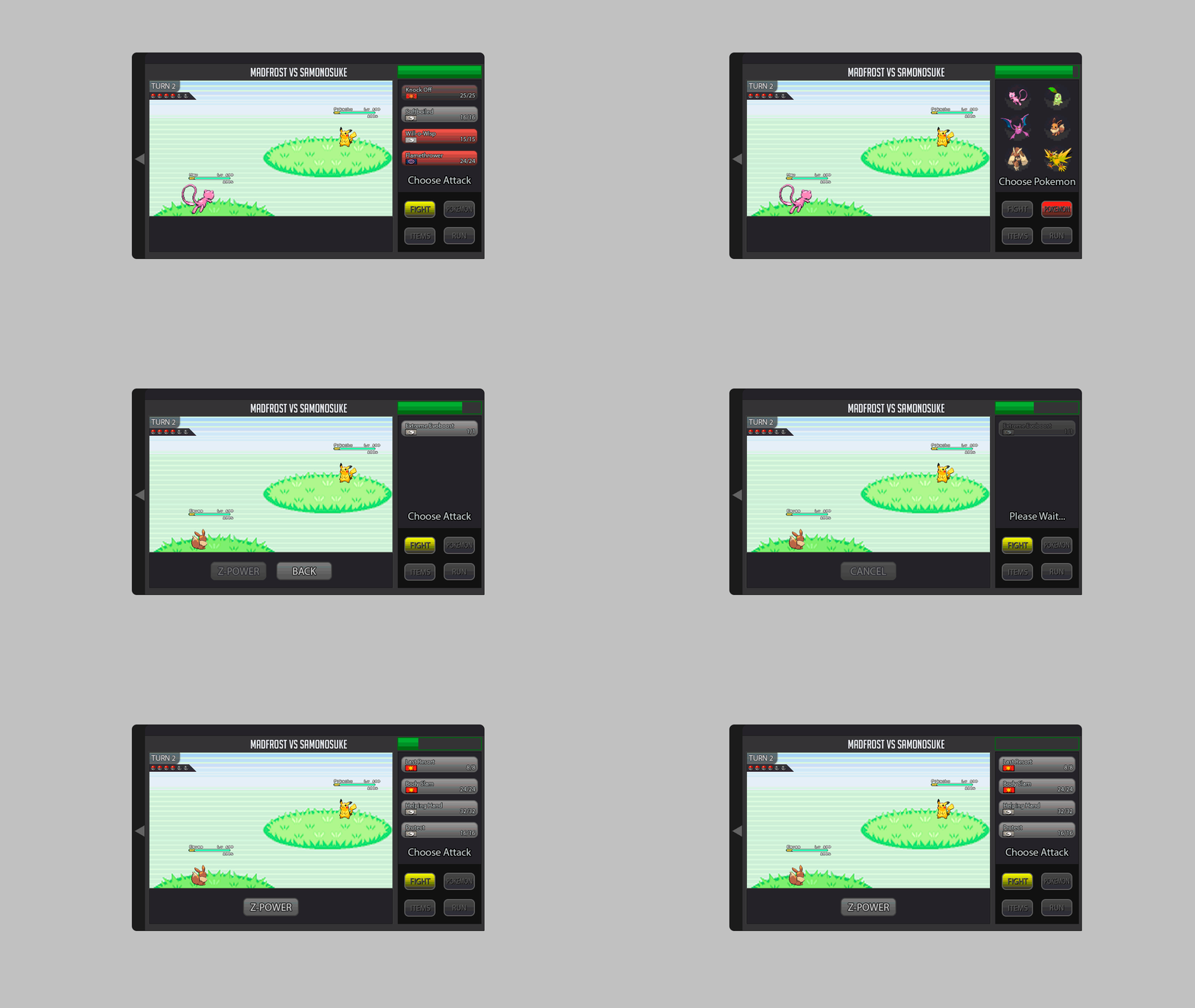
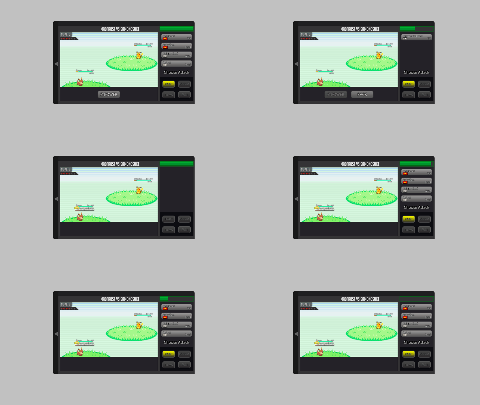
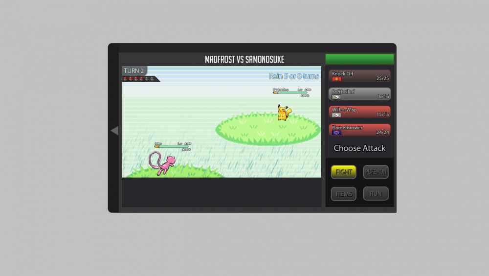
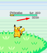
About the new battle UI I explain what I think and I'm putting some gifs and images as an example, I hope you understand. About the new Battle UI I thought a lot and I came to a conclusion about doing a Battle UI based on the old one, because I think the old one is very good, and I think it would be better to recreate it because if I create a new Battle UI, I think it would bother a lot of people who hunt all day and for those people who play the game on the cell phone. So I decided to recreate the old one trying not to disturb the people who play the game on the cell phone and for those who are hunting pokemons all day. Battle 2v2 and 3v3 fights: For 2v2 battles could work with the first two pokémons of your list. For 3v3 battles could work with the first three pokémons of your list Example: In the example I put the video of the Ash playing the pokeballs because I had not found an animation on the internet just playing the pokeball. Button for Megas: For the megas I think it should stay down as it is there in the example. Example: Button for Z-Moves: For the Z-MOVES I think it should stay down as it is there in the example. Example: Button for Cancel: For the Cancel I think it should stay down as it is there in the example. Example: Battle Logs: I think it would be nice to create a button next to the logs, as soon as it clicks the button will appear the logs next. Because there are people who get pokemons all day long, and with the logs appearing this right away I think I could mess up these people who are hunting many pokemons. More information looks at the example below. Example: Buffs, Paralyzed, Taunted etc: Paralyze, taunts, buffs and etc. I think I should stay in below life because I think it would look cool because it was going to look like the other pokemon games! Paralyze, taunts and etc. should appear before, and the buffs soon after. More information looks at the example below. Example: Then in the example you will see that he took Paralyze, it is because the pikachu used an attack and gave paralyze in Eevee, and the Paralyze appeared before the buffs. Weather and room effects as well as their turn count: The weather and counting should be right there in the upper right corner, showing that she is in such a Climate and showing the count of turns that she ends up. More information looks at the example below. Example: Extra: I think it would be nice to put a percentage of the Pokémon's life at the time of battle. Example: I made some changes in the post to put the bigger gifs because they were too small and hard to see. Thank you for your attention. :D1 point
-
1 point
-
Hello there! Glad your issue has been resolved. If you have any further questions, please don't hesitate to ask! With that said, will now be locking this thread. Good luck and have a great day!1 point

