Leaderboard
Popular Content
Showing content with the highest reputation on 01/19/19 in all areas
-
Sup everyone, My time here is over. Salt ded meat, I wanted to write a public thread because this community as no other one, supported me and walked along me during my 14 months of activity, It was a pleasure having the chance to be able to help many of you and enjoy pleasant sessions of moderation. I am proud of how I worked the whole time and how the team I made part perfected what we started over a year ago. I never had the chance but also thanks for so many Votes in the awards last year and this year. I was never nowhere near best MOD or TMOD but it cheered me up knowing the community recognized some value into my persona. I hope everyone will enjoy this game for years, and your children and the children of your children. Become part of the game actively, get in touch with the ones above you. Don't be scared of trying to change things ever, because what is future now, one day will be present. And progress is unstoppable. I want to give a special thank to my leader Fadoka and my team for being always where I needed them to be, Rider sensei for giving me the chance to start this journey long ago and last but not least Maccarone Arkos for being my friend from start to end of the journey. I hope the staff team will pursue what I aimed for during my journey and I hope the community will not hate on the future ones as they did on the past ones no matter the circumstances. I will hop on here and there on my personal account maybe on pro discord too, but I will now go back to my original goals since here there is no need of me anymore. Peace beautiful nerds, I love you Tazz11 points
-
Resolved. Sorry for the delay. Make sure to check your last box to find your Gurr and I sent slowpoke to Traum too. Good day. Tigerous~2 points
-
What do you thing about making daily login bonus? like scratching cards or fortune wheel. we can win with it potions, balls, and with low chance random mount or random shiny poke as jackpot1 point
-
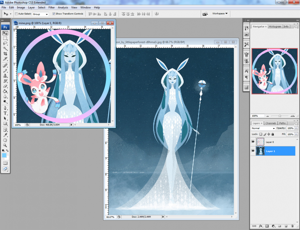
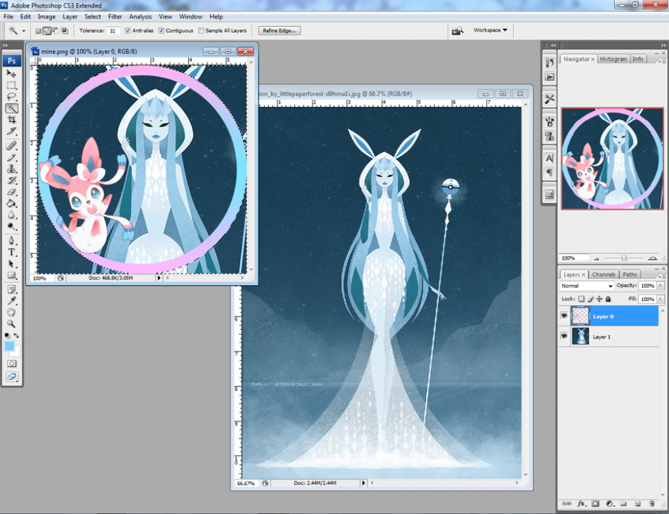
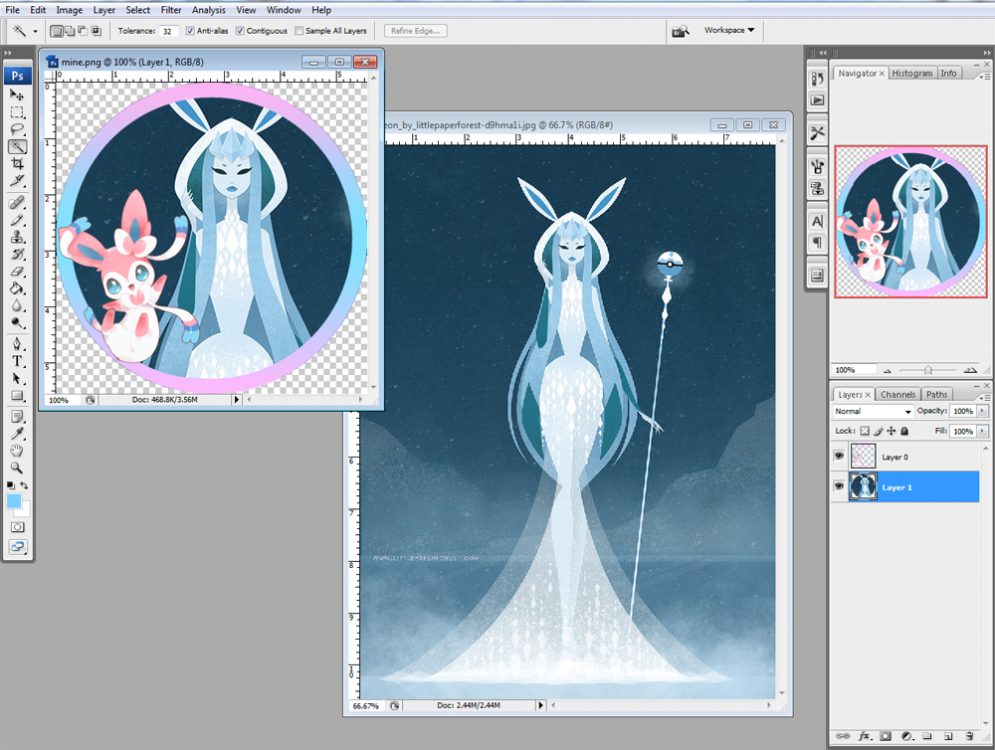
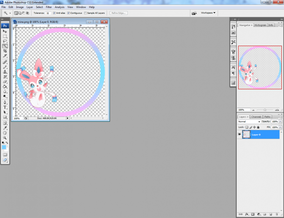
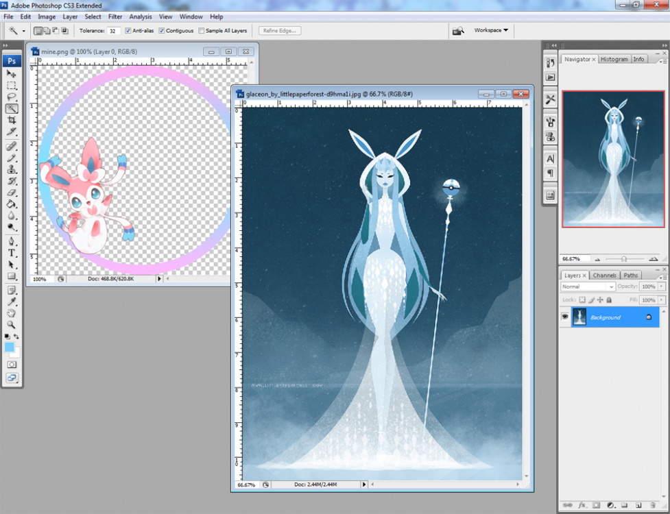
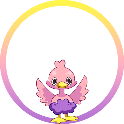
Hello everybunny and welcome to my Discord Frames Thread! This is NOT a shop. All you see here is free. Discord Frames are borders that you can put over your desired picture and when uploading as your Discord picture it will show exactly like a frame. You are free to use any of these frames as you wish and in any channel that you wish. It's absolutely free! Here is a small undetailed tutorial in case you don't know how to use them. If you can't figure it out by any chance, you can always ask a friend who has a minimum knowledge of Photoshop to help you. I promise it's not hard at all. Also for those who would like to create their own frames: Here is the border itself on which you can add and modify whatever you wish.1 point
-
1 point
-
Well that was I thought, this is pretty expensive to complete the quest. Time to sell pokemons and candys ^^' Thanks1 point
-
You'll be missed, and I wish you luck in everything you do from here. It was a great experience working with you. Don't be a stranger. Look forward to seeing you around.1 point
-
1 point
-
Very saddened to see you leave nerd salty, you have been my favorite staff always and will always be, friendly and funny ever since i got to know you, will miss the times we spent in pro discord voice chat :( . Hope you still find time in your busy life now and then to come and chat in discord. #voice-chat is our little home bro, never forget.1 point
-
You were, are and always will be one of those people that guided me and taught me so many stuff, mostly in life. I will not say the cliche "good luck", cause you never needed that to achieve your goals and rise up. I hope you drop by Discord from time to time and have a chat with us, whenever you feel like it. I already miss that bloody emoji you were using. Farewell, brother.1 point
-
Take care buddy, hope all is well with you and i hope it never stops getting better for you, overall great person and someone i could call a friend. it wont be the same without you1 point
-
:( don't leave us Salt, who will I joke around discord voice chat for hours nonstop complaining about every single thing in existence? Please don't leave us completely, I need a bit of Salt in my life.1 point
-
Idealists are a kind close to extinction. Only idea you worked under was the Game and the Community and aside of our friendship i will always remember you like this. You are a special, honest person, honesty is rare nowadays. Respect has to be earned and you taught us this. I will miss you , even if we will talk every day. "Unus pro omnibus, omnes pro uno"1 point
-
You know the amount of love and how strong is that eternal bond. Gotta keep the cool big onion. Thanks for letting me learn what I learned and the amount of fun we had as team members and the greatness of the friendship we have and we will always have. Stay awesome, it's just a game anyway. Gotta keep the spice boi, #OnionEmpire.1 point
-
Nothing can touch you, you're the boss. Be proud and take care my friend. You'll be missed.1 point
-
1 point
-
1 point
-
Hi @Diwaka I'm sorry for the inconvenience. I would like to inform you that you that you can only teach Surf to your Pikachu if you picked Pikachu as your starter. Also, if you have picked Pikachu as your starter, you will be able to teach Surf o all the Pikachu that have your OT. In order to teach Surf to your OT Pikachu you have to speak with Victor who is South of Fuschia keeping in mind that the cooldown to teach it is around 3 weeks. I hope what said provided some clarification, let me know if you have any further questions. Have a wonderful day !1 point
-
Hello, Yes, you are allowed to use more than one Eevee Evolution in PvP, you can even have a team that is composed only of Eeveelutions, like Flareon, Jolteon, Sylveon, Vaporeon, Umbreon, Leafeon. However, just like with every other species, due to Species Clause you may not use two or more of the same Eevee Evolution. Only one Pokemon species is allowed per team, and eeveelutions are all counted as different species. Good luck with your PvP battles, Have a nice day! - Locked as Solved -1 point
-
1 point
-
1 point
-
As you have talked with our content scripter and your issue has been solved, i will now close the thread. I'm really happy to hear that your issue has been solved. If you have any further questions, please don't hesitate to ask. Have a wonderful day !1 point
-
The thing you're talking about is the fact that MS, Train Ticket, BMS, Safari Ticket and EXP boost was extended for 6 days to everyone that had them active before the server going offline. However, I'm really happy to hear that your issue has been solved. If you have any further questions, please don't hesitate to ask. With that said, i will now lock the thread. Have a wonderful day !1 point
-
Hi @ContacTech I'm sorry for the inconvenience. I would like to inform you that, as a way to solve this issue, i can offer you a Magic Mirror which is an item that permit you to customize your character while in game. Therefore, you can rush the customization of your character and change it later through this item. Could you please tell me which is your main server where you would like to play? Looking forward to your reply, have a wonderful day !1 point
-
Hi @egron I'm sorry for the inconvenience. I would like to inform you that Red is useful only to unlock the Trainer Valley and you can do that either by winning or losing, it really doesn't matter. If the freeze you're experiencing are the "please wait", unfortunately there is not a fix yet and our developer is working on it. However, i would suggest you to try to fight him and lose on purpose as it should be able to make you achieve your aim and unlocking the trainer valley in any way. Could you please try that and let me know how it goes? About the status of the server and the disconnections, please stay tuned on our OFFICIAL PRO DISCORD for further announcements and let me know if you have any further questions. Have a wonderful day !1 point
-
I heard that they are solving the last issues that causes the crashes, so the server will stay down for a few hours... so wait and keep try to log in. ;-) Maybe someone can add some other information.1 point
-
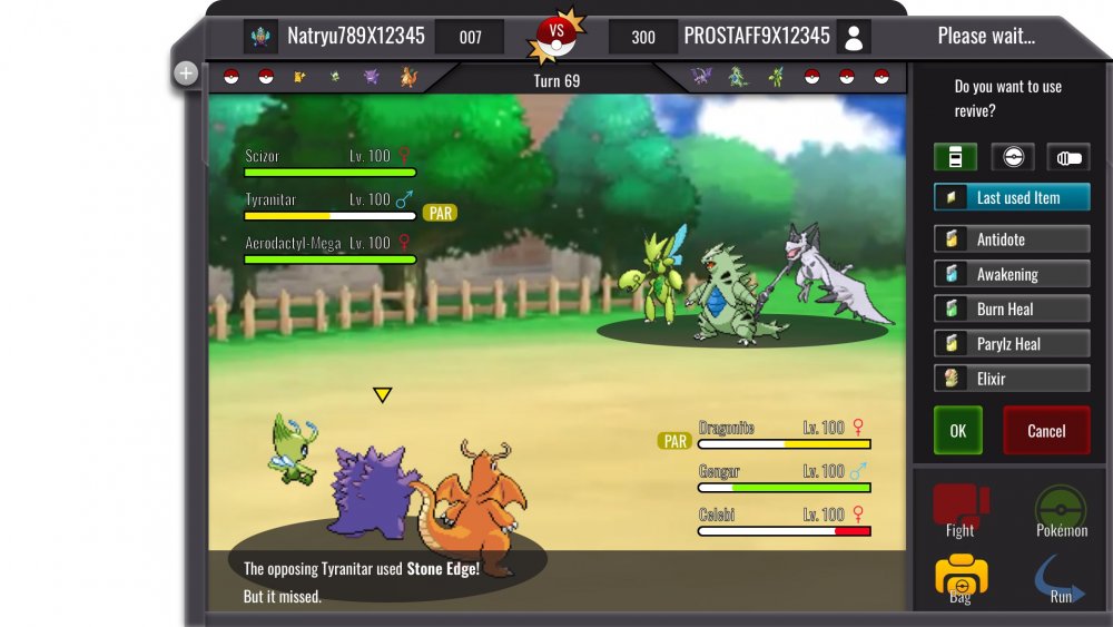
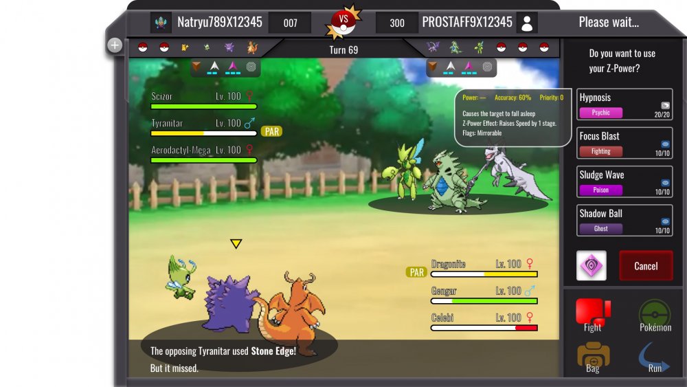
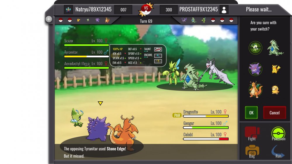
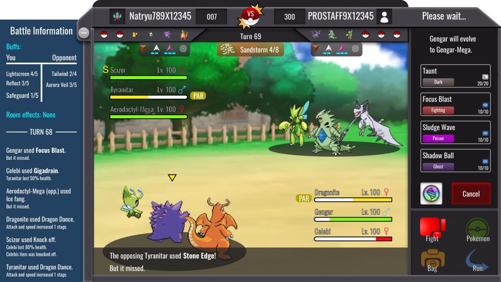
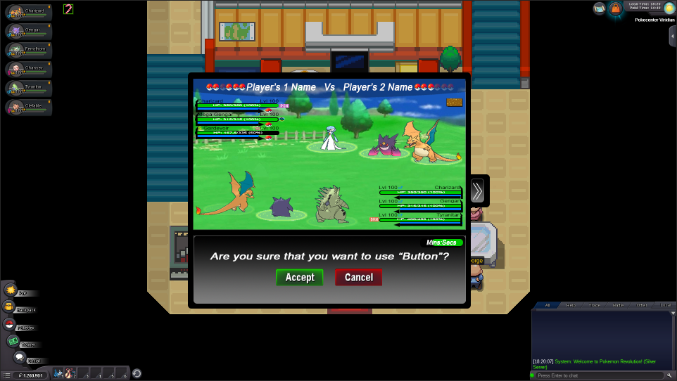
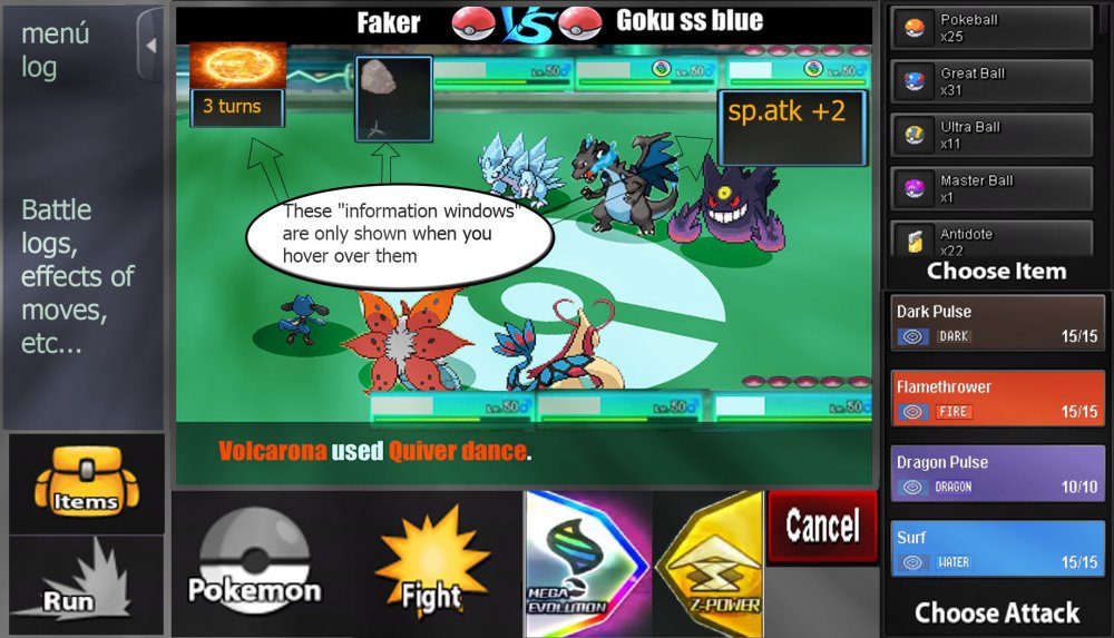
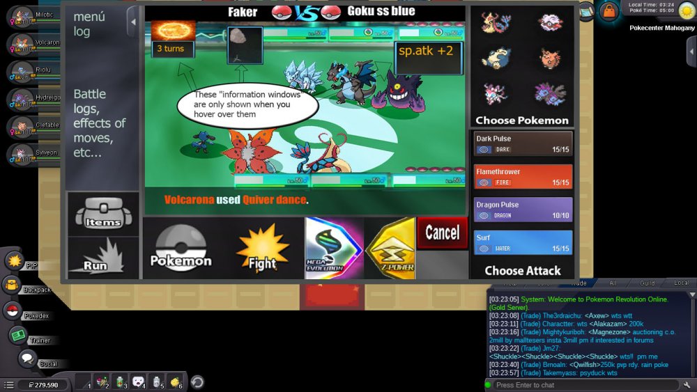
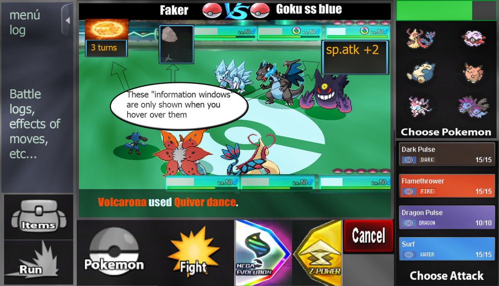
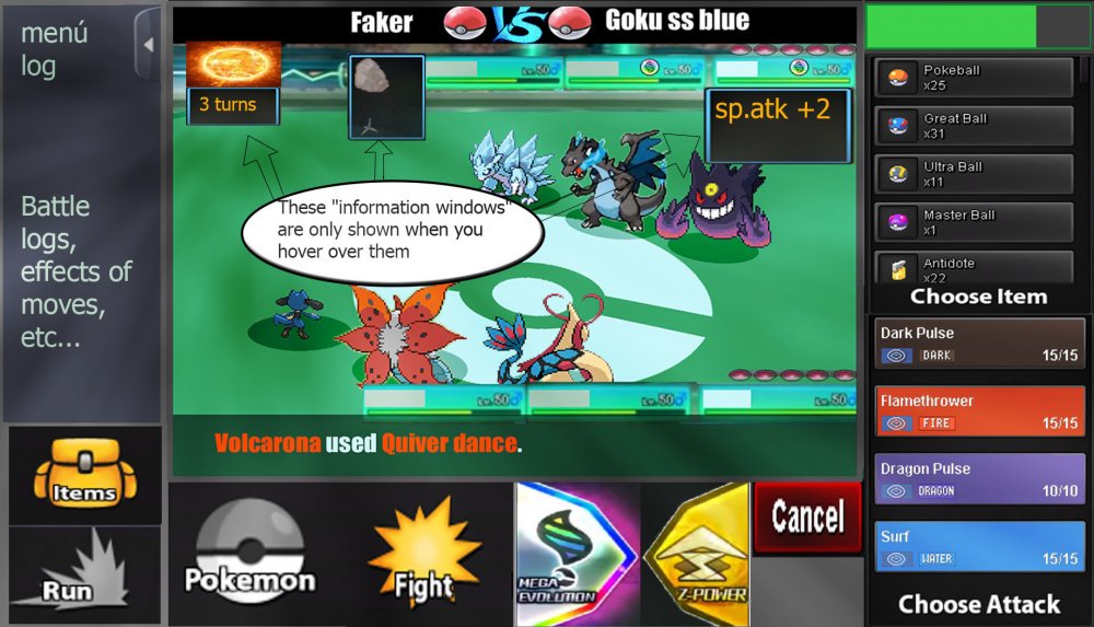
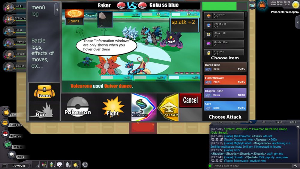
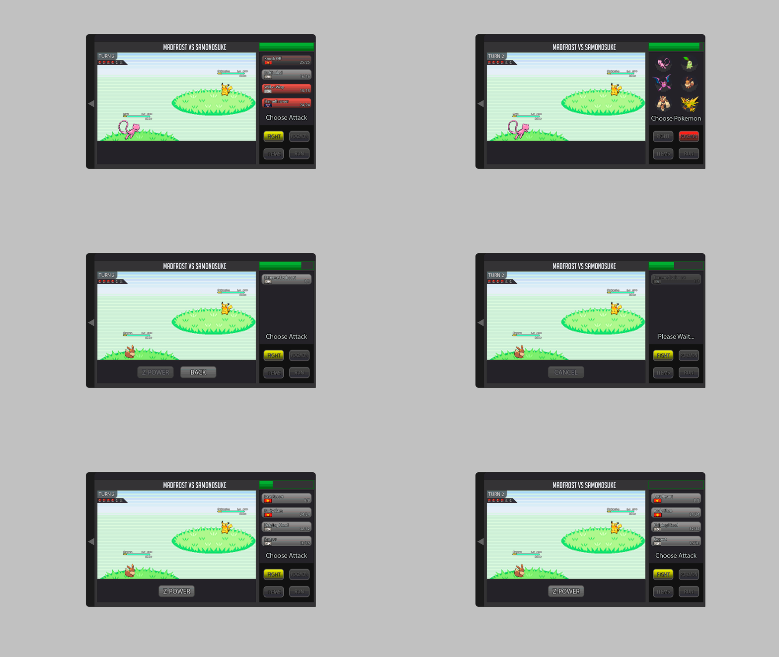
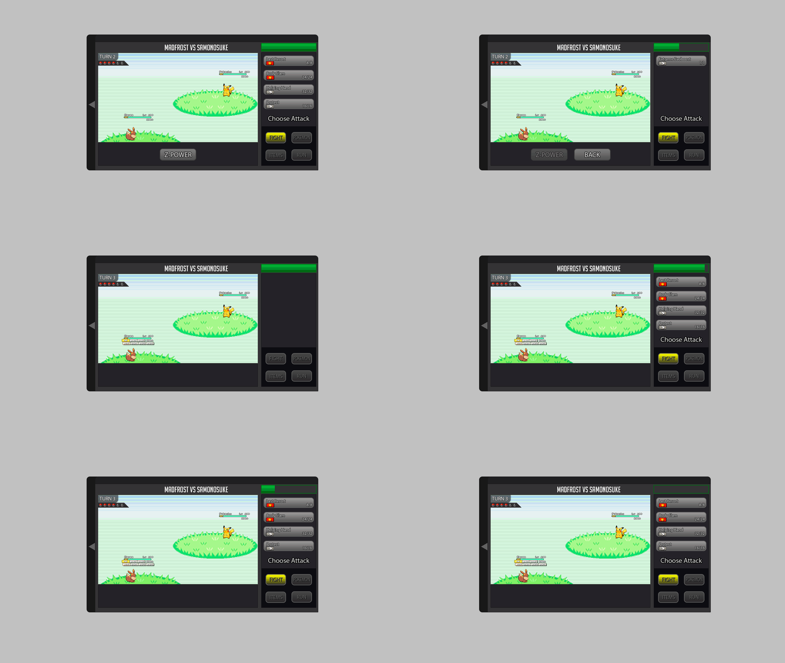
3v3_battle information Description: On the left you can see the battle information screen which can be opened by clicking on the plus icon ( minus icon if active). The screen includes information about room effects and buffs. The effects show the remaining turns. So basically it counts downwards( 3,2,1,0). Below you can see the battle log. Next to the players name you can see your Avatar and the PVP rating. Below the team preview you can see the field hazards and the weather condition. Mega Evolution should be triggered by clicking on the icon. You will then be asked if you are sure. You can cancel then or even afterwards if the opponent is still deciding for his move. Clicking on the Mega stone = yes. [spoiler=Team Switch and stat info] Description: The switch works with DRAG and DROP. The active pokemons are those with the green icon behind them. You will ask if you chose the correct Pokemon for the incoming switch and you can press OK or Cancel. Stat information can be shown if you hover over a pokemon Name. It will show HP in % and ONLY buffs which made changes. So if you have no boost in ATK, the ATK change will not appear. I have placed ALL possible changes into this "bubble". Obviously most of them will not be triggered at the same time. Just to showcase what is possible. [spoiler=Item usage] Description: I hope the Item menu is self explained. Only new thing are the categories: HP/Status heal items; Pokéballs and Battle items such as X-attack. And the feature last used item should be added for convenience . [spoiler=Z-move usage] Description: Here is the Z-Stone placed where the Mega Stone would be. Depending on your choice, since you can't have both in one team. Same dialog function. Important is. A NORMAL move, will not trigger a question where you have to press OK... You will just use it. If you have not a Z or Mega Stone the box will be replaced with OK. If you hover over a move it will show description of it as well information about Z-move. On mobile hover=press longer. __________ Hello guys. Here is my second submission. Quick info: Blue background should have around 90% opacity... Nevertheless. I hope you like it. Vote it up and dm me feedback if you want. Criticism is welcomed.1 point
-
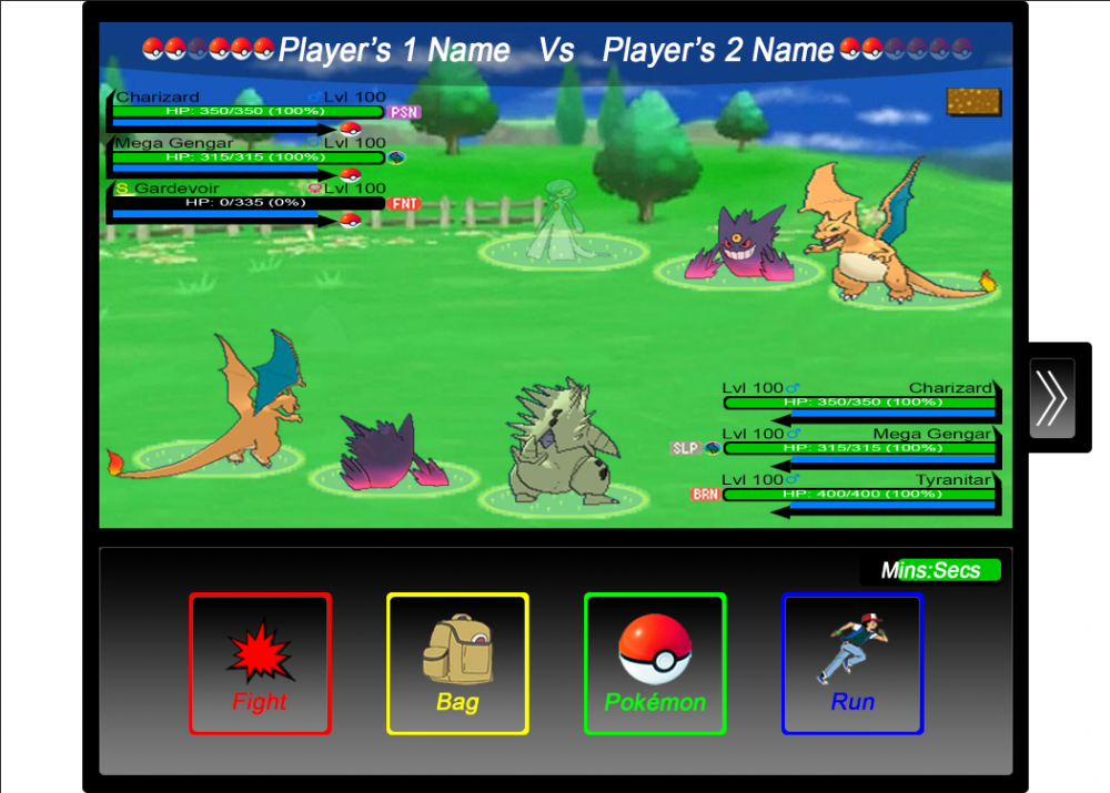
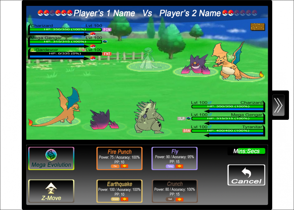
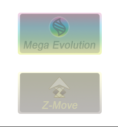
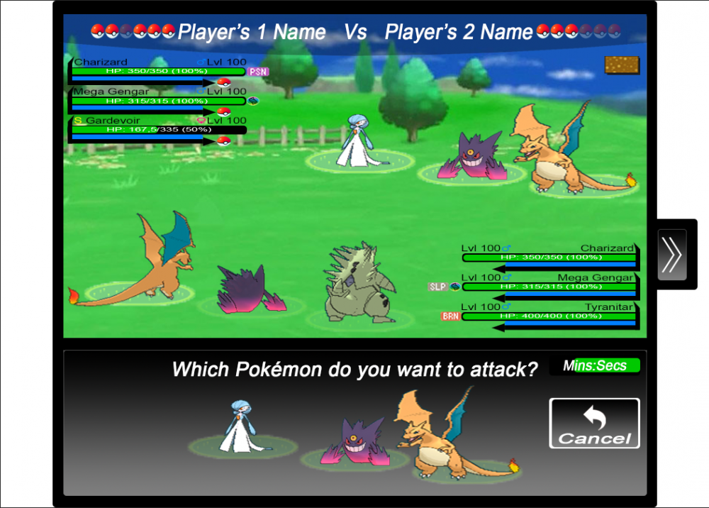
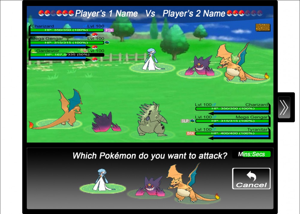
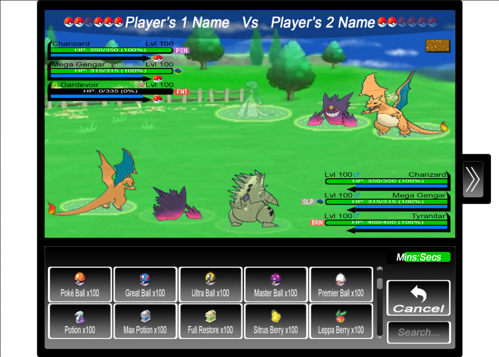
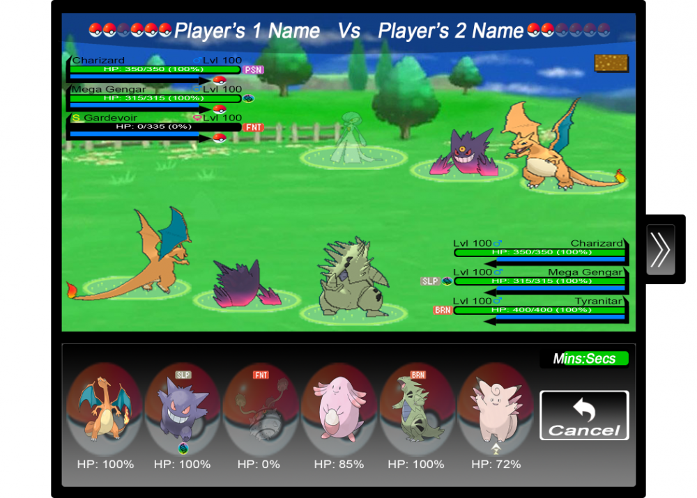
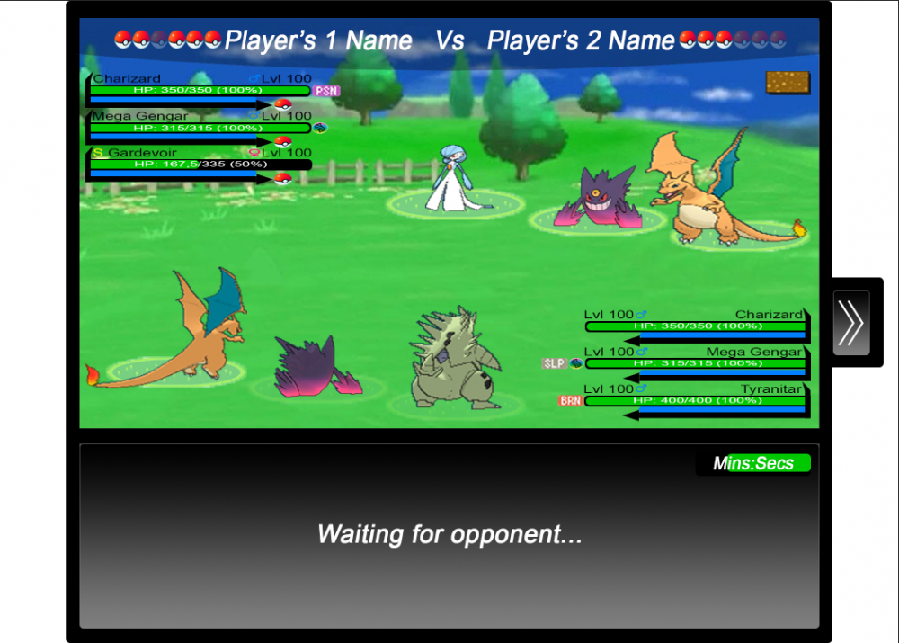
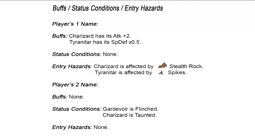
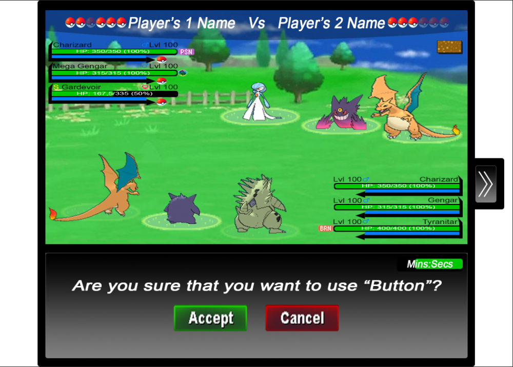
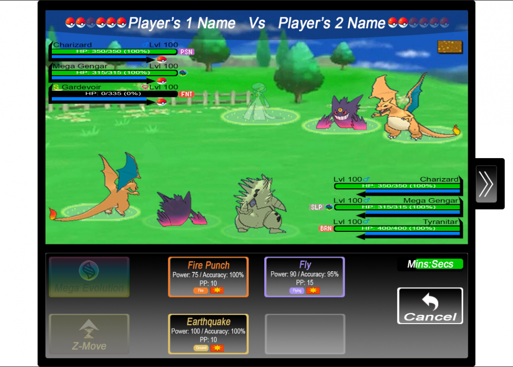
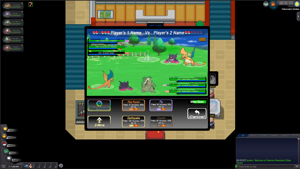
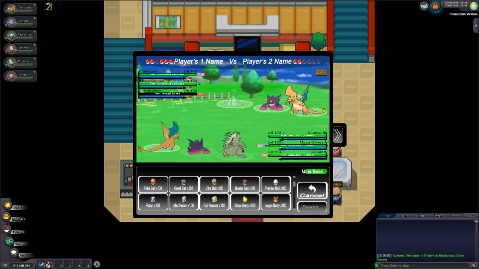
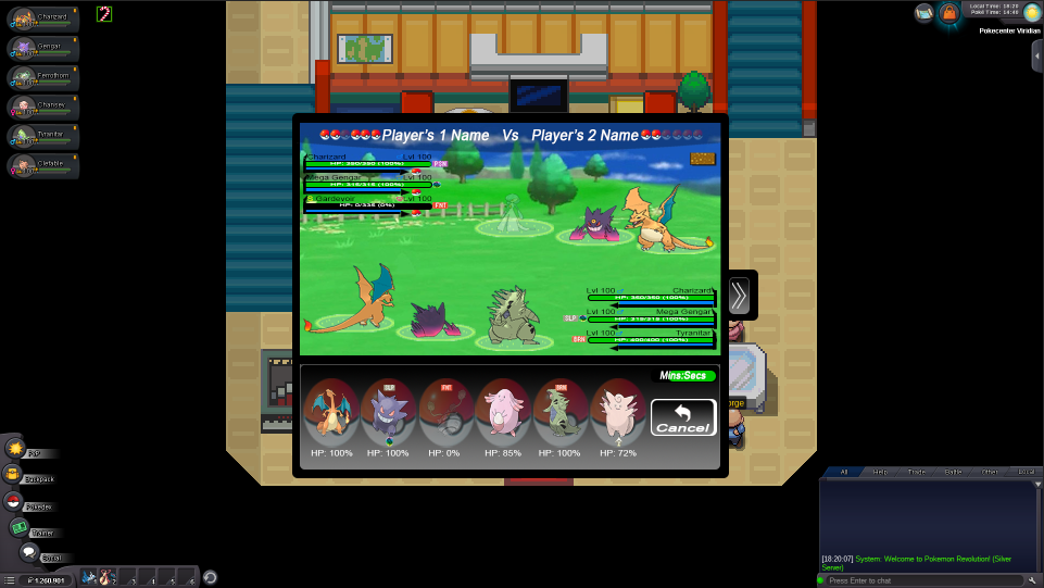
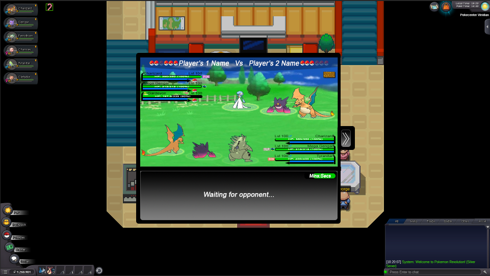
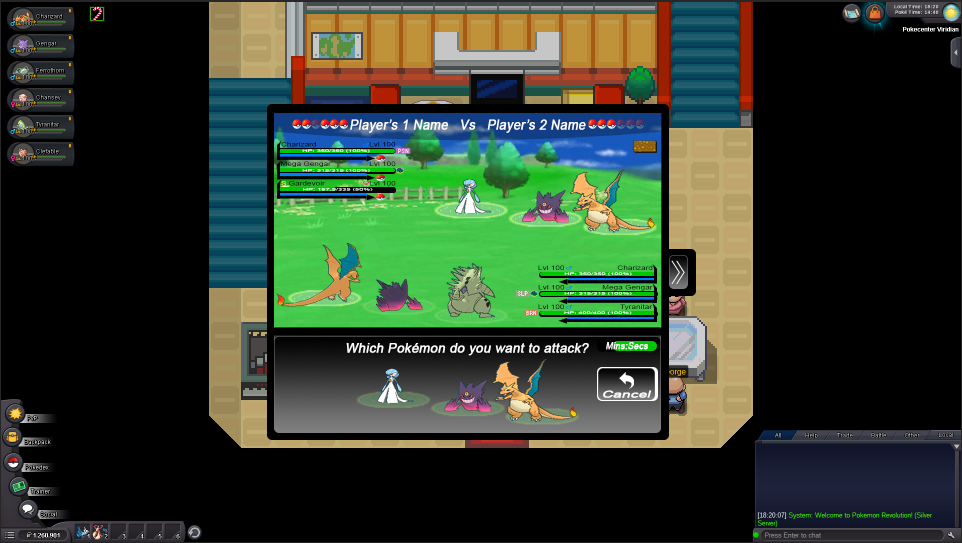
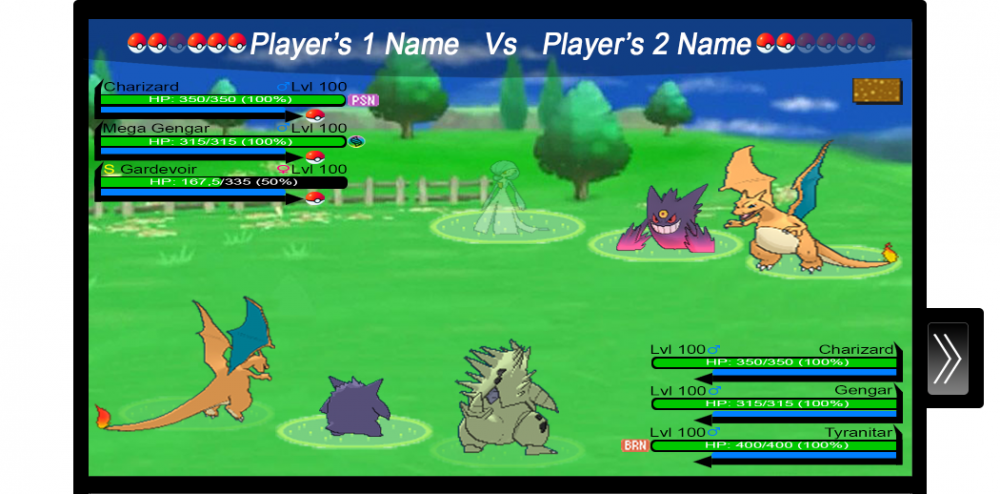
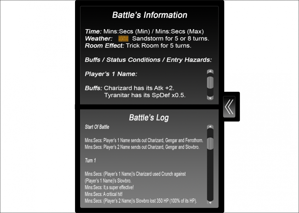
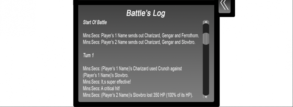
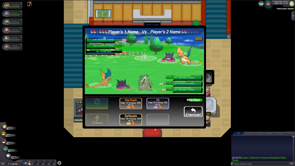
Hello everyone! This is my work for the Battle UI Rework and I hope that you will like it. First of all I want to apologize for the big upcoming post. I have made a completely new Battle UI as you will see below and I have made a lot of changes compared with the current Battle UI and I think that these changes could help a lot everyone. Also, I'm thinking that this Battle UI shouldn't be used only for PvP and it could work as well at normal battles with wild Pokémon, NPCs, Bosses, etc. I will explain every thought that I had above each image, while I was working on this Battle UI, even the obvious things, in order to avoid leaving any possible questions unanswered. So let's begin! Generall Idea: My idea was to create a Battle UI a bit similar to Pokémon's 3rd-5th Generation video games. Then I thought that it would be completely different with the current Battle UI and people either wouldn't like it at all or they couldn't get used to it and to enjoy it. So I tried to combined them a bit, if anyone can say so. Also, I made bigger buttons, in order to help mobile users, as I know that a lot of people use the Android version of the game and they keep complaining that the buttons are too small and they missclick a lot. I play the game in my PC, but I have played a bit in my mobile phone, too and the buttons where a bit small and in my opinion they weren't practical. The buttons where a bit small to me, not only in the fight, but generally in the game and imagine that my mobile phone has a screen of 5,5 inches. Ok, it's a game in the phone and no one expects to have big buttons, but they should be a bit bigger than they are now. I wanted my Battle UI to have big buttons enough, to be clear and distinct, to be understandable, and to have as much space as it can be between everything, that appears in it. Here is a first look at my work... Main Menu: This is how the Battle UI's main menu would look like, when we are in the start of the fight. You can see that there is a countdown in the right bottom corner near the "Run" button. This is like the countdown that the current PvP Battle UI has, but this one that I used, shows the minutes and the seconds that have left for our move. In my opinion this is better than just showing a bar that ends as the time passes. I placed it down in the menu section, because in my opinion our eyes will mostly check in this section, as we have to choose an action that we want to do, to use the move, the item and the Pokémon that we want and I think that it's the best place there in order to check it easier and not to check the one moment in the menu section and the other at the top, where it is right now in the current Battle UI. This countdown is the same for us and for our opponent. Also, I have made two references in the anime, in the main buttons with Red's bag appearing in the "Bag" button and Ash appearing in the "Run" button, where he runs to escape from the fight. I hope that there is no problem with copyrights as I found these pictures in Google. So the fight starts... Fight Menu: When someone presses the "Fight" button, this menu appears, where it contains the moveset of the first Pokémon of his/her squad, the "Mega Evolution" and "Z-Move" buttons, again the countdown in the same position as it was in the main menu and a "Cancel" button, which if it is pressed, we go back to the main manu. About the moves, the first move is Flamethrower, the second is Fly, the third is Earthquake and the fourth is Crunch. The moves have all the information that someone needs. They have the type's name in order to be recognizable easily, in case that someone doesn't remember the move's type and also the have an outline of type's color just for looking cool. They have the power's, accuracy's, PP's and category's information, too. If we hover over the moves, it should appear a window with the move's description. The buttons for Mega Evolution and Z-Move can't be pressed if a Pokémon doesn't hold a Mega Stone or a Z-Crystal, respectively, or if it is Mega Evolved and these buttons should be like this: Also, if a Pokémon doesn't know four moves and for example it knows only three, the last of its moves should be like this: Here, is a better example: In 2v2 or 3v3 battles, we have to choose in which Pokémon we want to use our moves. So, I thought something like this... This appears in the menu section when we have chosen a move to use against our opponent's Pokémon, but we haven't chosen which Pokémon we want to attack. As you see the terrain of each Pokémon is transparent. When we hover our cursor over the Pokémon, that we want to attack, that Pokémon's terrain will not be transparent anymore and it will be as it is in the battle screen. This indicates which Pokémon we are about to attack. Now if we press that Pokémon, the selected move will be used against it. As you see the rest Pokémon's terrains are transparent, because our cursor isn't above them. So now we are ready to use a move against opponent's Gardevoir and if we press Gardevoir, our selected move will be used against it. Now, let's press the "Cancel" button and then the "Bag" button to check our bag... Bag Menu: Here as you can see the bag menu contains all of our Poké Ball and our medicines. I would like that all of these items, to be in alphabetical order. In this picture the first item in our bag is Poké Ball, the second is Great Ball, the third is Ultra Ball and so on, and in the below line the Potion is the sixth item, the Max Potion is the seventh item and so on. If we hover over the items, it should appear a window with the item's description. Near the items, there is a scroll down bar with arrows on its edges, in case that someone wants to use them to scroll down. Again there is the "Cancel" button and the countdown and there is a "Search" section, where we can type as many letters we want in order to find the item that we want, in case we have a lot of items in our bag. For example, if someone types "Premi", the Premier Ball should appear if he/she has any. Also, I would like to share an idea about finding an item. An item should appear even though when someone types its letters with not the correct order. For example, if someone types "abll" in the "Search" section, all the items that have the letters "a", "b", "l" and "l" in their names should appear, regardless of their order in the item's name. This should be implemented in the Pokémon storage too, while some people doesn't know how to type correctly a Pokémon's name and they have to find it among all of the Pokémon that he/she has. Also, in the Pokémon storage should be implemented that you can type "." (dot) or " " (space), because for example you can't find Mime Jr., unless you search it among all of your Pokémon. Also, we have to know which Pokémon we are using, while we search our items in our bag. This can be shown by the terrain of that Pokémon. If it isn't transparent, then it is the Pokémon that we are using right now and for example we can give it a Max Potion, if it needs it. Let's press the "Cancel" button again and now let's press the "Pokémon" button to check our Pokémon... Pokémon Menu: As you can see here we have again the countdown and the "Cancel" button. Except these we have our Pokémon squad with the very left Pokémon to be the first of our squad and the very right Pokémon to be the sixth of our squad. Furthermore, a fainted Pokémon should be transparent as this Ferrothorn with the "fainted" status above its head, too. Here, there are some status conditions above each affected Pokémon's head and below of the Pokémon that is Mega Evolved or it has used a Z-Move, there is the Mega Evolution's symbol and it shows which Pokémon we have Mega Evolved in this fight and the Z-Move's symbol and it shows which Pokémon used a Z-Move in this fight, respectively. Also, here we can check each of our Pokémon's HP. Now that the explanation of each menu has ended, let's explain what we see in the batle screen... Battle Screen: I am thinking that when the fight is about to start, the battle screen that shows the Pokémon, the HP/Level bars and the backgrounds fade in, then the first Pokémon with its HP/Level bar appears (first two for 2v2 or first three for 3v3) and after that we can make any action that we want. The Pokémon that appear in the fight at first, are our first three Pokémon. As you can see in the image we have Charizard, Mega Gengar and Tyranitar. Charizard is the first Pokémon in our squad, Mega Gengar is the second and Tyranitar is the third one, that was sent out in the place of a fainted Ferrothorn. Our opponent's first Pokémon is Charizard, the second Pokémon is Mega Gengar and the third one is Gardevoir. In addition, you can see that our third Poké Ball at the top, to the left of our name is transparent and that is because our third Pokémon fainted (Ferrothorn) and in its place we sent out Tyranitar. So, the very left Poké Ball is our first Poké Ball and the very right is our sixth Poké Ball. For our opponent, the very left Poké Ball is his/her first Poké Ball and the very right is his/her sixth Poké Ball. I did it this way, cause I think it helps a lot, as it's like reading a text. Also, if a trainer doesn't have a Pokémon to send out in the place of a fainted Pokémon, the fainted Pokémon should be transparent like Gardevoir in the image above. In case, that we battle for example, a swarm of Ariados (2v2 or 3v3 battle), then the fainted Pokémon would be transparent like the Gardevoir in the image above, or it would be removed from the field. I didn't design a 2v2 battle, because it's the same with a 3v3 battle. Moreover, the status conditions, Mega Evolution's symbol and Z-Move's symbol should be near each Pokémon's name in order to know which Pokémon has a status condition, or it is Mega Evolved or it has used a Z-Move. By the way, the order of the status condition and the Mega Evolution's or the Z-Move's symbol should be like this: First Gengar has been Mega Evolved and after that Gengar fall asleep. So, the symbol that is nearest to each Pokémon's name is the one that happened first. Also, the name of each Mega Evolved Pokémon should be changed to the mega one, such as "Gengar" to be changed to "Mega Gengar". I think that it would be perfect, if there would be an indication of how much HP does a Pokémon have, like "HP: 284/350". This helps us knowing how much damage deals, a move from our opponent's Pokémon to a specific Pokémon of our squad. With this change if we take damage from a certain opponent's Pokémon move, then we may know how much the same move will deal the next time the same two Pokémon fight again, unless there were stats or something that changed the move's power. Now you can see that appears the weather's symbol in the battle screen, which in this case is Sandstorm's symbol. Something else about battle screen, is that we have to know which Pokémon we use each time. We can understand it from the terrain below of each Pokémon. The unselected Pokémon's terrain is transparent and it shows us that we don't use that Pokémon and we use the one that its terrain isn't transparent. We really don't care which Pokémon our opponent is using each time and that's why there isn't any transparent terrain below of his/her Pokémon. We check at the Battle's Log, which Pokémon he/she uses. Also, if we own a Pokémon that our opponent owns, too, a Poké Ball should be appear near the Level Bar and if we don't own it, then that place should be blank. If a trainer doesn't have complete squad (six Pokémon), then his/her squad near his/her name, should be like this: As you see there are five Poké Balls in the Player's 2 squad, instead of six, as he/she doesn't have complete squad. Now what is going on when our opponent's turn arrives? Waiting For Opponent: This message appears, when the opponent's turn arrives. And when our opponent makes his/her move this message disappeares and we are redirected to the main menu, where we are ready to make our next move. Something else that you may have noticed, is that I don't have the battle's information about the weather's/trick room's turns, the buffs, some status conditions such as "flinched", the entry hazards and some kind of battle log. This is why it is hidden and it is revealed with this button: It is hidden, because it may covers enough space and this can be annoying. If someone presses it, it opens and it is like this: Now let's discuss a bit about this window... Battle's Information/Buffs, Status Conditions and Entry Hazards/Battle's Log: Here as you can see there are all the information about the battle such as the time that counts down (I wanted to place it in this section, too, because someone might be busy, while he/she tries to find something in this window and he/she didn't look at the countdown that there is in the main menu, in the fight menu, in the bag menu and in the Pokémon menu), the weather and the room effects and how many turns have passed. If there isn't any weather or any room effect in the field, then in the place of weather and room effect, should appear this: "Weather: None." and "Room Effect: None.". Also, here there is a buffs/status conditions/entry hazards section with a scroll down bar, where it shows for each player his/her Pokémon's buffs/status conditions (if there is any) and if any of his/her Pokémon is affected by any entry hazard. Furthermore, there is a battle's log, in which we can see everything that took place in this fight. Check the examples of battle's information, of buffs/status conditions/entry hazards and of battle's log: Time shows how much time has left for our move and also there are how many turns have passed from the weather and room effects. Here we see the buffs, the status conditions and the entry hazards that affect each Pokémon. In status conditions's section there should be only the status conditions that don't have a specific symbol, in order to be recognizable such as "Sleep" that has this symbol: So in this section there should be only the status conditions like "Taunted", "Flinched", etc. and not the major status conditions such as "Burned", "Frozen", etc. The major status conditions are shown in the battle screen and we can recognize them easily. Namely, there should be only status conditions that affect mobility like "Wrapped", that affect move execution or move effects like "Confused", the move-based status conditions like "Dig", the shield status conditions like "Reflect", the sword status conditions like "Focus Energy", those status conditions that affect the use of items like "Embargo", the HP-related status condtions like "Leech Seed", the visibility-related status conditions like "Miracle Eye" and finally the miscellaneous status conditions like "Gastro Acid". Also, among these status conditions there should be only one sleep-related status condition like "Sleepless". In the entry hazard's section we see that there is an entry hazard with its symbol, that affects each Pokémon. Let's check a better example of how this section is: And now we check the last section of this window... Now we have a Battle's Log with a scroll down bar, where there is what exactly and when happened in this fight from start to finish. The "Mins:Secs" indicates the real-life time. For example, if we started a fight at 16:57, in the start of the fight there should be this time (16:57). I didn't know if you wanted to check some new sentences and that's why I sticked to some classic sentences and I added some new things that the current battle log doesn't have. I think that you may wanted to see a place for battle log and not some kind of battle log with some sentences of mine, but if you want something like this I can work on it. Now what happens if someone missclicks an action and wants to correct this mistake? I think that this can be very helpful... This question should be appeared after every action that we take, because a lot of people have missclicked a button or they have regreted about their choice of a move/item/switch Pokémon. I think that this will be very helpful to all of us. But this can also make the game very slow, so I recommend to use it only in "Mega Evolution" and "Z-Move" buttons that can be used only once per battle. So if we wanted to mega evolve Gengar to Mega Gengar, then that message should appear. Now I will show you how the Battle UI would look in game... So this is my Battle UI! I hope that you like it. I did my best in order to give you a Battle UI that everyone will enjoy!. I think that I haven't forgot anything and that I have covered everything about the Battle UI rework. If there is something that you don't understand, feel free to ask me. Also, in case that my Battle UI is chosen, if the developers want to know anything about my work such as my sources, the dimensions of the objects or more, of course you can ask me. Of course I can design some backgrounds for the battle screen, add some items that the game doesn't have right now, such as the rest Poké Balls and more! If you want anything, like I said before, don't hesitate to contact with me. I hope that the stuff will love it and the developers will not have problem to materialize it! Credits go to Bulbapedia, because I used a lot of stuff from there and of course to Google!1 point
-
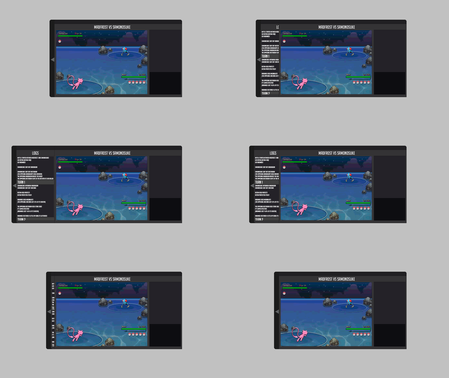
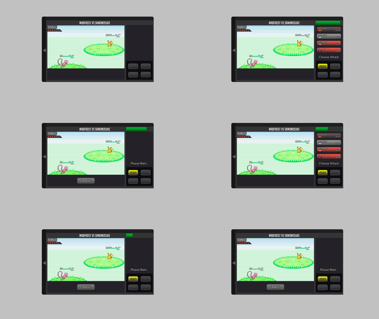
Hello guys (: Please open the spoiler and click on the images to view them. [spoiler=1v1_first impression] The first picture is 1v1 clean version. This means it doesn't contain info boxes and effect boxes. The 2nd picture include those boxes I've mentioned. When opening the Battle Information the sprites should resize to fit the battle field. The Info boxes for moves and stats are ONLY seen when you hover on it PC player. Mobile user can press the i-con for move information. For stat information mobile player can double click the name. Here you can see the screen for people who prefer the menu on the left side. Can be achieved through the settings toggle on the top left side. If you would like to chat , you might use the settings which are on the bottom side at the battle information box. [spoiler=Menu_UI_switching_and_items] Here you can see the UI when you want to switch out the current Pokémon which is placed in a slightly green box. For 2v2 and 3v3 there will be obviously 3 green boxes to indicate which Pokémon are active fighting. Defeated Pokémon are shown with a red overlay. Here you can see the UI for using ITEMS. There is a quick pick( Last used item) and 3 categories which are like tabs. The first category has all HP and status items. The 2nd has Pokéballs. And the 3rd has battle items such as X-Attack pills or whatever they are called. [spoiler=2v2 and 3v3] Here you see 2v2 with the battle information. So the sprites are smaller. Here 2v2 without battle information. Sprites are slightly bigger. Here 3v3 with the battle information. Sprites slightly smaller. Here 3v3 without battle information and the sprites are resized again. [spoiler=Z_move and mega_stone] Depending on the pokemons item these icons should be clickable and you will be asked to use Z-move or Mega Evo. You can cancel it or press ok. *Important* For normal moves you won't be asked. Also the name of the Z move will be in the dialog box top right corner!!! Not in the actual former move. Since the longest Z - Move name has 25letters. Everything done so far is using the mobile first approach. Which means that I designed it for mobile devices( 360x640). The reason for that is that it is easier to scale later on since all Elements are already implemented. #responsive Most Icons and Elements were done by me. I can provide you with further support and also adjust the design to your liking. Here you can see how it would look on a mobile device. [spoiler=mobile device] I appreciate feedback and I am willing to make changes if necessary. Please hit me up on my DMs if you have suggestions.1 point
-
You have only transport pass. But you have to pay in other fact. In journey to moon 15 k cost for oxygen. Or for what I do no. I am also a player like you. I also have a transport pass but I have to pay 2.5 k to enter per Excavation sites. You can only roam here to there using transport pass. But in other fact you have to pay for it. I think this info will help you.1 point
-
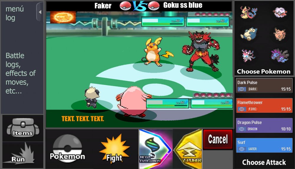
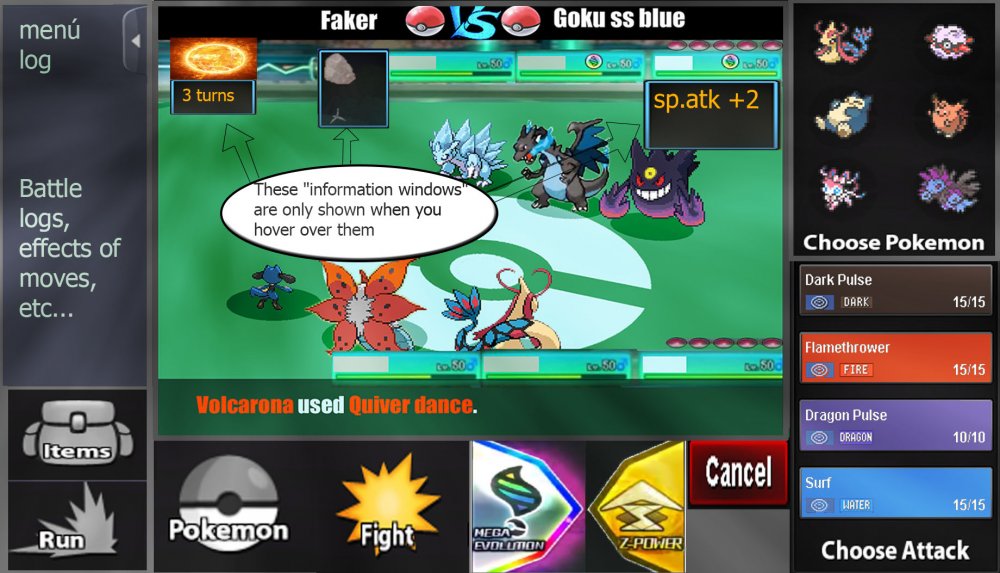
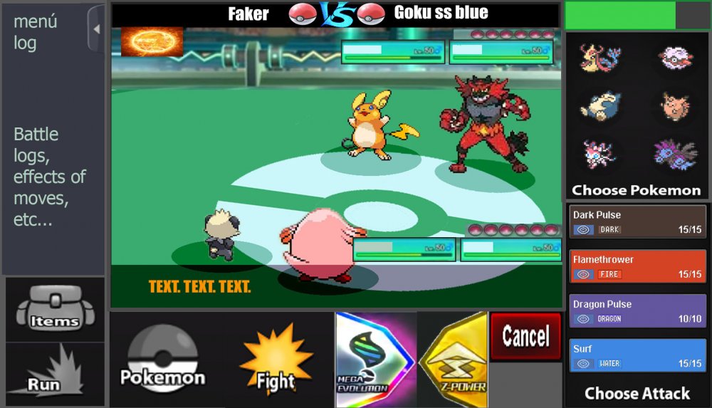
Hi, this is my battle iu, I hope you like it. Basically it has all the buttons that have been required, bigger buttons also thinking about the Android version and PC users. The battles, I prefer them to be full screen optionally (The battlefield is made by me ... it's for the pvp battles) Let us begin 3 vs 3 Battles: -I have reinvented some parts like the "vs", and also the attacks with colors of their types. -The buff states must be as shown in the image, - they only have to be displayed when the mouse passes over- -The Menu Logs must be able to open and close, as the user wants, by means of a button placed as shown in the image -items and pokemon in same place, are changed, by pressing "pokemon button" or "items button"- -items and pokemon in same place, are changed, by pressing "pokemon button" or "items button"- -As I see it in the game "window mode"- -2 vs 2 Battles- -same controls as in version 3 vs 3, there are no major changes. That's it, I hope I have not forgotten anything, thanks for watching, regards1 point
-
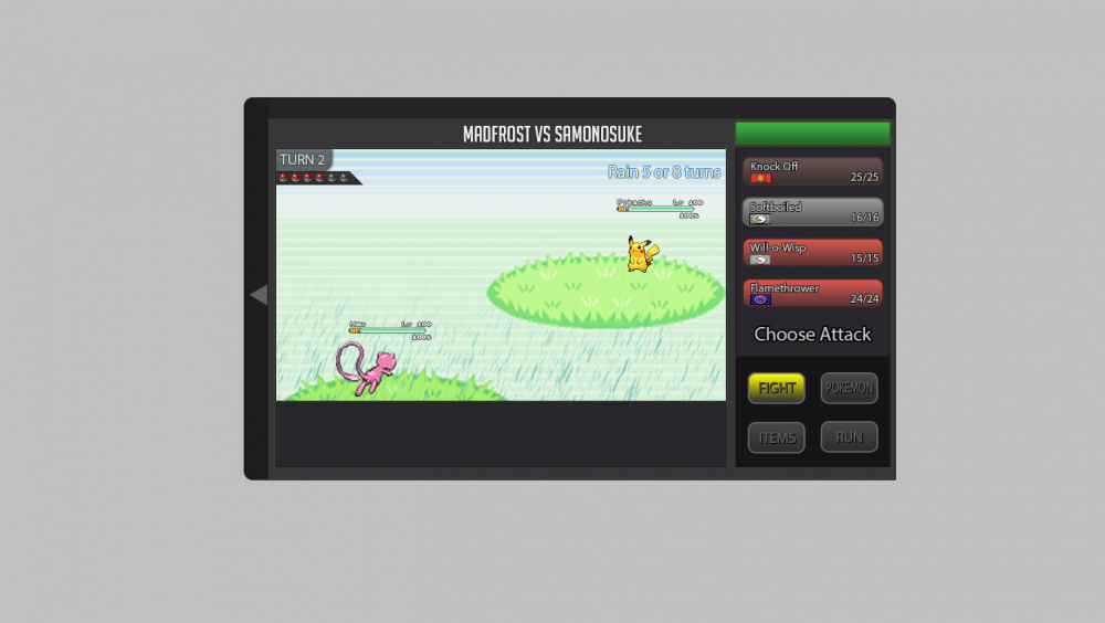
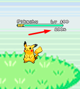
About the new battle UI I explain what I think and I'm putting some gifs and images as an example, I hope you understand. About the new Battle UI I thought a lot and I came to a conclusion about doing a Battle UI based on the old one, because I think the old one is very good, and I think it would be better to recreate it because if I create a new Battle UI, I think it would bother a lot of people who hunt all day and for those people who play the game on the cell phone. So I decided to recreate the old one trying not to disturb the people who play the game on the cell phone and for those who are hunting pokemons all day. Battle 2v2 and 3v3 fights: For 2v2 battles could work with the first two pokémons of your list. For 3v3 battles could work with the first three pokémons of your list Example: In the example I put the video of the Ash playing the pokeballs because I had not found an animation on the internet just playing the pokeball. Button for Megas: For the megas I think it should stay down as it is there in the example. Example: Button for Z-Moves: For the Z-MOVES I think it should stay down as it is there in the example. Example: Button for Cancel: For the Cancel I think it should stay down as it is there in the example. Example: Battle Logs: I think it would be nice to create a button next to the logs, as soon as it clicks the button will appear the logs next. Because there are people who get pokemons all day long, and with the logs appearing this right away I think I could mess up these people who are hunting many pokemons. More information looks at the example below. Example: Buffs, Paralyzed, Taunted etc: Paralyze, taunts, buffs and etc. I think I should stay in below life because I think it would look cool because it was going to look like the other pokemon games! Paralyze, taunts and etc. should appear before, and the buffs soon after. More information looks at the example below. Example: Then in the example you will see that he took Paralyze, it is because the pikachu used an attack and gave paralyze in Eevee, and the Paralyze appeared before the buffs. Weather and room effects as well as their turn count: The weather and counting should be right there in the upper right corner, showing that she is in such a Climate and showing the count of turns that she ends up. More information looks at the example below. Example: Extra: I think it would be nice to put a percentage of the Pokémon's life at the time of battle. Example: I made some changes in the post to put the bigger gifs because they were too small and hard to see. Thank you for your attention. :D1 point
-
1 point
-
the best opinion is the "choose 1 from 6 pokecard" daily login gift, and the new schratching cards as i said before :D all in one1 point
-
1 point
-
+1 , is a great idea for the implementation in game. Like a Lotary Ticket with 3/4 icons and u click on one and it will give you the item reward of it and discard the ticket from the current result. I like it, good idea. in fact can contain the new Pokeball's(fast, heavy, time, etc, etc). but -1 at the shiny chance , i think give pokémon's inside a "bonus login" is to much, in my opinion will drop a lot shiny prices and is not the objective, only if they are ultra rare in chance, then i agree with all your idea.1 point
-
1 point
-
I saw that login gift system on alot of games. my idea: fortune wheel or scratch card daily one (choose 1/6). Requ: 2 gym badge completed on kanto. Pokedollars, 5x ultra balls, 5x rare candies, rare held items, and with low chance jackpot some valuable rewards (3day ms, master ball, skin costumes, chlotes, hats) And another idea: New item to market Silver pokemon fortune card for 5 coin, (contains normal rewards like pokedollar, ball, repel...and with 5% chance some valuable) gold pokemon fortune card for 20 coin (contains middle grade rewards and with 20% some valuable) diamond pokemon fortune card for 50 coin (contains the best valuable rewards and with 35% chance something super reward)1 point


