Leaderboard
Popular Content
Showing content with the highest reputation on 01/24/19 in all areas
-
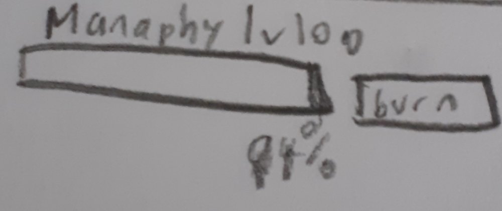
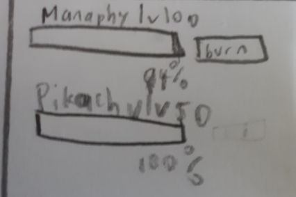
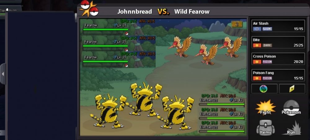
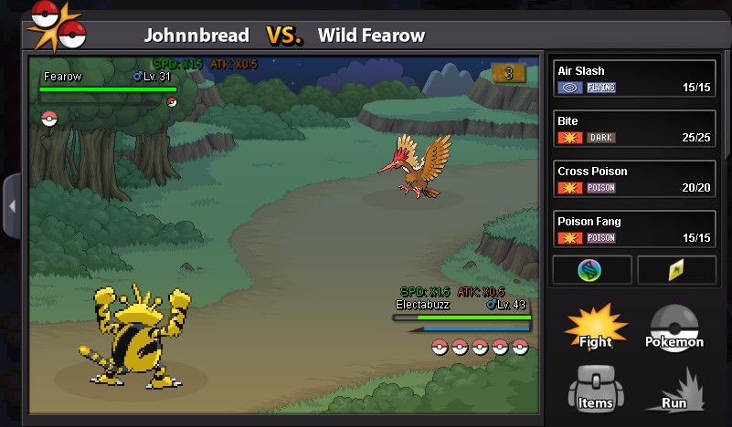
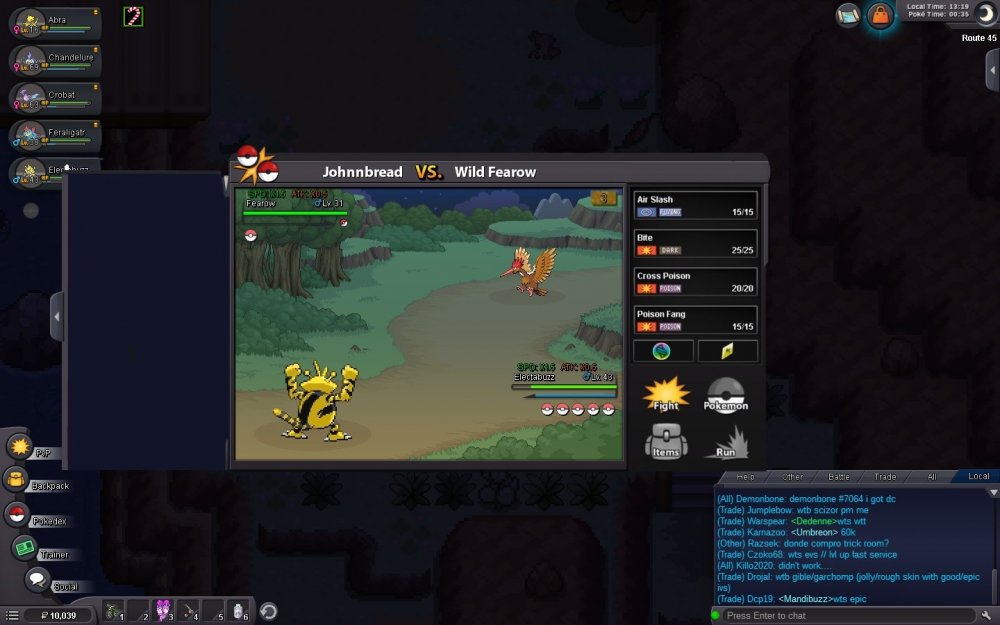
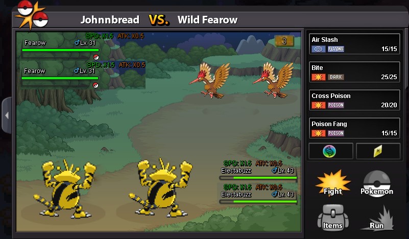
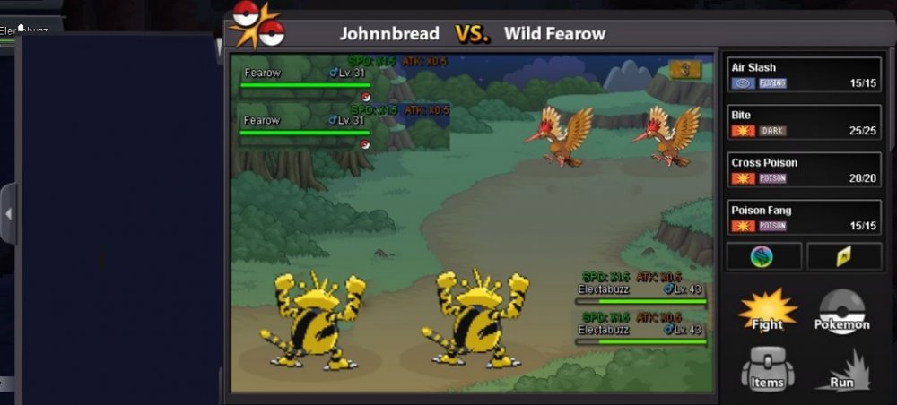
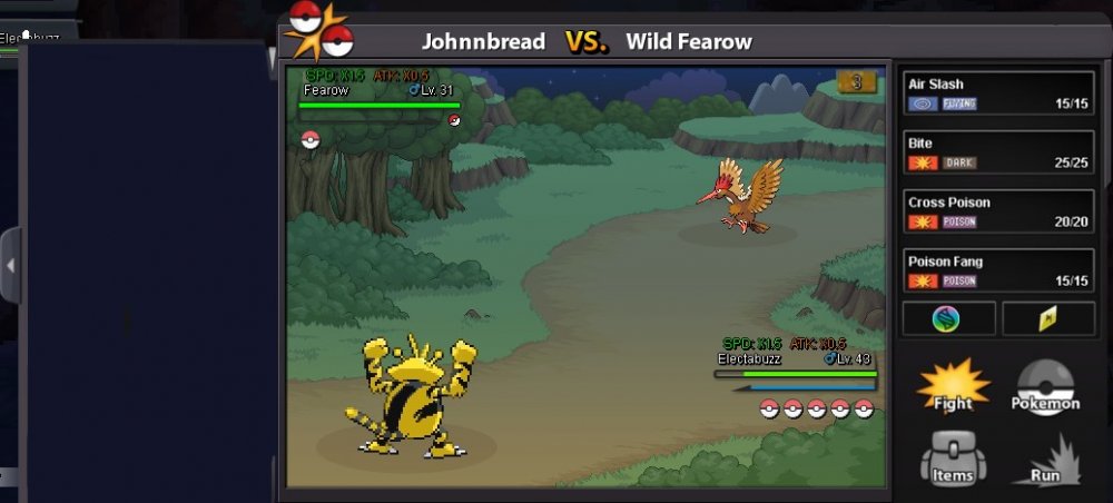
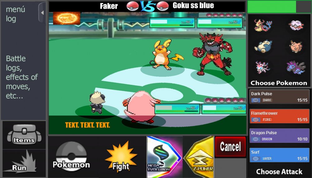
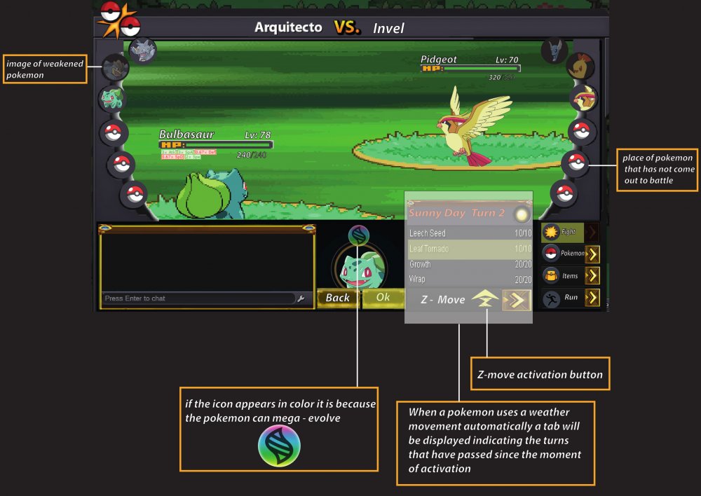
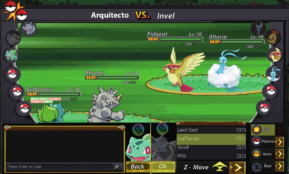
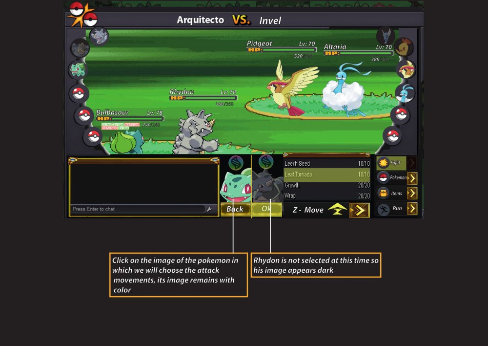
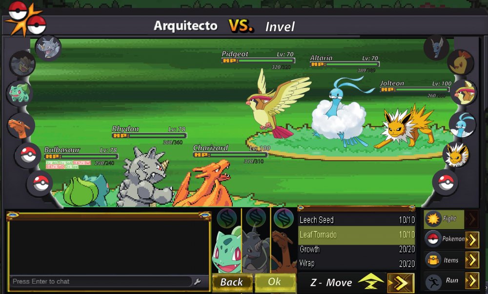
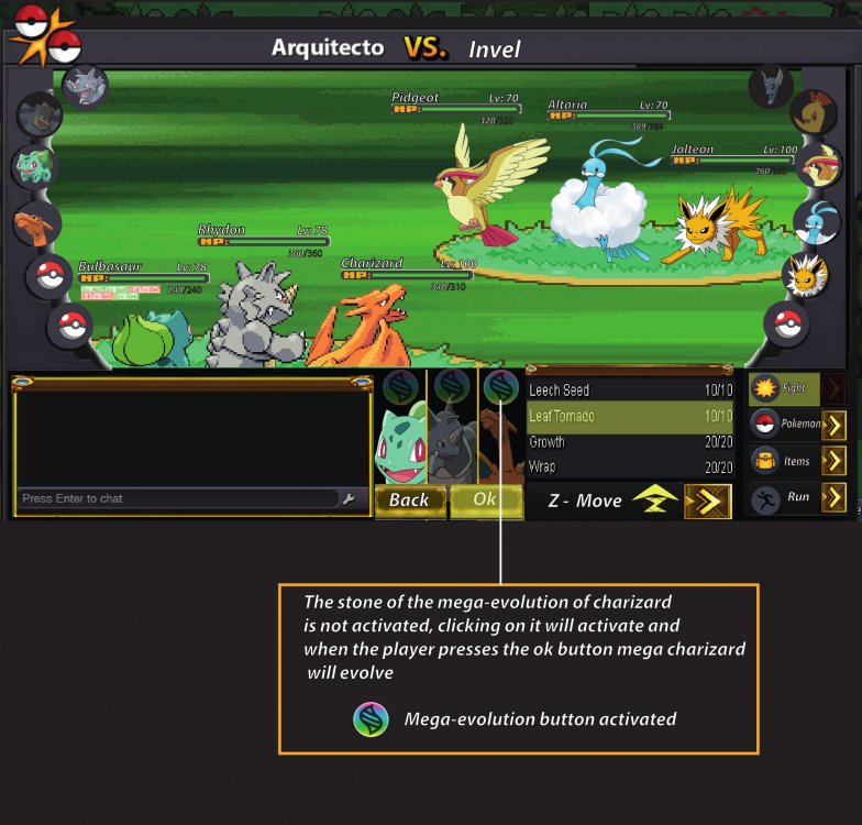
In near future there will be a significant PVP update. My full concentration is set on this right now, which is why there will probably less updates in the next time. For this PRO needs a new Battle UI, because the current one is missing a few features. There are already staff members who work on it, but as their specialty lies in other areas, I want to give everyone the possibility to participate. That's why I make a small event out of it. Everyone is allowed to create a new Battle UI and the Battle UI that will be taken over will be royally rewarded. The one gets a non-tradable shiny of your choice. The nature can be chosen, the IVs and ability will be generated randomly. The Pokemon must be catchable by everyone. The following things have to be added in the new Battle UI: - Enough space for 2v2 and 3v3 fights. - Buttons for Megas, Z-Moves and Cancel a move. - Some kind of battle log should be included as well. - Every current element (items, run away, moves, switch Pokemon) should be included obviously. - An option to show boost and effects (SPD x 1,5, Paralyzed, Taunted etc.) would be great. - Weather and room effects as well as their turn count. You do not have to stick to the current design. You can change it completely, even make it full screen mode. That is completely up to you. Please note, that if we take non of the submitted designs, there will be no winner at all. You have 30 days (Janurary 15th, 11:59 PM GMT+0) to submit a battle UI. The time might be extended if there's no usable design till then. This post will be unlocked in 2 weeks on December 30th, please post your battle UIs in here. Do not make any unrelated posts here. Please only post the final UI in here. The winner has to submit the final design, all UI elements and has to give PRO the permission to use it. Good luck to every participant.2 points
-
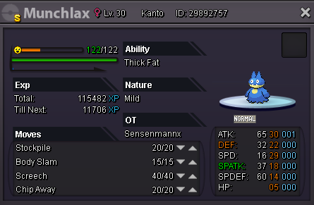
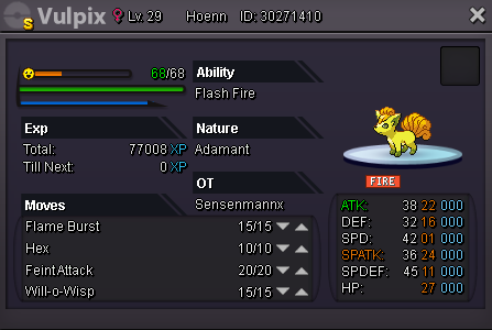
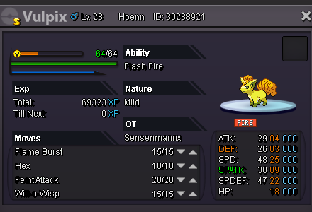
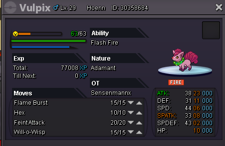
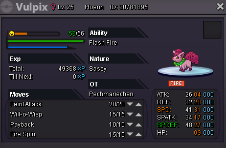
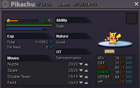
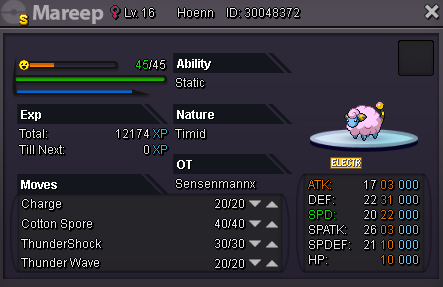
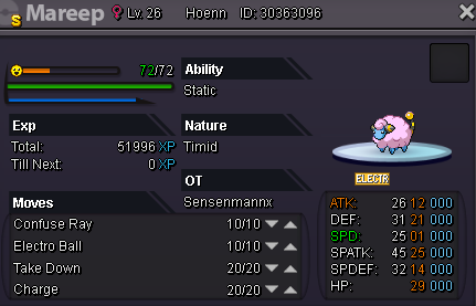
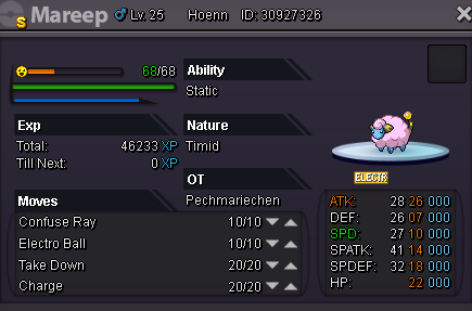
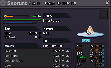
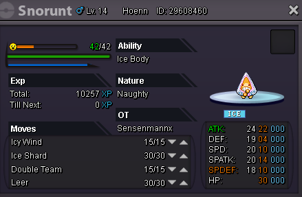
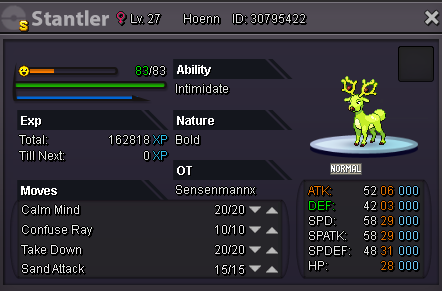
So i don't want to say much i'll just do a cute giveaway :b Just leave a comment and u can win one of these Pokemon -> (silver server btw) Winners: 1.PopInSmoke/Shiny Munchlax 2.GentleSnow/Xmas eevee 3.Inbaa/Xmas Torchic 4.Duerenkran/Shiny Vulpix adamant 5.Dame201/Shiny Vulpix Mild 6.Eboncandle/Xmas Vulpix Adamant 7.Lysandre/Xmas Vulpix Timid 8.hahahaka/Xmas Vulpix Relaxed 9.Elleaf/Xmas Vulpix Sassy 10.Celina96/Xmas Pikachu 11.SoCloseToRage/Shiny Mareep 12.Dexshop/Shiny Mareep 2 13.legendarylord/Shiny Mareep 3 14.Justyuno/Shiny Mareep 4 15.Nickelangelo/Xmas Snorunt Mild 16.tsclone/Xmas Snorunt Naughty 17.RuthlessSlayer/Shiny Stantler Congrats everyone <3 1. 2. 3. 4. 5. 6. 7. 8. 9. 10. 11. 12. 13. 14. 15. 16. 17. Informations: If u win and u didnt finish Hoenn yet ill keep that pokemon for u until u can take it or u can tell me a friend u trust in and he can take care of it aswell o: I'll close the giveaway on Sunday 27.01 - 18:00 CET the winners will be announced some hours later so gl everyone :32 points
-
2 points
-
I want to take a moment to mention on how great the gifting event that you make. I'm sure it benefit to all player whether they still new or already veteran. Sorry for didnt participate in the picture, and Im also promoting to other people to take part in the gifting event . Anyway, congratulates you once isnt enough.. so here another one, Happy Birthday to you Ic3thirst . Such a compassionate and generous player.2 points
-
2 points
-
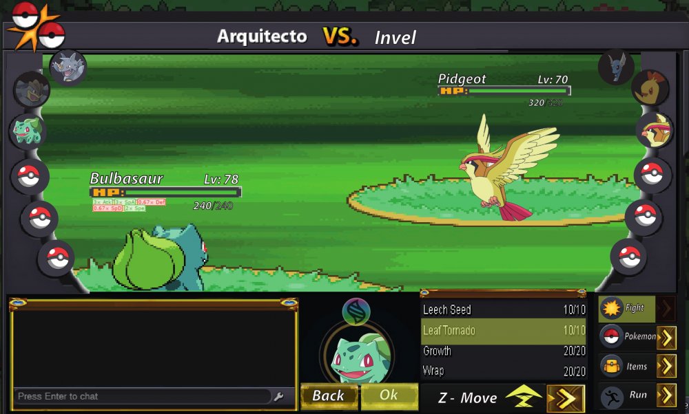
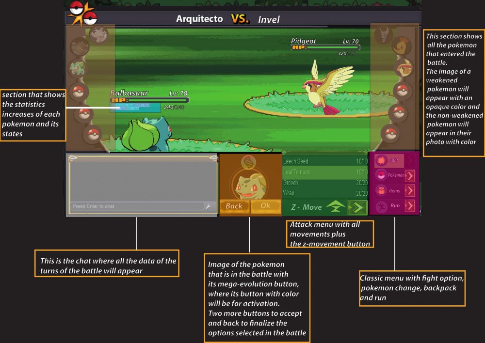
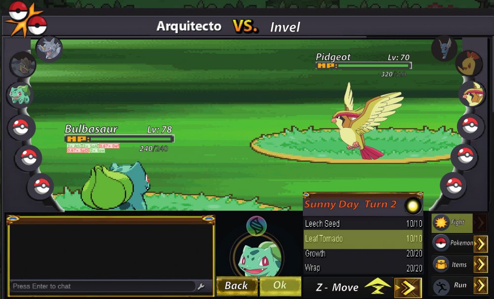
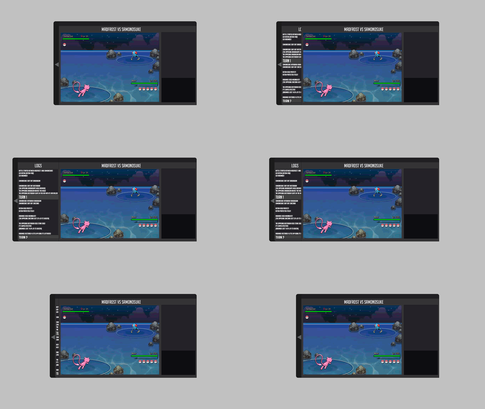
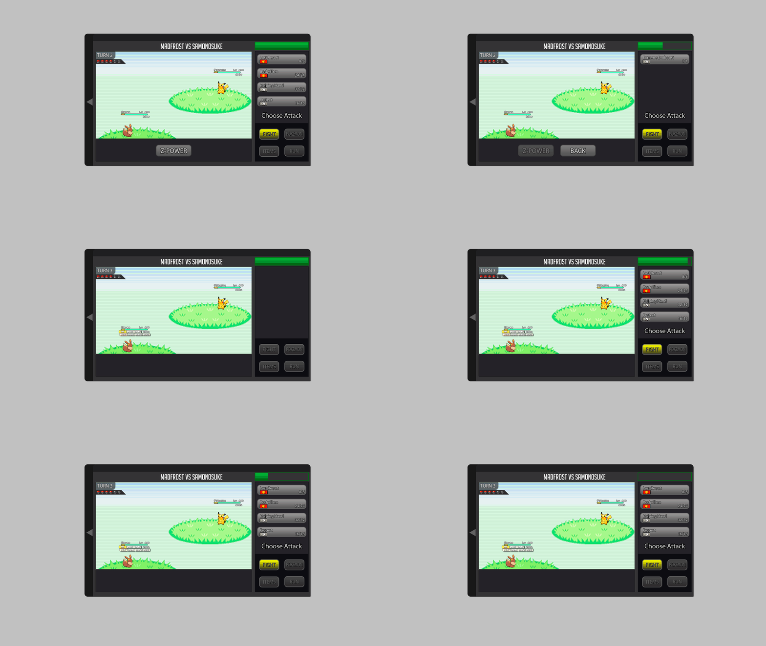
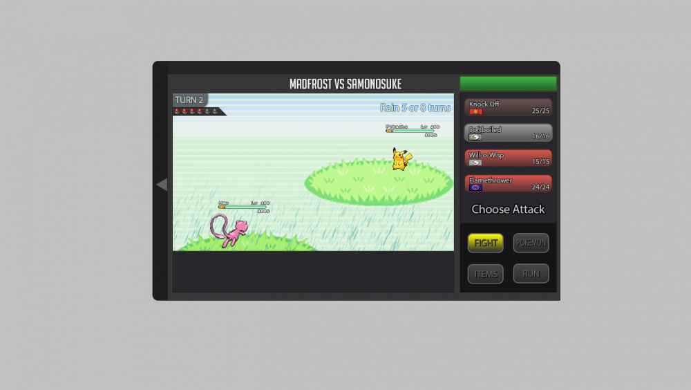
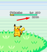
About the new battle UI I explain what I think and I'm putting some gifs and images as an example, I hope you understand. About the new Battle UI I thought a lot and I came to a conclusion about doing a Battle UI based on the old one, because I think the old one is very good, and I think it would be better to recreate it because if I create a new Battle UI, I think it would bother a lot of people who hunt all day and for those people who play the game on the cell phone. So I decided to recreate the old one trying not to disturb the people who play the game on the cell phone and for those who are hunting pokemons all day. Battle 2v2 and 3v3 fights: For 2v2 battles could work with the first two pokémons of your list. For 3v3 battles could work with the first three pokémons of your list Example: In the example I put the video of the Ash playing the pokeballs because I had not found an animation on the internet just playing the pokeball. Button for Megas: For the megas I think it should stay down as it is there in the example. Example: Button for Z-Moves: For the Z-MOVES I think it should stay down as it is there in the example. Example: Button for Cancel: For the Cancel I think it should stay down as it is there in the example. Example: Battle Logs: I think it would be nice to create a button next to the logs, as soon as it clicks the button will appear the logs next. Because there are people who get pokemons all day long, and with the logs appearing this right away I think I could mess up these people who are hunting many pokemons. More information looks at the example below. Example: Buffs, Paralyzed, Taunted etc: Paralyze, taunts, buffs and etc. I think I should stay in below life because I think it would look cool because it was going to look like the other pokemon games! Paralyze, taunts and etc. should appear before, and the buffs soon after. More information looks at the example below. Example: Then in the example you will see that he took Paralyze, it is because the pikachu used an attack and gave paralyze in Eevee, and the Paralyze appeared before the buffs. Weather and room effects as well as their turn count: The weather and counting should be right there in the upper right corner, showing that she is in such a Climate and showing the count of turns that she ends up. More information looks at the example below. Example: Extra: I think it would be nice to put a percentage of the Pokémon's life at the time of battle. Example: I made some changes in the post to put the bigger gifs because they were too small and hard to see. Thank you for your attention. :D2 points
-
1 point
-
1 point
-
Hi @Libayasan I'm sorry for the inconvenience. I would like to inform you that Red on Mt. Silver is useful only to unlock the Trainer Valley and you can do that either by winning or losing against him as the result of the battle really doesn't matter. However, do note that to access the Trainer Valley you need to meet other requirements that are the following: Quoting our HOW TO ACCESS SPECIFIC MAPS: Fight with Red at the top of Mt. Silver (doesn't matter whether you win or lose) Catch 120 Pokémons native from Kanto (from range #1-#151) Get 38 evolved data Be able to take the train Subway & Train Quest Guide I hope what said provided some clarification, let me know if something is unclear and if you have any further questions. Have a wonderful day !1 point
-
1 point
-
1 point
-
Hi i don't now is this can help but i think in 2019 year your guy shoudl add mega stones and quest for them like beedrillite from a quest of bug catches ,... New region like unova, kalos ,.... because that can made more player join this game . Pleast tell me is your guy like this i really want now what will u guy think about this1 point
-
I want bold happiny with 02 sp att and 13 spdef. My ign rhyxzr and discord is dittold#14201 point
-
General belated birthday to our community members. Hope you enjoy the +1 closer to becoming an old person.1 point
-
Thank you so much Eth4rnal <3 , yeah i hope we all can do the best for our beloved people here on PRO , I promote too for any gifting event , thank you so much love <3 <3 u were so amazing last night and thanks for the gift too <3 Cheers <3 And here is another lovingly post from bunny too : https://pokemonrevolution.net/forum/topic/118152-url :*1 point
-
The comments are hilarious !! <3 and the photos are amazing <3 Epic gathering @ silver server with the most amazing ppl <3 Re-Shoutout to nikhilnick , goldenpika , Dukmak , Astro , bunnystar , kimstars , silverstar ,Curl , gendrixo , lipenzo , Redcandle , wanli , urahara , duerenkran , Nickelangelo , Eboncandle , Mayuur , Logan <3 love u all Ty bunny so much for the photos and uploads and epic comments <3 Appreciate ur efforts <31 point
-
1 point
-
Hi there. The servers were down due to technical difficulties. You should now be able to log on again. Also, please refrain from asking regarding server status here as it is against the rules. In the future, an announcement on our Official PRO Discord will be made once issues like this have been resolved. You can check server status by doing ^up in #bot-commands in our Discord. If you still can't log on, can you please tell me the error message you receive? Looking forward to your response.1 point
-
1 point
-
1 point
-
Bunny ty so much that was so nice of u participating in the birthday and co-ordinating and the pix are so amazing Ty so much dear , much love to you Shout out to nikhilnick , goldenpika , Dukmak , Astro ,bunnystar , kimstars , silverstar ,Curl , gendrixo , lipenzo , Redcandle , wanli , urahara , duerenkran , Nickelangelo , Eboncandle , Maya , Logan and everyone on silver server :RowletHeart:1 point
-
1 point
-
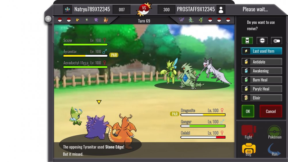
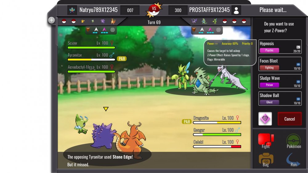
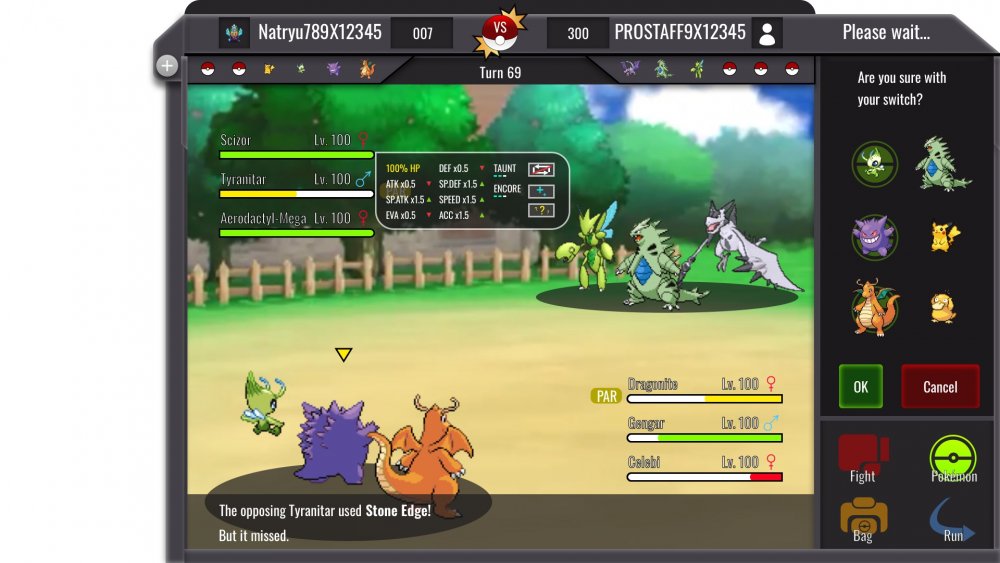
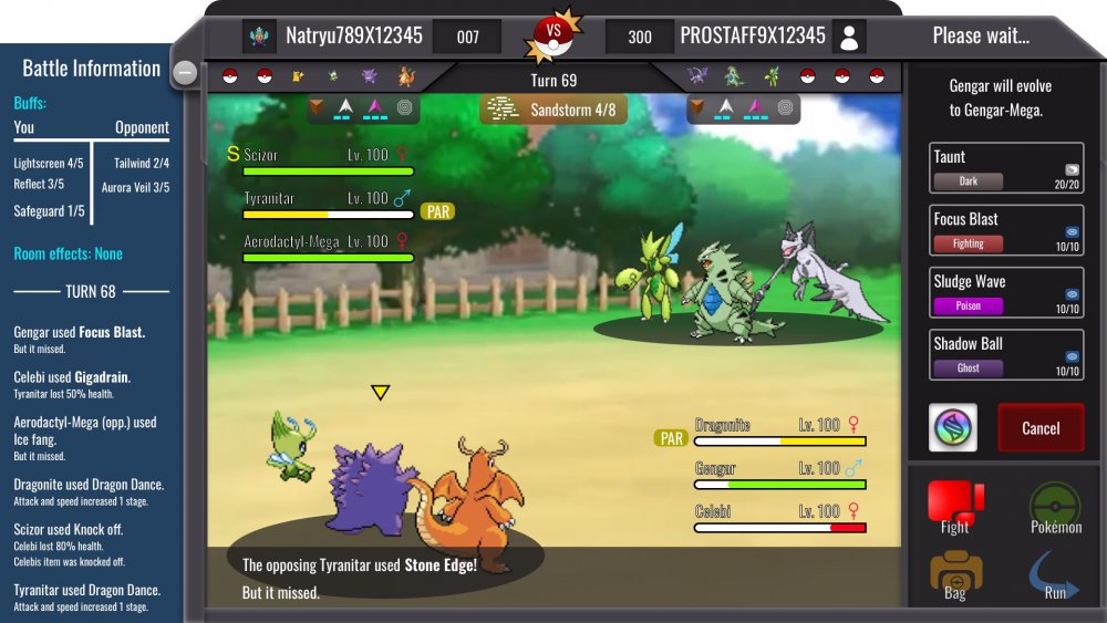
3v3_battle information Description: On the left you can see the battle information screen which can be opened by clicking on the plus icon ( minus icon if active). The screen includes information about room effects and buffs. The effects show the remaining turns. So basically it counts downwards( 3,2,1,0). Below you can see the battle log. Next to the players name you can see your Avatar and the PVP rating. Below the team preview you can see the field hazards and the weather condition. Mega Evolution should be triggered by clicking on the icon. You will then be asked if you are sure. You can cancel then or even afterwards if the opponent is still deciding for his move. Clicking on the Mega stone = yes. [spoiler=Team Switch and stat info] Description: The switch works with DRAG and DROP. The active pokemons are those with the green icon behind them. You will ask if you chose the correct Pokemon for the incoming switch and you can press OK or Cancel. Stat information can be shown if you hover over a pokemon Name. It will show HP in % and ONLY buffs which made changes. So if you have no boost in ATK, the ATK change will not appear. I have placed ALL possible changes into this "bubble". Obviously most of them will not be triggered at the same time. Just to showcase what is possible. [spoiler=Item usage] Description: I hope the Item menu is self explained. Only new thing are the categories: HP/Status heal items; Pokéballs and Battle items such as X-attack. And the feature last used item should be added for convenience . [spoiler=Z-move usage] Description: Here is the Z-Stone placed where the Mega Stone would be. Depending on your choice, since you can't have both in one team. Same dialog function. Important is. A NORMAL move, will not trigger a question where you have to press OK... You will just use it. If you have not a Z or Mega Stone the box will be replaced with OK. If you hover over a move it will show description of it as well information about Z-move. On mobile hover=press longer. __________ Hello guys. Here is my second submission. Quick info: Blue background should have around 90% opacity... Nevertheless. I hope you like it. Vote it up and dm me feedback if you want. Criticism is welcomed.1 point
-
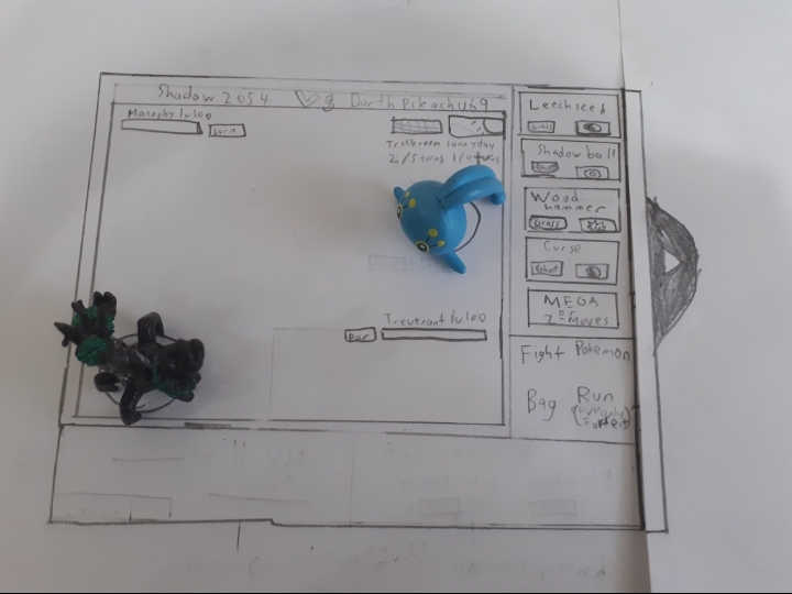
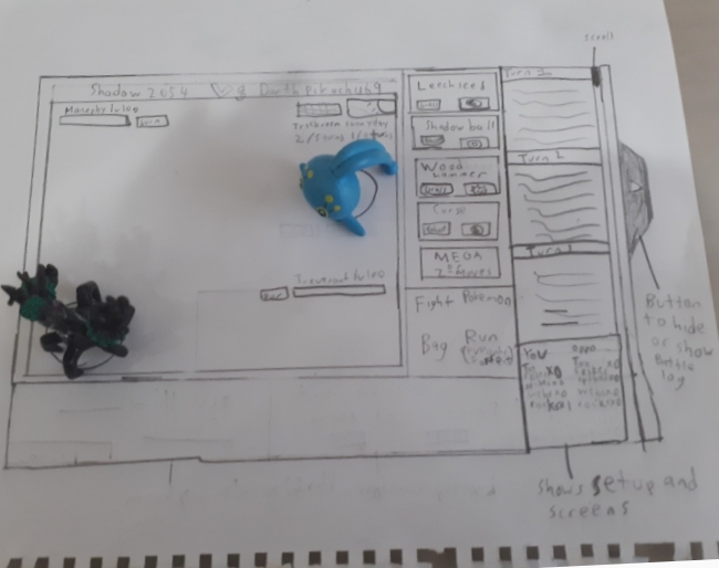
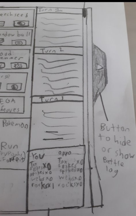
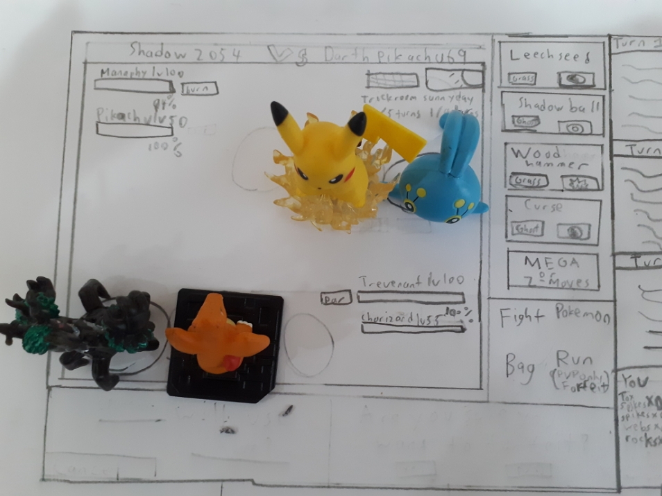
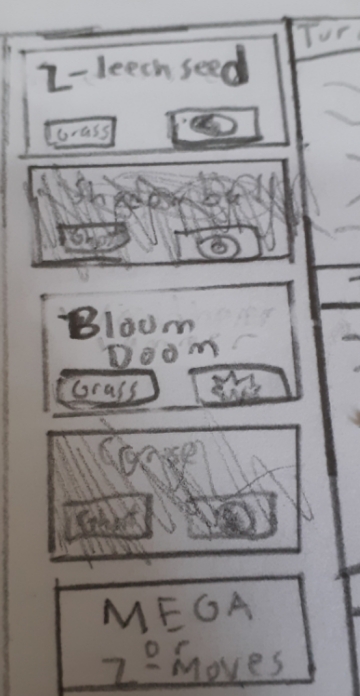
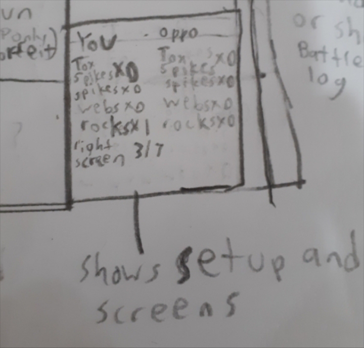
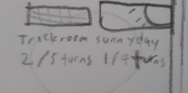
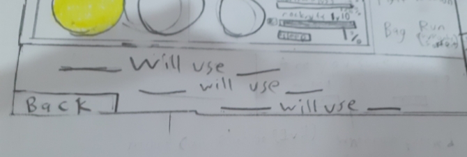
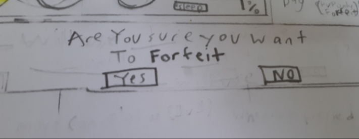
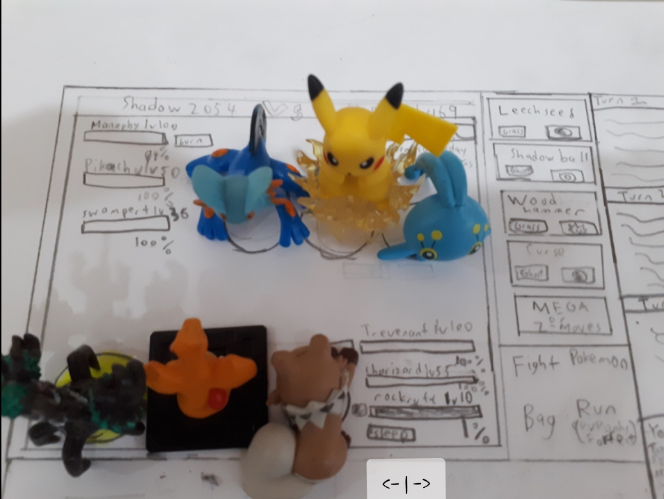
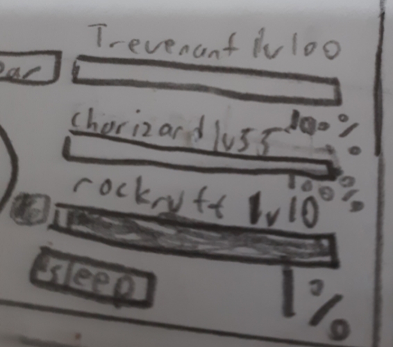
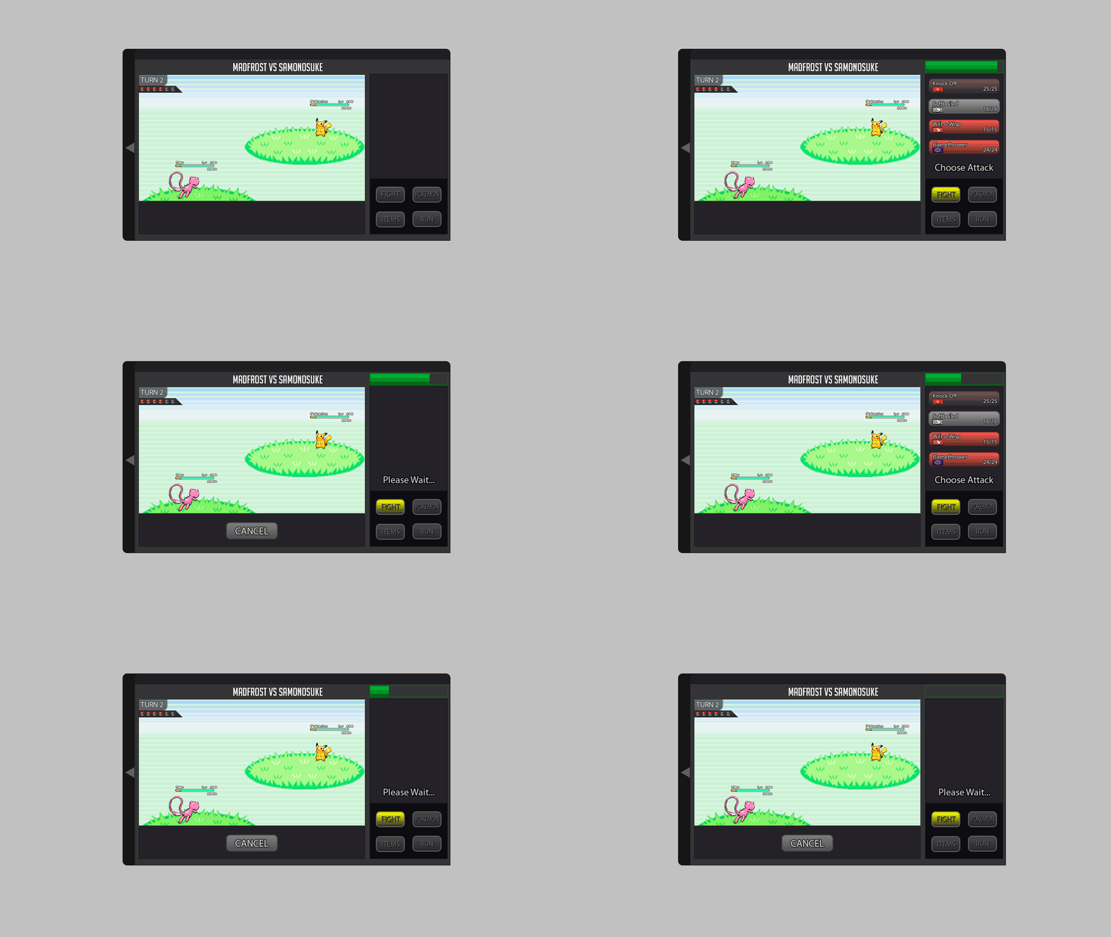
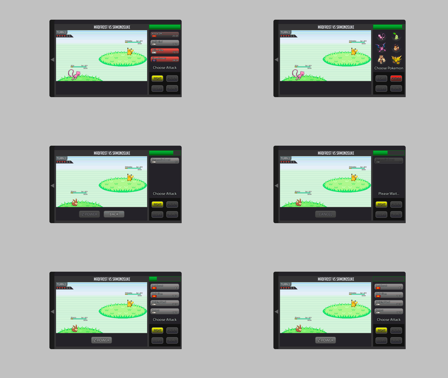
Welp, here is my design, i cant computer draw so...ye...i had to draw it on paper This is battle UI without battle log shown and then with battle log shown, the mega button and z-move button switch places when the pokemon is using one (mega becomes zmove if pokemon has z-crystal, zmove becomes mega if pokemon has mega stone) if the pokemon has no mega pr z-move, move selection will be the usual 4 buttons. (edit) z-move selectiom aded This is the battle log up close, u can see that, at the bottom, it shows what setup and screen are present on which side (you = your side, oppo is opponents side) and the top shows turns and is scrollable, allowing you to keep track of moves (edit) (screen-turns added) hp bar and percentage In 2v2 (UI and hp bars) 3v3 UI and hp bars (arrows to swap pokemon possition below) during 2v2 and 3v3, pokemon u want to attack must be clicked/tapped During 2v2 or 3v3, yellow floor below pokemon indicates that that is the pokemon you are instructing when pokemon is taunted and when weather and rooms are active dialogue below and move cancelation, stat changes and this shld be the end of my presentation, gl to all1 point
-
Well this is my entry for the Battle ui, I like the original battle ui so I based mine off of it and did improvements on it that was needed with mega, z-power, where 2s and 3s would look like, stat changes, and a battle log that is naturally closed but can be open with a tab on the side. I also attached an example of how big the ui will be with the log opened in game. I hope you enjoy my changes ;D .1 point
-
Hey everyone ^^, I created a Battle UI and im very proud x) since im kinda new to Photoshop and i spend a lot of time creating this :D. I created a completely new Design but tried to stay as true to the classic design as possible . Sooo i hope U will like it ^^ First Picture shows the Countdown/Timer for the Round (necessary for pvp) 1. Battle LOG I placed the Battle LOG on the left because i think this is the best way and looks nice. in think the battle log should be able to fade in and out so i created a button for it. (Random Text xD as Example) 10/11. Scroll Buttons for Battle Log 2. The Weather should be on the top (seems logic for me xD) A little Icon that shows how many turns left. 3. Field Status My Idea is it to show field status only if u want to. So I created a Button for each Side where u can fade in all Informations. (2nd Picture) 4. Title, Names etc. Here is written what is happening in the moment. For Example: If u Select the Pokemon Button it says"choose" or if u choose Fight in 3v3 Battle it tell u the name of the chosen Pokemon. 5. Buttons Here we have the classic Buttons wich are colored if u choose/hover them. (redesigned :D ) 6.Cancel Button I placed it like this because i think it should be near to the other buttons. 7. Mega & Z- Buttons These Buttons should be gray until they are usable, then they should be highlighted. 8. Boosts and Effects should stay classic at the HP bar of the Pokemon. Big thx to Kad1r and Chroxler (I want to mention Obviously on the Top right Box u have the option to select Pokemon, Attack, Items etc...) =)1 point
-
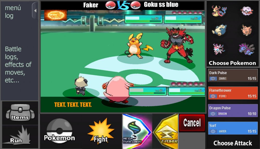
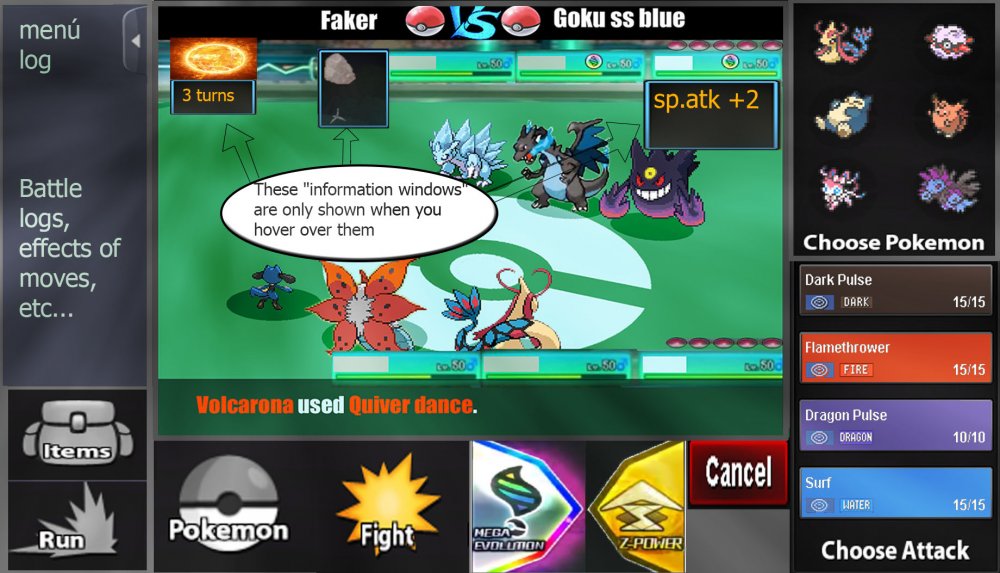
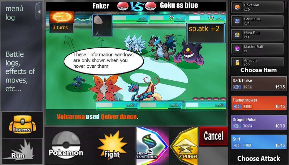
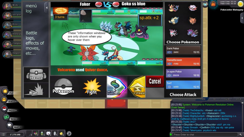
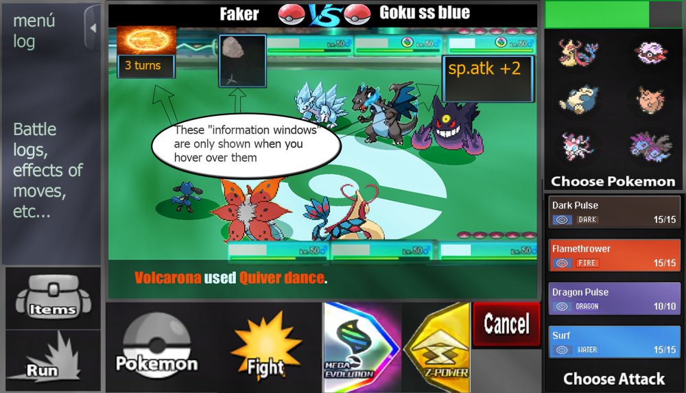
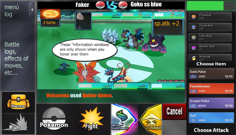
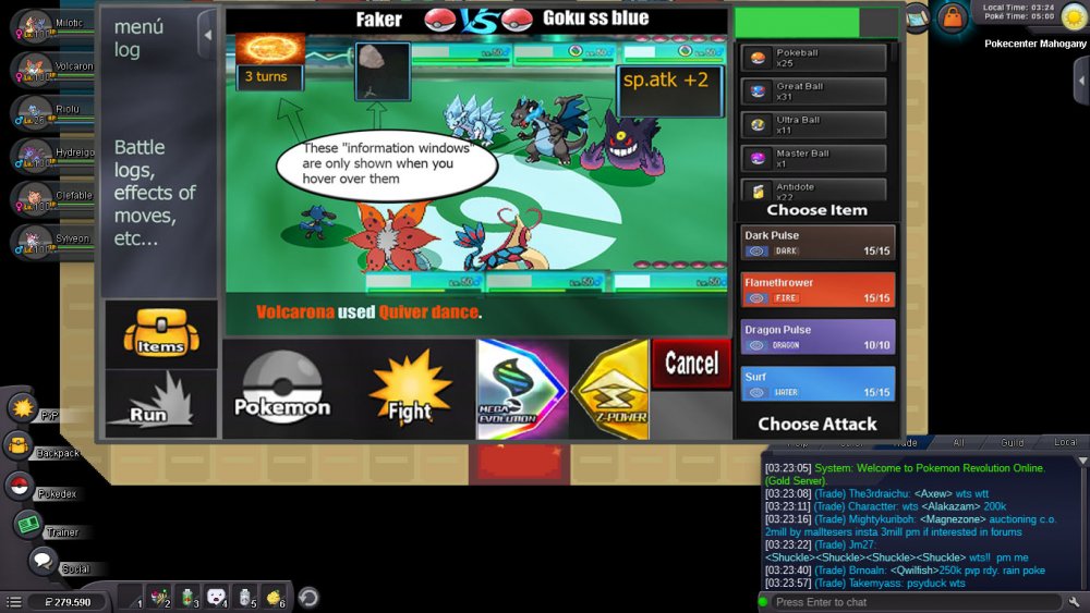
Hi, this is my battle iu, I hope you like it. Basically it has all the buttons that have been required, bigger buttons also thinking about the Android version and PC users. The battles, I prefer them to be full screen optionally (The battlefield is made by me ... it's for the pvp battles) Let us begin 3 vs 3 Battles: -I have reinvented some parts like the "vs", and also the attacks with colors of their types. -The buff states must be as shown in the image, - they only have to be displayed when the mouse passes over- -The Menu Logs must be able to open and close, as the user wants, by means of a button placed as shown in the image -items and pokemon in same place, are changed, by pressing "pokemon button" or "items button"- -items and pokemon in same place, are changed, by pressing "pokemon button" or "items button"- -As I see it in the game "window mode"- -2 vs 2 Battles- -same controls as in version 3 vs 3, there are no major changes. That's it, I hope I have not forgotten anything, thanks for watching, regards1 point
-
ok.. HII :3, this is my own version of the battle iu ,i decide to keep the visual concept of the game, the principal reason is that is more easy for the :incoming,new ,casual and those that live on the game :v to assimilate the redesign and the way that the iu works , redesigning the space and the visual order of some elements that all the player already know and integrate the new ones by a easy and familiar look . (i apologise for the font of the text ,i don't know how to find it,i try to find a similar) This is the way that the iu look on full screen (example) [MEDIA=imgur2]YdjG9Kx[/MEDIA] (the design of 3vs3/ 2vs2/ 1vs1 use the same space) This is the way that looks the different iu (the post will show the way that looks with mega evolution an z move) this preview is for understand some elements and its function that appear on the iu [MEDIA=imgur2]5hxnusI[/MEDIA] 1. the time time that each player have for do a action on each turn , attack etc( this time can be cut by the action of the opponent in the case of the attacks) 2. the boost /effects/others -those effects that create a negative stat on the pokemon will be show on red describing which stat is been affected negative(-hp,-spd etc.) -this include the effects of poison,sleep,stun.etc) 2.1-those effects that create a positive stat on the pokemon will be show on green describing which stat is been affected positive(+spd,+atk etc) 3. the identification number the purpose of this numbers is make easy the identification of the pokemon that is making a action /making a easy way to decide which pokemon you want to attack by looking the number that this one have and making a easy way to decide a action 4.weather this title is for tell the players if there's any weather condition on the battle ,if there no weather conditions this will be without any indication ,in the contrary case 4.1- there going to appear a image that show which weather is on battle and the time that left to over 5. turn/battle chat this title is going to change each time that both players do and actions ,this helps to indicate the left turnos for the weather too 5.1 -the battle chat will be a history of the current battle action and turn ,describing which player do a action against the other payer.(this will be sow too the time that left for the weather condition)(this will show too the boost stats and negative stats by the exact % of each state)((this chat only show the events on battle u cant talk to the other payer)) 6. the action chat/description this text will be generated automatically after the player do and action ,so in this way the player can be sure that the action that says the battle chat is the right one,if is not the player can cancel the action by clicking on the cancel button (this action depends too on the action of the other player,if the other player already do their action the option will be executed automatically within any option to cancel) 1v1 MEGA evolution [MEDIA=imgur2]yXtUhr6[/MEDIA] Z move [MEDIA=imgur2]BhEIjoP[/MEDIA] 2v2 MEGA evolution [MEDIA=imgur2]D6kEUP3[/MEDIA] Z move [MEDIA=imgur2]p6cykEE[/MEDIA] 3vs3 MEGA evolution [MEDIA=imgur2]bM51OUL[/MEDIA] Z move [MEDIA=imgur2]JJtVdBz[/MEDIA] Ok and now you can see how the panel changes when you already use the MEGA evolution or the Z move MEGA EVOLUTION [MEDIA=imgur2]WnpLJoa[/MEDIA] Z MOVE [MEDIA=imgur2]VvkTUDZ[/MEDIA] ( after use the MEGA evolution or the Z move the option blocks with the text you already use it ) Ok that is the way that is the way that the battle iu looks now this its the way that the select of pokemon and items looks. Chose pokemon [MEDIA=imgur2]M5qkzDZ[/MEDIA] Choose item [MEDIA=imgur2]zlw2vi4[/MEDIA] (the small icons that are in front of the panel are for select :items ,pokeballs and potions etc) Ty for read the post ,i hope all the staff member like my design,so that's it :3 . sorry for my bad english ;v1 point
-
1 point

















2.thumb.jpeg.8c7281e3346e77cfee8498663fa7050e.jpeg)
(1).thumb.png.cc601e8b7ac8ea3a34e8aac1770e0b24.png)
