Leaderboard
Popular Content
Showing content with the highest reputation on 01/07/19 in all areas
-
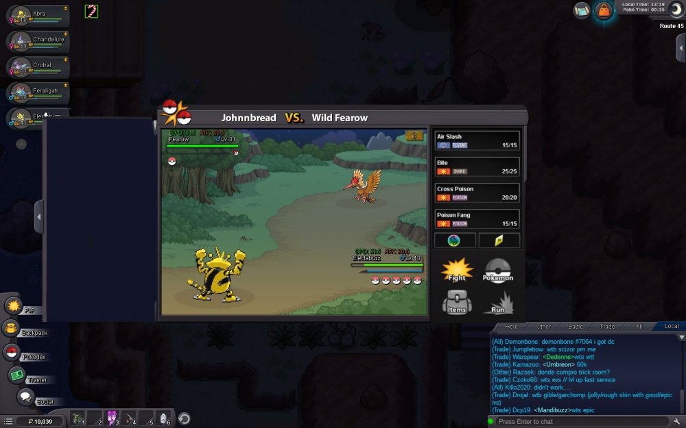
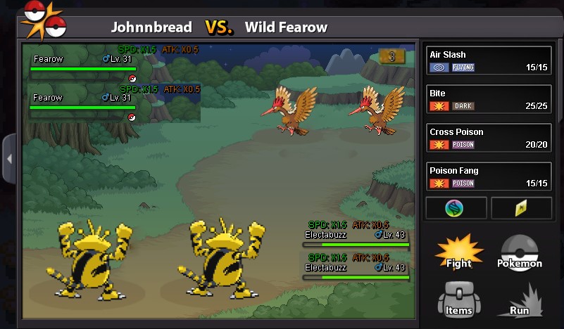
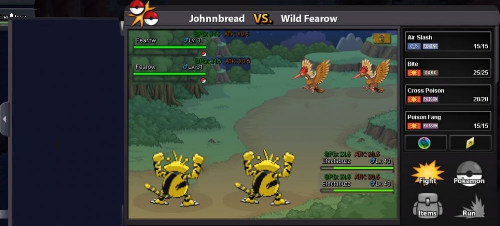
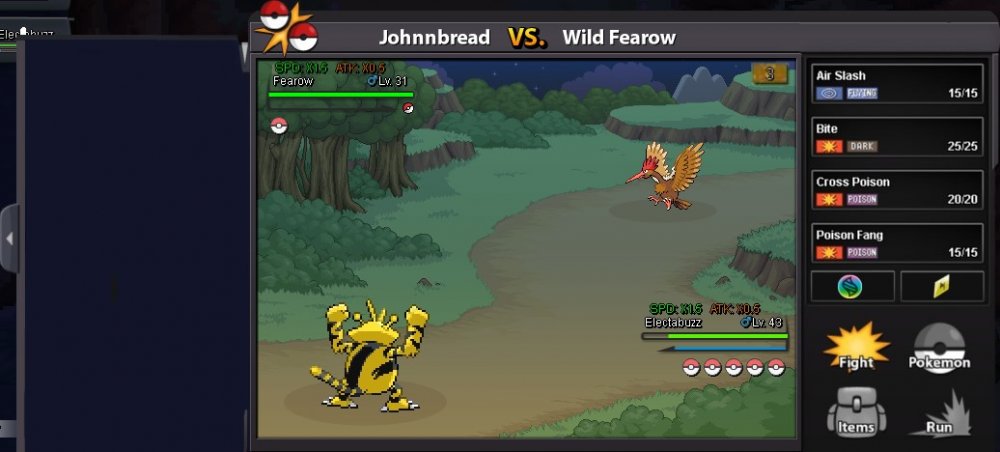
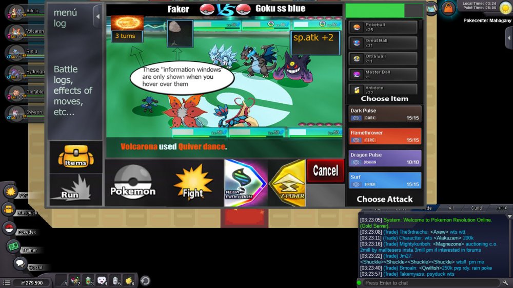
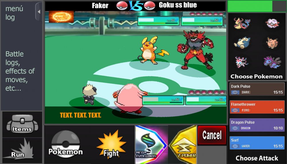
In near future there will be a significant PVP update. My full concentration is set on this right now, which is why there will probably less updates in the next time. For this PRO needs a new Battle UI, because the current one is missing a few features. There are already staff members who work on it, but as their specialty lies in other areas, I want to give everyone the possibility to participate. That's why I make a small event out of it. Everyone is allowed to create a new Battle UI and the Battle UI that will be taken over will be royally rewarded. The one gets a non-tradable shiny of your choice. The nature can be chosen, the IVs and ability will be generated randomly. The Pokemon must be catchable by everyone. The following things have to be added in the new Battle UI: - Enough space for 2v2 and 3v3 fights. - Buttons for Megas, Z-Moves and Cancel a move. - Some kind of battle log should be included as well. - Every current element (items, run away, moves, switch Pokemon) should be included obviously. - An option to show boost and effects (SPD x 1,5, Paralyzed, Taunted etc.) would be great. - Weather and room effects as well as their turn count. You do not have to stick to the current design. You can change it completely, even make it full screen mode. That is completely up to you. Please note, that if we take non of the submitted designs, there will be no winner at all. You have 30 days (Janurary 15th, 11:59 PM GMT+0) to submit a battle UI. The time might be extended if there's no usable design till then. This post will be unlocked in 2 weeks on December 30th, please post your battle UIs in here. Do not make any unrelated posts here. Please only post the final UI in here. The winner has to submit the final design, all UI elements and has to give PRO the permission to use it. Good luck to every participant.2 points
-
Hey just thinking it might be a good idea to display guild logo or name in team preview as some guilds are large and not all member names are known to each other., which would clear up alot of confusion2 points
-
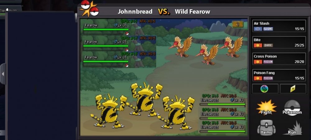
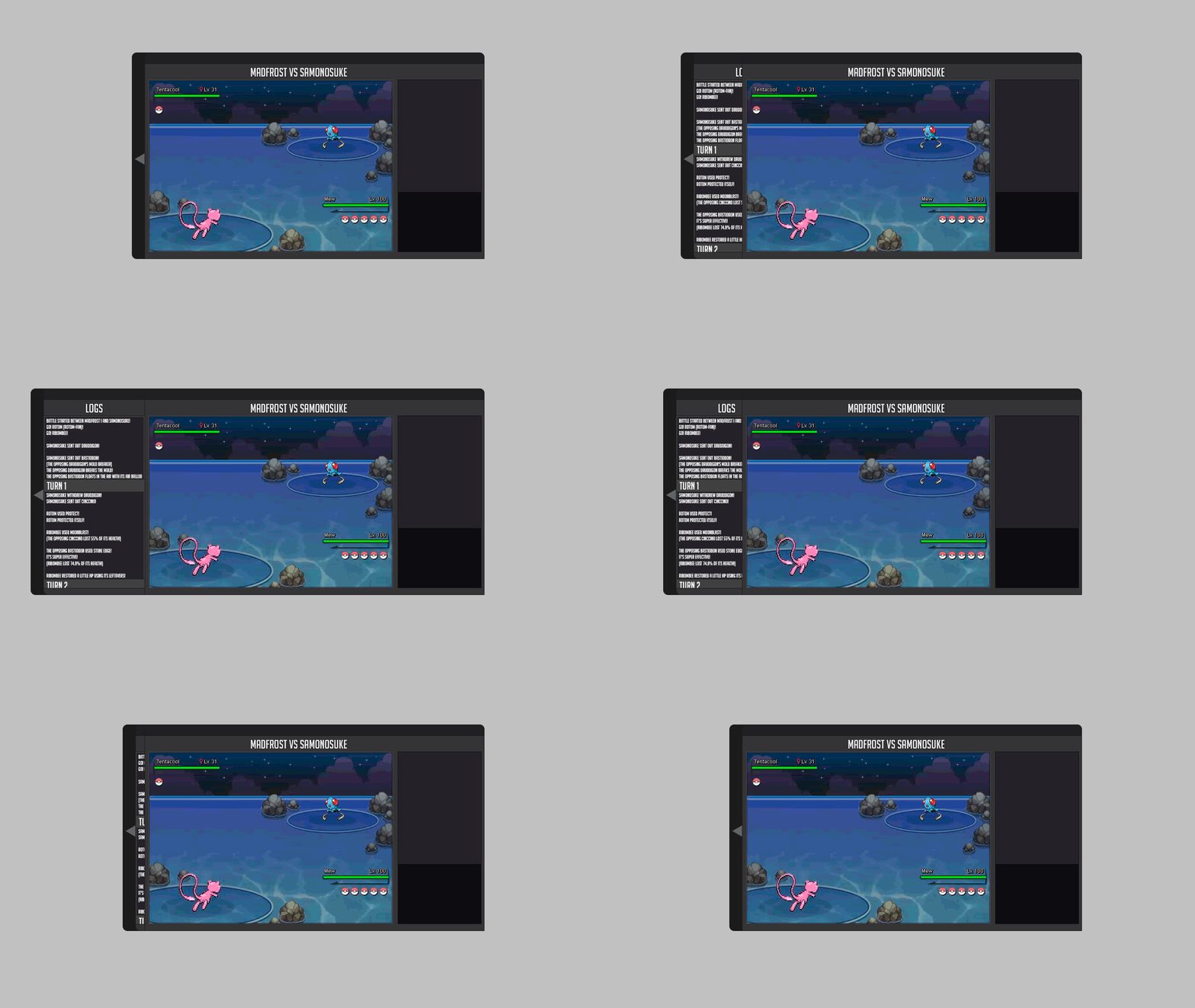
Well this is my entry for the Battle ui, I like the original battle ui so I based mine off of it and did improvements on it that was needed with mega, z-power, where 2s and 3s would look like, stat changes, and a battle log that is naturally closed but can be open with a tab on the side. I also attached an example of how big the ui will be with the log opened in game. I hope you enjoy my changes ;D .2 points
-
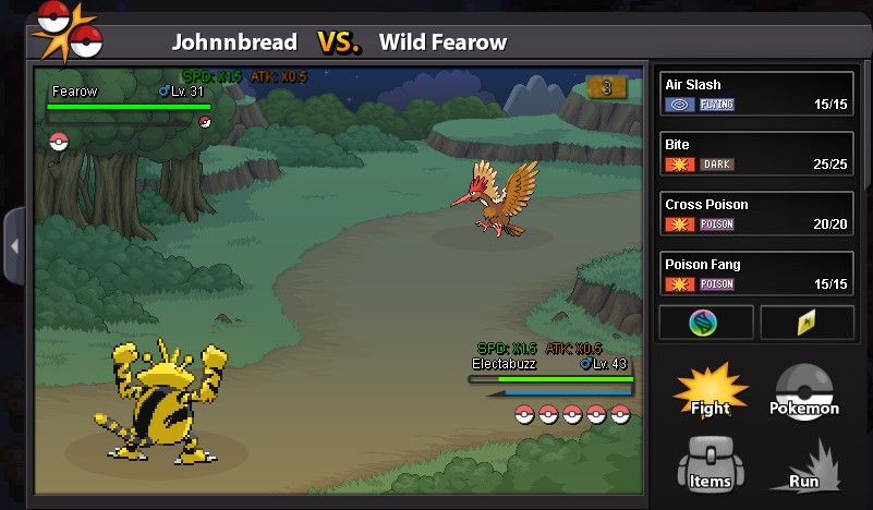
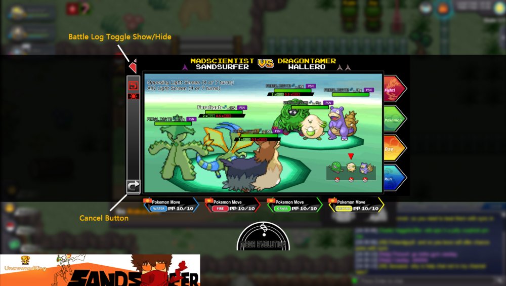
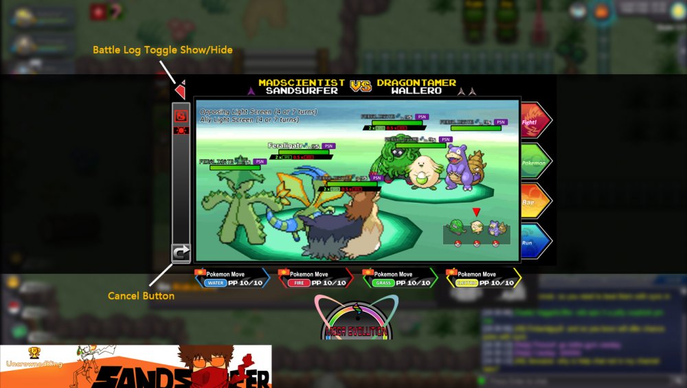
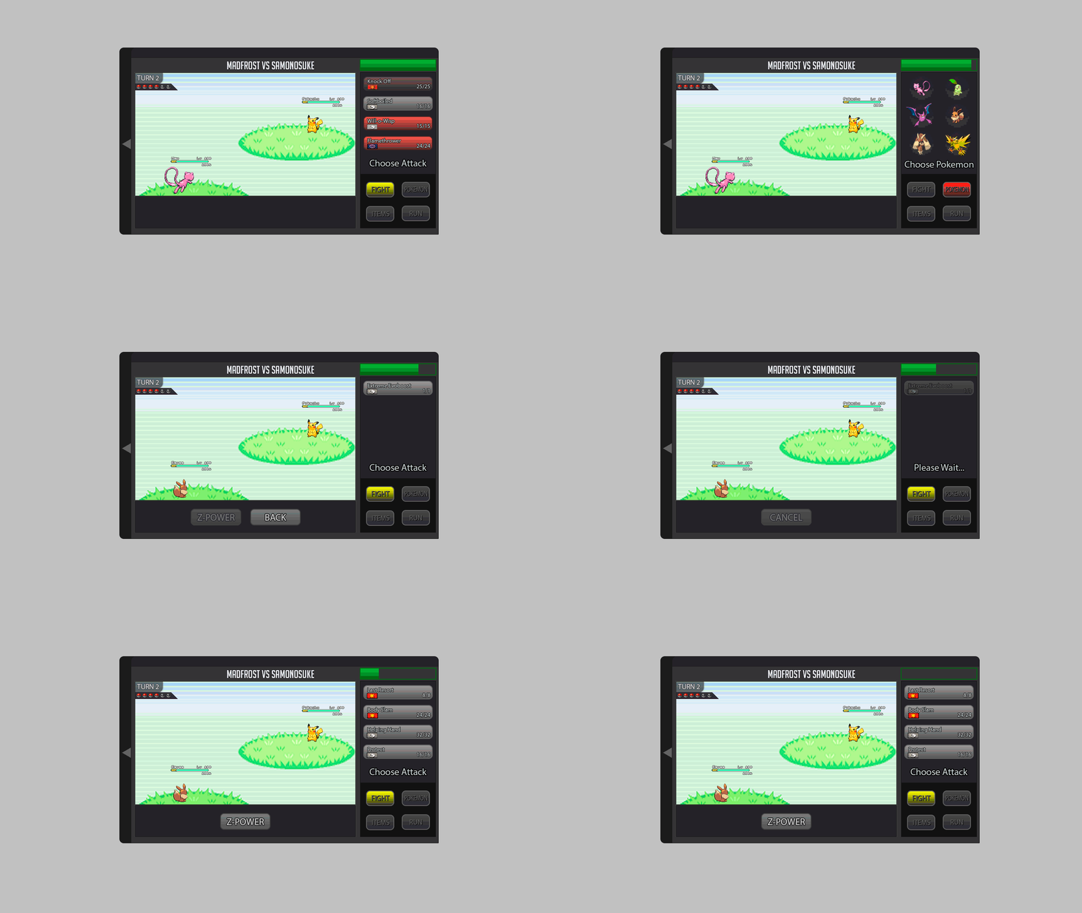
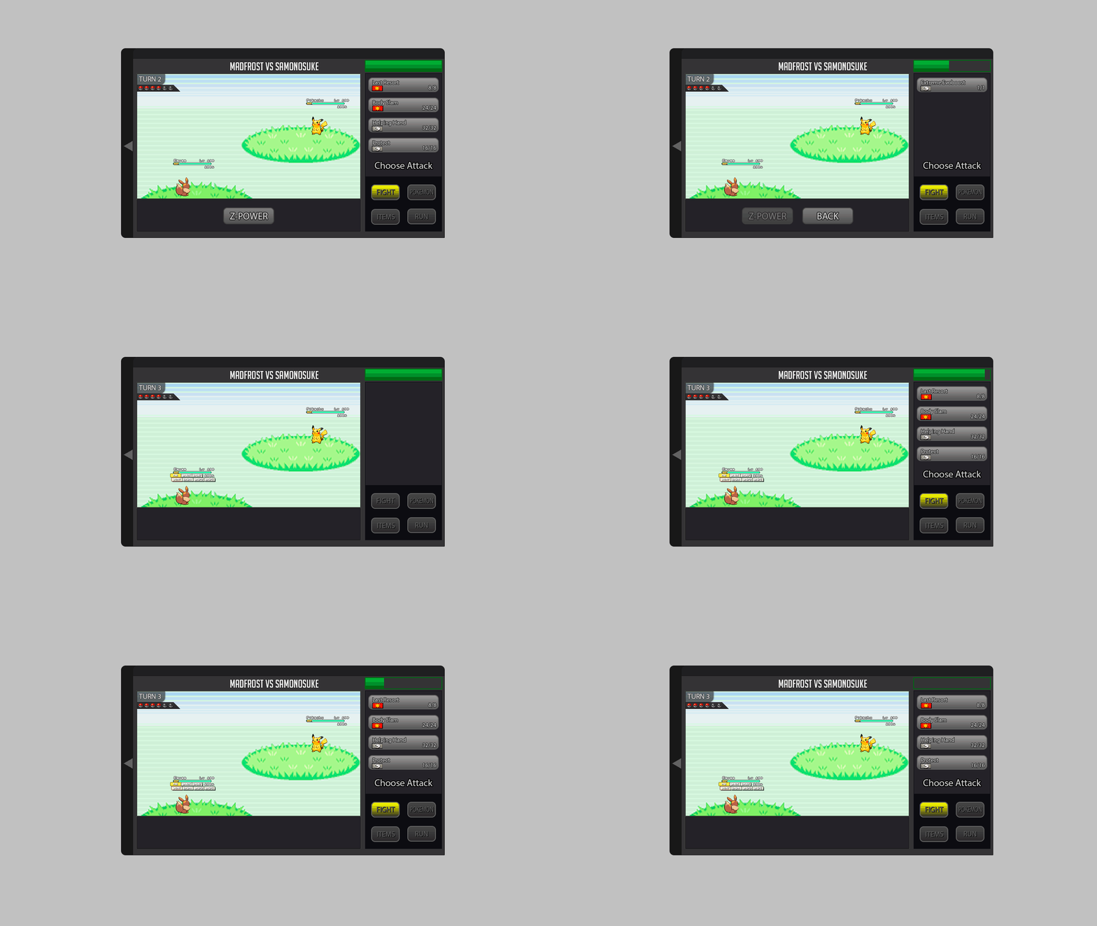
Hey everyone ^^, I created a Battle UI and im very proud x) since im kinda new to Photoshop and i spend a lot of time creating this :D. I created a completely new Design but tried to stay as true to the classic design as possible . Sooo i hope U will like it ^^ First Picture shows the Countdown/Timer for the Round (necessary for pvp) 1. Battle LOG I placed the Battle LOG on the left because i think this is the best way and looks nice. in think the battle log should be able to fade in and out so i created a button for it. (Random Text xD as Example) 10/11. Scroll Buttons for Battle Log 2. The Weather should be on the top (seems logic for me xD) A little Icon that shows how many turns left. 3. Field Status My Idea is it to show field status only if u want to. So I created a Button for each Side where u can fade in all Informations. (2nd Picture) 4. Title, Names etc. Here is written what is happening in the moment. For Example: If u Select the Pokemon Button it says"choose" or if u choose Fight in 3v3 Battle it tell u the name of the chosen Pokemon. 5. Buttons Here we have the classic Buttons wich are colored if u choose/hover them. (redesigned :D ) 6.Cancel Button I placed it like this because i think it should be near to the other buttons. 7. Mega & Z- Buttons These Buttons should be gray until they are usable, then they should be highlighted. 8. Boosts and Effects should stay classic at the HP bar of the Pokemon. Big thx to Kad1r and Chroxler (I want to mention Obviously on the Top right Box u have the option to select Pokemon, Attack, Items etc...) =)2 points
-
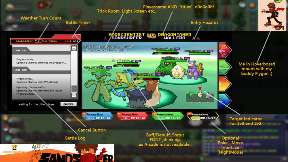
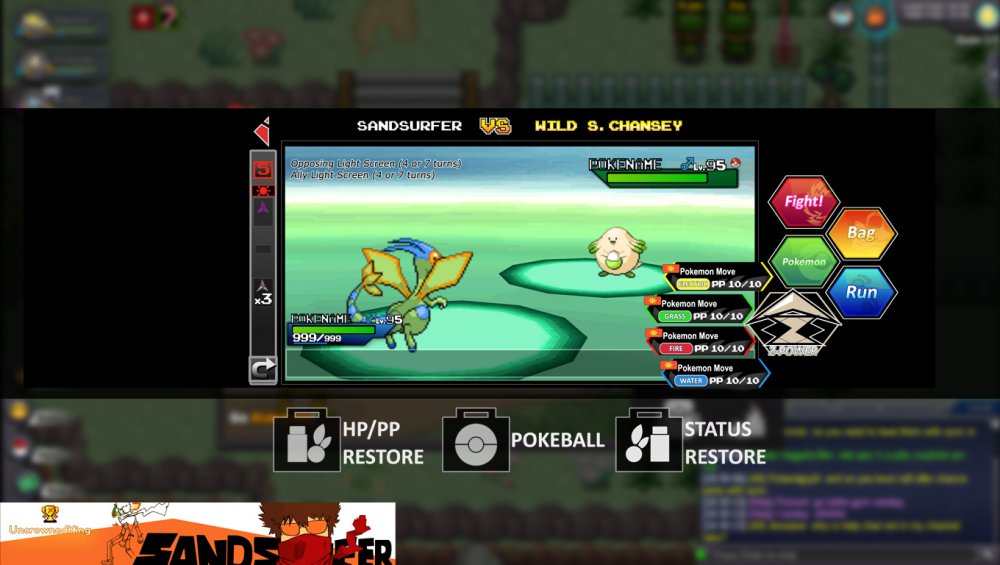
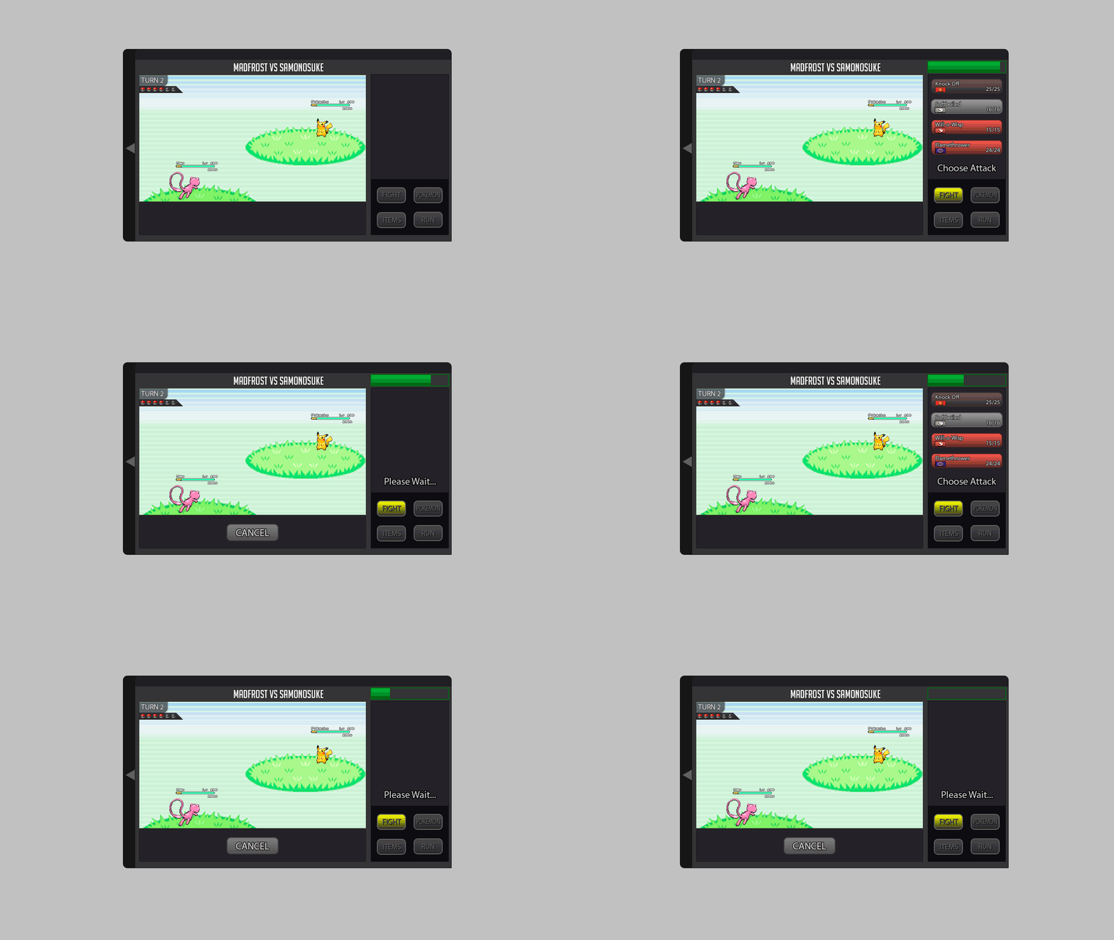
Hi guys, I hope everyone is enjoying the Holiday season!! So0o0o with two days of tweaking, here's what I came up with. I do have tons of questions(like ease in animations, opacity changes, mouse hover, camera movement etc.) but yeah I guess those would be discussed if ever this design was picked. Vectored assets used here are in the attached Pdfs including the switch button for 3v3 and also some optional interface. Everything is made from scratch and is editable except for the bg and the sprites(I just took them from the internet) This one shows the mega button bring activated while the battle log is toggled hide. SORRY NOT SORRY Im not confident with making .gifs so ill upload the two frames here. The "5" "8" blinking means sunny day in 5 or 8 turns btw. MEGA ON!!! Last one is the bag interface with the battle HUD OPTION2 AAAAAAAAND there you have it XD GGWP2018. PS Notice that title on top of playername? Those are gained by doing insane quest like specific bug catching, using mono dragon team to beat a boss or catching 100 ratatas. Who knows? Completing all of them and maybe gain the title PokemonMaster? ;wink; assets.pdf2 points
-
1 point
-
we already have excavation and doctor quest i migth like a quest about collecting apricorn's and start making custom pokeballs and need certain level of craftsman to craft the pokeball the quest should start with finding that damn kurt somewhere in ilex forrest or the at end's world LOL to unlock the quest we need beat thor XD that would be good requirement or johto champion + johto dex completed and a key item too APRICORN BOX we had it in heart-gold lets start with Black Apricorn that can be turned into Heavy Ball they can found in Johto: Routes 31, 33, 37, and 43, BCC random rewards Blue Apricorn into Lure Ball (Johto: Routes 36, and 37, BCC) Green Apricorn into Friend Ball (Johto: Routes 29, 30, 35, 39, 42, 45, and 46) Pink Apricorn into > am getting tired of this i mean (Love Ball) (Johto: Routes 30, 33, 42 and BCC) Red Apricorn into Level ball e-e this should need a higher level of craftsmanship to make ( Johto: Routes 37 and 44 ) White Apricorn intooooooooooooo fastttttt balll i need this to catch a top speed rattata (Johto: Route 38, Azalea Town) Yellow Apricorn into Moon ball damn i need sun balls too (Johto: Routes 42 and 46, Violet City) so here i am while the servers are down .___.1 point
-
1 point
-
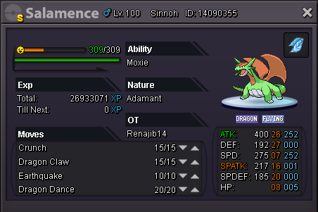
hello!!! have a good year!! i have to ask if the choise scarf is bugged!!! for me works only for one turn!! and after that no!!! i dont have any evidence cause i dont know how to rec a video in my pc!!! but i have to tell you that my sala had choise scarf!!! and a magnezone atk first than my sala!!! well thats kinda imposible tho!!! cause max spd of a timid magnezone its 240!! and my sala has more!!! i didnt had any effect like paralyzed! or spider web!! it just atk faster!!! i will try to see more examples if anything else happen and i will inform you!!! thanks for your time!!!1 point
-
1 point
-
Thank you for your explain and to be this quick and this efficient. With regards1 point
-
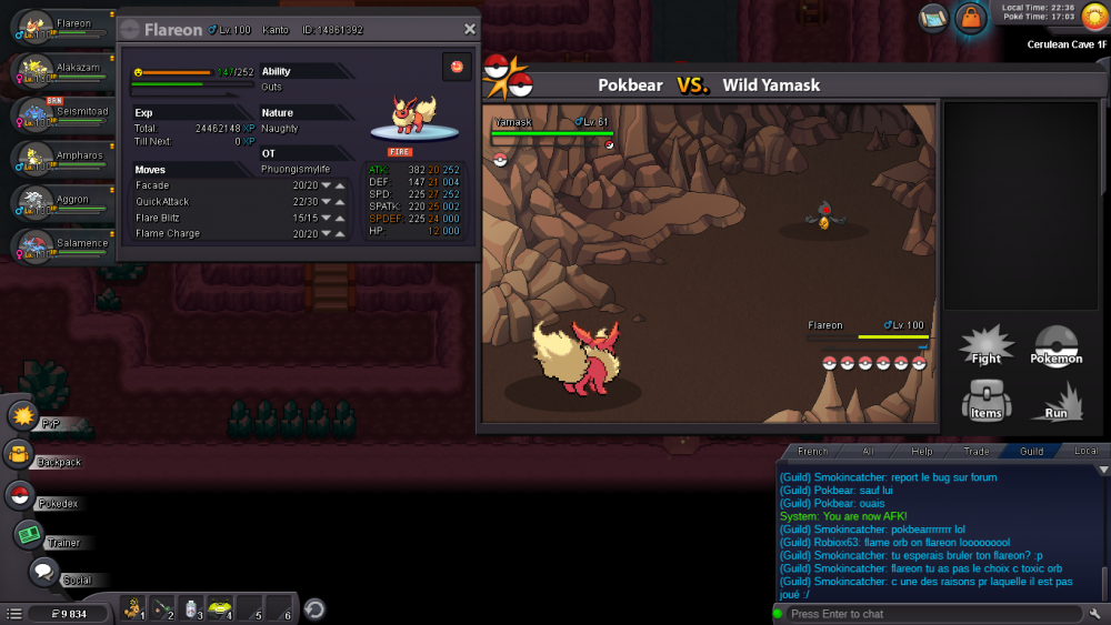
Hi there, @Pokbear I would like to start off by saying sorry for the inconvenience that you are experiencing. To shed some light on your issue, I can confirm with a 100% accuracy that is not a bug. This is because Fire Type Pokémon cannot be burned. Flame Orb is: Since a Fire Type Pokémon cannot be burned, Flame Orb consequently did not active on your Flareon despite it having the guts ability. Now as for a solution I recommend using Toxic orb instead Flame Orb. Toxic Orbs works the same exact way as the Flame Orb but it inflicts a Poison Status instead of a Burned Status. I hope this answer helps! If you have anymore questions or concerns in regards to my answer please let me know here. Looking forward to your reply :) With Regards, Juliph1 point
-
Hello and no problem. Tyranitar and eviolite should be both back to your PC. Please confirm before i lock the thread. Kind regards, Logan1 point
-
1 point
-
I can't add you on discord, are you sure about your tag ?1 point
-
How about the money ? Im losing money around 80k i think because disconected agains tamer1 point
-
hello!! thank you very much for your time to answer me!! there wasnt any trick room 100% !! and i dont know about quick claw!!! i will try to find more examples in the next battles!! and i will try to post some ss if anything else atk faster!!!1 point
-
Hi there, @sarks I am sorry for the inconvenience you are experiencing. To address your issue down below I have a few possible ways that a Magnezone could have out sped your Salamence 1. Trickroom: With that being said, Is it possible that the move trick room was active? Since Magnezone is slower than your Salamence, Trickroom would allow it to go first while active. 2. Quick Claw: Quick Claw allows pokemon to occasionally move first. This is what possibly could have let Magnezone out speed your Salamence. I hope this helps! There wasn't a video so I am looking forward to further clarification from you :) Kindest Regards, Juliph1 point
-
Hi @BlackKitty2097 ! I'm sorry for the inconvenience. Could you please try the following: Delete all the old files or PRO Restart your Phone Download another browser on your smartphone and then try to download again the game from our PRO DOWNLOAD PAGE If that should not solve your issue, could you please tell me what is error you are experiencing? Looking forward to your reply, have a wonderful day !1 point
-
1 point
-
1 point
-
1 point
-
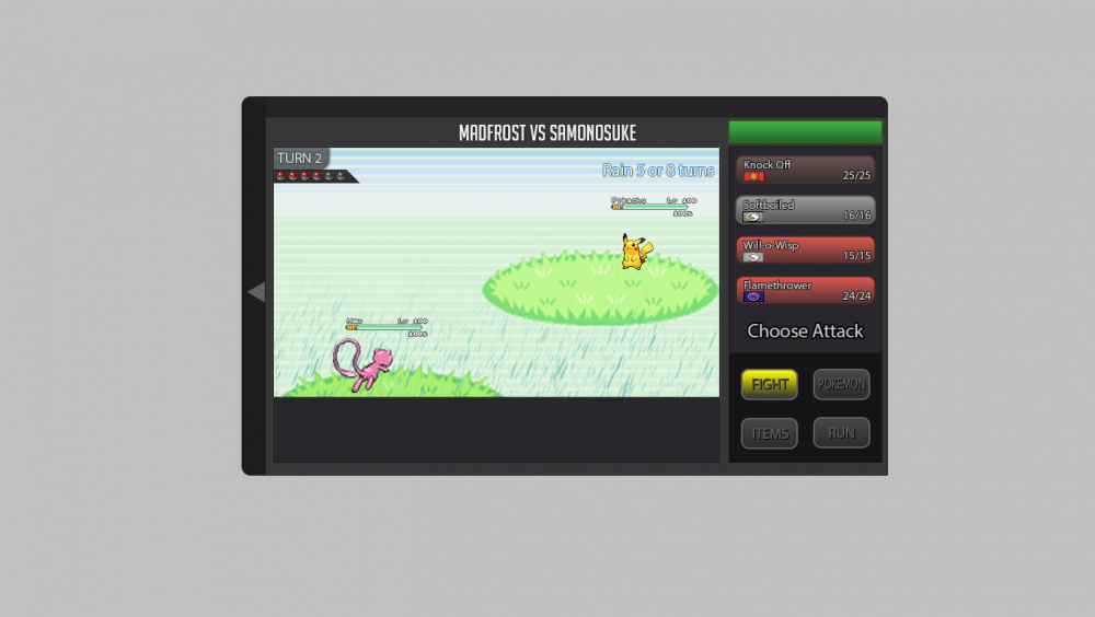
Hi everybody My rework should stick to the current design with all new required buttons and stuff included. I designed new buttons for the menu. And so I added in the "FIGHT" window the buttons for Z-Moves, Mega-Evolution and a button for cancel the moves. It would be nice if the attack moves has the color of it type. For example: water attacks are with a blue touch. Maybe we can add a "super effective", "not effective", etc... sign to the different attacks, depending on the enemys pokémon. The information for boosts and effects could be with a hover on the blue information button near by the health bar by each pokémon. The weather stats could be simply added as shown. Maybe as an extra animation for rain for example would be great. You can see at the top left corner a little triangle. With this you can show or hide the battle log as seen below. Important for the textbox is, that every time it arrives the health bars should be hidden imo. Thats all I guess. Do not hesitate to ask if you need more detail informations about my rework battle ui.1 point
-
Magnezone hp fire? If yes, I buy. Also the price for shiny slugma is fix or still can nego for the 300k slugma1 point
-
Why do you want to join NoMercy? For 3 reasons. 1. It is the best guild 2. I like the link in the members, I also like my guild. 3. It is the best guild What can you contribute to NoMercy? With my dramas when they use 6 walls (funny moments). To part I contribute with my bad English jajajajaj (it returned the bot). Another thing to contribute would be with a rating for the top. The bot helps me learn English despite everything jjaja Have you ever been banned in PRO, and why? Do not No, although once they gave me a mute trade, because of a confusion -.- thanks barakiel1 -.- How old are you and other than English, what languages do you speak? I always confuse my age, I'm not aware of my birthday, or how old I am, at this moment I am 25 years old. I speak spanish, and english semi good. Naniiiiii Note: The truth came out of NM because a moment removed the SystemQ, I mean I did not read anything about that, at least if they were placed votes to remove, I felt that they did not take me into account in that part, I just got a little bit enriched. Hail one piece Hail potato Iam back apes <31 point
-
I'm sorry for the inconvenience. Could you please tell me your operative system. Also, could you please try the following procedures in the same exact order i give you: Delete all the PRO Files that you have (.zip and remaining files too). Then download CCLEANER and run it to make sure to delete anything else. Install the latest version of .NET Framework Restart your computer Totally disable your Firewall and Antivirus Download again the game from HERE Put all PRO Files in a folder and not directly in your drive. (Not directly in C: or D: , but you can put them in your documents into a folder like this: CLIENT FOLDER) Run the program as Administrator However, keep in mind that the servers are currently down to PRO switching hosts. We are unable to give an estimated time as to when the servers will be up once again. Please do note that we're always trying to improve our server stability, but it isn't perfect and can sometimes still result to a crash. An announcement on our OFFICIAL PRO DISCORD will be made once this issue has been resolved. You can check server status by doing ^up in #bot-commands in our Discord.1 point
-
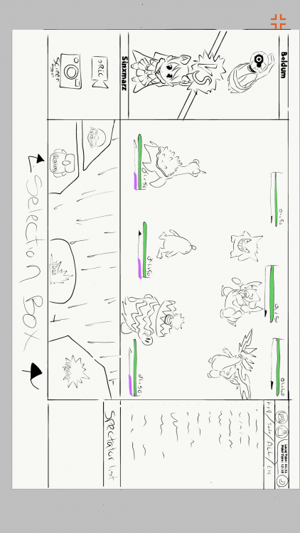
It's simple yet has everything one needs the chat on the right side and would be nice to have an option to spectate your guild mates. I put a small box under the chat box to show who is spectating you also a simple record or screen shot button and a (vs) on top with awesome animation one us to show what or who your battling on the left. it's a full screen view! It would work well with computer and mobile devices also for the bottom box where we have the options for the bag/ pokes /run away/ battle icon everything should be shown in that box aka the selection box if You click/tap on the battle icon it should take you to your moves/ z-moves and mega icons there should be enough room to add the weather conditions status condition of each pokes etc. In the center of the selection box as well. Pokemon they should also be displayed in the selection box when you click/tap on the Pokemon icon so on and so forth with the other icons nice an simple not to complex :) and as for the 3 v 3 display it should have just enough space to veiw all the pokes yur over all Pokemon and health bars are great just the way they are no need to change it. well your over all original design is nice and easy to understand and it is why I think you should consider just improving the original but keeping the same simplicity of that is all I don't own a computer but I Drew this on my phone I got sick and could not finish coloring it.1 point
-
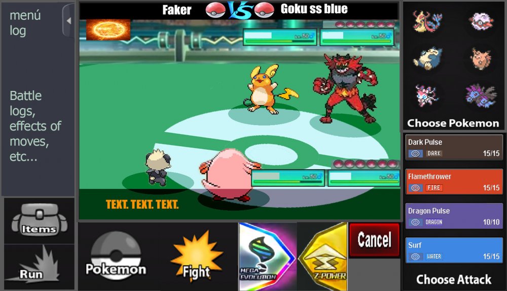
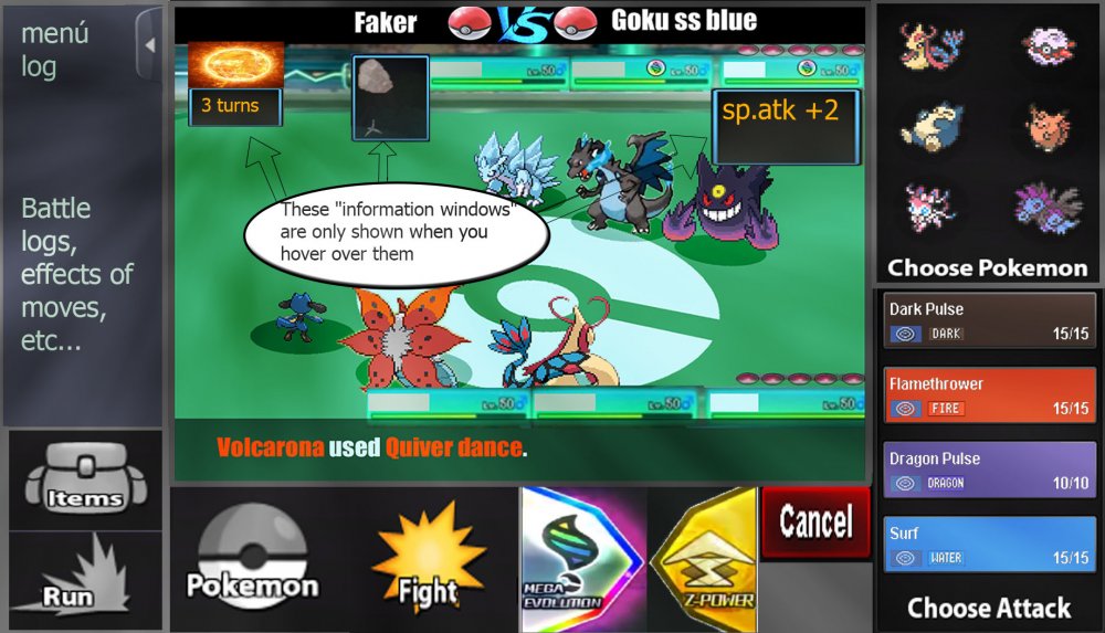
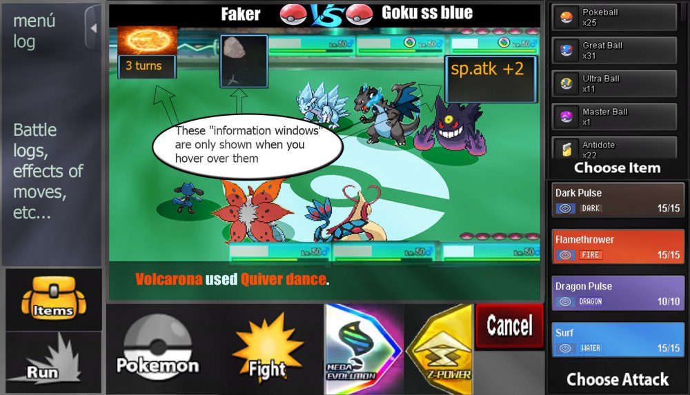
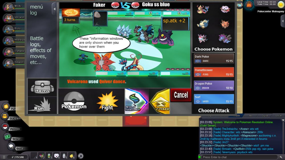
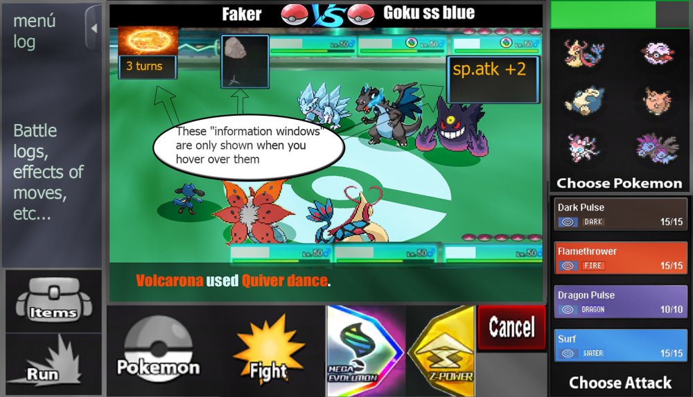
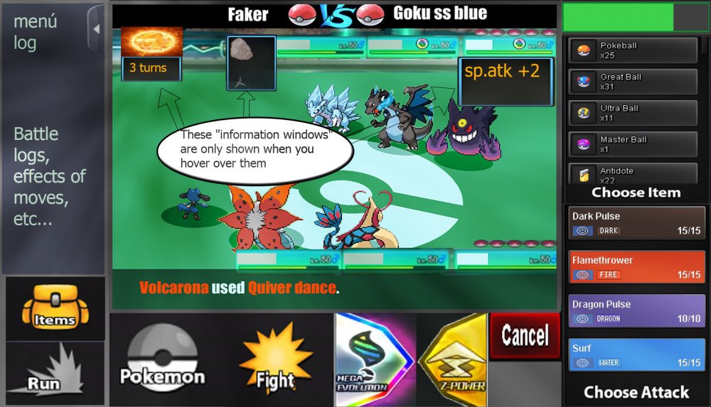
Hi, this is my battle iu, I hope you like it. Basically it has all the buttons that have been required, bigger buttons also thinking about the Android version and PC users. The battles, I prefer them to be full screen optionally (The battlefield is made by me ... it's for the pvp battles) Let us begin 3 vs 3 Battles: -I have reinvented some parts like the "vs", and also the attacks with colors of their types. -The buff states must be as shown in the image, - they only have to be displayed when the mouse passes over- -The Menu Logs must be able to open and close, as the user wants, by means of a button placed as shown in the image -items and pokemon in same place, are changed, by pressing "pokemon button" or "items button"- -items and pokemon in same place, are changed, by pressing "pokemon button" or "items button"- -As I see it in the game "window mode"- -2 vs 2 Battles- -same controls as in version 3 vs 3, there are no major changes. That's it, I hope I have not forgotten anything, thanks for watching, regards1 point
-
Changelog 30.12.2018 Nikola reworked. He is now substantially stronger, though his Pokemon are no longer level 120. Items are now banned in his fight. Nikola now has the ability to re-summon Manaphy. He now allows you to re-summon each legendary you've released once. Bear in mind that neither he nor Community Coordinators will restore your legendary if you release it, intending to utilize the recapture as a reroll. He will only restore the legendary this way once, whether or not you manage to capture it. It is highly recommended that you do not utilize this as a reroll - this is intended for players who accidentally release their legendaries. Having a Regice from Christmas 2017 should no longer interfere with recatching a Regi from the quest. Nikola still does not work with Darkrai, as it is not currently available.1 point
-
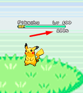
About the new battle UI I explain what I think and I'm putting some gifs and images as an example, I hope you understand. About the new Battle UI I thought a lot and I came to a conclusion about doing a Battle UI based on the old one, because I think the old one is very good, and I think it would be better to recreate it because if I create a new Battle UI, I think it would bother a lot of people who hunt all day and for those people who play the game on the cell phone. So I decided to recreate the old one trying not to disturb the people who play the game on the cell phone and for those who are hunting pokemons all day. Battle 2v2 and 3v3 fights: For 2v2 battles could work with the first two pokémons of your list. For 3v3 battles could work with the first three pokémons of your list Example: In the example I put the video of the Ash playing the pokeballs because I had not found an animation on the internet just playing the pokeball. Button for Megas: For the megas I think it should stay down as it is there in the example. Example: Button for Z-Moves: For the Z-MOVES I think it should stay down as it is there in the example. Example: Button for Cancel: For the Cancel I think it should stay down as it is there in the example. Example: Battle Logs: I think it would be nice to create a button next to the logs, as soon as it clicks the button will appear the logs next. Because there are people who get pokemons all day long, and with the logs appearing this right away I think I could mess up these people who are hunting many pokemons. More information looks at the example below. Example: Buffs, Paralyzed, Taunted etc: Paralyze, taunts, buffs and etc. I think I should stay in below life because I think it would look cool because it was going to look like the other pokemon games! Paralyze, taunts and etc. should appear before, and the buffs soon after. More information looks at the example below. Example: Then in the example you will see that he took Paralyze, it is because the pikachu used an attack and gave paralyze in Eevee, and the Paralyze appeared before the buffs. Weather and room effects as well as their turn count: The weather and counting should be right there in the upper right corner, showing that she is in such a Climate and showing the count of turns that she ends up. More information looks at the example below. Example: Extra: I think it would be nice to put a percentage of the Pokémon's life at the time of battle. Example: I made some changes in the post to put the bigger gifs because they were too small and hard to see. Thank you for your attention. :D1 point
-
Changelog 05.12.2018: There is a swipe down from top to open the F2 console now. Android-only feature There is a X to close the F2 console now. Android-only feature Battle inventory should be fixed now. Caught Pokemon, HP changes etc. should be updated correctly now. Christmas Vulpix and Ninetales have follower sprites now. Christmas Flaaffy and Ampharos have back sprites now. Changelog 09.12.2018: Loading screen was reworked. Repel prompt was added (deactivatable in game options). Repel lock on prompt was added (deactivatable in game options). Burmy evolves correctly to Wormadam (female) and Mothim (male) at level 20. Tyrogue evolves correctly now. There was a bug for some reasons. Swirlix and Spritzee can evolve now. With this all evolutions up to gen6 work now. Changelog 20.12.2018: Updated the Python API documentation. Changelog 26.12.2018: Lending Trade is in trade window now. Lending Trade time can now be specified in minutes, hours and days. You cannot put items in Lending Trades anymore. Items are tradable without Pokemon now. Region locked Pokemon are tradable now but sent to your box. Several error messages added (ID 0, not tradable Pokemon etc.). You can drag and drop emotes in your hotkeys now. You can swap the position of items in your hotkeys now. Hotkeys are saved for every user individually now. Repel icons with remaining steps are displayed now. Charizard and Aerodactyl Mounts were reworked. Added Mareep, Liepard and Mantine Mounts. Many other small fixes/changes/additions I don't remember anymore.1 point
-
DIG - TM28 • FREE Cerulean House 6 • Celadon Mart - $3,500 • Route 36 Smuggler - $5,000 • Lilycove Mart - $4,000 • Dig Spot Route 1141 point

