Leaderboard
Popular Content
Showing content with the highest reputation on 10/05/24 in all areas
-
6 points
-
3 points
-
2 points
-
2 points
-
1 point
-
1 point
-
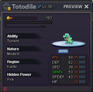
SHINY TOTODILE • Start point: The auction starts at the starting price and will last for 72 hours. • Starting offer: 5m • Minimum raise: 500k • Instant price: N/A REMINDER: • This is a Gold Server auction. If bidding from an alternative server, please state that you will transfer upon winning. • If you intend to purchase with an alternate account, specify the account alongside your bid. • All fake offers will be reported. • Bids cannot be withdrawn once placed.1 point
-
1 point
-
1 point
-
1 point
-
1 point
-
1 point
-
1 point
-
1 point
-
1 point
-
1 point
-
1 point
-
1 point
-
1 point
-
1 point
-
1 point
-
1 point
-
1 point
-
1 point
-
1 point
-
1 point
-
1 point
-
1 point
-
1 point
-
1 point
-
1 point
-
1 point
-
1 point
-
1 point
-
1 point
-
1 point
-
1 point
-
1 point
-
1 point
-
Pm me Discord : Pinkorabane Or IG if im online : /pm Pinkorabane I just wake up (5:17 am gmt +2 here )1 point
-
1 point
-
1 point
-
1 point
-
1 point
-
1 point
-
1 point
-
1 point
-
Hey everyone ^^, I created a Battle UI and im very proud x) since im kinda new to Photoshop and i spend a lot of time creating this :D. I created a completely new Design but tried to stay as true to the classic design as possible . Sooo i hope U will like it ^^ First Picture shows the Countdown/Timer for the Round (necessary for pvp) 1. Battle LOG I placed the Battle LOG on the left because i think this is the best way and looks nice. in think the battle log should be able to fade in and out so i created a button for it. (Random Text xD as Example) 10/11. Scroll Buttons for Battle Log 2. The Weather should be on the top (seems logic for me xD) A little Icon that shows how many turns left. 3. Field Status My Idea is it to show field status only if u want to. So I created a Button for each Side where u can fade in all Informations. (2nd Picture) 4. Title, Names etc. Here is written what is happening in the moment. For Example: If u Select the Pokemon Button it says"choose" or if u choose Fight in 3v3 Battle it tell u the name of the chosen Pokemon. 5. Buttons Here we have the classic Buttons wich are colored if u choose/hover them. (redesigned :D ) 6.Cancel Button I placed it like this because i think it should be near to the other buttons. 7. Mega & Z- Buttons These Buttons should be gray until they are usable, then they should be highlighted. 8. Boosts and Effects should stay classic at the HP bar of the Pokemon. Big thx to Kad1r and Chroxler (I want to mention Obviously on the Top right Box u have the option to select Pokemon, Attack, Items etc...) =)1 point




.png.4b5bb50d4f21a969f7d31648e4dd62cf.png)




.thumb.jpeg.61f415c02a9c8c138c9f12003639644c.jpeg)




.thumb.gif.e37ae9c5976bd6e35b90460f11d5eb9f.gif)

.thumb.jpg.280f0b86236e6c87ca70889b80b6039a.jpg)

.thumb.jpeg.facb3b78cac0fe15cac6fcc9227a330b.jpeg)
